-
-
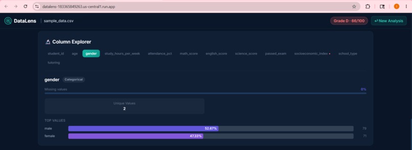
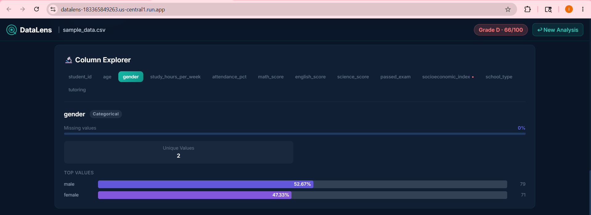
Interactive Column Explorer detailing statistical attributes and Recharts bar chart value distributions.
-
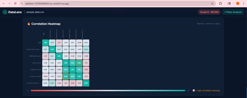
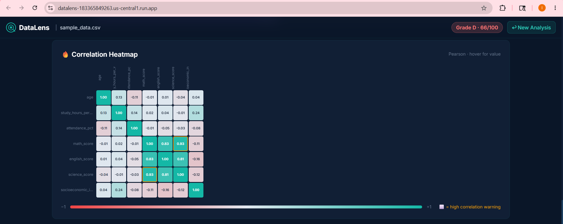
Pearson Correlation Heatmap displaying feature correlations to easily detect data leakage points.
-
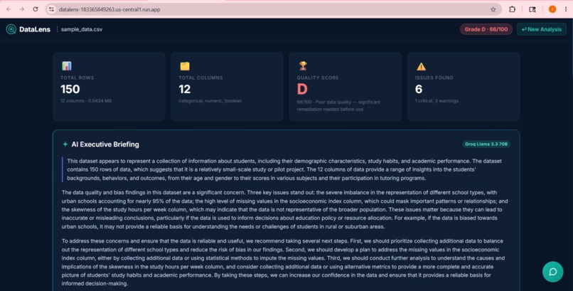
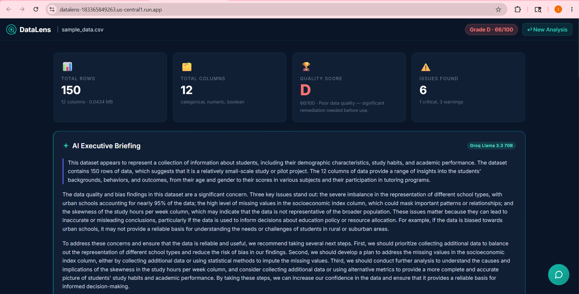
DataLens dashboard overview showcasing the dataset Quality Score and the AI-generated executive briefing.
-
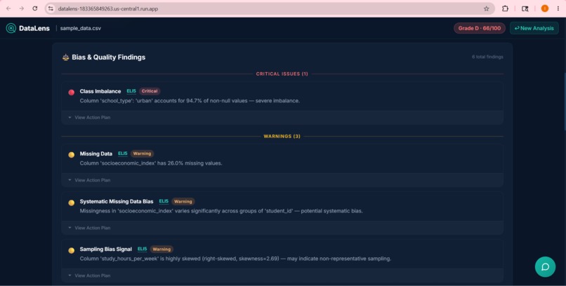
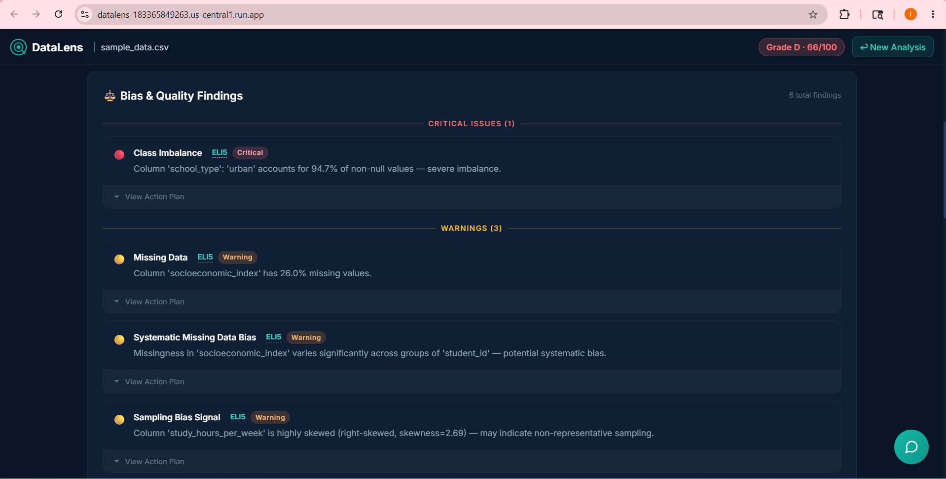
Automated 8-point Bias Audit highlighting critical dataset findings, ELI5 definitions, and actionable code fixes.
Inspiration
I have been there: you spend hours training a machine learning model, only to realize later that the results are completely skewed because of a class imbalance or a sneaky column with 80% missing data. Most data scientists spend the vast majority of their time just cleaning and preparing raw data, yet systematic bias auditing is rarely done early in the pipeline because it is tedious to set up. I wanted to build a simple, beautiful tool that instantly exposes these hidden dataset flaws so you can fix them before you even write a single line of training code.
What it does
DataLens acts as an automated dataset auditor. You simply drag and drop any CSV file into the interface, and the platform instantly runs an eight-point bias audit, checks for high correlations that could indicate data leakage, and calculates an overall data quality score.
To determine how reliable the dataset is, I calculate a dynamic Quality Score Q on a scale of 0 to 100 using the following weighted penalty formula:
$$Q = \max\left(0, 100 - \sum_{i=1}^{n} w_i \cdot C_i\right)$$
Here, C_i represents a triggered bias check or data issue, and w_i is the severity weight assigned to that finding (ranging from minor warnings to critical imbalances).
The results are laid out in a custom dark-mode dashboard featuring interactive column explorers and Pearson correlation heatmaps. To make the report completely actionable, the app uses Groq Llama 3.3 to write an executive briefing and runs a floating conversational chatbot so you can ask direct questions about your dataset. I also included simple explainer tooltips and quick Python code fixes next to every finding.
How we built it
I designed the frontend using React 18 and Vite, styling it with custom CSS to build a highly polished glassmorphic Teal and Navy interface. I chose Recharts to handle the live column distribution charts and built the correlation matrix visually from scratch.
To identify potential data leakage or redundant features, I compute the Pearson correlation coefficient r for all numeric feature pairs (X, Y) using:
$$r_{xy} = \frac{\sum_{i=1}^{N} (x_i - \bar{x})(y_i - \bar{y})}{\sqrt{\sum_{i=1}^{N} (x_i - \bar{x})^2 \sum_{i=1}^{N} (y_i - \bar{y})^2}}$$
Any pair where |r_xy| > 0.85 triggers an automatic warning.
The backend is powered by FastAPI, which handles the secure upload, runs the math pipelines using Pandas and NumPy, and integrates with the Groq API. To make deployment incredibly lightweight and cost-effective, I created a multi-stage Dockerfile that builds the React assets and packages them directly inside the FastAPI app, hosting the entire unified container on Google Cloud Run.
Challenges we ran into
One of the trickiest parts was managing the CSS stacking context on the dashboard. When I added the beginner explainer tooltips and the collapsible code dropdowns, the elements would occasionally get clipped or hidden underneath other rows due to the slide-in entry animations I set up. I had to carefully restructure the z-indexes and container properties to make the layout feel perfectly seamless. I also spent a lot of time tuning the multi-stage Docker build to keep my container size small and ensuring that the React frontend resolved its API endpoints perfectly when hosted inside the single unified Cloud Run service.
Accomplishments that we're proud of
I am incredibly proud of the visual finish and overall user experience of the dashboard. Instead of looking like a generic MVP, the interface feels premium and alive. Getting the Groq-powered chatbot to understand the exact mathematical context of the uploaded dataset was another major milestone, as it allows users to have actual, coherent conversations about their raw data. Finally, having the entire application deployable to a single zero-scaling container on Google Cloud Run makes hosting cheap and robust.
What we learned
I learned a lot about the importance of making deep technical results accessible. Adding the "Explain Like I'm 5" tooltips taught us how to translate complex statistical metrics into simple, intuitive concepts. On the engineering side, I gained a much deeper understanding of how to configure unified SPA routing inside a FastAPI backend so that the entire app can be served from a single web server.
What's next for DataLens
I plan to support much larger datasets by integrating chunked parquet streaming so the analysis remains blazing fast even on millions of rows. We also want to expand the bias auditing engine to automatically flag proxy variables for sensitive categories, such as zip codes correlating with protected attributes. Ultimately, I want to add a one-click "Clean and Export" feature that downloads a debiased, balanced version of your CSV ready for model training.


Log in or sign up for Devpost to join the conversation.