Inspiration
Needs aren't always met, and in humanitarian crises, these inadequacies can severely harm millions of lives. The possible repercussions of this issue motivated us to explore the locations of humanitarian aid distribution and visualize the differences between the amount of aid required and the amount of aid received by a country.
What it does
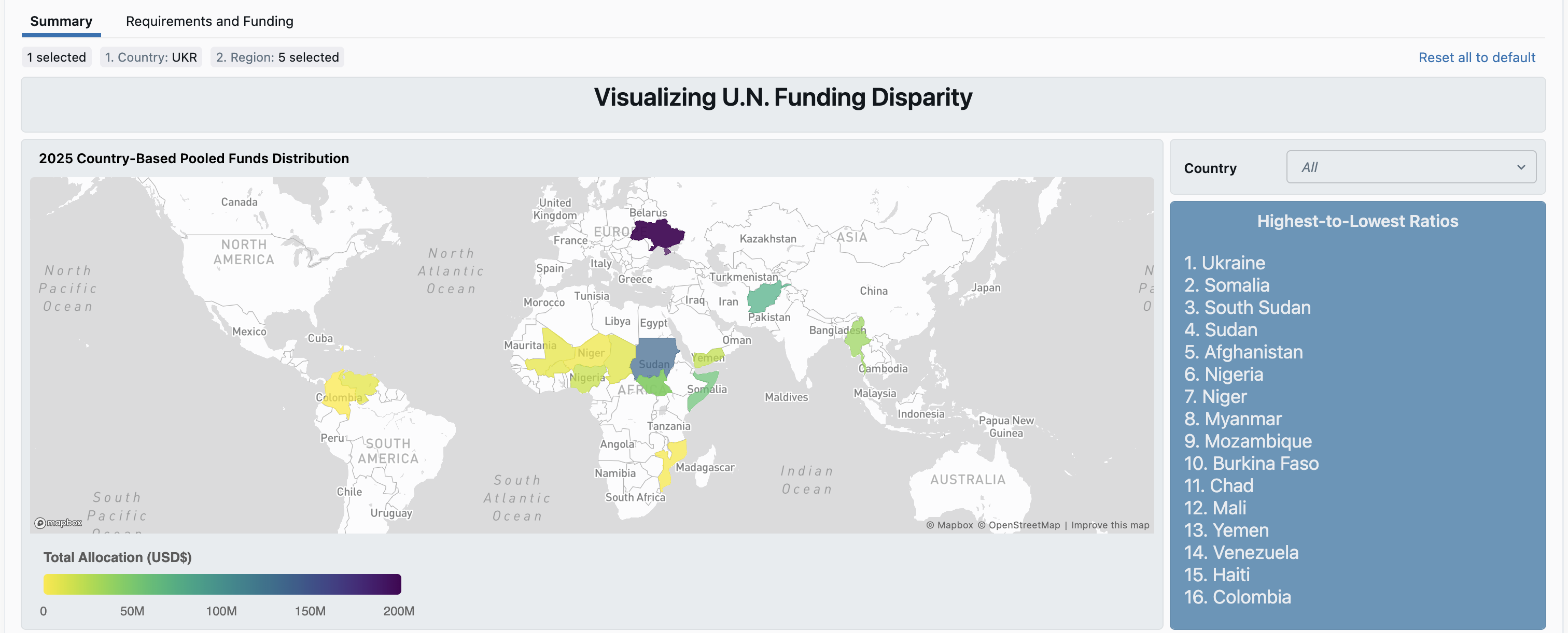
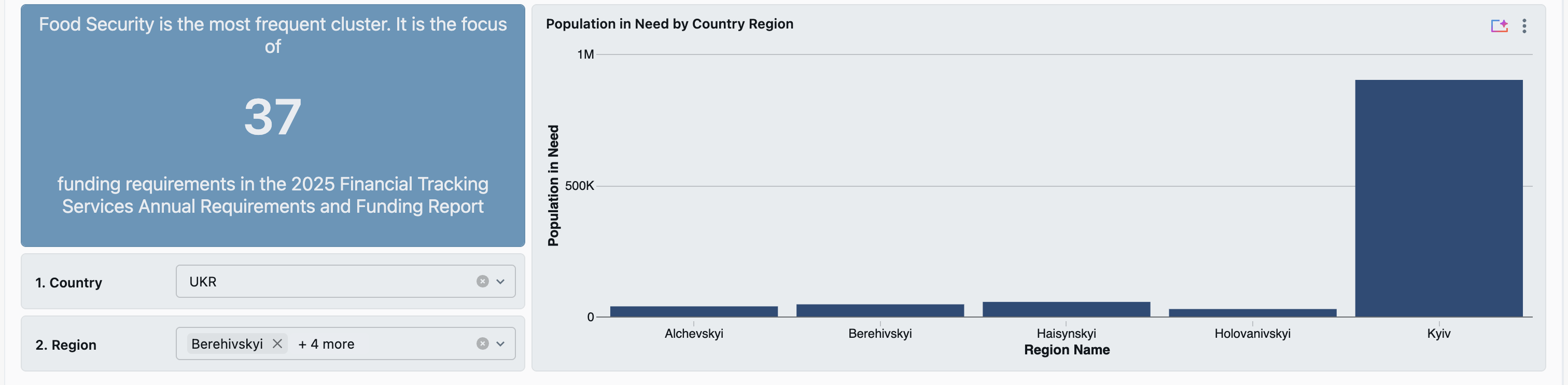
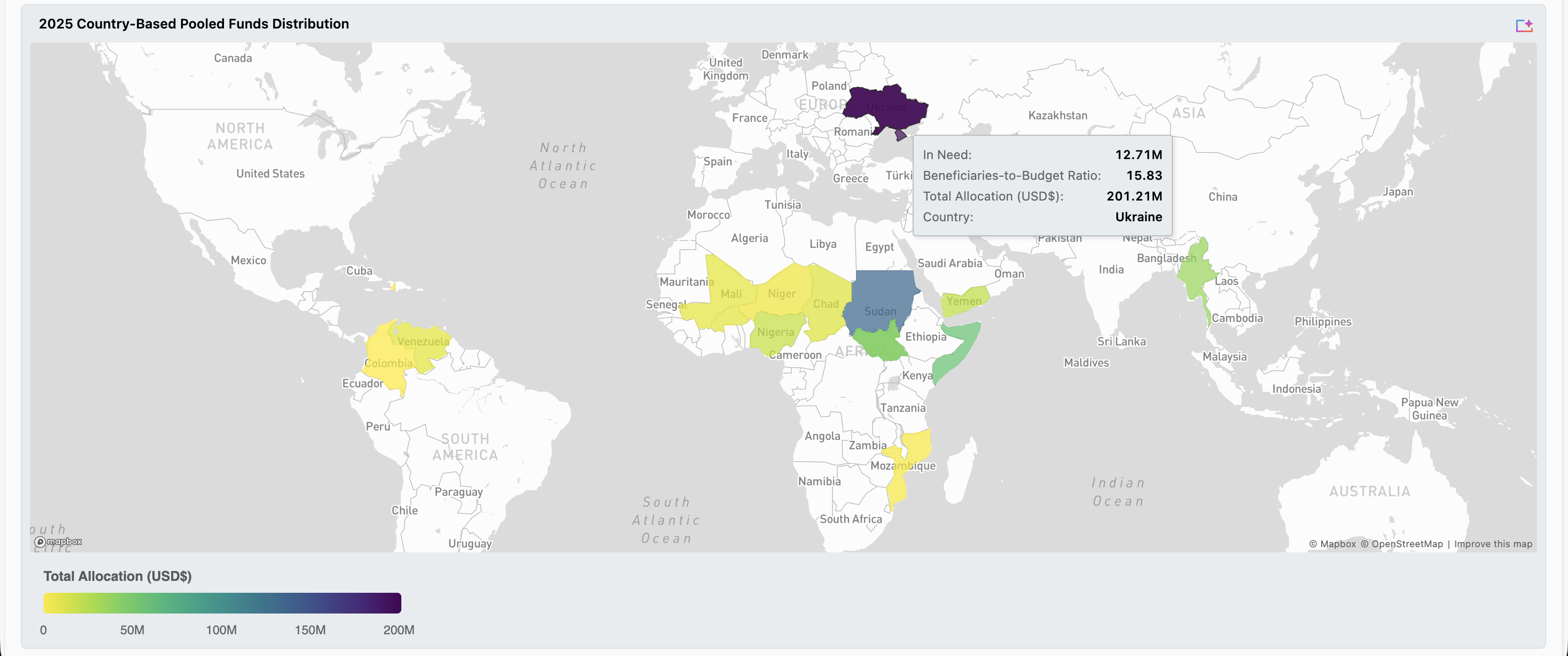
This project visualizes the disparities between the funding for countries and their humanitarian need. In using a spatial perspective, we aim to efficiently highlight countries that need priority in the United Nations' humanitarian efforts.
How we built it
The majority of our project composed of exploring the different humanitarian datasets. Once we were familiar with the subjects of each dataset, we curated the ones that would help us calculate the difference between a country's humanitarian aid amount and their actual needs. We used Databricks as the environment for our work. We used the notebooks to clean, wrangle, and standardize our data for the joining of different datasets. Then, we imported our data to the dashboards to create the final visualization and interactive features.
Challenges we ran into
We wanted specific information from the datasets, but we had to clean the data and make sure what we had was what we wanted in our vision. We also cross-checked the data thoroughly to ensure that the data we were given was sound and that what we are presenting was accurate. Local and national reporting of humanitarian data, especially in the clusters and sectors, were described differently and often in different languages (e.g., Spanish, French). We had to translate and standardize that column for later aggregation.
Accomplishments that we're proud of
This project marks our first time using Databricks (as well as our first hackathon!), and we are proud of being able to create a simple but effective visualization in an environment that we had to learn very quickly.
Built With
- databricks
- python

Log in or sign up for Devpost to join the conversation.