-
-
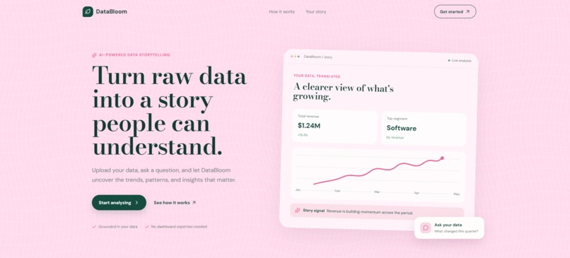
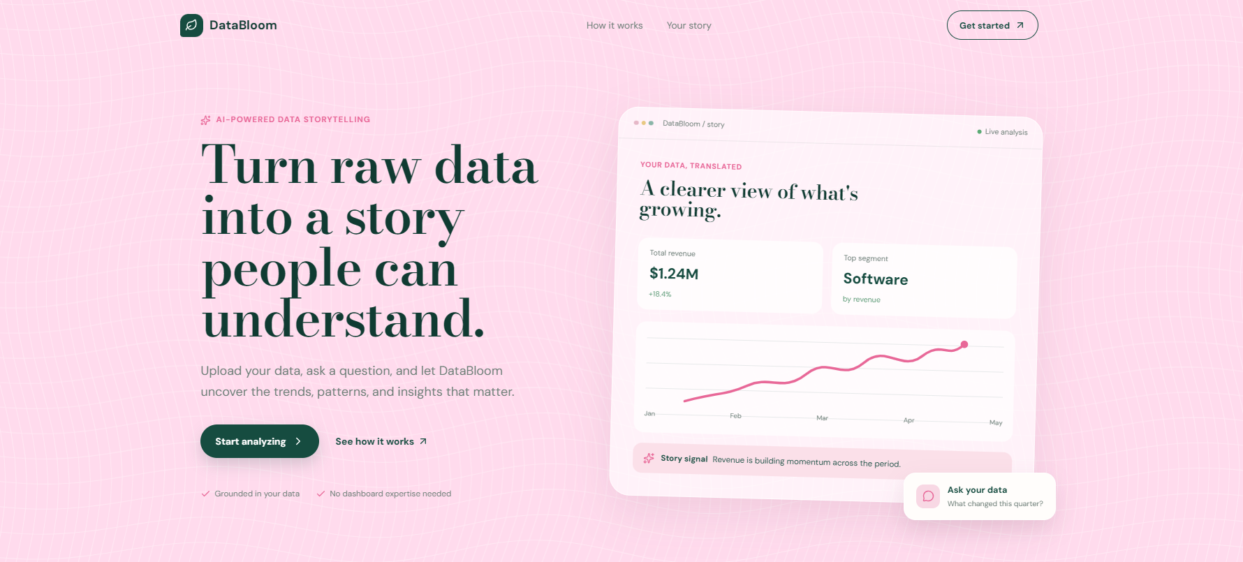
hero section | DataBloom
-
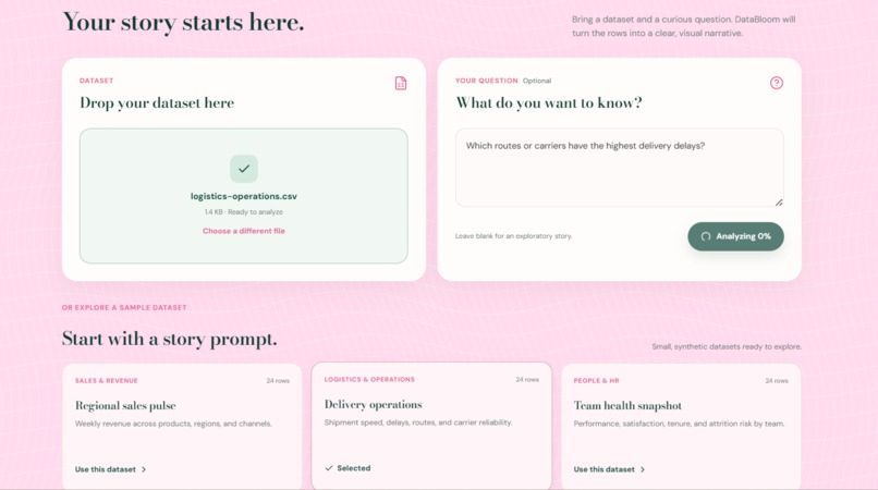
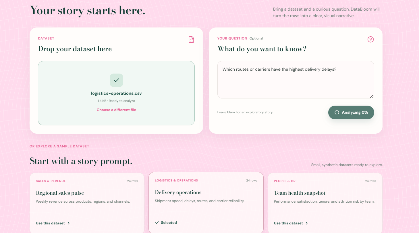
data analysis | DataBloom
The idea
I’ve worked with datasets enough times to know that getting the data into Python is usually not the hardest part. The harder part is figuring out what the data is actually trying to say and then explaining that clearly to someone else.
That was the starting point for DataBloom.
I wanted to build something where you could upload a CSV, JSON, or Excel file, ask a question in plain English, and get more than just a chart. The idea was to have AI help turn the raw numbers into a small, understandable story — what is happening, what stands out, which visualizations make sense, and what someone should pay attention to.
Hence the name DataBloom: taking something that starts out messy and raw, and helping it grow into something people can actually understand.
Building the data
One of the first challenges was having realistic data that could actually demonstrate the idea properly.
For the hackathon, I used Adaptation AI Labs to create a sample dataset designed around the kind of technical and numerical data DataBloom is meant to work with. I then used the Data Scientist feature from Adaptation AI Labs to augment the dataset, which helped me create a larger and more varied set of examples to work with.
This was also useful beyond simply having a dataset for the demo. It gave me a way to think about the different kinds of questions, patterns, and visualizations that DataBloom should be able to handle.
What I built
DataBloom is an AI-powered data storytelling tool.
The basic flow is:
Upload data → ask a question → analyze → visualize → explain
A user can upload a dataset or start with one of the built-in sample datasets. DataBloom profiles the data, looks at the question and the available columns, and generates a data story with visualizations and written insights.
I wanted the AI to do more than simply generate a paragraph about a dataset. The goal was to make the visualization itself part of the reasoning.
The system follows a simple principle:
AI decides what is worth looking at. Code makes sure the numbers are grounded in the data.
Python handles the data processing, profiling, validation, and visualization work, while the AI handles the more interpretive parts such as deciding what story is interesting and how it should be communicated.
How I built it
The frontend is built with Next.js, React, TypeScript, and Tailwind CSS.
The backend is a FastAPI + Python service using Pandas for working with uploaded datasets. Plotly is used for interactive visualizations, and the AI layer uses the OpenAI API.
I also spent quite a bit of time on the actual experience rather than making it look like a standard analytics dashboard. I wanted the product to feel closer to an editorial storytelling tool, so I went with a soft pink and deep green visual identity, large typography, rounded surfaces, subtle motion, and the idea of the data "blooming" into a story.
There are also three sample datasets for people who want to try the product without preparing a dataset first.
What I learned
This project taught me that building an AI feature is only one part of building an AI product.
A model can generate a convincing explanation very easily. The harder question is whether that explanation is actually supported by the data.
That made me think much more carefully about the separation between AI-generated interpretation and deterministic data processing. I also learned a lot about connecting a Next.js frontend to a separately deployed FastAPI backend, handling CORS, environment variables, API keys, and production deployment.
Working with Adaptation AI Labs also gave me a chance to experiment with AI not just for the final product, but earlier in the development process like from creating and augmenting the data I needed to actually testing the kind of analysis DataBloom was supposed to perform.
And, probably most importantly, I learned that small product decisions matter. Things like how a user is introduced to the dataset, what question they are encouraged to ask, why a particular chart is shown, and how an insight is presented can make the difference between a tool that technically works and one that people actually want to use.
Challenges
The biggest challenge was getting all the pieces to work together.
The frontend worked locally, but deploying the application introduced a completely different set of problems. At one point the frontend was still trying to call a local localhost API after deployment. Then the backend deployment itself failed because of a Python syntax issue. After fixing that, the application finally connected to the backend only for the OpenAI API credits to run out while testing.
It was frustrating, but it also ended up being one of the most useful parts of the project because I had to understand what was actually happening between the frontend, backend, and AI service instead of treating the application as one black box.
There are still things I would improve with more time, especially around deeper validation, more robust handling of unusual datasets, and making the generated stories even more grounded and useful.
But for this hackathon, I wanted to focus on getting the core idea into something people can actually interact with.
What's next
The bigger idea behind DataBloom is not to replace data analysts or visualization tools.
It is to make the first step of understanding a dataset much easier.
You shouldn't need to already know whether you need a scatter plot, a histogram, or a grouped bar chart just to start asking questions about your own data.
Upload the data. Ask the question. Let it bloom into a story.
Built With
- ai
- ai/ml
- analysis
- css
- data-visualization
- fastapi
- generative
- natural-language-processing
- next.js
- openai
- pandas
- plotly
- python
- react
- rest-api
- tailwind
- typescript


Log in or sign up for Devpost to join the conversation.