Inspiration
I created this visualization for understanding the Iris dataset.
What it does
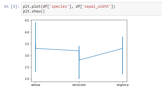
This graph shows us the difference between the sepal length of different species.
How we built it
I built this graph using matplotlib, seaborn libraries. First of all, I imported the dataset using seaborn libraries then created a data frame using the pandas' library. After that, I created a graph using a matplotlib.
Challenges we ran into
I faced many errors while creating this graph.

Log in or sign up for Devpost to join the conversation.