


Inspiration
Data Visualization is the art of providing beautiful insights to the tabular data by using beautiful charts, graphs, plots etc. Investing time in learning data visualization techniques is worthwhile, as data visualization is becoming one of the most sought out fields in data science overall. Moreover, excellent data visualization skills are high-in-demand across a myriad of businesses and industries and open the door to many rewarding career opportunities. With this in mind, we thought to explore some simple but significant plotting libraries to build this project.
What it does
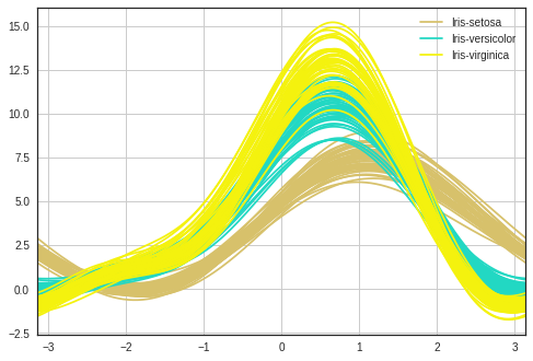
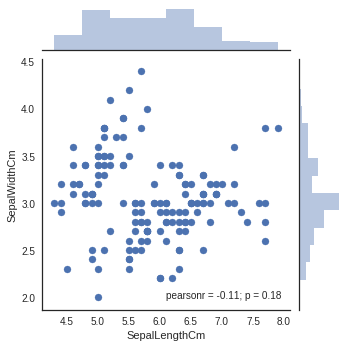
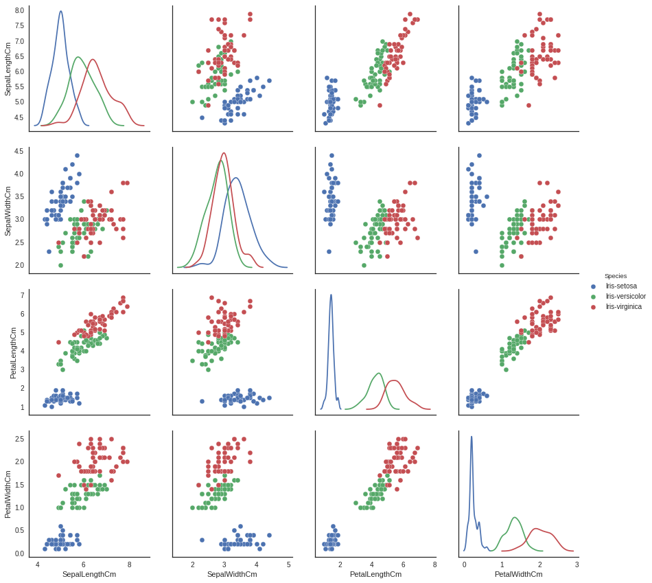
This is a simple data visualization project that shows various graphs using pandas, matplotlib and seaborn. We used the Iris dataset for data visualization. The Iris flower data set is a multivariate data set introduced by the British statistician and biologist Ronald Fisher in his 1936 paper The use of multiple measurements in taxonomic problems. It is sometimes called Anderson's Iris data set because Edgar Anderson collected the data to quantify the morphologic variation of Iris flowers of three related species. The data set consists of 50 samples from each of three species of Iris (Iris Setosa, Iris virginica, and Iris versicolor). Four features were measured from each sample: the length and the width of the sepals and petals, in centimeters. This dataset became a typical test case for many statistical classification techniques in machine learning such as support vector machines. The dataset contains a set of 150 records under 5 attributes - Petal Length, Petal Width, Sepal Length, Sepal width and Class(Species). This dataset is free and is publicly available at the UCI Machine Learning Repository
How we built it
On the Iris Dataset, we ran several functions of various libraries for data visualization. The code is run on Jupyter Notebook and written using Python 3. The outputs consist of graphs, scatterplots, box plots, joint plots, facet grids, histograms, Andrews Curves etc.
Challenges we ran into
Though we studied about data visualization earlier, this is the first time we implemented it in real. Choosing a suitable dataset among a huge collection was quite challenging. This was the first time that we used seaborn library, hence we studied a lot about it.
Accomplishments that we're proud of
Implementing our first data visualization project
Researching about various plots and libraries
What we learned
Everything that we did for this project made us understand the importance of data visualization and its applications in real life. Data can be hectic but visualization enables us to get the insights of the dataset and help us figure out the stuff quickly.
What's next for Data Visualization on Iris Dataset
Data is beautiful and invaluable when presented the right way. We would love to try using different libraries on the Iris dataset that enable us to provide the insights in a broader perspective.


Log in or sign up for Devpost to join the conversation.