-
-
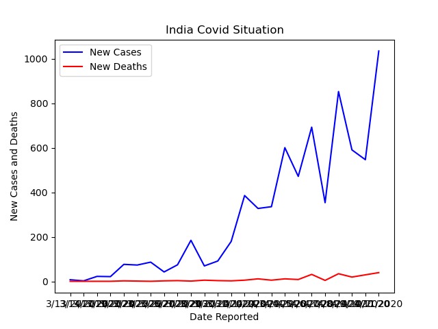
The Output graph

It feels surreal to imagine how the COVID-19 virus began to spread from one person that is patient zero to four million today. In this project we are going to use COVID-19 dataset to represent the number of confirmed cases and deaths with respect to Date reported on the Graph
Data visualization is an interdisciplinary field that deals with the graphic representation of data. Data visualization is a particularly efficient way of communicating when the data is numerous as for example a time series.
To get started with the project, I needed to set up a Jupyter notebook After getting my Jupyter notebook ready, I had to import some important Python libraries like Pandas, Numpy and Matplot to visualize the required set of data on the graph. Next, I opened my csv file which contains all of the data for different countries in the world Now to see the data of a specific country (in this case India) — I searched for ‘India’ in the ‘Country’ column of my data frame To display this data in the form of a line chart I used the Plotly module again having entries which included: Name of the data frame (df_india); X-axis will show the ‘Date Reported’; Y-axis will show the ‘New cases’ along with the ‘New Deaths’.
From the graph we can clearly see that during the lockdown period in India— the ‘New cases’ increases during the middle of the lockdown and the ‘Deaths’ increases slightly
This Project helped me understand the spread of COVID-19 in a single country, it was important to be able to compare the data of different countries
As my future work, I decided to create a new data frame with 2 columns showing the name of the country along with the maximum deaths. With this I will plot a bar chart to show the comparison between the different countries as to identify which country had the highest number of confirmed COVID cases in a single day.
Built With
- dataset
- pycharm
- python

Log in or sign up for Devpost to join the conversation.