-
-
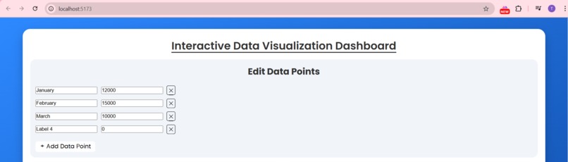
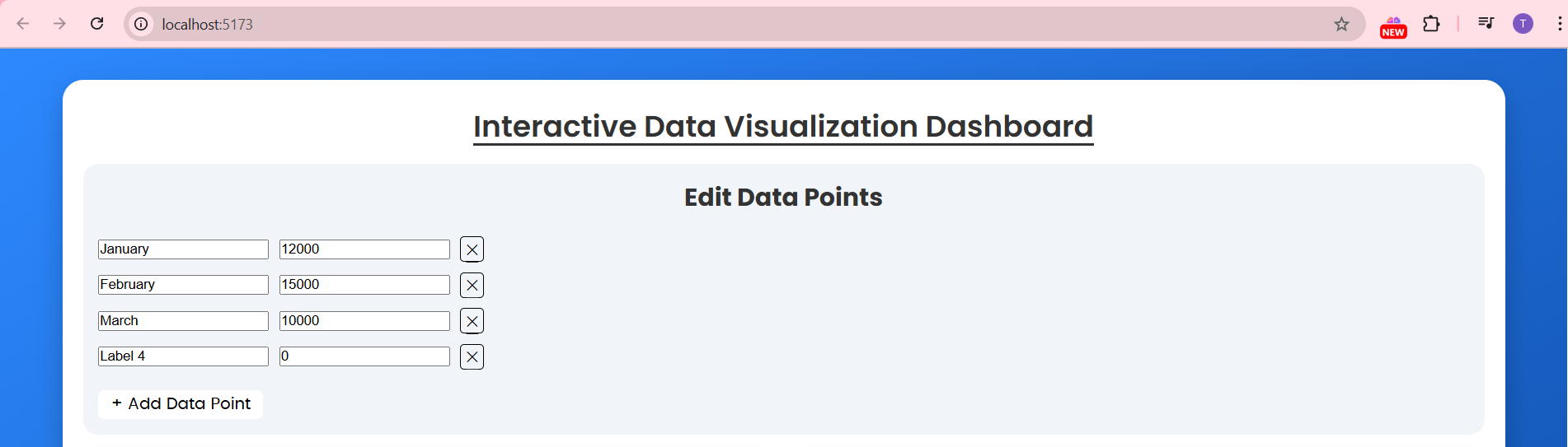
Data points the graphs
-
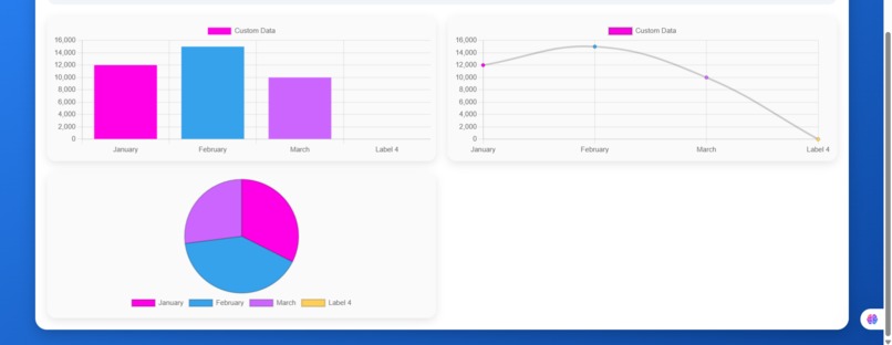
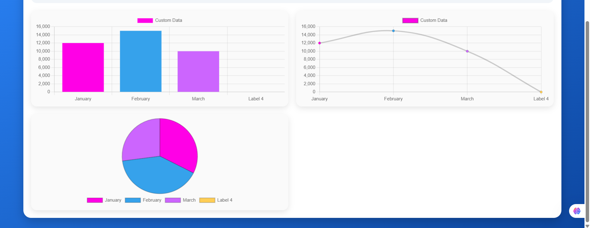
Different types of graphs formed from the above data points
🚀 Project Story
💡 Inspiration
In today’s world, we generate data at an exponential rate. However, raw data is often overwhelming and difficult to interpret. We were inspired to build this Data Visualization Dashboard to transform complex datasets into clear, interactive visualizations that empower decision-makers, students, and researchers to uncover insights quickly.
Our motivation came from the fact that existing dashboards are often:
- Too technical for beginners
- Static and hard to customize
- Not user-friendly for non-analysts
🛠️ How We Built It
- Built with React.js for dynamic components.
- Used Chart.js for interactive data visualizations.
- Designed with CSS for a clean, responsive UI.
📚 What We Learned
- The importance of clean UI/UX in making data accessible.
- How to integrate charting libraries effectively with real datasets.
- Working as a team under time pressure and dividing tasks efficiently.
⚡ Challenges We Faced
- Data Cleaning: Raw datasets often contained missing values or inconsistencies.
- Chart Responsiveness: Making visualizations work across devices was tricky.
🔮 What’s Next
- Supporting drag-and-drop widgets for customizable dashboards.
- Expanding to more data sources (Google Sheets, SQL, APIs).
👥 Team
- Tanvi Chauhan
- Indranil Mandal
Built With
- css
- html
- javascript
- vite
- vscode

Log in or sign up for Devpost to join the conversation.