
Inspiration
At work, visual dashboards are essential but tedious to create. Many engineers spend significant time building and maintaining internal dashboards, manually assembling components and struggling to determine the most relevant visualizations. Existing solutions are static, requiring users to recreate all visualizations whenever the data changes and manually fine-tune charts. We wanted to build a tool that simplifies this process—one that dynamically generates interactive dashboards from a Google Sheet, making data visualization effortless and adaptable.
What it does
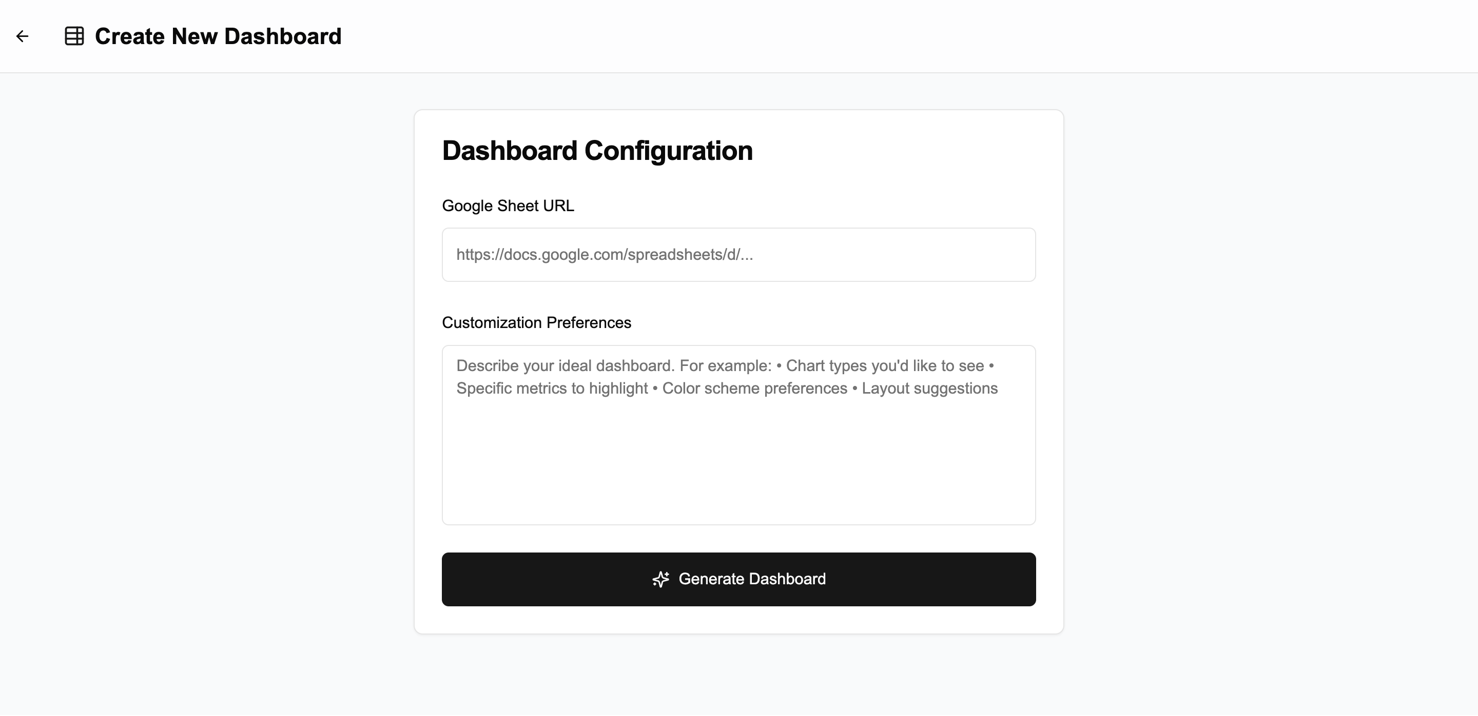
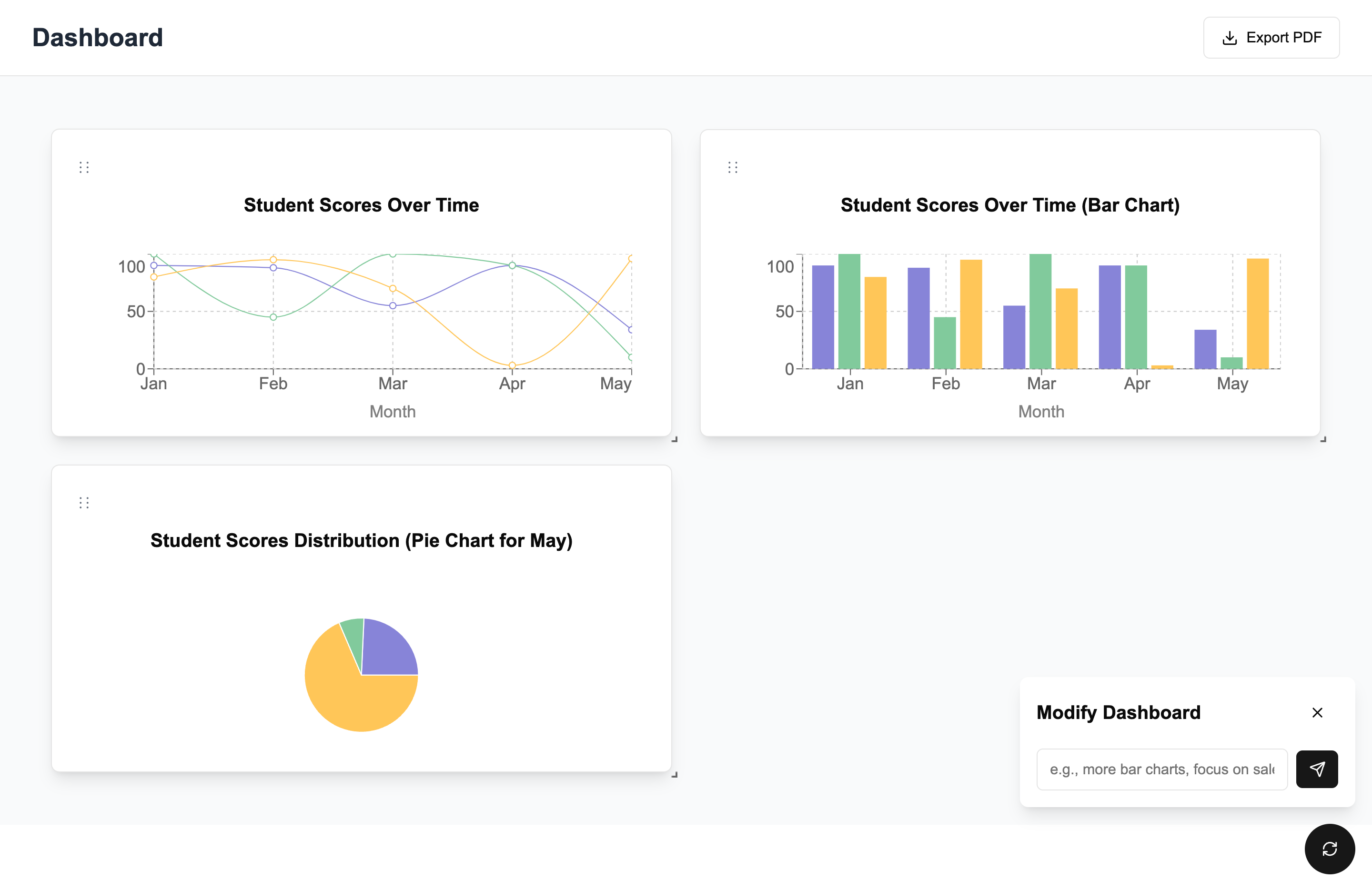
Dashify transforms a Google Sheet into an interactive, customizable dashboard. Users provide a link to their sheet and the tool:
- Generates dynamic charts based on spreadsheet data.
- Allows real-time customization of visualizations.
- Automatically updates charts when the source data changes.
- Supports drag-and-drop for easy chart rearrangement.
How we built it
We started by identifying gaps in existing spreadsheet tools and brainstorming a solution to streamline data visualization. Our development process was guided by the expected user flow. Using Vercel’s v0, we created the initial app template and then integrated Google Sheets. We integrated with the OpenAI API allowing us to generate visualizations and reason through a user's data on the fly. Using Recharts, we rendered charts that update in real time as data changes.
Challenges we ran into
One of our biggest challenges was managing the variability of LLM-generated output when dealing with highly diverse spreadsheet data. Enforcing a strict structured format was too rigid, while allowing open-ended responses led to excessive unpredictability. Striking the right balance required careful prompt engineering and iterative refinement. We also faced difficulties in identifying a clear gap in existing Google Sheets tools that our solution could uniquely address. Additionally, defining the project scope was challenging, as there were many potential directions we could explore.
Accomplishments that we're proud of
We are proud of coming up with an idea that addresses a common problem we all experience. We successfully built an easy-to-use user interface that makes interacting with the dashboard simple. We implemented a sync functionality that ensures the dashboard is updated on click when data changes. Finally, we were able to figure out how to get the LLM to reason over data, which was a complex challenge but a rewarding accomplishment.
What we learned
- We learned how to fine-tune prompts and structure LLM outputs to create reliable and meaningful chart recommendations.
- Keeping the dashboard in sync with Google Sheets was trickier than expected, requiring efficient polling and state management.
- We realized that a great UX is just as important as the AI itself—users need intuitive controls to refine charts
What's next for Dashify
- User Accounts & Dashboard Management – Save your dashboards, revisit them anytime, and make edits effortlessly. Link to a user's Google account to enable dashboard creation for privately owned sheets.
- Leverage a wider range of chart types available on Recharts for richer data representation.
- Insights Tab – Get a concise, AI-powered breakdown of key insights from your data, making analysis more intuitive and actionable.
Built With
- flask
- google-sheets-api
- next.js
- openai
- recharts
- shadcn
- tailwind
- typescript
- vercel

Log in or sign up for Devpost to join the conversation.