-
-
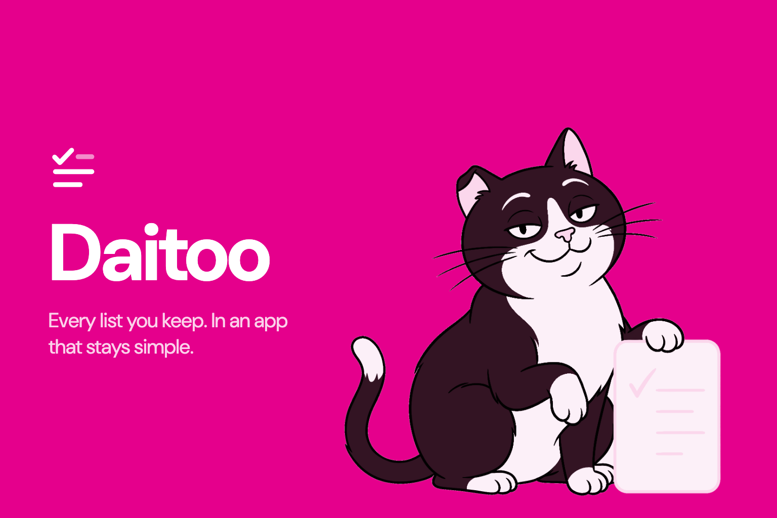
Daitoo: Every list you keep
-
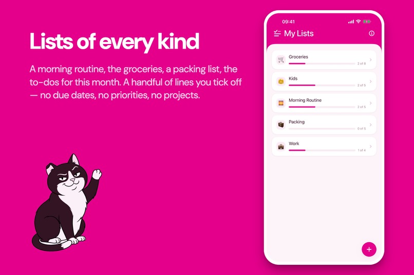
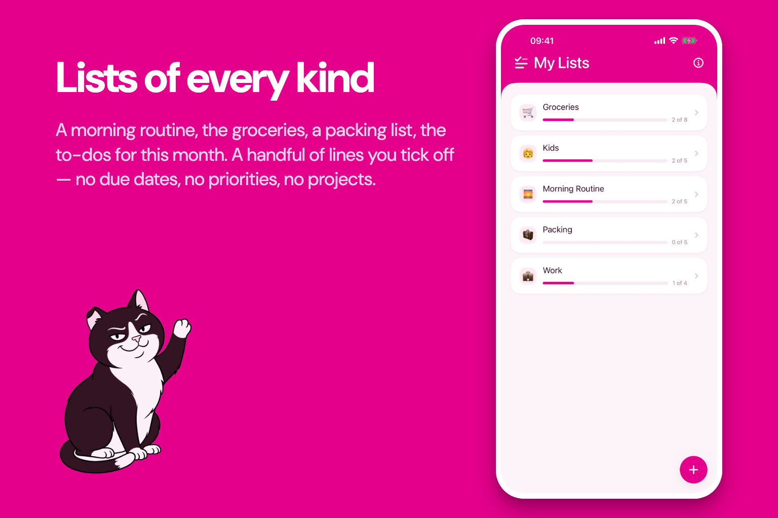
Lists of every kind
-
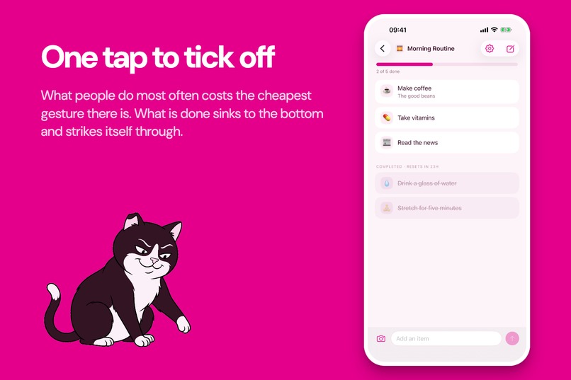
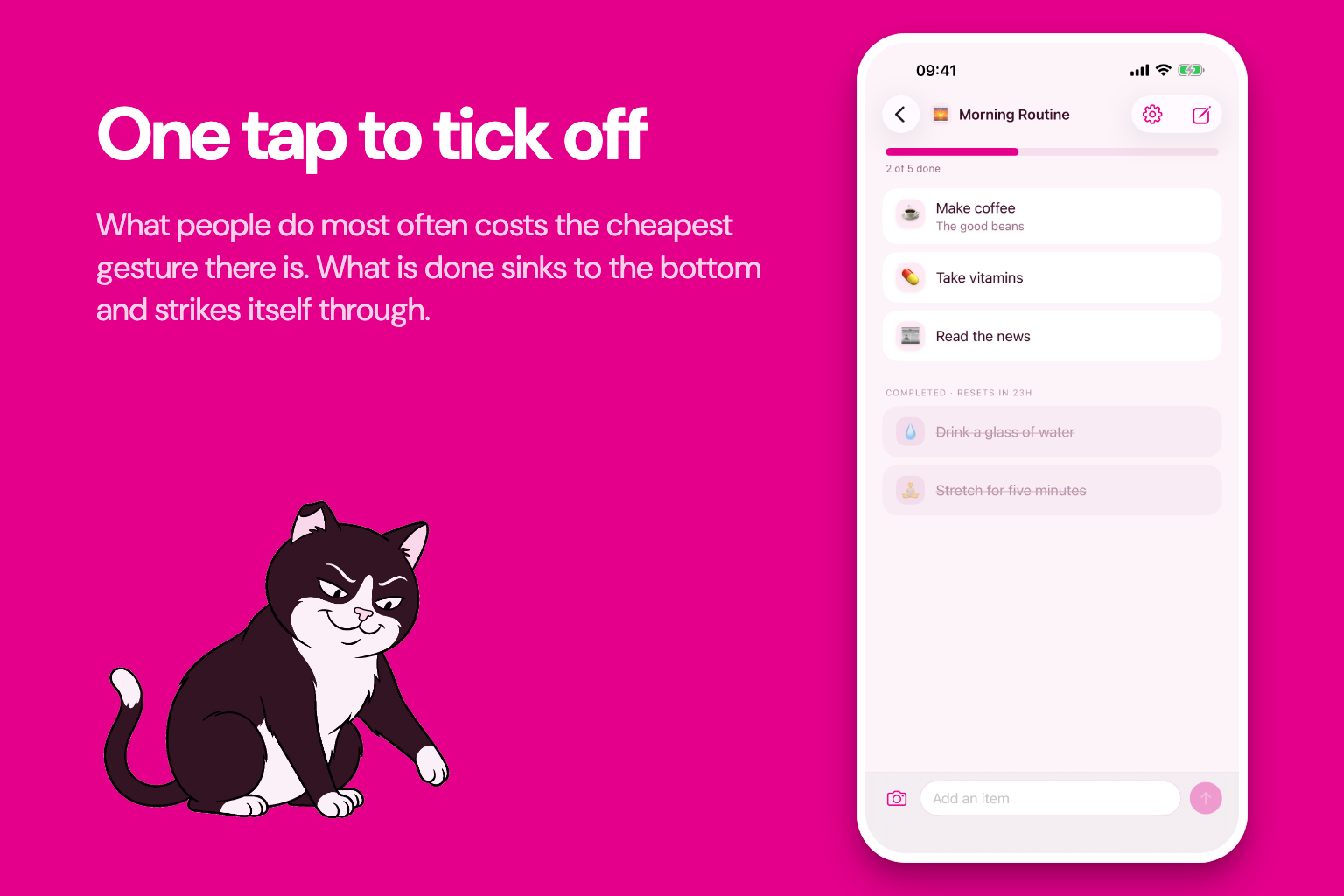
One tap to tick off
-
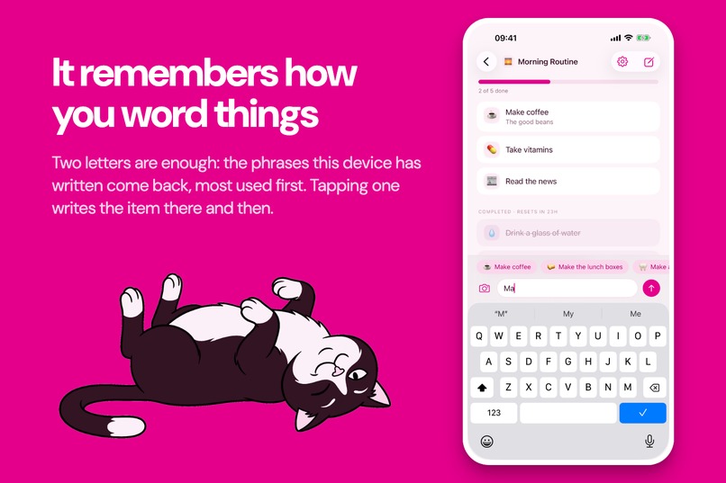
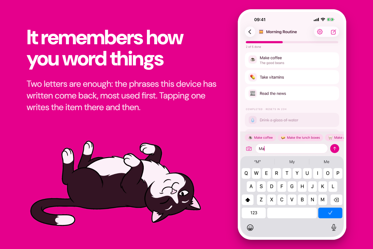
It remembers how you word things
-
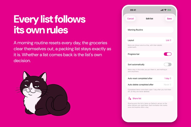
Every list follows its own rules
-
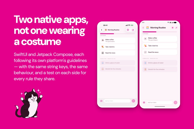
Two native apps, not one wearing a costume
-
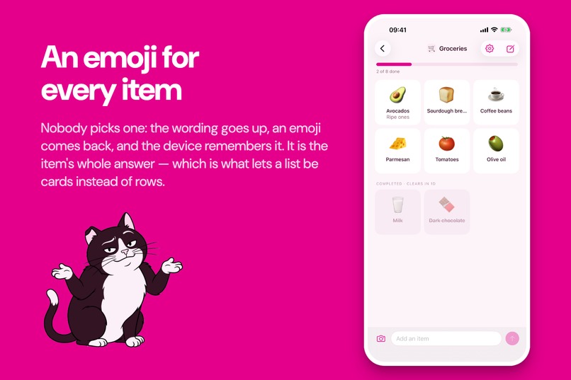
An emoji for every item
-
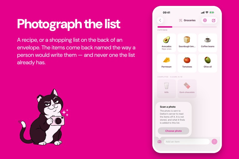
Photograph the list
-
-
-
Frameless Screenshot iOS
-
Frameless Screenshot Android
-

App Icon

Inspiration
I was re-typing the same eight lines every morning. Coffee, vitamins, feed the cat. My notes app had no opinion about it, and everything I tried instead was a project manager with a friendlier icon: due dates, priorities, sub-tasks, an inbox to review. That's a lot of machinery for a grocery list. The lists I actually keep are dumb and repetitive. The annoying part was never organising them. It was writing the same words again, and reading back a grey wall of text.
Two ideas came out of that, and the whole app is still those two ideas.
Your phone should remember phrases, not just store todos. If you've written Coffee three hundred times, the three hundred and first should take one tap.
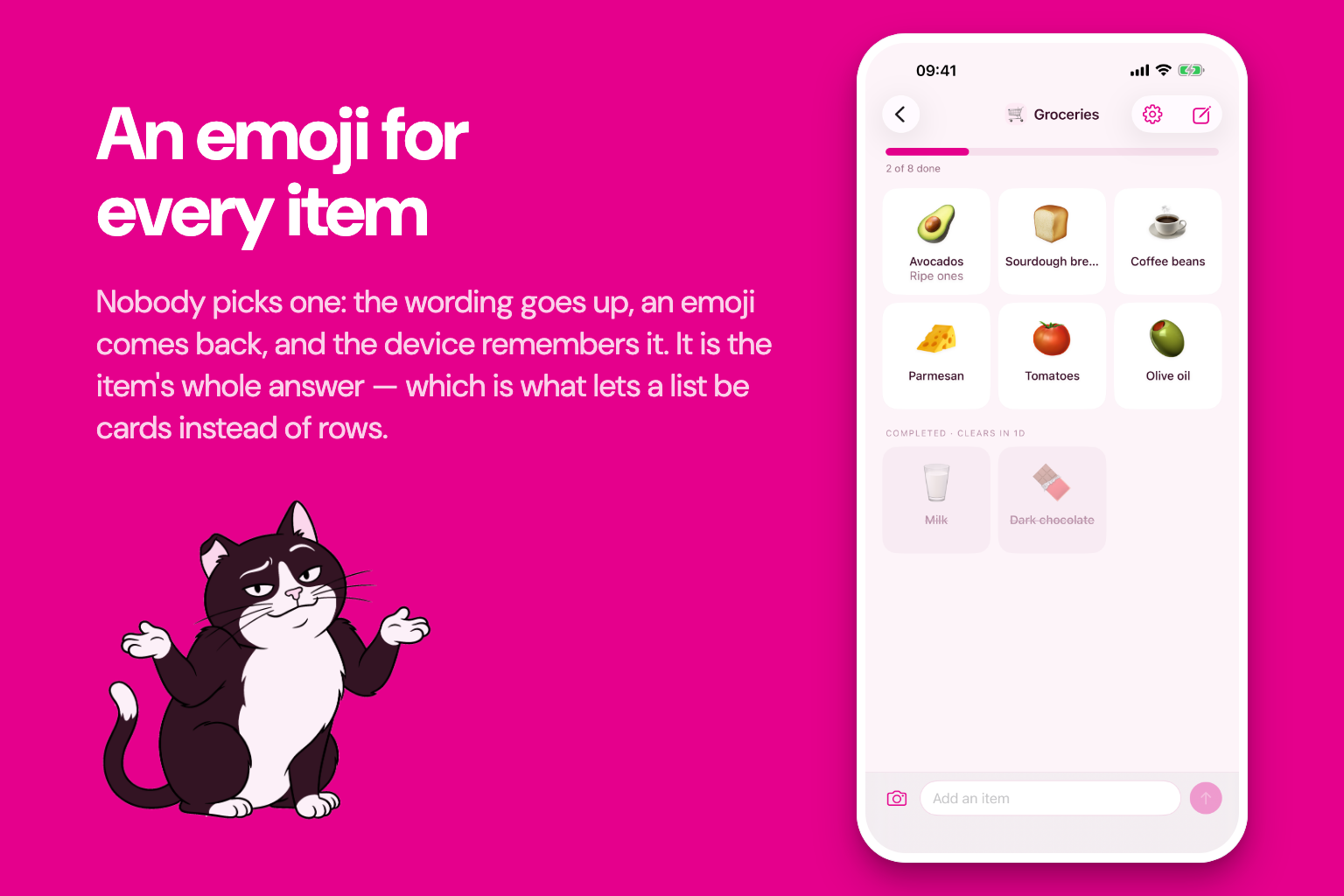
An emoji makes a line readable at a glance, but nobody opens a picker to decorate "buy milk". So something else has to choose. One phrase in, one character out, and you never see it happen. Daitoo has no emoji picker at all.
What it does
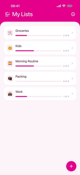
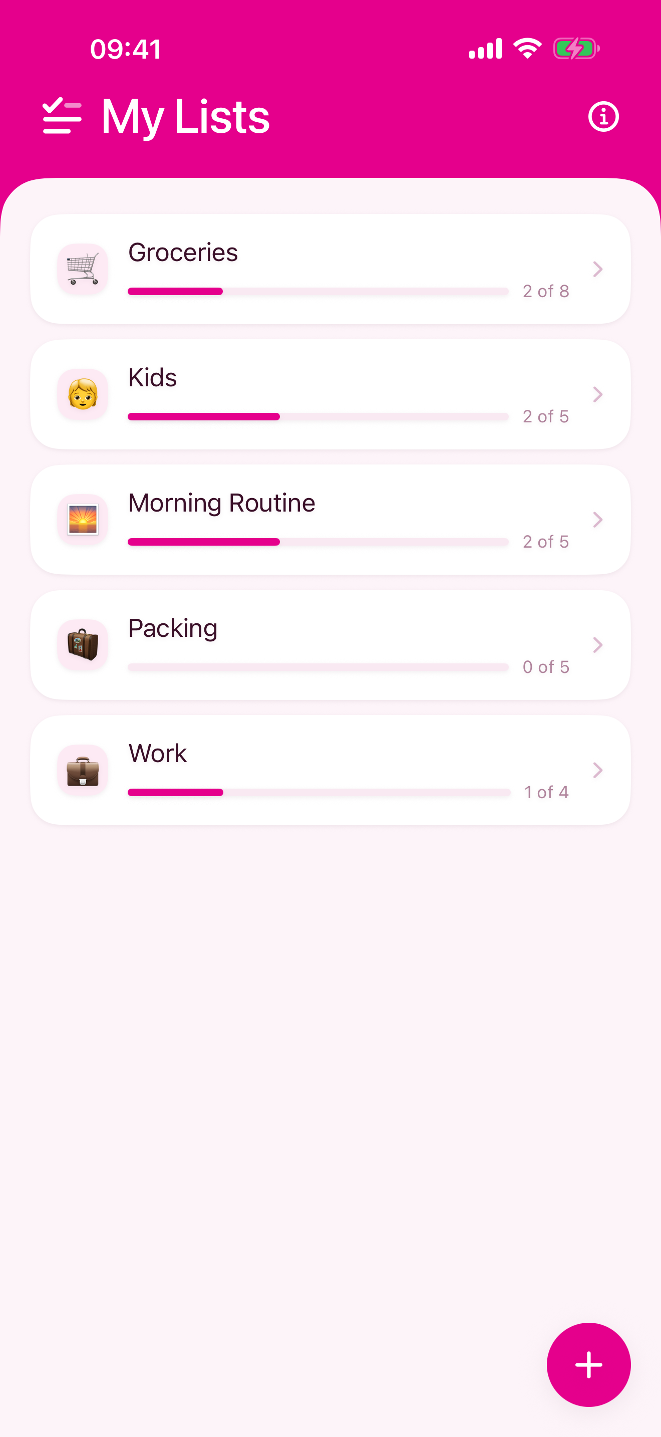
Daitoo keeps lists. A morning routine, the shopping, a packing checklist. A list is a handful of lines you tick off: no due dates, no priorities, no assignees, no sub-tasks.
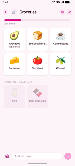
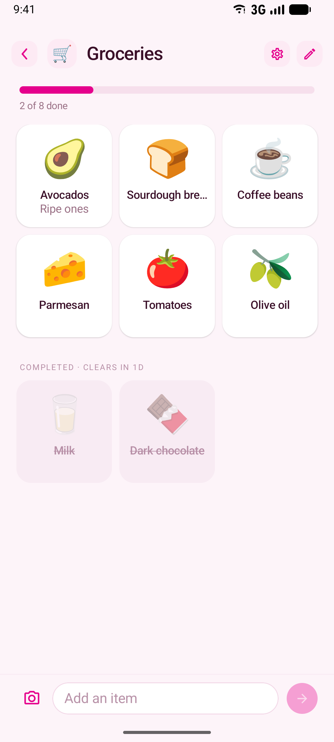
- Tap an item to tick it off, tap again to put it back. Completed items sink to the bottom, struck through. Swipe to edit or delete, long-press to reorder.
- Every item gets an emoji, chosen for it. You never pick one. A phrase this device has written before is answered from its own memory, with no request at all.
- The composer autocompletes from what you've written before, most-used first. Tapping a suggestion writes the item instead of filling the field.
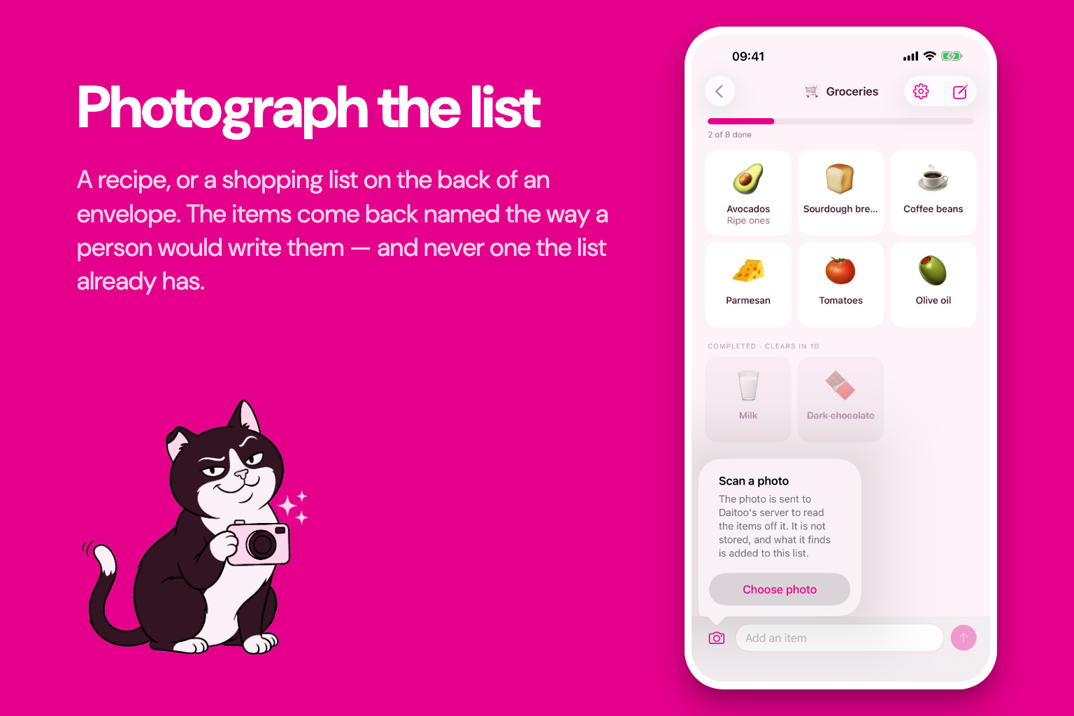
- A photo becomes a list. Point the camera at a recipe or a handwritten shopping list. It comes back as items named the way a person would write them (
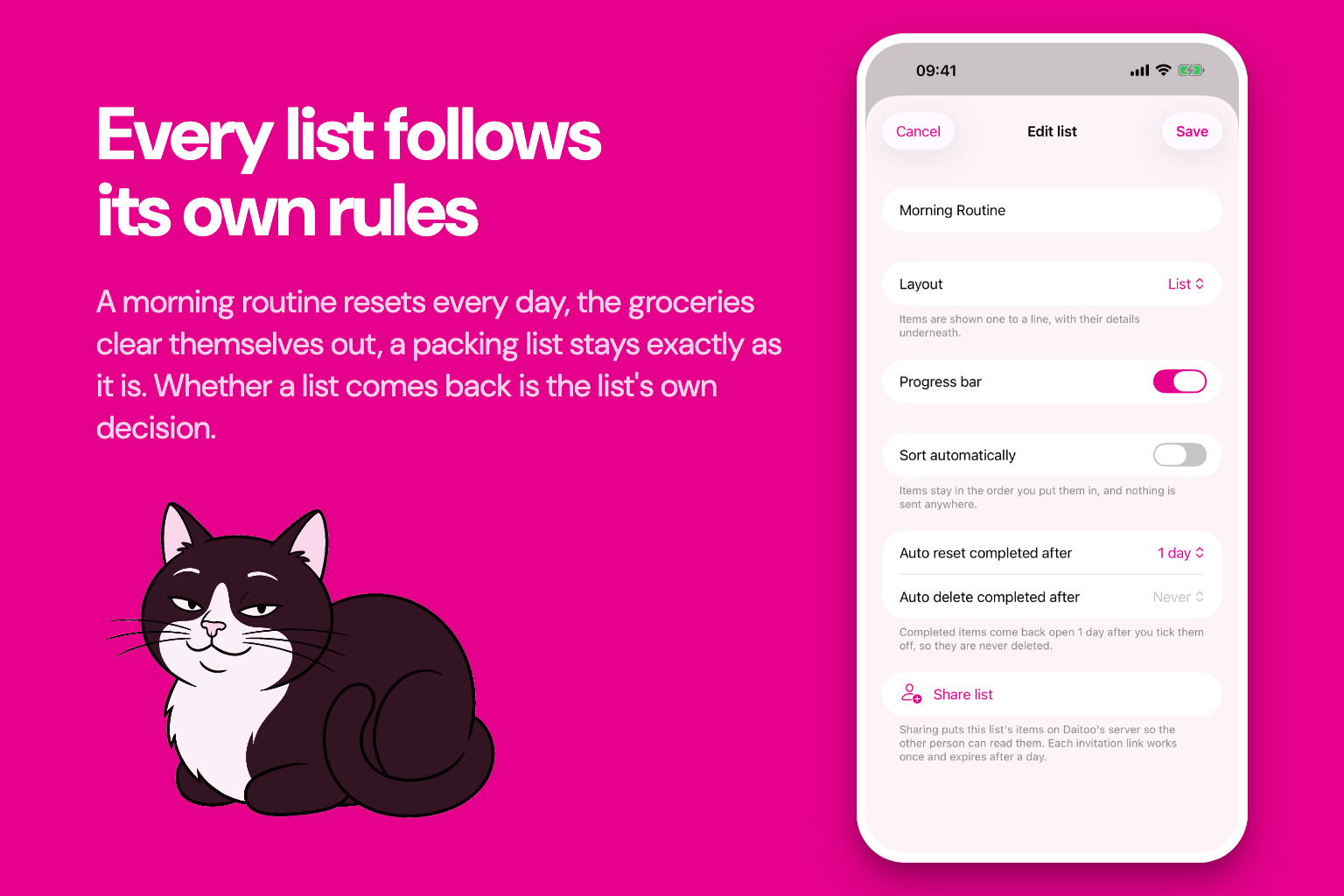
200 g plain flour, siftedbecomesFlour), in your language whatever language the page is in. Anything already on the list is skipped instead of added twice. - Each list decides how it behaves: rows or a grid, showing its progress or not, sorting itself, and whether completed items come back after a day or clear out after a week. A new list does none of that until you ask.
- Share a list with a link, and nobody signs up for anything. Send it, they tap it, and you're both on the same list. Daitoo has no account, no password and no sign-in screen anywhere. The phone proves it's a real phone instead.
- And there's a cat. Mochi turns up where the app has nothing to say. He's supportive. He's also, unmistakably, judging you. Work out what he likes and he'll show himself.
Four languages, light and dark. Works offline.
The design
Simplicity is the constraint everything else was designed against. Every screen was cut back until only a handful of lines you tick off was left. No emoji picker, no spinner. An item waiting for its emoji shows a pulsing dot instead of a stand-in glyph, because an honest wait beats a fake answer.
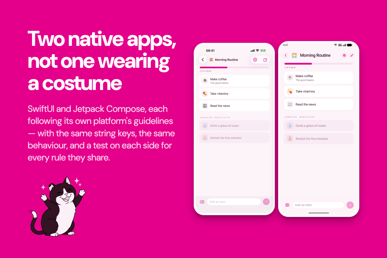
One brand colour, and a dark mode that's a second design, not an inversion. The same palette, checklist mark and drawings carry across the app, both store listings and the website. Strictly native on each platform: Apple's Human Interface Guidelines on iOS, Material 3 on Android, neither a port of the other. The best user experience is the one people already know how to use.
And Mochi, a tuxedo cat in clean-line comic style who appears only where the app has nothing to show. Every pose is generated against the same approved reference, so he's always the same animal. https://daitoo.app/en/mochi ends with a photo of the real cat he's based on.
How I built it
Two native apps instead of one shared codebase. iOS users expect an app that feels like iOS, Android users expect Android, and this product is mostly gestures, which is exactly where each platform's conventions matter. SwiftUI and SwiftData on iOS, Compose and Room on Android. They share no code and offer the same features, and nothing counts as done until it has landed on both. The old cost of this was mastering two languages. AI has made it much easier to build for different platforms.
The AI is built around how repetitive list-writing is. Every phrase a device has written is kept locally with the emoji it earned, so the common case costs nothing and works on a plane. A fresh install already knows three hundred phrases in its own language. Only new wording goes to the backend, which answers in the same round trip and caches the result, keyed on the language, the country and the list as well as the words. The backend stores a hash and an emoji, never the wording.
Two OpenAI calls, deliberately different sizes. A small model for the emoji, asked once per phrase and cached forever. A better one for reading photos, where a misread item is something you have to fix by hand.
Sorting isn't a language problem, so a language model no longer does it. It goes to Jev, TypeSafe AI's decision model, which can't write text at all. It answers typed questions in bulk, and an order is just a ranking. On lists, it cut the wait from 8–11 seconds to under one. What Jev can't do is invent, so a list shape nobody anticipated falls back to the old model path.
An anonymous, attested backend. No accounts means no password to leak, so the device proves itself: App Attest on iOS, Play Integrity on Android. TypeScript on AWS, Lambda behind an HTTP API, DynamoDB, all defined in CDK, with 100% backend test coverage enforced. OpenAI comes in through LangChain, Jev through the Vercel AI Gateway, and App Attest through node-app-attest, an MIT package I wrote and published for exactly this job.
And a website, because a good app needs a FAQ, a manual and somewhere to write to. daitoo.app has 31 FAQ answers, a fourteen-chapter manual and a contact form that reaches a real person, in four languages. The app links to the site for help, so a clearer answer ships the same afternoon, without a new build.
Monetization
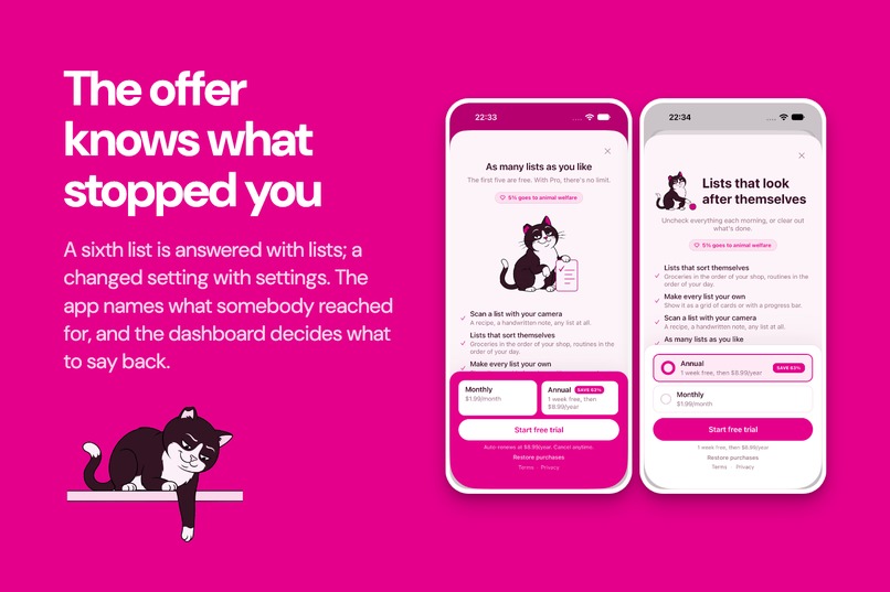
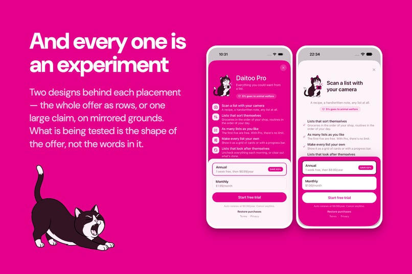
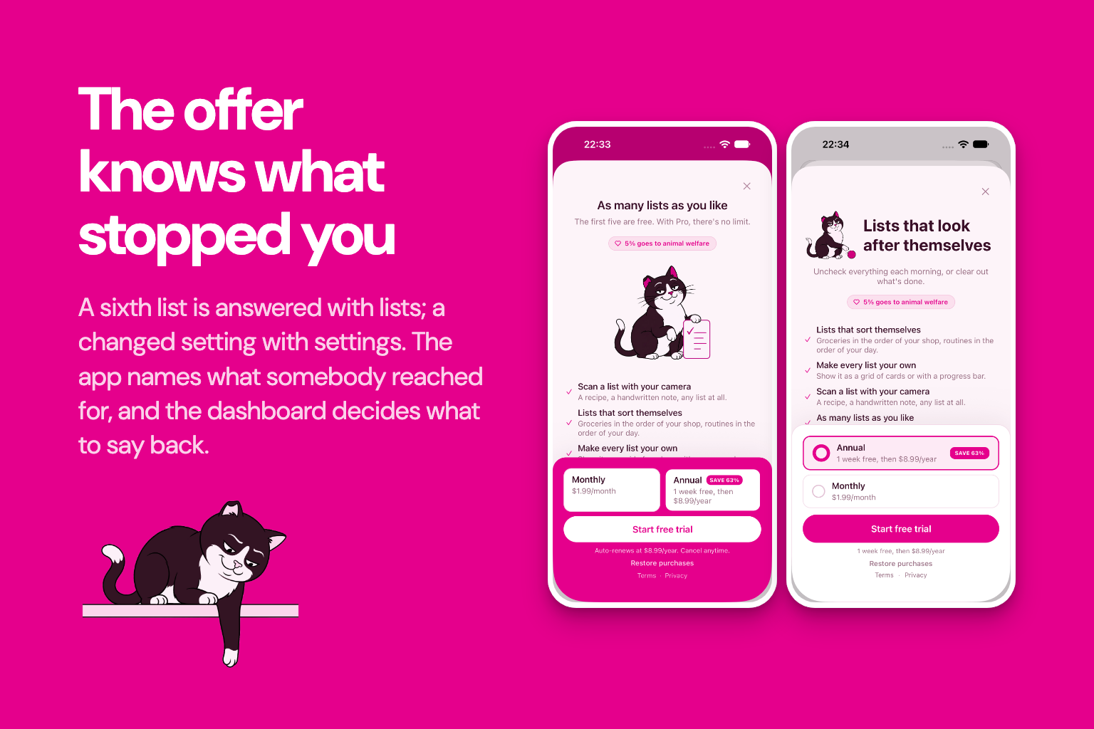
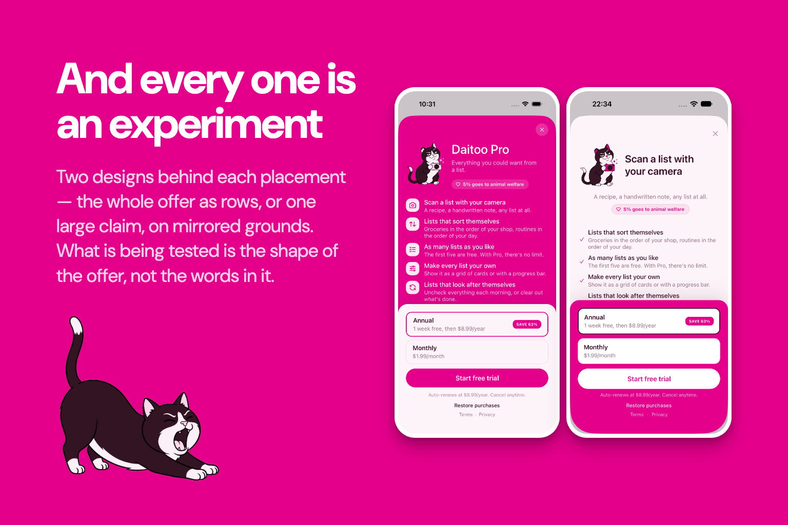
Daitoo is free to use. You pay to scan a photo into a list, to keep more than five lists, or to configure what a list does. One subscription, Daitoo Pro, sold through RevenueCat: about €2 a month or €10 a year, with a 7-day trial on the annual plan.
Everything else is free, sharing most of all. A paywall in front of writing a line and ticking it off is a paywall in front of the whole app. Sharing used to be paid, which meant charging the one person an invitation link had just brought in. Scanning is paid because it's the one call whose cost grows with use. And the first scan on every install is free, so the offer only reaches someone who has watched it work and wants it again.
The first goal is users, not revenue. For now, income only has to cover running costs. Growing revenue comes later, from a user base that exists, not from charging early users more. 5% of subscription revenue goes to animal welfare. Revenue, not profit, because profit can legitimately be zero.
Challenges I ran into
One emoji sounds like a one-liner. It was the hardest thing in the app. Gift is a present in English and poison in German. Rock is a skirt. Chips are fries in one country and crisps in another. So the prompt is written in the phrase's language and told the language, the country and the list, because one line of wording can't say those things. Then the model has to act on it. The cheap model answered German Rock with a stone or a guitar eight times out of eight, never the skirt. That's why I picked the model with a comparison script, not from release notes. The prompt is built from named parts, so tests can check that every language comes out the same shape and that a cleverly named list can't break out of the instructions.
No account, no login, and an AI bill anybody could run up. The best thing about opening Daitoo is that there's nothing to sign up for. That's also the hardest thing to defend. Three endpoints reach a model and cost real money per call, and with no accounts there's nobody to rate-limit and no key to revoke. So the device authenticates instead of the person, and every call carries a one-time challenge bound to its exact body, so a captured request can't be replayed. Nobody signs up, nobody signs in, and only a real install of Daitoo can ask the model anything.
Apple rejected a screenshot for the word "free". Guideline 2.3.7 treats a screenshot as metadata and a free tier as a price reference. The panel headed "Free in Daitoo" is now headed "Features", and a test pins that in all four languages, because the word that gets a listing rejected is different in each one.
And the Samsung Galaxy Store wouldn't let me become a seller at all. Every application was refused with the same sentence: the company website on my D-U-N-S record doesn't match my account email's domain. The D-U-N-S record has no website and no email. It's a mismatch against an empty field, with nothing to fix. So there's no Galaxy Store listing, and that's the one category here I couldn't enter. The build is ready and goes up the day that record is sorted.
What I learned
The win came from noticing how repetitive list-writing is, not from optimising anything afterwards. Understanding the behaviour beat tuning the machinery.
Give the model exactly one job. Early on it also corrected typos. That sounded helpful and meant your list said something you hadn't typed. Now it picks an emoji and nothing else.
A rule that depends on when you look isn't a rule. A list could bring completed items back after a while or throw them away after a while, and letting whichever deadline came first win looked obviously correct. Then the same item was deleted if I opened the app at 30 hours and restored if I opened it at 60. Now a list that resets never deletes. Less clever, same answer every time.
A better tool turned up mid-build, and it was worth stopping for. Sorting took eight to eleven seconds, long enough to watch a list not reorder itself. TypeSafe AI released Jev halfway through the hackathon. Reading up on it, working out how to ask it and shipping it took a day, and the wait dropped to under a second. The lesson isn't the model. A number I'd accepted as "how long sorting takes" stopped being true within a day of something new existing, and I only found out because I went and looked.
Write down why, not what. A decision log saved me over and over, mostly from reopening arguments I'd already settled and from letting the two apps quietly drift apart.
What's next
Reminders by time and place. A morning routine that shows up at seven, a shopping list that appears when you walk into the supermarket. On the list, not the item, so there are still no due dates and nothing to miss. A reminder decides when a list comes back, which is what the reset window already does.
More ways to draw a list, and bigger screens to draw them on: proper tablet and foldable layouts, and a Mac app.
Templates, for the checklists people rebuild from scratch every time.
Bucket lists, the one kind of list that isn't about this week. Nothing resets, nothing clears, and a tick stays ticked.
And more Mochi, for the people who want him. He earns his place by only turning up where there's nothing to show, so there's more of him to come.
Built With
- amazon-web-services
- claude
- fastlane
- jev
- kotlin
- langchain
- llm
- native
- openai
- revenuecat
- serverless
- swift
- swiftui
- typescript

Log in or sign up for Devpost to join the conversation.