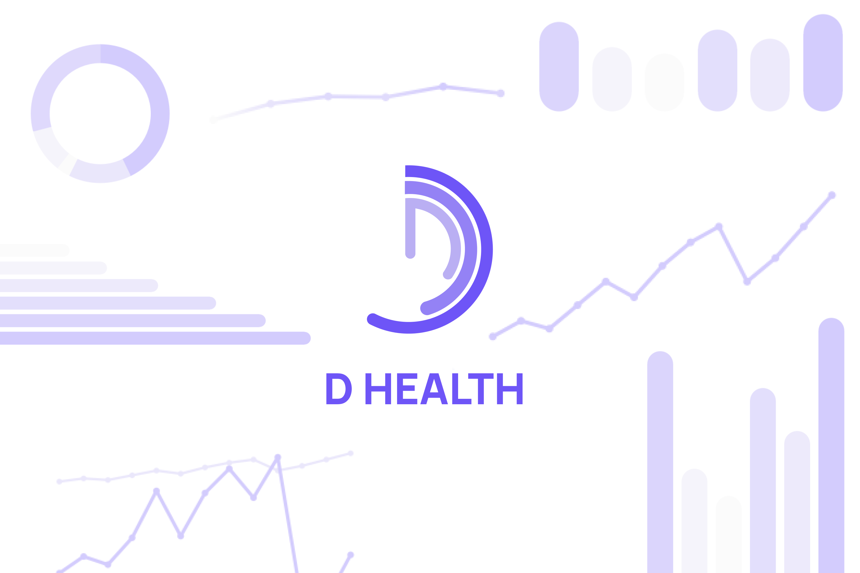
D-Health — Visualizing Company Health with Clarity
Inspiration
Modern organizations rely on dozens of dashboards and KPIs, yet leadership often struggles to answer one simple question:
“How healthy is the business overall?”
Despite having access to massive amounts of data, insights are often fragmented across teams, tools, and reports. This creates decision fatigue instead of decision clarity.
D-Health was inspired by the gap between data availability and actionable understanding. The goal was to design a framework that transforms scattered metrics into a single, intuitive view of company health that leaders can understand and act on instantly.
What it does
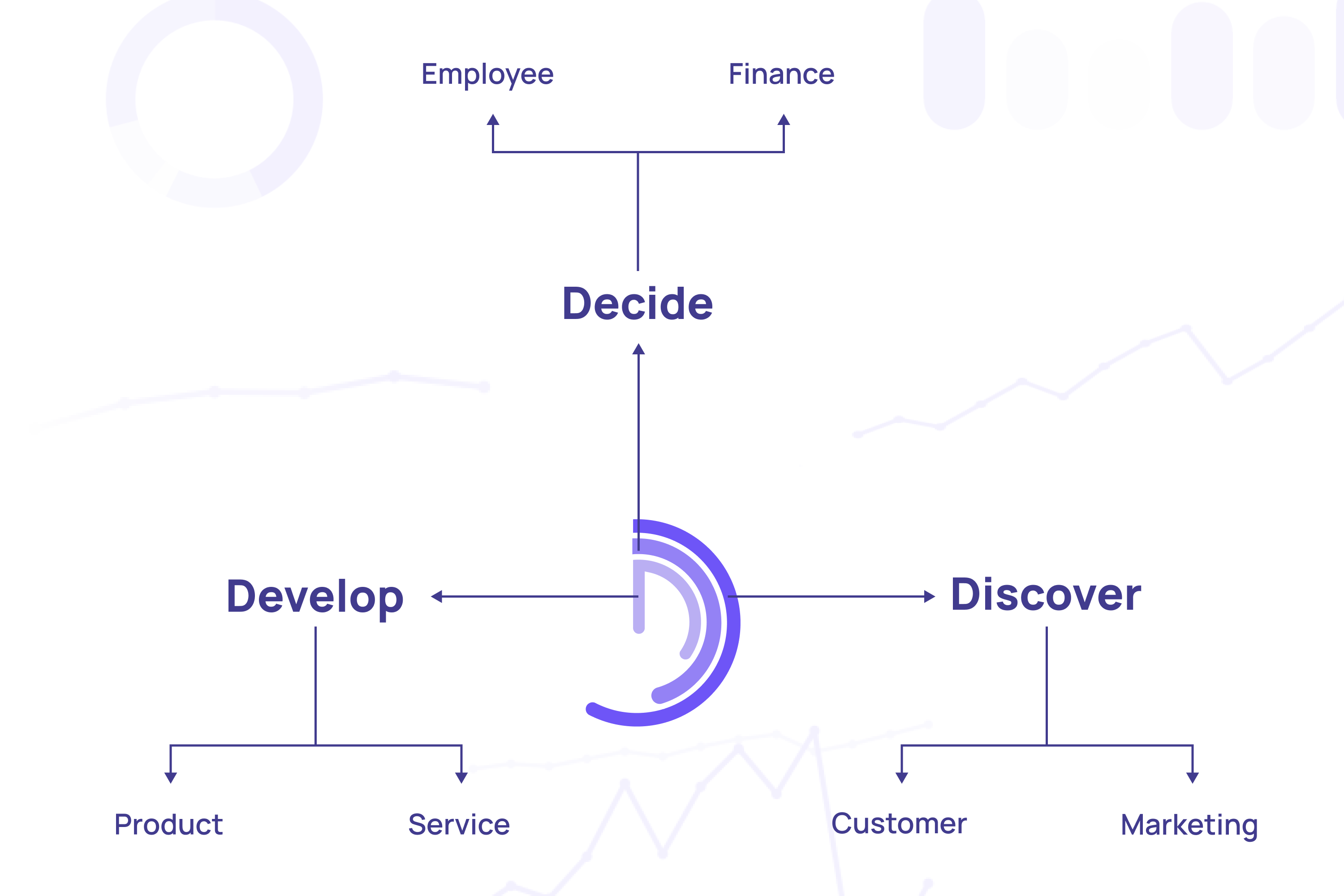
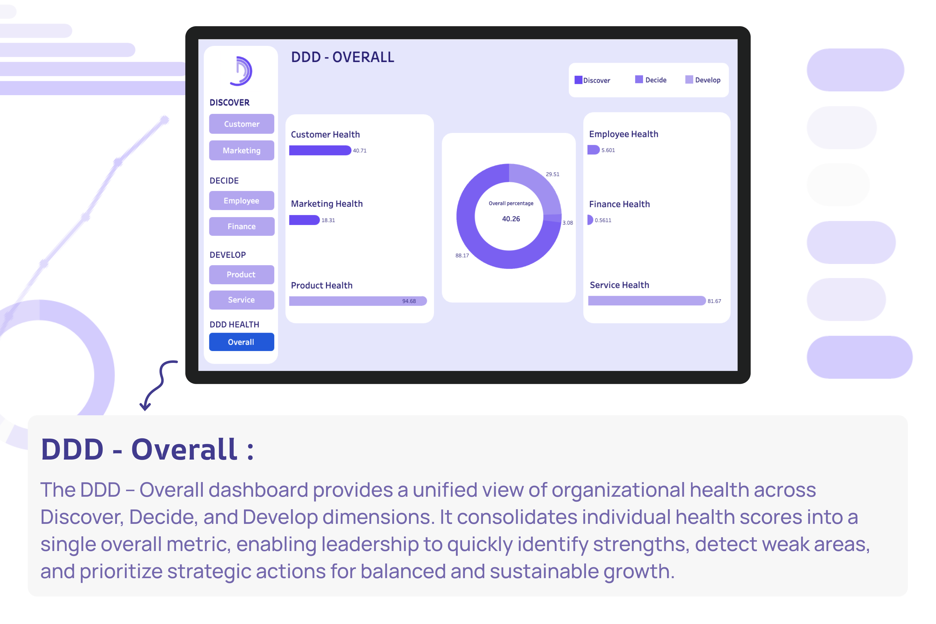
D-Health is a visual company health framework that evaluates organizational performance across three core dimensions:
Discover
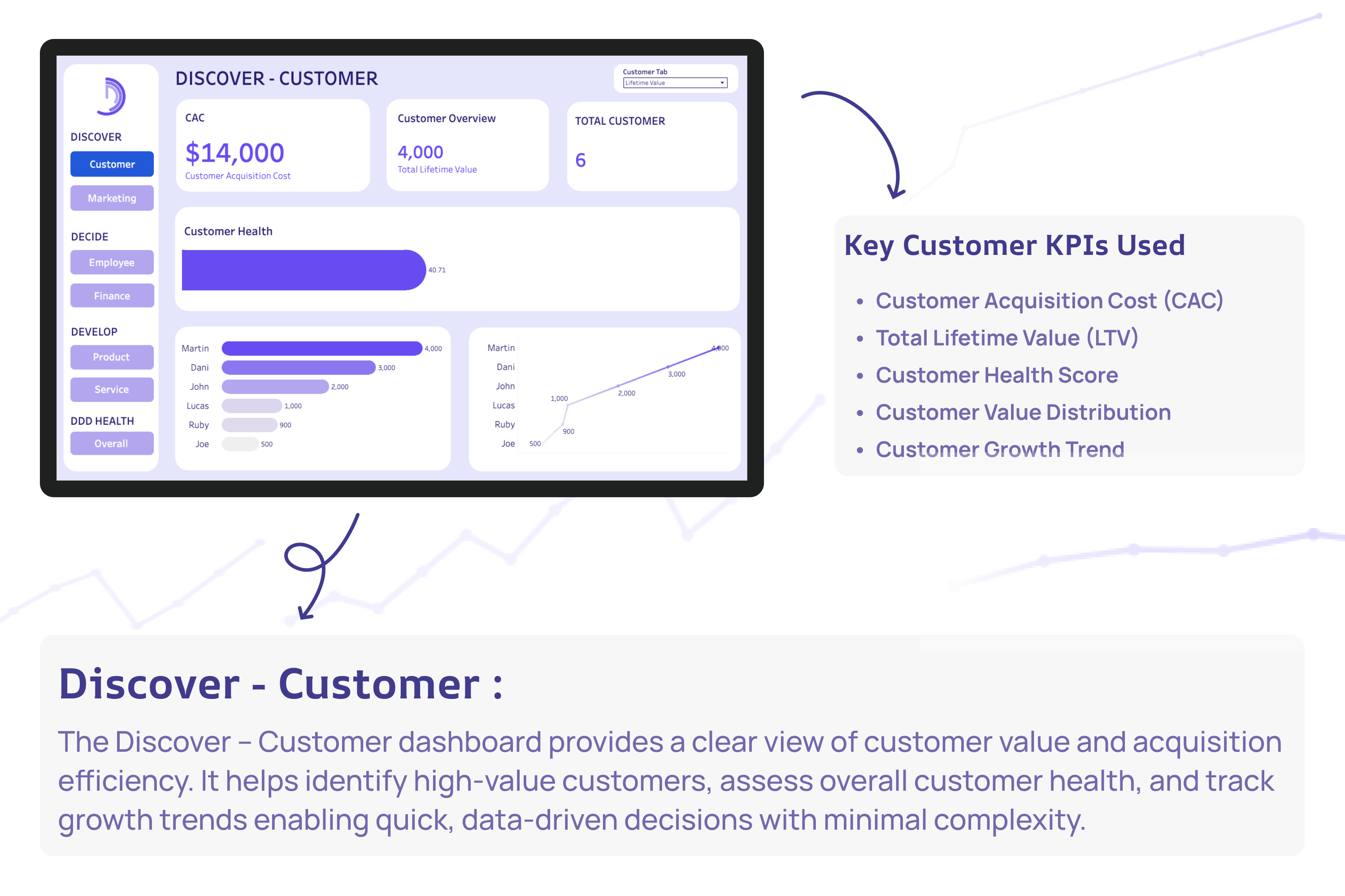
- Customer Health
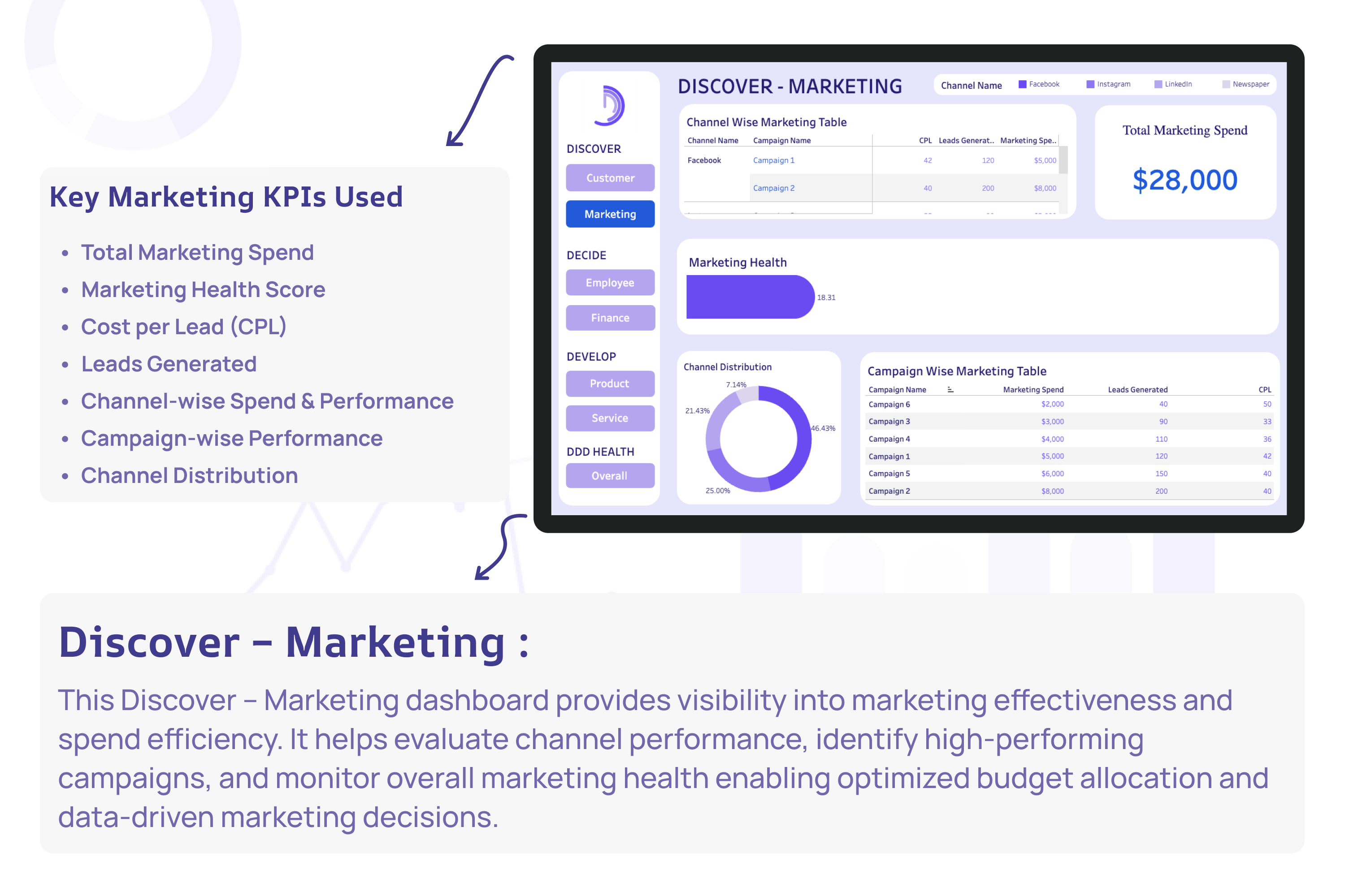
- Marketing Health
Decide
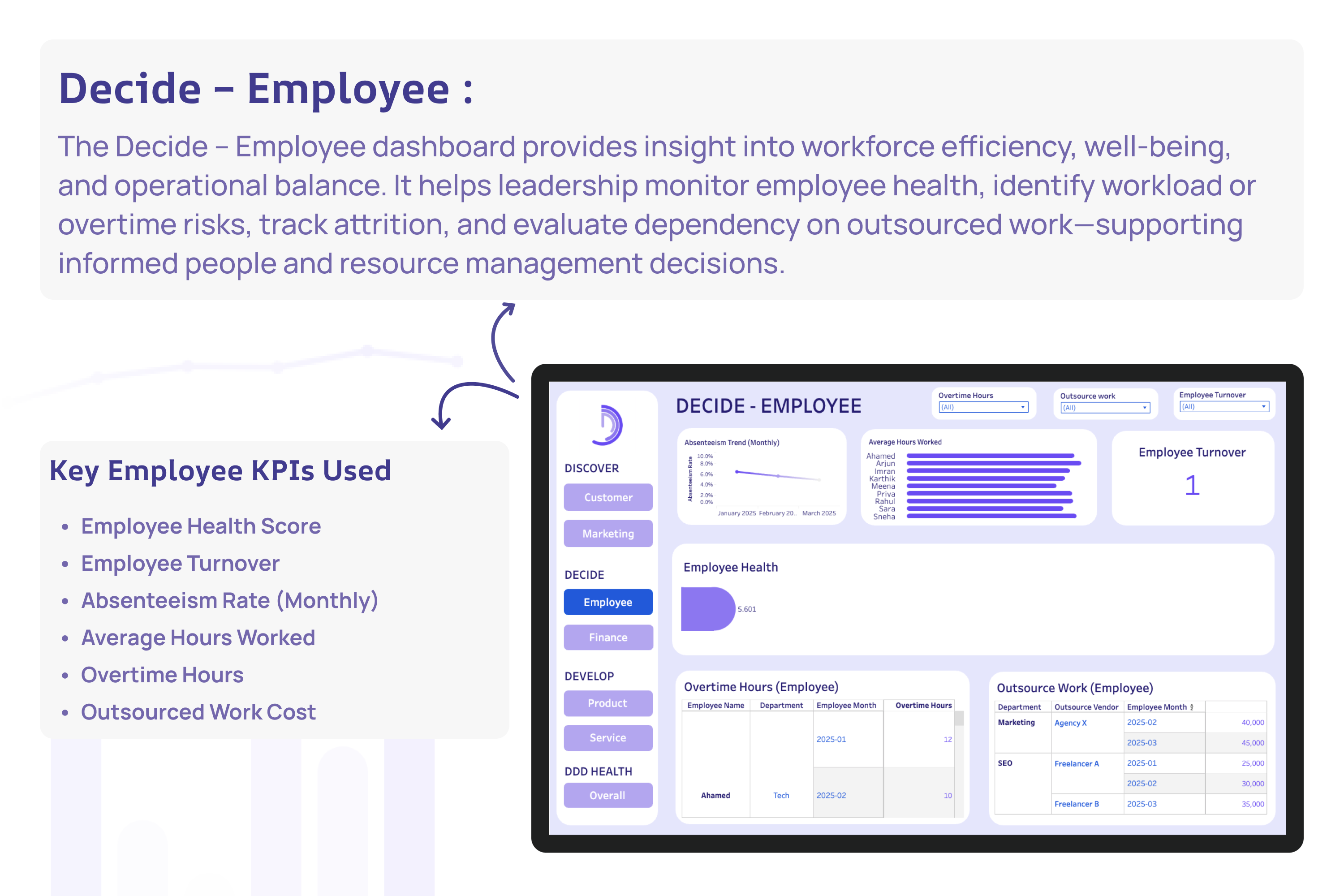
- Employee Health
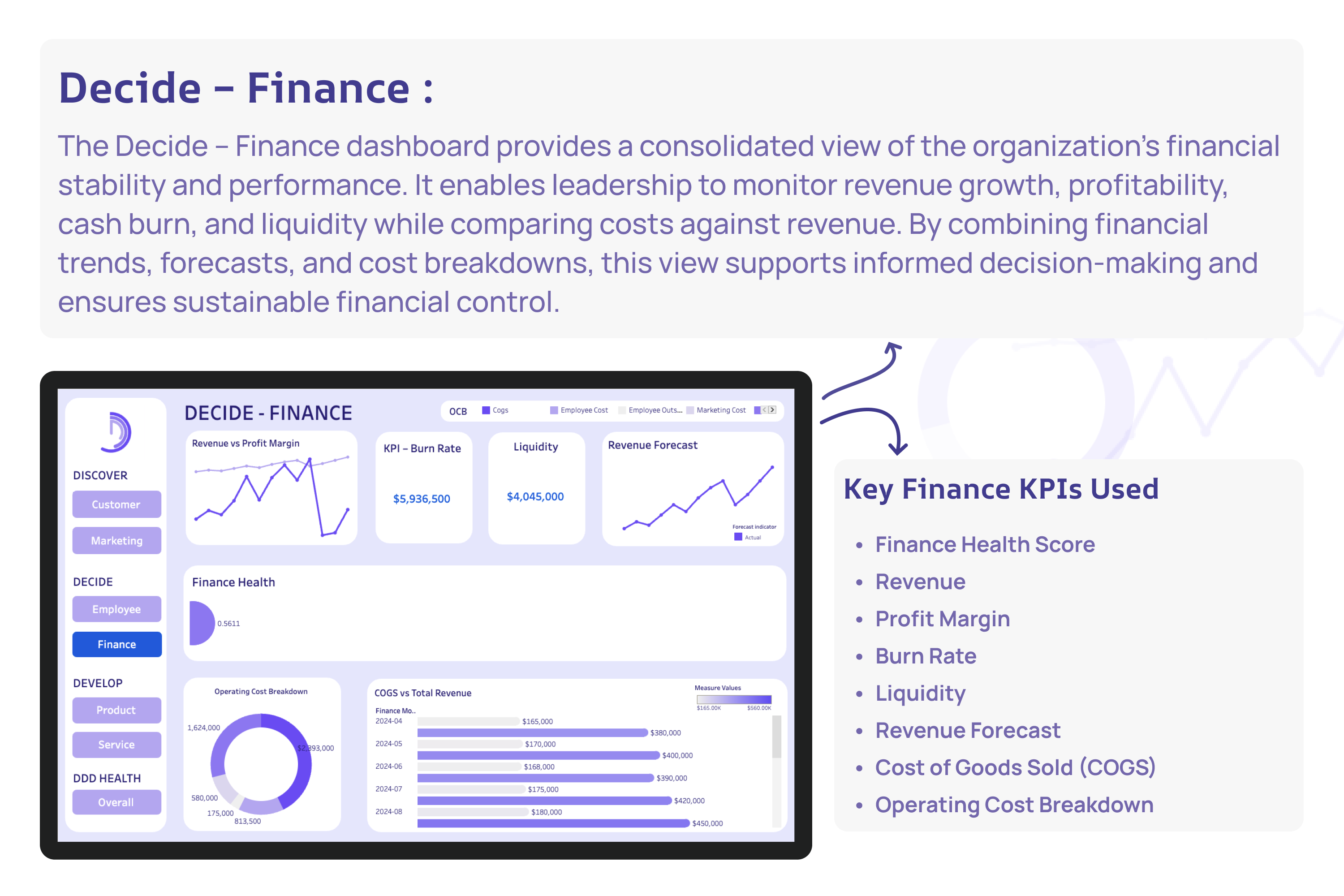
- Finance Health
Develop
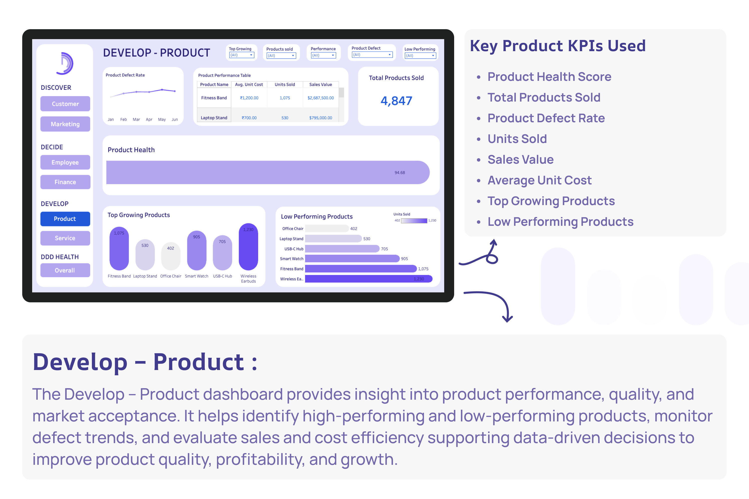
- Product Health
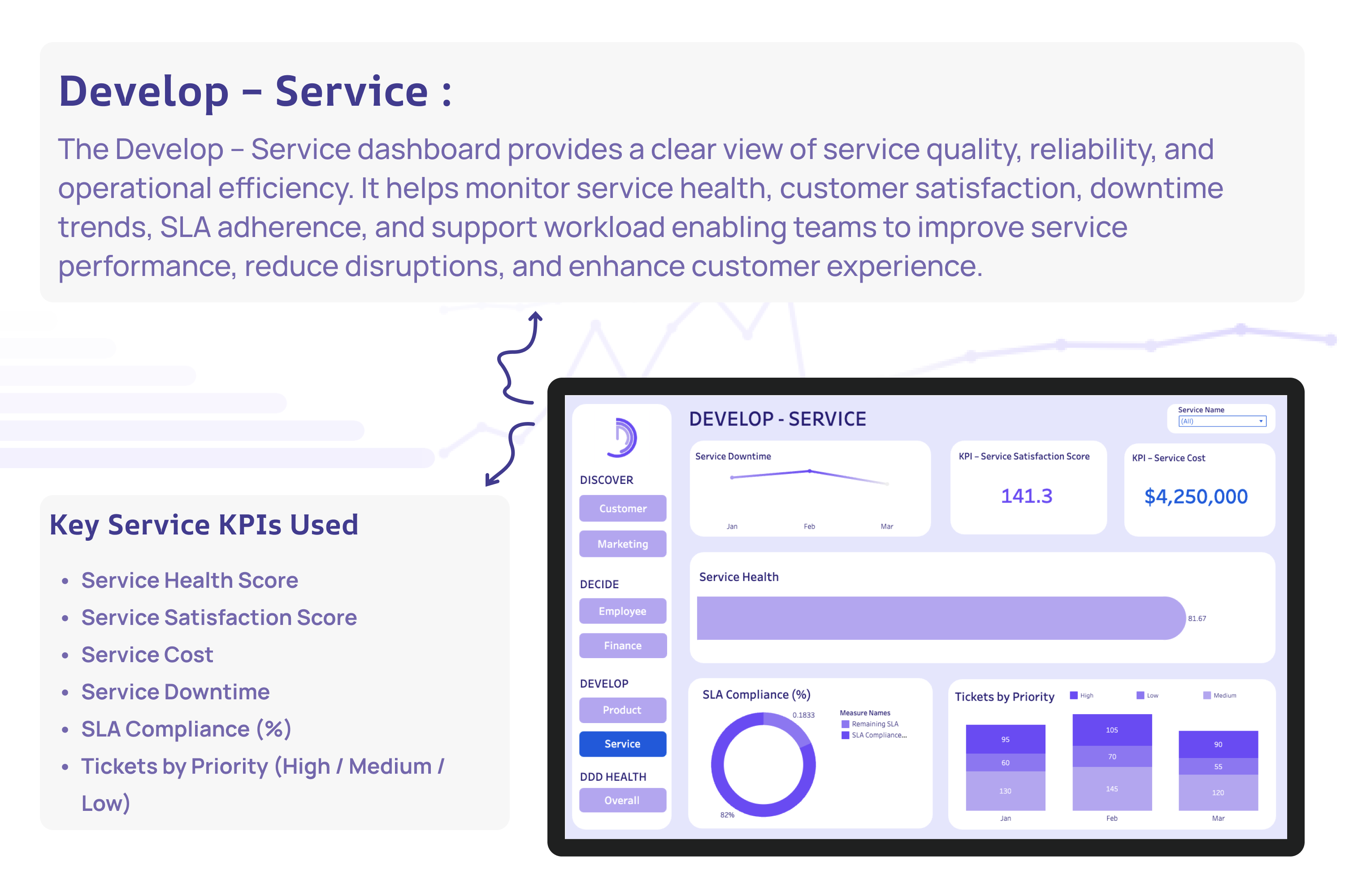
- Service Health
Each dimension is represented through a focused dashboard with relevant KPIs, trends, and health indicators. All individual health scores are consolidated into a single Overall D-Health Score, enabling leaders to quickly identify strengths, weaknesses, and priority action areas.
The Outer health ring represent Customer and Marketing and Inner most ring represent the Product and Service that will developed by the Company
How we built it
- Designed a business-aligned health framework focused on executive decision layers
- Built multiple interactive Tableau dashboards for each D-Health dimension
- Created custom KPIs and calculated health scores to normalize diverse metrics
- Implemented filters, trends, comparisons, and visual indicators for clarity
- Ensured visual consistency and storytelling across all dashboards
- Unified all insights into a D-Health – Overall dashboard for executive-level visibility
The solution focuses on clarity, consistency, and storytelling, not just raw metrics.
Challenges we ran into
- Translating complex KPIs into simple, meaningful health scores
- Maintaining visual consistency across multiple dashboards
- Ensuring each dashboard was useful individually and collectively
- Balancing analytical depth while keeping views executive-friendly
- Avoiding KPI overload while preserving insight quality
Accomplishments that we're proud of
- Built a holistic company health framework instead of isolated dashboards
- Designed 7 interconnected dashboards across Discover, Decide, and Develop
- Created a single unified health score for leadership decision-making
- Balanced detail for analysts with simplicity for executives
- Demonstrated Tableau’s strength in visual storytelling and decision intelligence
What we learned
- Effective analytics is about decision support, not data volume
- A strong visual framework improves understanding more than adding KPIs
- Executives value clarity, prioritization, and context
- Tableau is most powerful when used for storytelling, not just reporting
- A unified health model enables proactive, insight-driven leadership
What's next for D-Health
- Dynamic weighting based on industry or business type
- Predictive indicators and early-warning signals
- Benchmarking across departments and time periods
- Integration with real-time data sources
- Expansion into a scalable decision intelligence platform
D-Health is not just a dashboard — it is a decision-making framework.
One system. One score. Total clarity.
Additional Demo: https://youtu.be/VL845qOcT1o

Log in or sign up for Devpost to join the conversation.