-
-
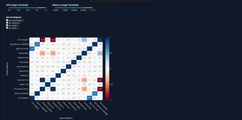
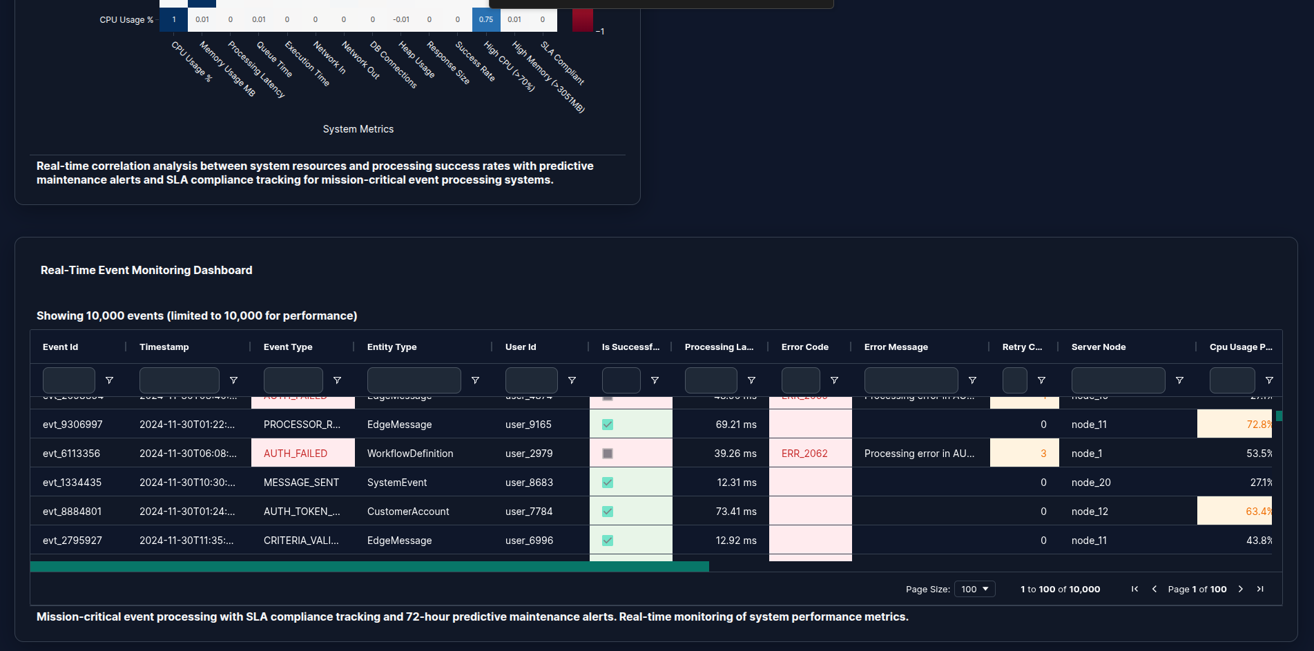
System Health Correlation Matrix
-
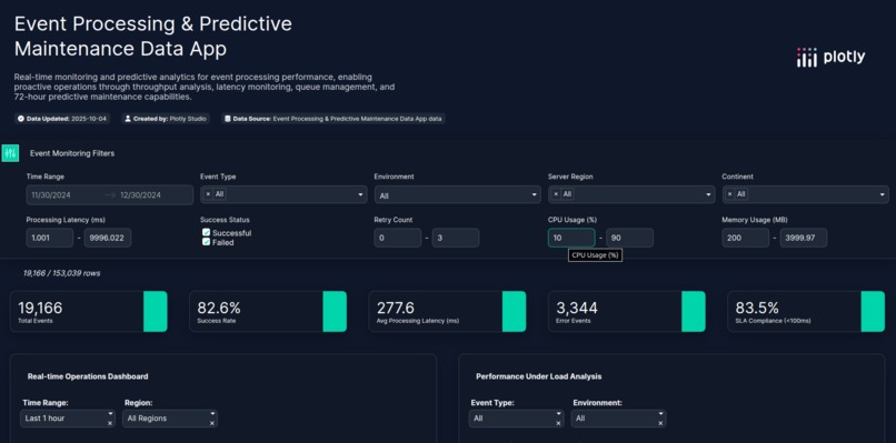
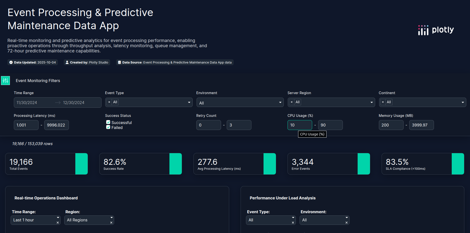
Event Monitoring Filters
-
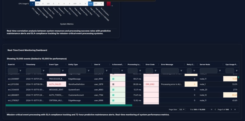
Real-Time Event Monitoring Dashboard
-
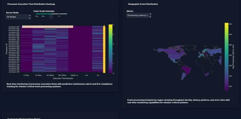
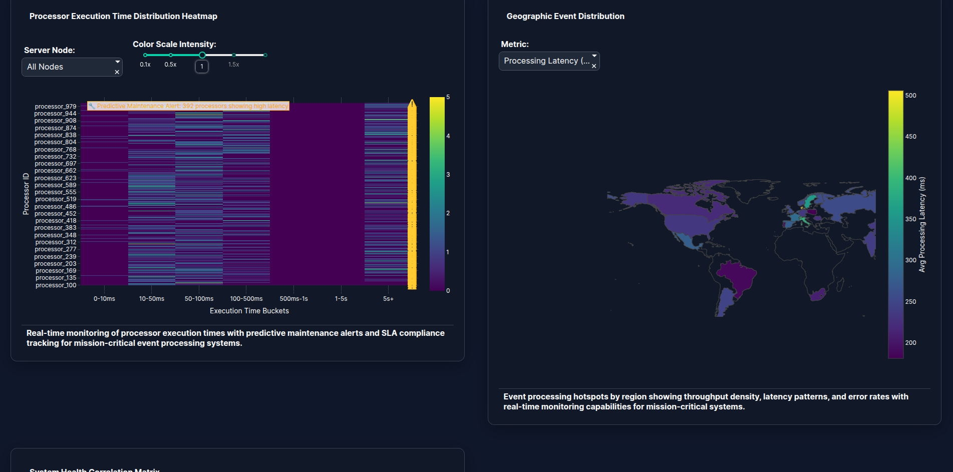
Processor Execution Time Distribution Heatmap
-
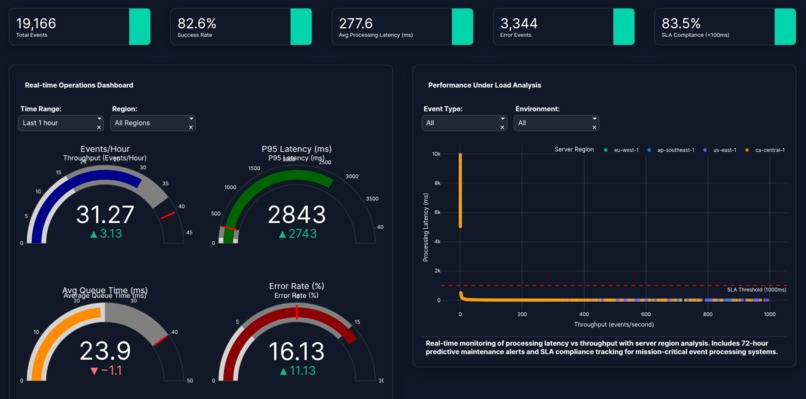
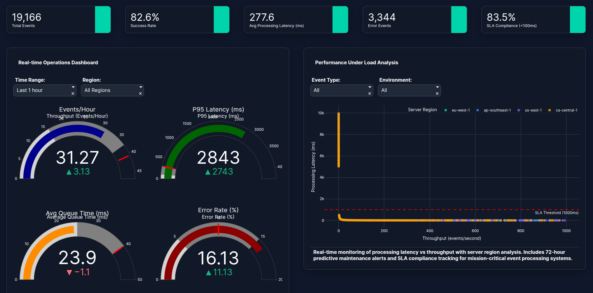
Real-time Operations Dashboard

Real-time insights, predictive intelligence, and geospatial awareness - all powered by Plotly₍^. .^₎⟆
Inspiration
At Cyoda, we’re passionate about making complex data systems transparent, actionable, and predictive. We wanted to explore how Plotly Studio could be used to visualize simulated event-processing operations in near real time - reflecting Cyoda’s potential for data platforms. We also considered other datasets - but this one looked most challenging.
What It Does
The Cyoda Event Processing Dashboard provides real-time analytics for event processing and system performance.
Key features include:
- Near real-time monitoring of throughput, latency, queue depth, and error rates.
- Predictive analysis to identify early signs of performance degradation (super important).
- Geospatial visualization of system hotspots .
- Customizable dashboard layout and themes for tailored user experience.
All data is simulated based on Cyoda’s potential operations - including geospatial activity across regions, services, and workflows - to fully showcase what the platform could deliver.
How We Built It
We built the dashboard using Plotly Studio, focusing on performance, interactivity, and clarity.
- The dataset (
cyoda_realtime_event_processing_analytics.csv) was generated based on Cyoda data operations. - We implemented core KPIs such as throughput, latency, queue depth, retry success, and potential SLA attainment.
- Plotly’s visual engine enabled fast rendering of large datasets, with smooth interactivity for zooming, filtering, and comparing performance metrics.
- We customized styles and configurations to align with Cyoda’s brand and analytics principles.
Challenges We Ran Into
Every build comes with surprises - here are ours:
- Application startup takes several minutes (Windows 11)
- Slow app loading when handling large simulated datasets (>50 MB)
- After applying a new theme, the dashboard failed to render until we updated configuration prompts. We tried to provide some styles in css, but it failed occasionally. Finally we copied the theme specification and edited it in a text editor to apply the colors and styles we needed - it worked. Although it was not clear when the theme was ready. Probably because the app rendering took more than 10 seconds.
- Two failed builds due to, probably, some cached deployment artifacts, which we resolved by deleting previous builds and redeploying cleanly.
What we really liked was an option to view logs.
Accomplishments That We're Proud Of:
- Delivered a functional, high-performance, near real-time dashboard using Plotly Studio.
- Simulated complex event data to mirror Cyoda’s large-scale data operations.
- Integrated geospatial intelligence, enabling visualization of regional data-processing performance.
- Created a flexible and visually engaging dashboard, ready for live operational integration.
What We Learned
- Plotly Studio is powerful for both rapid prototyping and serious data engineering visualization.
- Handling large datasets requires thoughtful optimization to keep dashboards responsive.
- Simulation-driven design can effectively demonstrate business value before production integration.
What’s Next for Cyoda Event Processing Dashboard
- Customer Journey Analytics to track user interactions and performance impact.
- Geospatial Business Intelligence to visualize regional performance and SLA hotspots.
- Platform Usage Analytics to monitor workload patterns and system utilization.
- Revenue & Business Performance Analytics to link operational efficiency to business outcomes.


Log in or sign up for Devpost to join the conversation.