Inspiration
Quitting nicotine is difficult. I wanted QuitShark to feel like something you’d want to open on a difficult day: friendly, useful, and a little playful.
The idea was to give people a companion for the small moments that make up quitting. A craving you get through. Money you’ve saved. A check-in after a rough day. Those things deserve recognition.
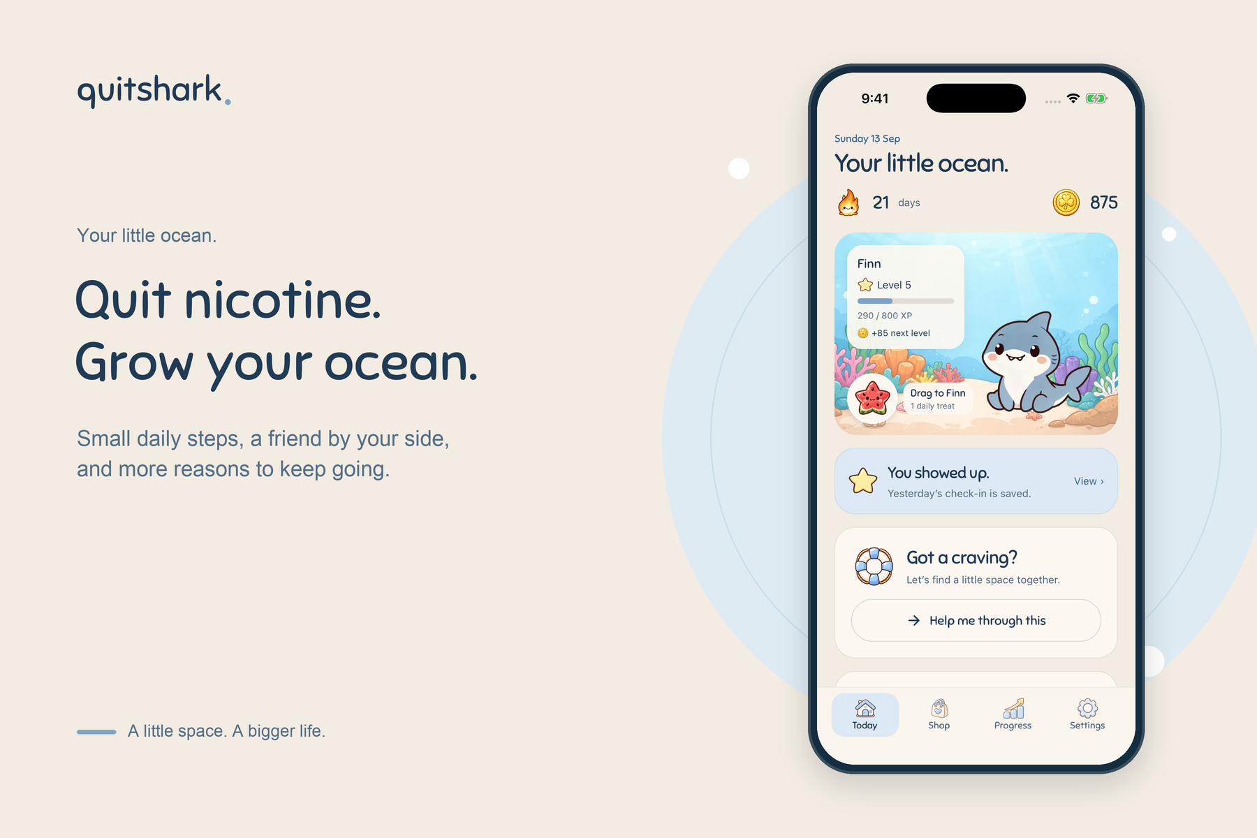
That companion became Finn, a little shark who joins you as you build your own ocean.
What QuitShark does
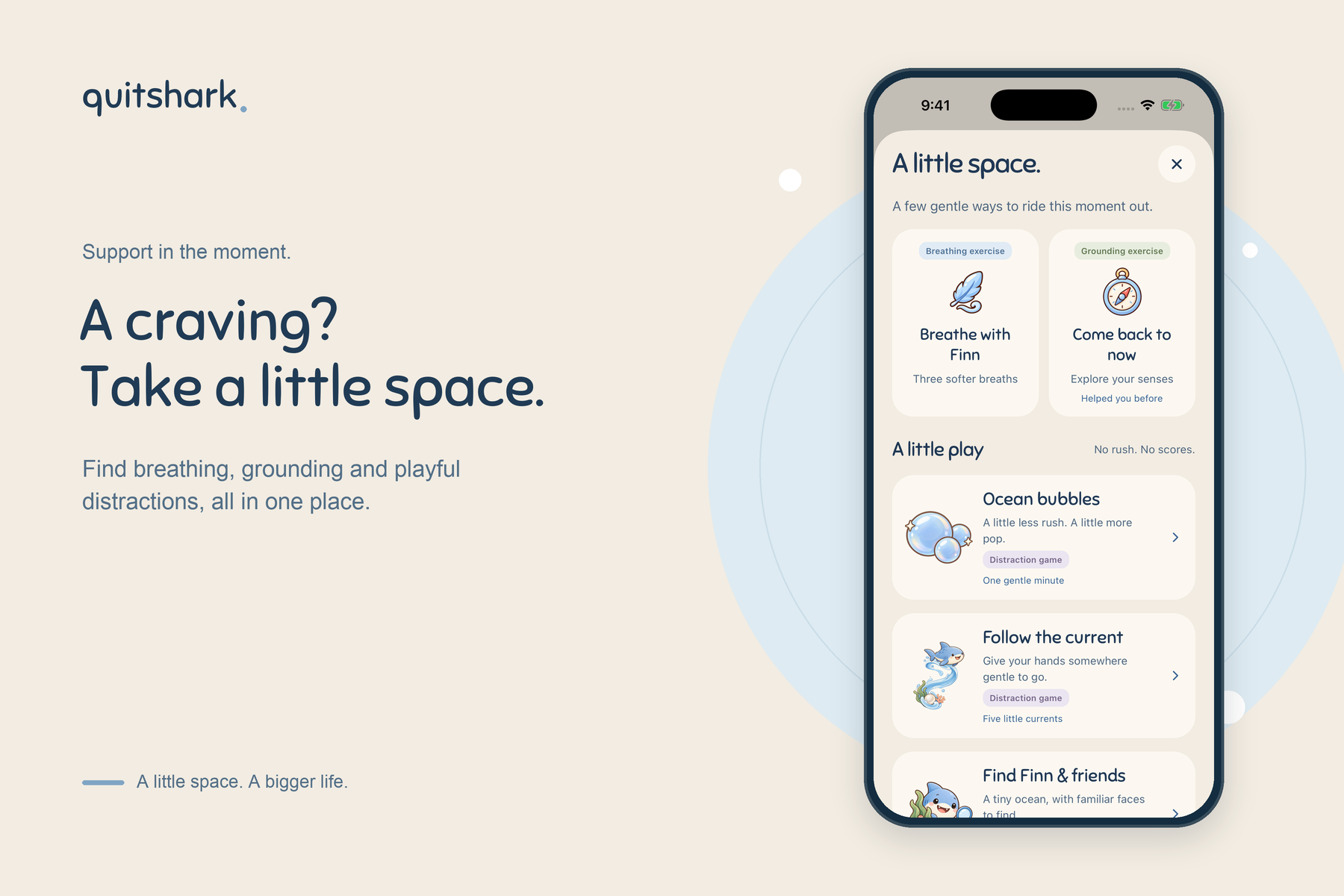
QuitShark helps people quitting vaping, cigarettes, or nicotine pouches track their progress and find something helpful to do when a craving hits.
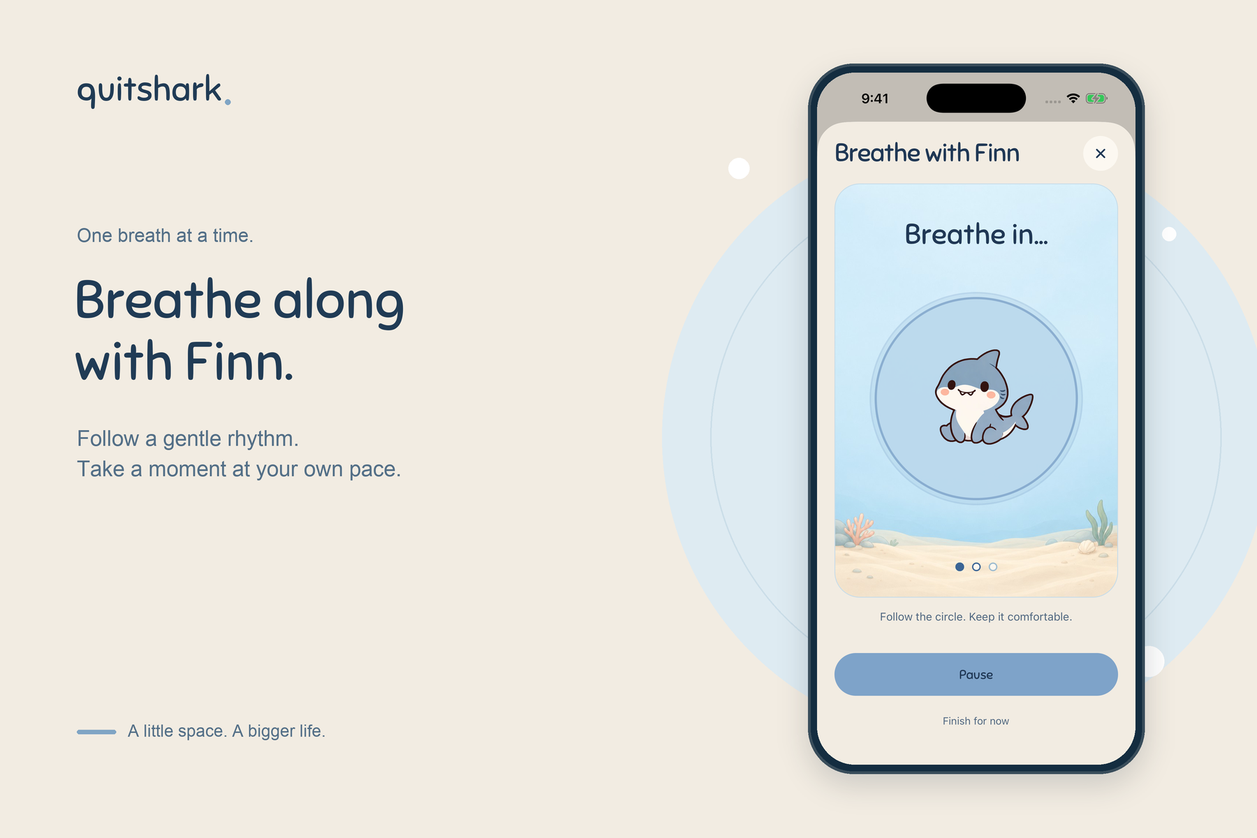
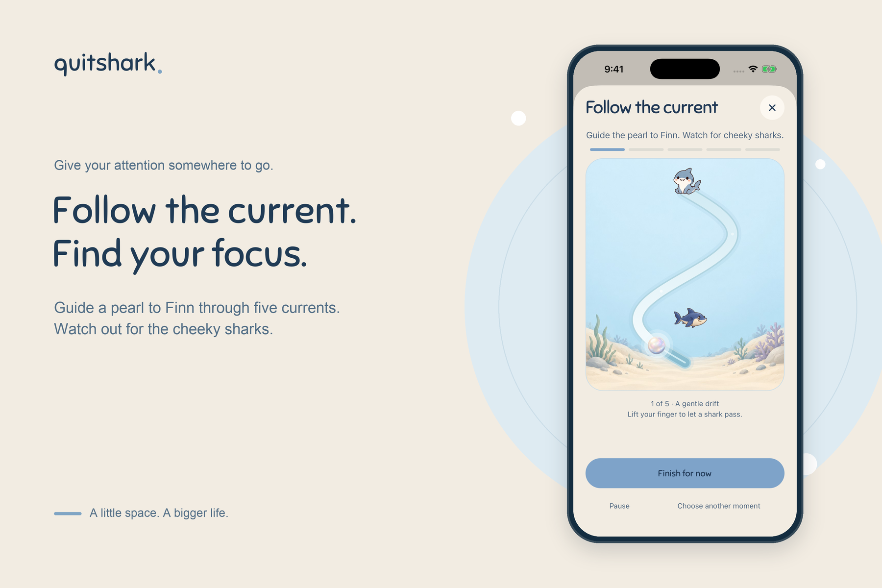
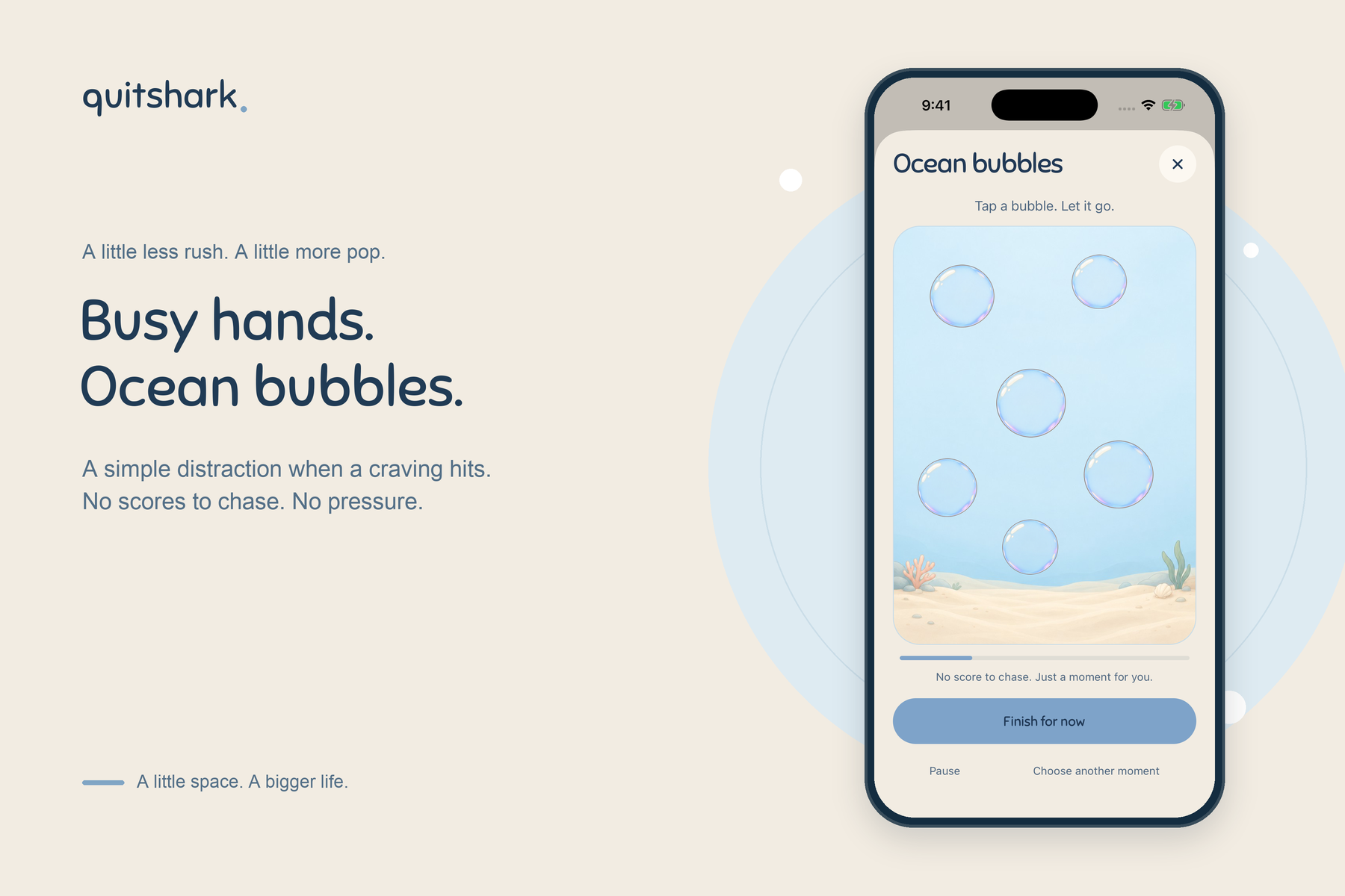
You can follow a breathing exercise, try a grounding activity, or spend a minute playing an ocean game. Pop bubbles, find Finn’s friends, or guide a pearl through a current while avoiding mischievous sharks.
Between those moments, you can:
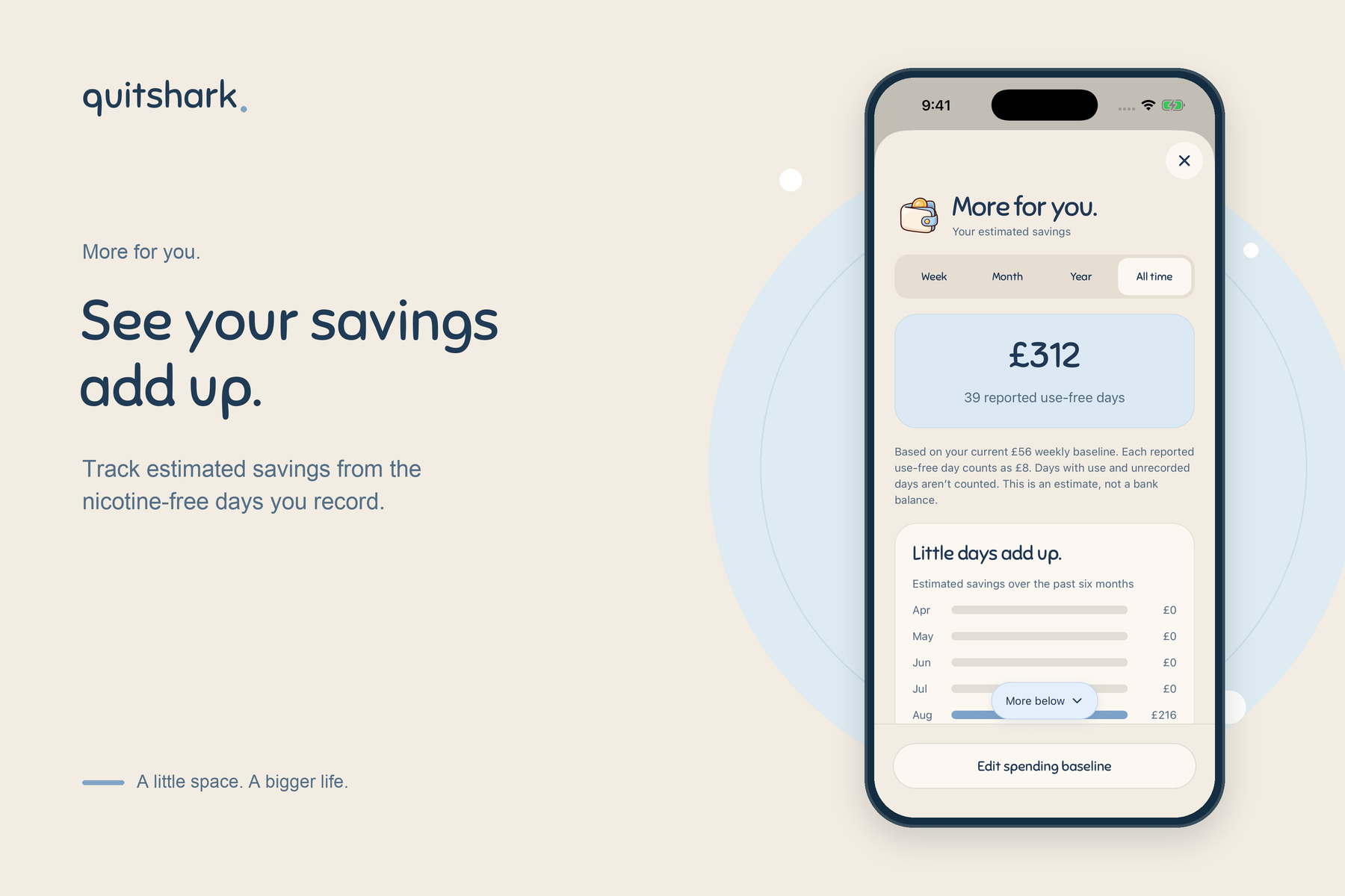
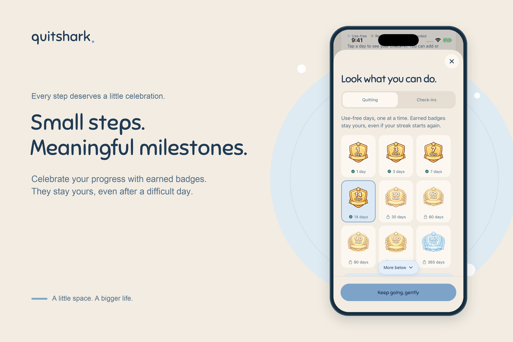
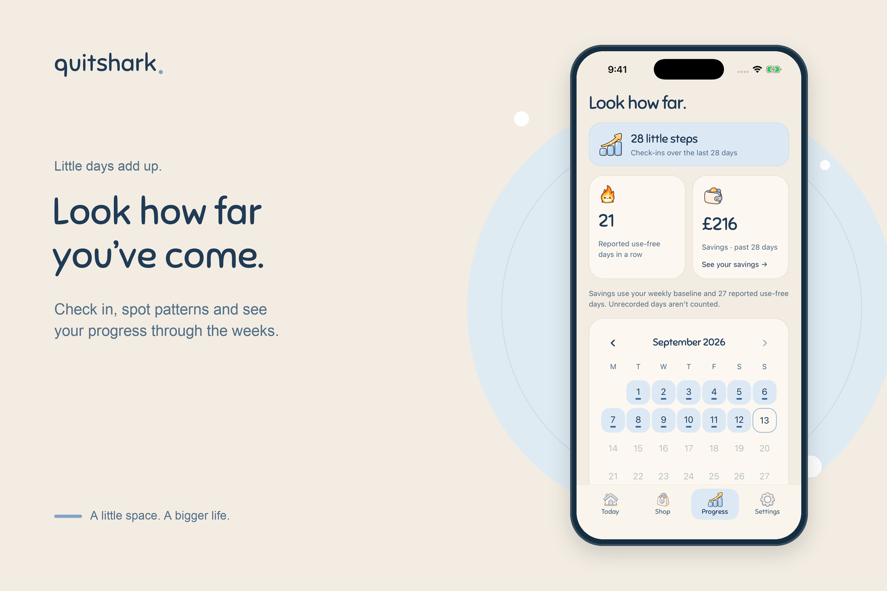
- Track your savings and milestones.
- Check in about how your day felt.
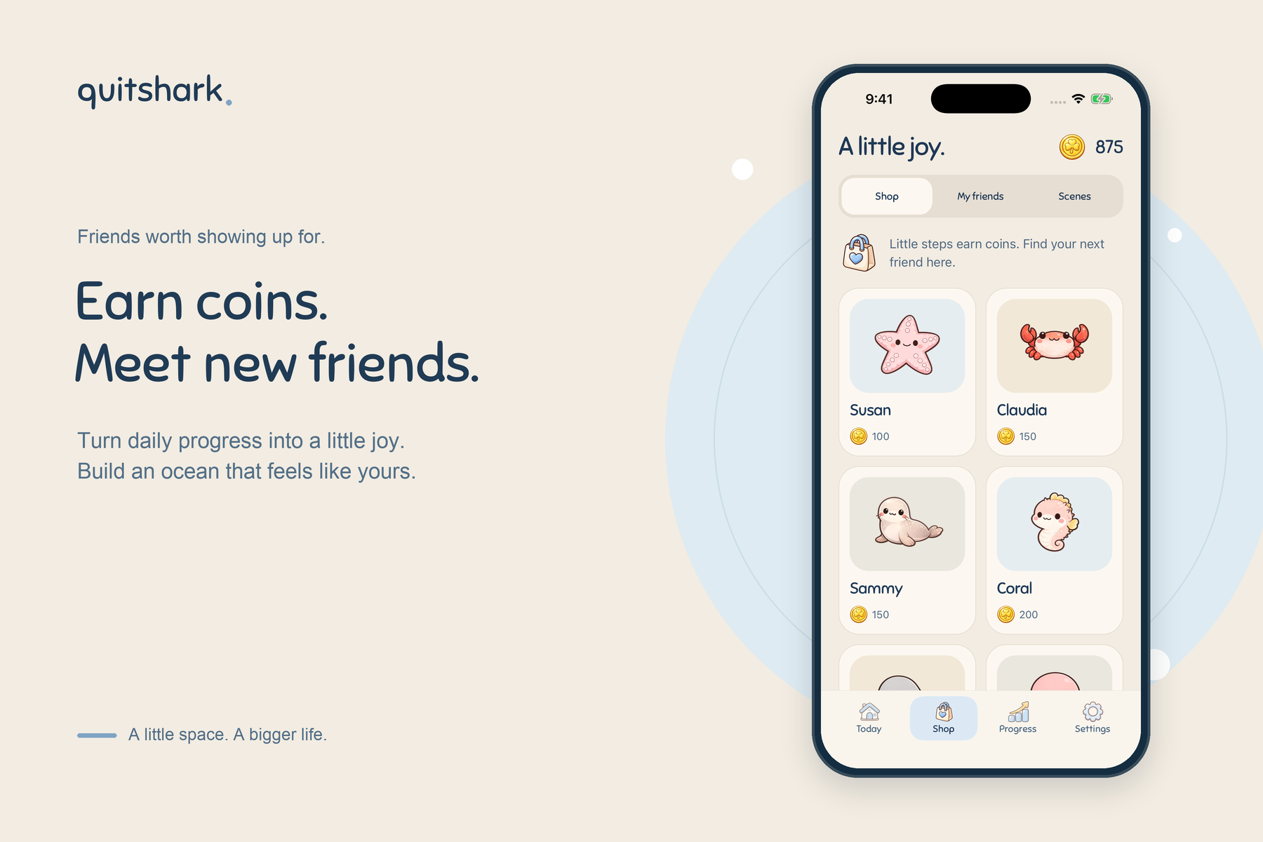
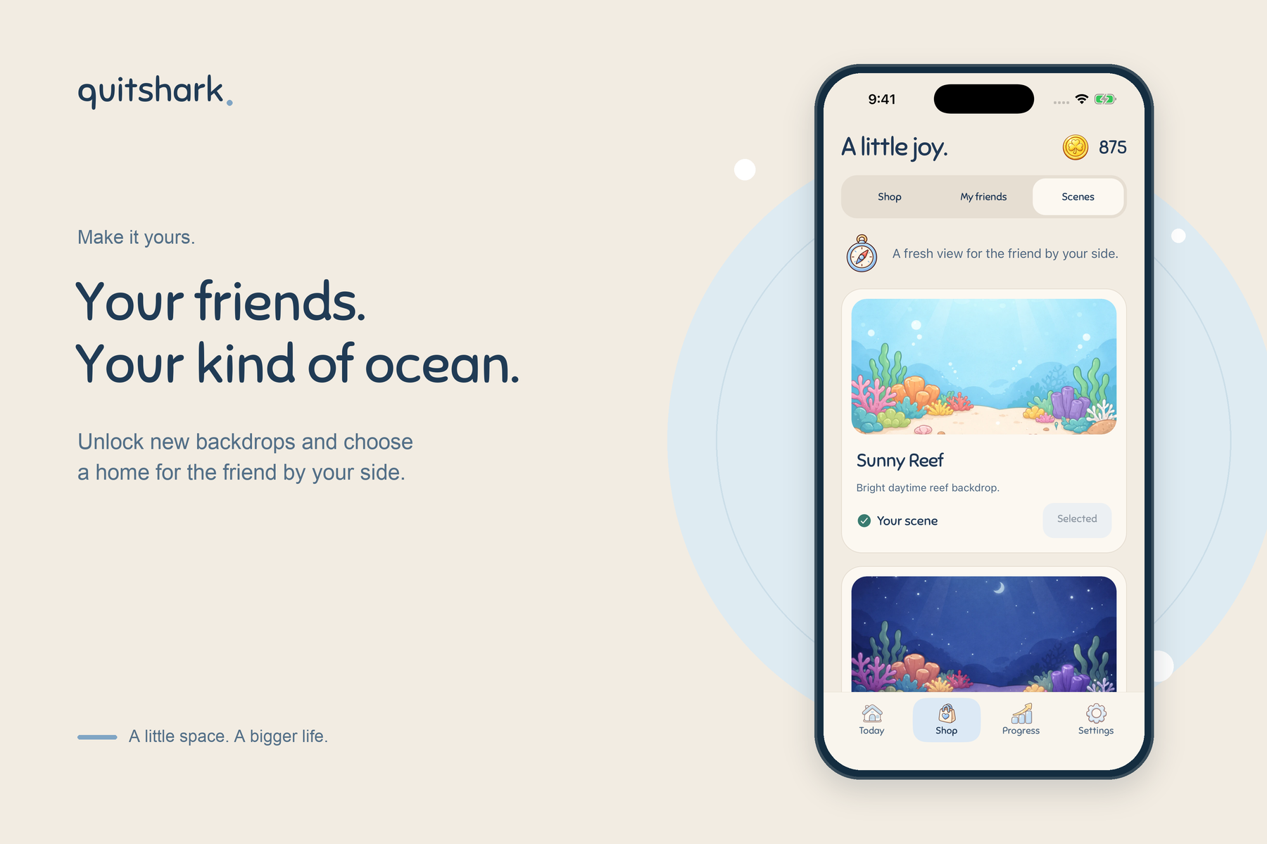
- Earn coins to unlock ocean friends and backgrounds.
- Give your companion a daily treat.
- Revisit the personal promise you wrote during onboarding.
- Suggest features and vote for ideas from other users.
I wanted the rewards to make returning enjoyable, while keeping the reason for being there—quitting nicotine—at the centre of the experience.
How I built it
I built QuitShark using React Native and Expo, with Convex handling saved progress, rewards, account recovery, and the feature-request board.
RevenueCat handles subscriptions, entitlement checks, purchase restoration, and the paywall. Its paywall tools let me work on the presentation without rebuilding the whole app each time. Eligible annual subscribers can start with a free trial.
I used AI image generation to create the ocean artwork, then prepared and optimised the assets for mobile. Animated companions, haptics, and small visual reactions help the app feel alive without making every screen busy.
Most of the design work happened through iteration: build something, use it on my iPhone, notice what felt awkward, and improve it. I also used the iOS Simulator and automated tests to check behaviour, alongside optional PostHog analytics to understand how people use the app.
The challenges
Knowing when to simplify
Some early screens had too much text, too many buttons, or too many things competing for attention.
The breathing exercise was a good example. It became much clearer once I stripped it back and let the animation guide the breathing. The games improved when their gestures and next steps became more obvious.
Even the wording needed work. I initially leaned too much on asking whether someone felt “calmer.” But a person might still feel restless while their craving has eased. Asking about the craving itself made more sense.
Making the artwork practical
The illustrations and animated friends are a big part of QuitShark’s personality. They also take up space.
I spent time resizing images, converting them to WebP, and improving caching. Then I checked them on a real phone to make sure the savings weren’t coming at the expense of how the app looked. Fixing images popping in while browsing the shop made a noticeable difference.
Supporting people on older versions
One less visible challenge was keeping the backend compatible with older app versions.
Adding new games meant the backend could return activity types an older app didn’t recognise. I added version-aware responses and safer UI handling so people could keep using their installed version without losing their history.
It was a useful reminder that shipping an update doesn’t mean everyone installs it immediately.
Testing the whole subscription journey
Getting the paywall looking right was only part of the job. I also had to test trial eligibility, localised pricing, purchases, restoration, and what happens when someone closes the paywall.
Testing those flows on a real device helped catch differences that weren’t obvious from a preview.
What I learned
A lot of the improvements came from small observations: a button moved when it shouldn’t, a drag gesture scrolled the screen, or a reward message covered part of a friend.
Those details add up. I learned to spend more time using the app from beginning to end, rather than judging each screen on its own.
I also learned that adding more isn’t always the answer. Sometimes the better version needs less explanation, fewer choices, or one clearer action.
What I’m proud of
QuitShark now feels like a coherent little world. The friends, rewards, games, and progress tracking belong together, and there’s something useful to reach for during a craving.
Getting the first confirmed trial was a particularly meaningful moment. Someone had found the app and decided it was worth trying. After so much building and refining, that felt encouraging.
What’s next
I want to learn which parts people actually return to, improve the activities they find helpful, and keep refining the daily rewards.
The aim is to make QuitShark a companion people want to keep around—and make the next nicotine-free moment feel a little more achievable.
Built With
- convex
- expo.io
- reactnative


Log in or sign up for Devpost to join the conversation.