Inspiration
Online shopping is almost to easy. An impulsive decision scrolling out of boredom at 2am, a few clicks and a package turns up at your door that you barely remember ordering. Studies have found that that the convenience and reduced friction of online shopping can encourage more frequent and impulsive purchases. Features like one-click checkout, personalised recommendations and buy now pay later services make spending feel almost disconnected from actual money.
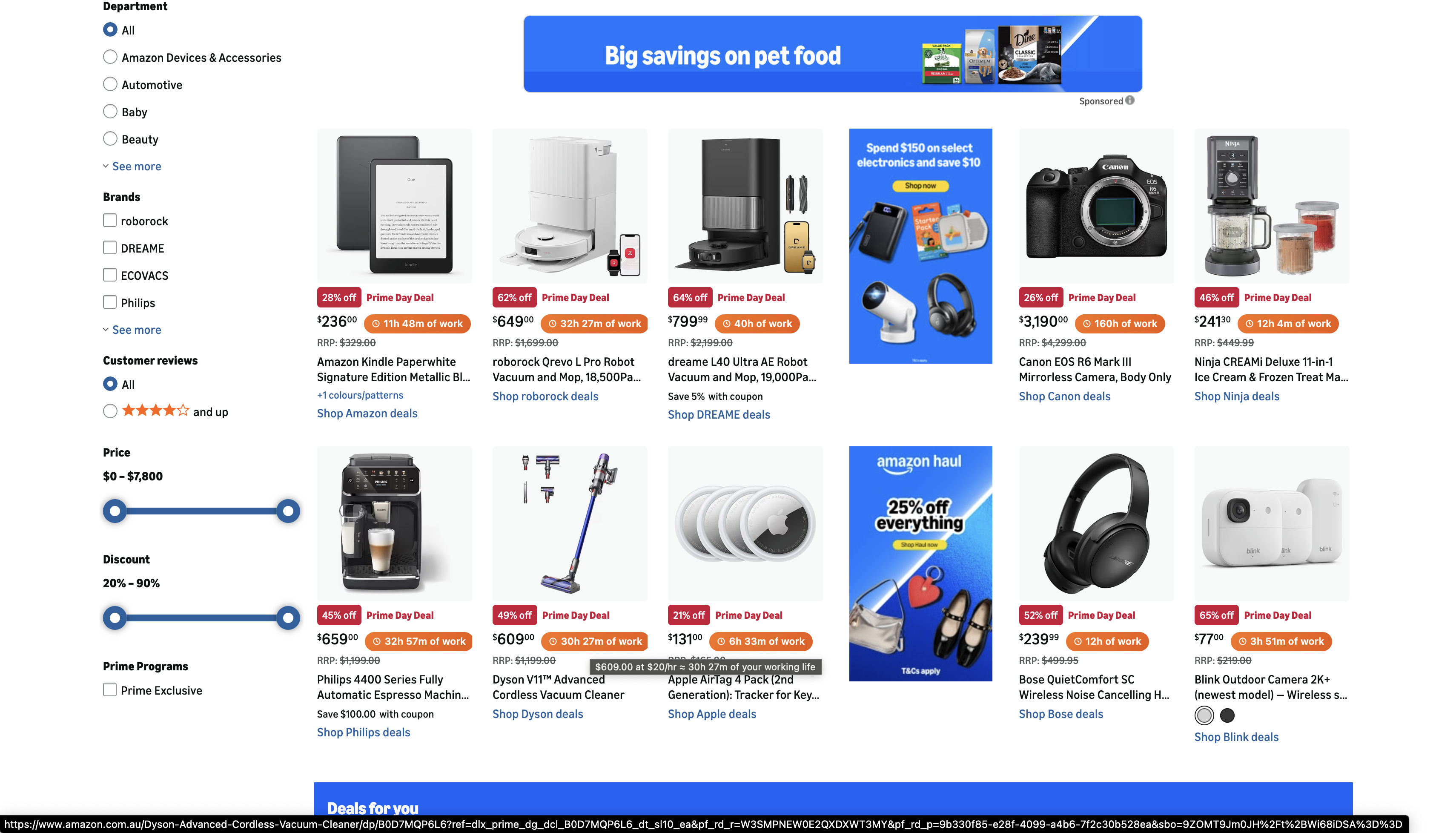
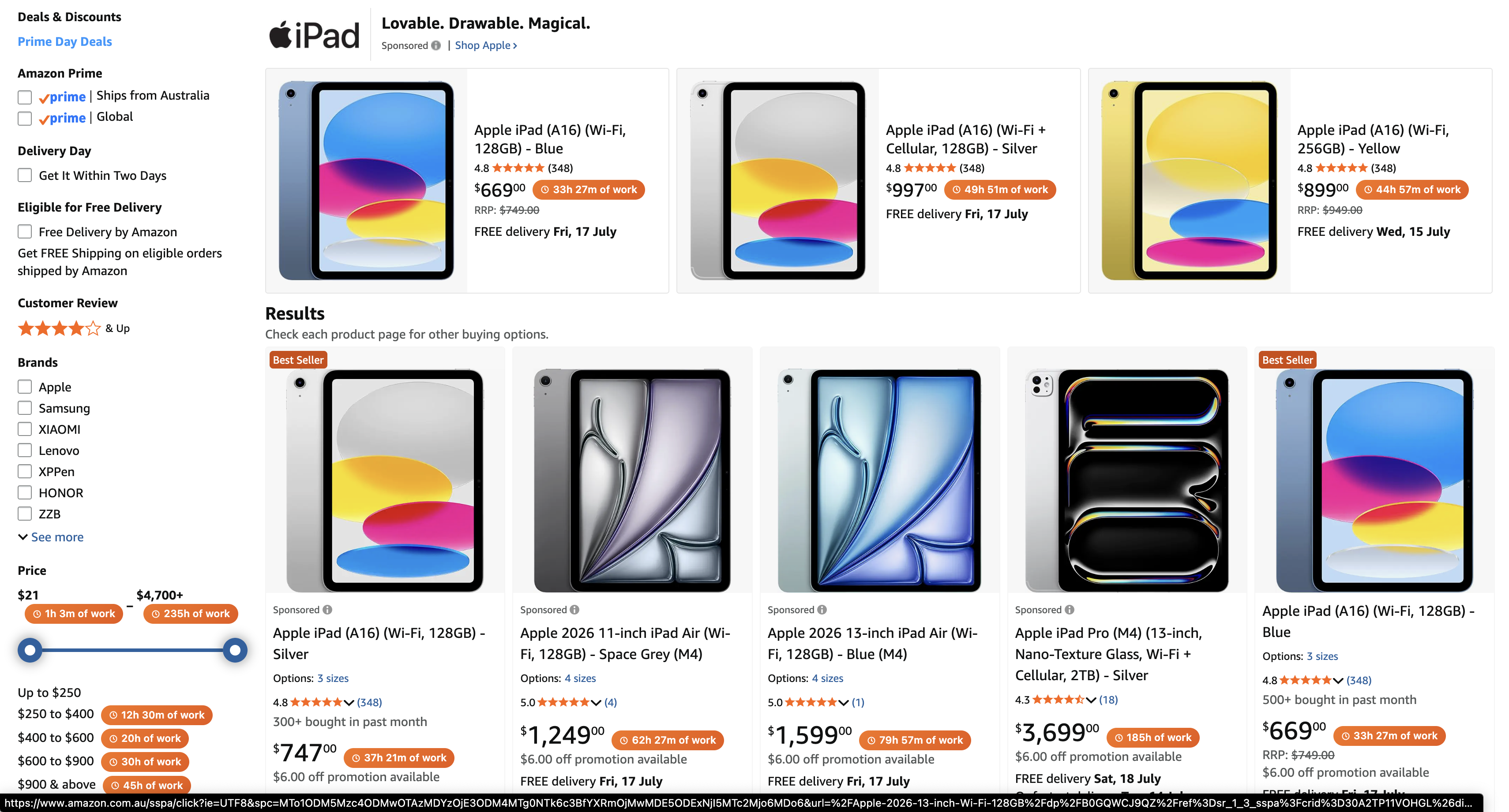
When prices are reduced to numbers on a screen, it's easy to forget what they actually represent. So we asked: what if, instead of showing how much something costs in dollars, we showed how long you would have to work to afford it?
A $90 pair of earbuds is easy to justify. "3 hours and 15 minutes of work" feels different.
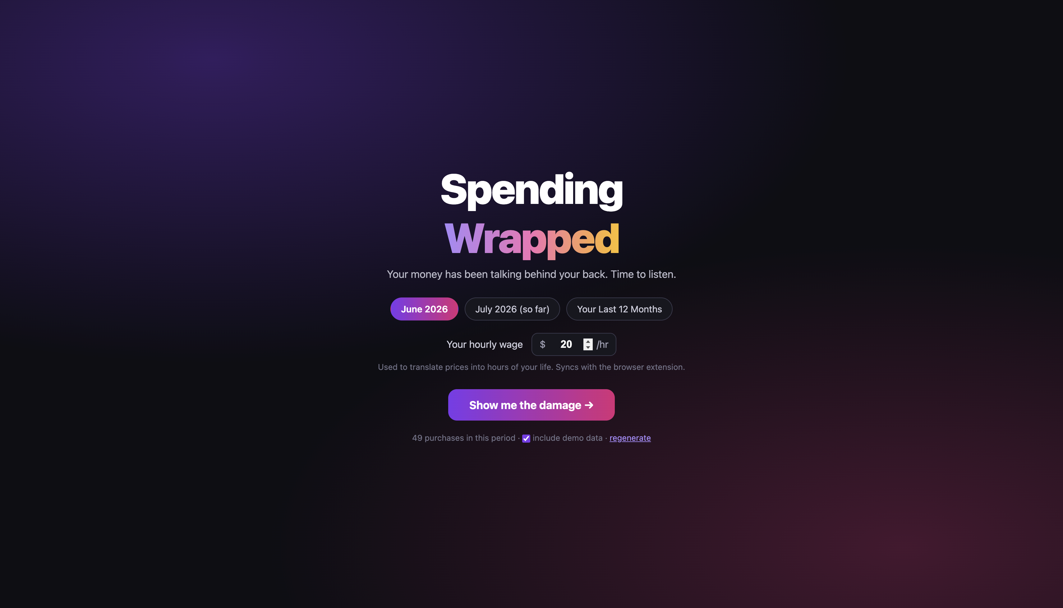
That idea became Spending Wrapped: a tool that makes the impact of online shopping harder to ignore, both while you shop and after the money has been spent. It translates prices into hours of work at checkout, then turns your purchase history into a monthly Wrapped-style recap, breaking down where your money went, which categories you spent the most on, your biggest purchases, and the habits and impulse buys you might not have noticed at the time.
What it does
Spending Wrapped consists of two connected parts. First, a Chrome extension converts prices on online shopping sites, including Amazon, into the number of hours you would need to work to afford them based on your wage. When you complete a purchase, the extension records it automatically.
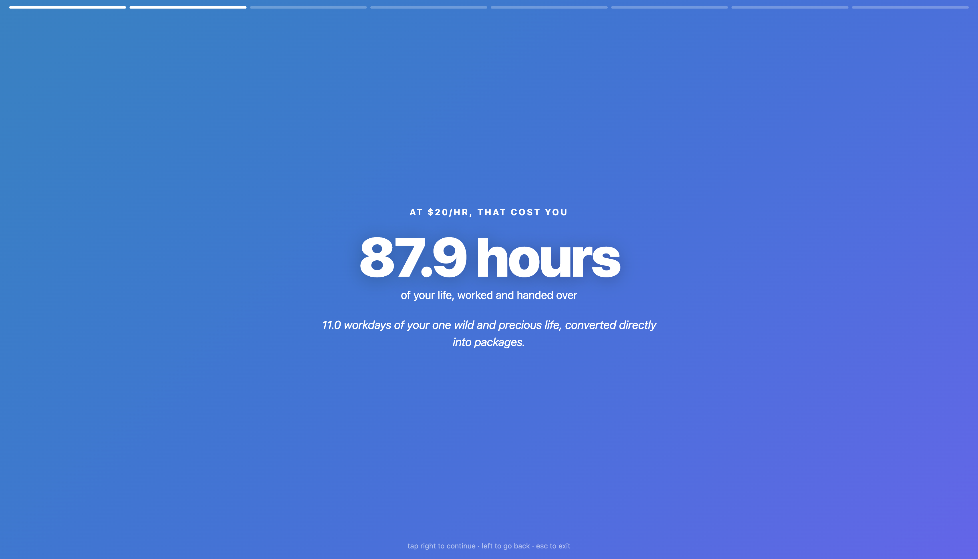
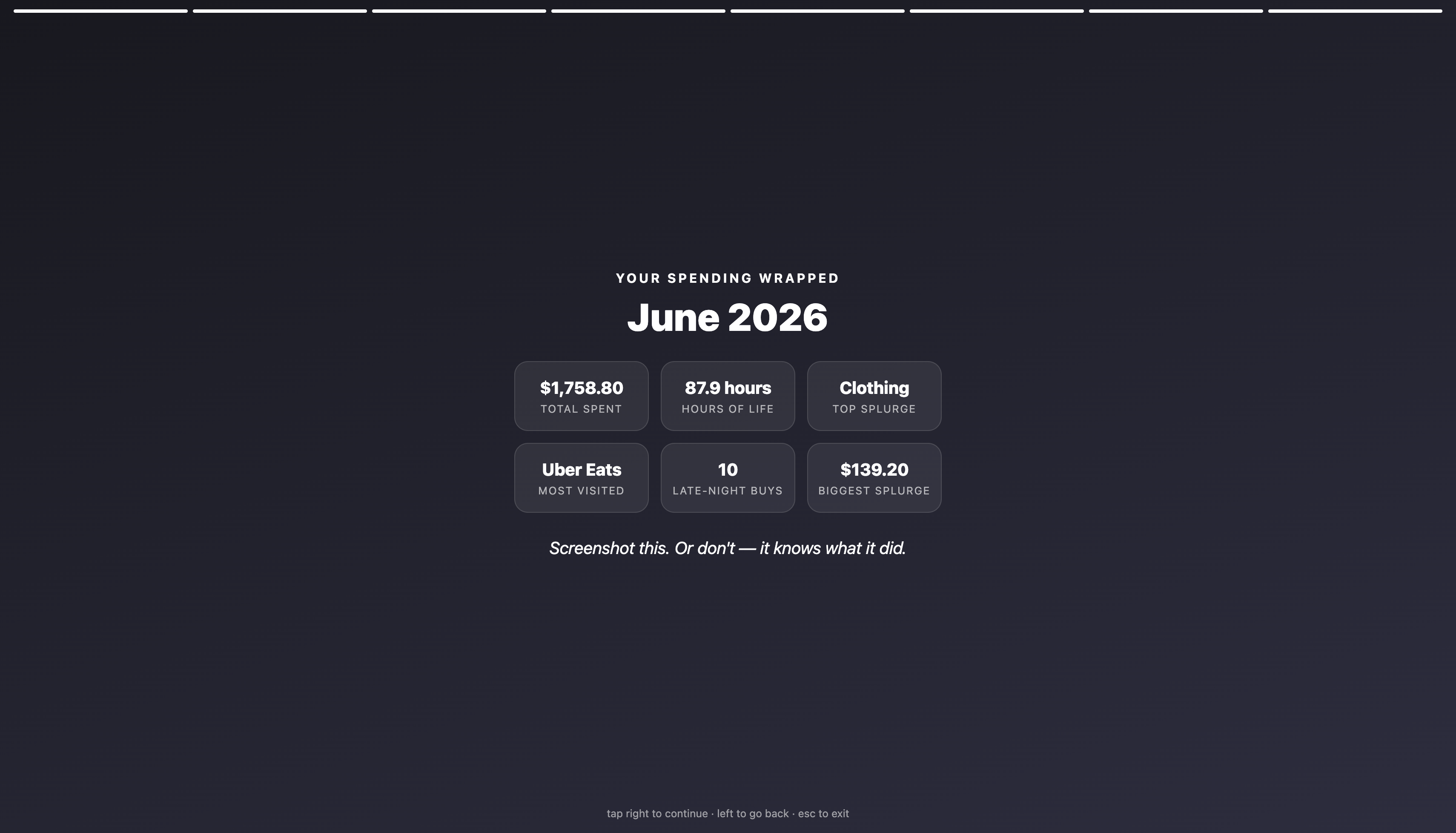
The web app then transforms your purchase history into a monthly Wrapped-style recap. It breaks down your total spending, the hours of work represented by your purchases, your most expensive spending categories, biggest splurges, late-night impulse buys, and other habits you may not have noticed, accompanied by personalised commentary about your spending decisions along the way.
The aim isn’t to shame people for spending money, but to make the impact of their purchases easier to understand. A price can feel like just another number on a screen, but expressing that same cost as hours of your life makes an impulse purchase much harder to ignore.
How we built it
The app is React + Vite with Framer Motion for the slide transitions, deployed on Vercel. The extension is plain JavaScript on Chrome's Manifest V3. Everything is client-side: purchases live in localStorage and chrome.storage, and a small content script bridges the two so a purchase captured at checkout appears in your Wrapped seconds later. Nothing touches a server, which we think matters for something this personal. The personalised commentary is generated using a rule-based system that analyses each user’s spending statistics and selects responses based on the patterns it identifies.
Challenges we ran into
Parsing real shopping sites was the big one. Amazon alone renders prices half a dozen ways — split-up price elements, plain text spans, struck-through RRP prices that shouldn't get tagged (a "you're saving 4 hours!" badge next to an inflated RRP would be doing Amazon's marketing for it), and different currency formats per region ("$12.88" vs "AUD 30.53"). We ended up with a tiered approach: known markup first, then a generic scanner that finds standalone price text on any page. Syncing state between an extension and a web app with no backend was the other headache — content scripts, storage events, and a two-way bridge that has to avoid echoing its own updates in a loop.
What we learned
Chrome extension internals went from zero to load-bearing for us: content scripts, isolated worlds, why nothing works until you refresh the tab. We learned that scraping real-world DOMs means designing for failure — every parser needs a fallback, because the markup will change. We also learned an unexpected design lesson. We initially colour-coded price tags green, amber, and red based on their cost, but soon realised that green could be interpreted as signalling a “good” purchase, unintentionally encouraging users to buy more inexpensive items. We ultimately switched to a neutral colour scheme, reinforcing how even small design decisions can subtly influence user behaviour.
Built With
- chrome
- css
- framer-motion
- html
- javascript
- react
- vercel
- vite

Log in or sign up for Devpost to join the conversation.