https://citycamp-production.up.railway.app/
Inspiration
Police departments publish incident data, but it usually arrives as a giant spreadsheet. Ours had about 234,000 rows covering sixteen years of Gainesville, Florida police responses.
The maps that do exist tend to show one scary number or a field of dots that implies more precision than the data has. And people ask very different questions. A parent, a bike commuter, a shop owner and someone who supports survivors of violence don't want the same view.
We wanted a tool residents could use to understand their community and act on it: filter to their concern, see the actual records, and share exactly what they're looking at. We also wanted it to be honest about what this kind of data can and can't tell you.
What it does
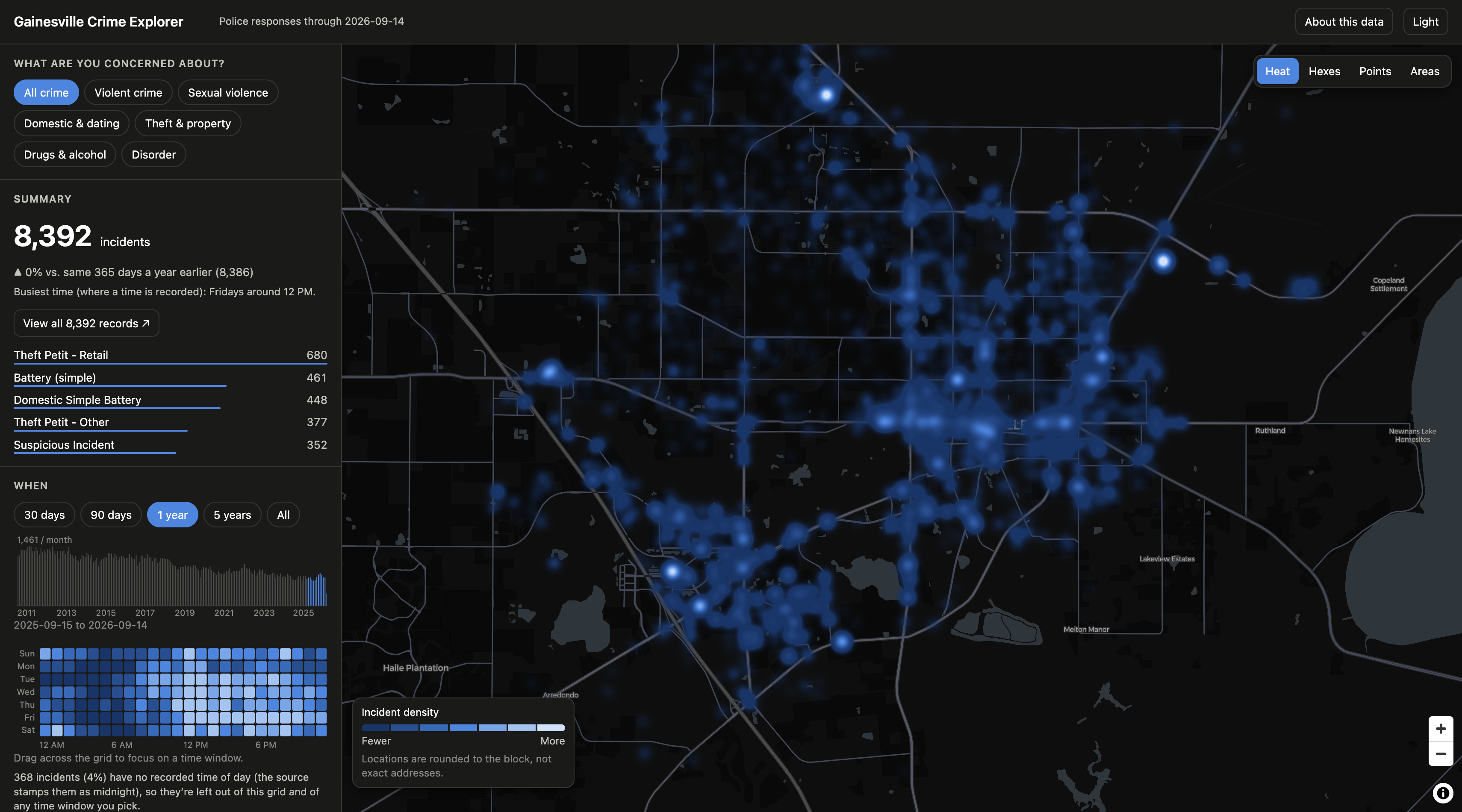
- One-click lenses for violent crime, sexual violence, domestic & dating violence, theft & property, drugs, and disorder, then narrow by specific offense, date range, time window (drag across a weekday-by-hour grid), or area (a Census block group, or a circle around a spot you click).
- Four map views (heat, hexagons, dots, block-group shading) with charts and a year-over-year comparison that update instantly.
- "View all N records" opens the raw table behind any filtered view. The count always matches the map.
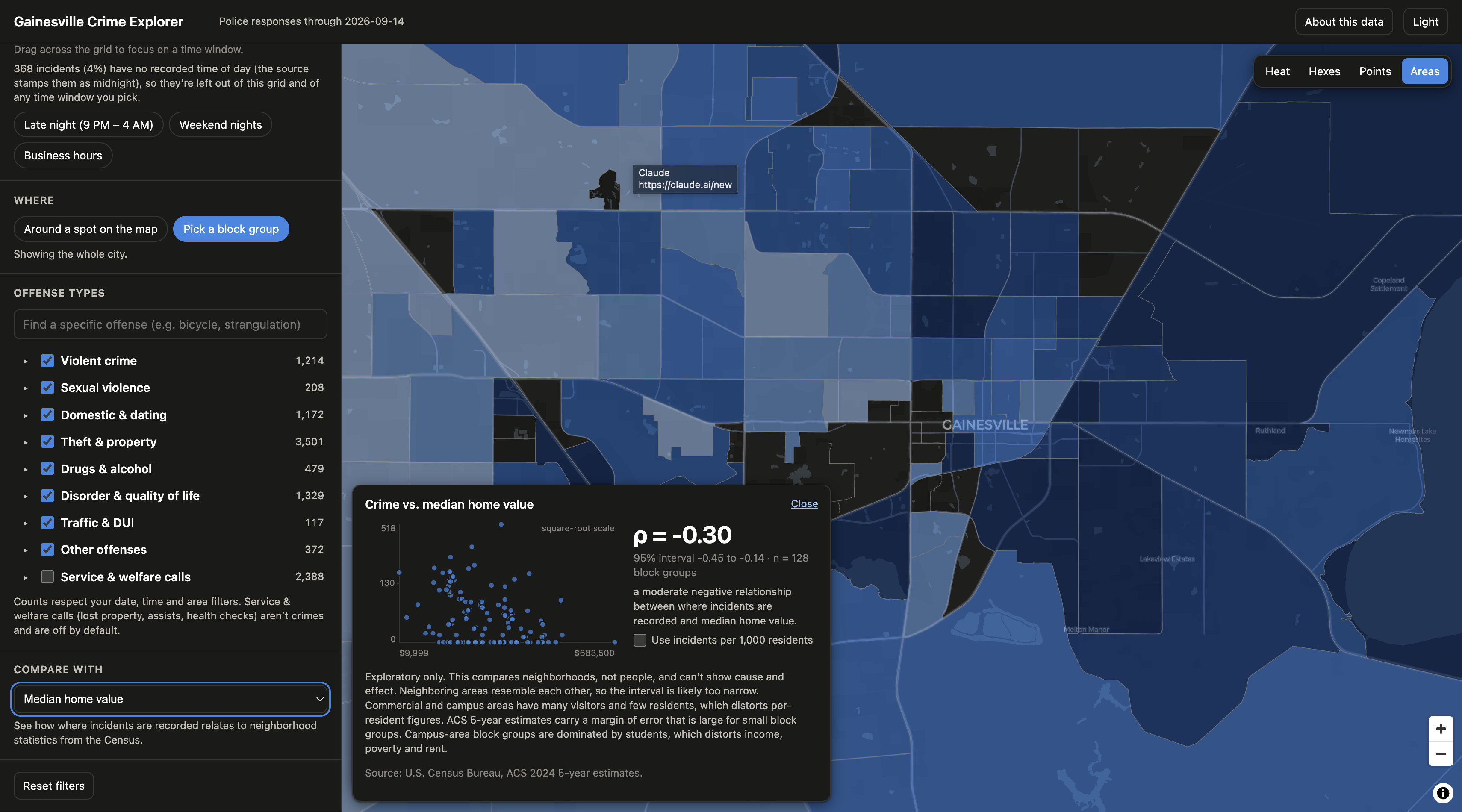
- Compare with the neighborhood. Overlay Census statistics (rent, income, home value, renter share) and get a correlation with a scatter plot and confidence interval.
- Every view is a link, so it can go in an email or a public comment.
How we built it
There is no backend. A build script cleans the CSV once, maps every offense into a category, assigns each location to a Census block group, and packs everything into a compact binary file of about 0.9 MB gzipped. The browser loads it as typed arrays and filters it live. A full filter update took about 3–4 ms in our benchmark.
One pass over the rows stores a small bitmask per incident, one bit each for offense type, date, time and area. A row passes when all four bits are set. A chart can ignore its own filter by checking that the other three bits are set, which is how the timeline still shows the whole history while you pick a date range.
For the correlation feature we pair each block group's crime count with an overlay value and compute Spearman's rank correlation, which is Pearson's correlation applied to ranks $R$ (ties get their average rank):
$$ \rho \;=\; \frac{\sum_i (R^x_i-\bar R^x)(R^y_i-\bar R^y)}{\sqrt{\sum_i (R^x_i-\bar R^x)^2}\;\sqrt{\sum_i (R^y_i-\bar R^y)^2}} $$
Ranks are used because crime counts are heavily skewed. We report a 95% percentile bootstrap interval, resampling block groups, and not a p-value. Neighboring areas resemble each other, so a naive p-value would overstate certainty. Per-resident figures are opt-in:
$$ \text{rate}_i \;=\; 1000\cdot\frac{c_i}{p_i}\qquad\text{only where } p_i \ge 500 $$
where $c_i$ is incidents and $p_i$ is residents, because a shopping district with almost no residents produces absurd rates.
The overlay is designed around a simple contract of one number per Census block group, so a new dataset (traffic crashes, 311 calls) is mostly a data-prep job.
Stack: TypeScript, React, Vite, MapLibre and deck.gl for the map, and zustand for state. Boundaries and statistics come from the U.S. Census Bureau. It ships as a Docker image served by Caddy.
What's next
More overlays (crashes, 311, code violations), pairing demographics with the same years as the crime being viewed, controlling for exposure ("more shops, more shoplifting"), and a CSV export of filtered records.
Built With
- react
- typescript
- vite

Log in or sign up for Devpost to join the conversation.