Inspiration
We are a group of college roommates who are really good at generating chores and really bad at tracking them. Groceries get forgotten, two people buy the same thing, and one person quietly becomes “the responsible one”. Our question was:
How might we make everyday, mundane tasks more enjoyable and engaging?
We decided to digitize what we already use at home: sticky notes on the fridge and doodles on a whiteboard. That became Crewmates, a tiny game like space where shared errands live on a playful board instead of in a boring spreadsheet.
Our design theme was:
a playful, hand sketched whiteboard with sticky notes in yellow, blue, and green, Comic Neue style titles, rounded body text, and doodles around the edges.
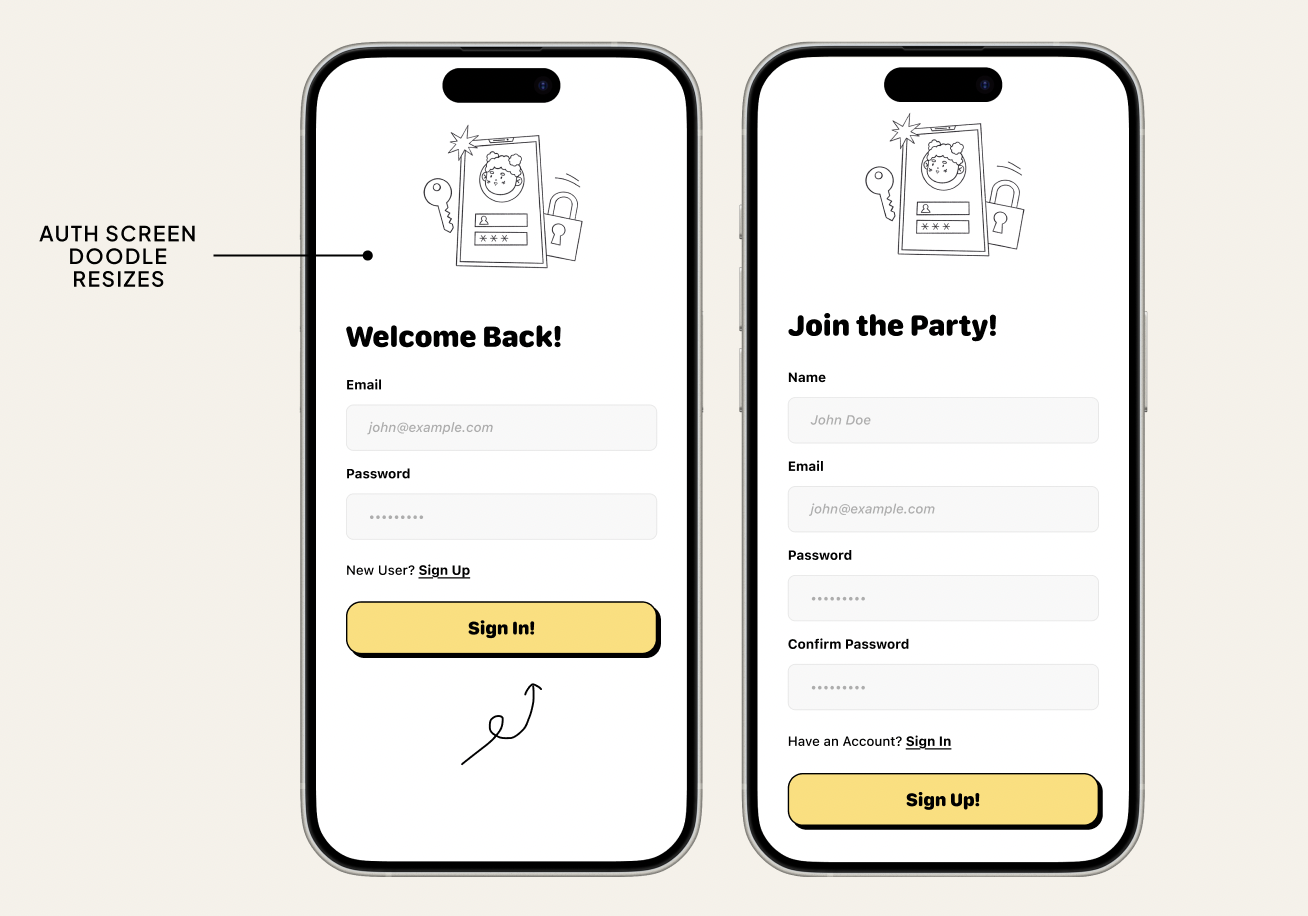
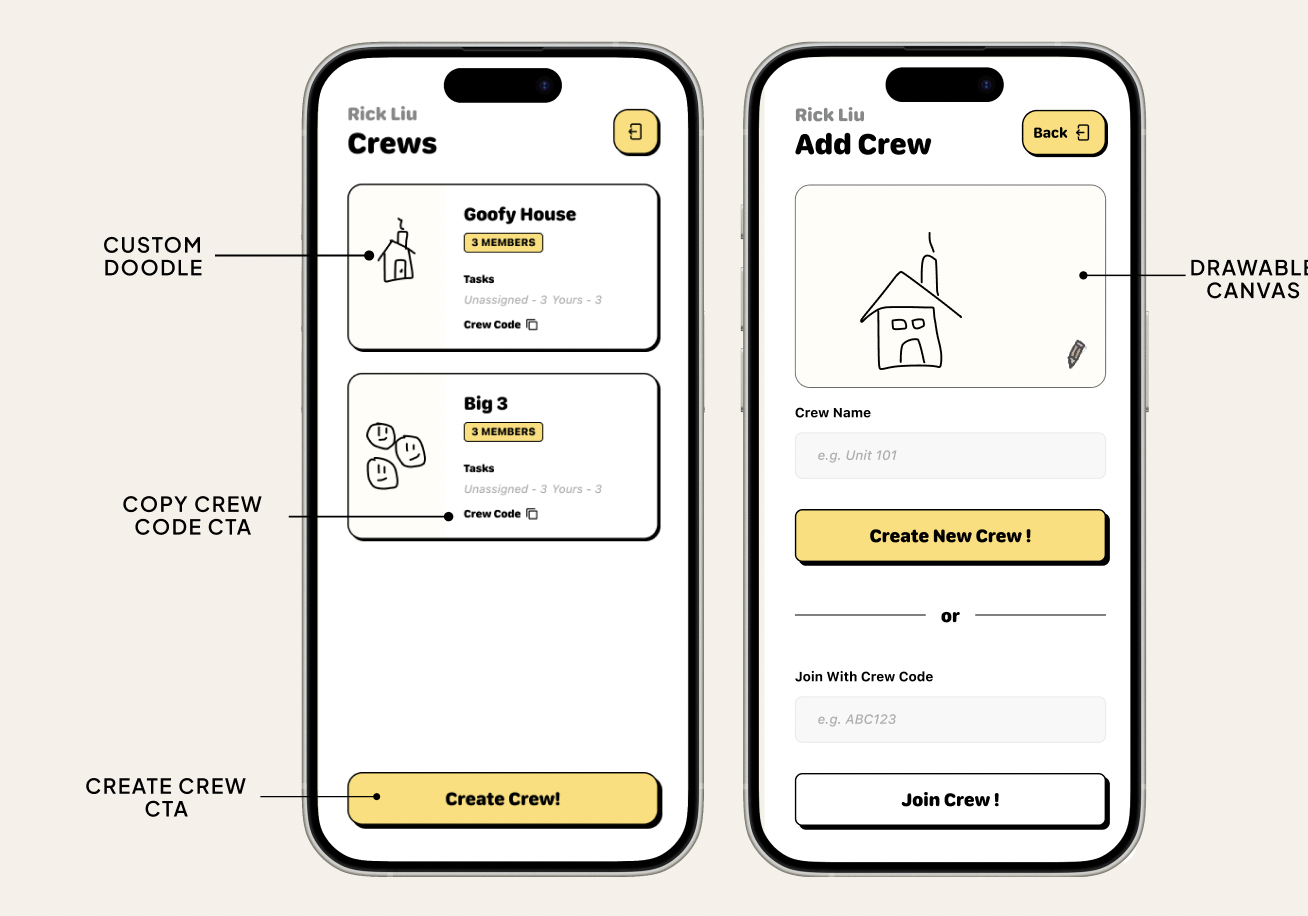
So the UI looks like a messy bulletin board, not a formal productivity app.
What we built
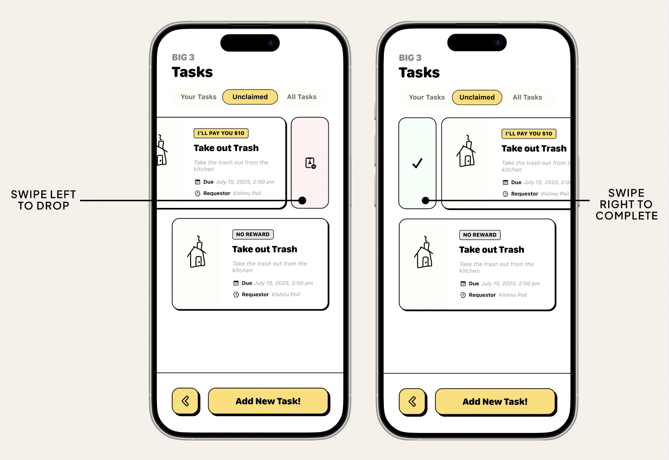
Crewmates is a mobile friendly web app where a household can:
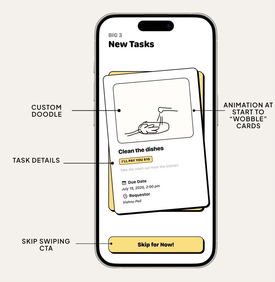
- See all chores on a kanban style Home Board with columns for “Needs doing”, “In progress”, and “Done”.
- Claim tasks through a Tinder style swipe screen that lets you accept or skip errands like “Groceries at Costco”.
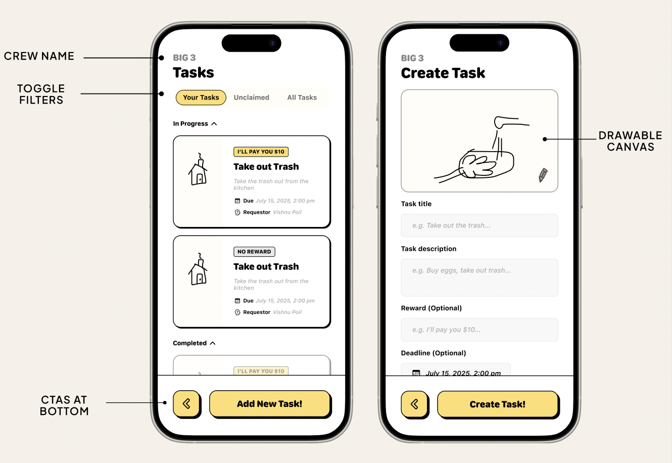
- Create new errands with a sticky note inspired form that previews the note as you type.
- View Errand Detail screens with checklists, assignees, and notes from the house.
- Celebrate effort in a House Wins feed that shows who did what, with emoji reactions.
Everything sits on a sketchy whiteboard background with hand drawn outlines, pastel sticky notes, rough shadows, and doodles (stars, arrows, scribbles) to keep the tone light.
How we built it
We started in Figma to lock in the “hand drawn whiteboard” aesthetic. We used a custom prompt for Figma Make that specified:
- Soft warm grey background (
#F5F5F3) - Sticky notes in pastel yellow, blue, and green
- Thick, slightly uneven marker outlines and small rotations
- Handwritten style headings and rounded body text
- Doodles around the edges to make it feel like a concept sketch
Challenges we faced
- Capturing the “hand drawn” feel in code. It was tricky to make the interface feel sketchy without importing a full illustration library. We used uneven borders, light rotations, SVG doodles, and playful fonts to approximate that vibe.
- Representing many “screens” in a single page. The app has splash, auth, onboarding, board, swipe, detail, routes, and history views. We had to organize the HTML and write simple screen switching logic so the code stayed readable.
- Balancing fun with clarity. It was tempting to add more doodles and motion, but too much made the UI noisy. We iterated on spacing, font sizes, and labels to keep it playful but still easy to scan.
What we learned
Working on Crewmates taught us that:
- Visual framing changes how tasks feel. The chores did not change, but a playful whiteboard, swipe gestures, and a “House Wins” feed made them feel less like nagging and more like a team game.
- Micro interactions matter. Small touches like card wiggles, soft shadows, and confetti at completion made the app feel alive without complex animations.
- Fast design to code loops are powerful. Going from Figma prompts to live HTML, CSS, and JavaScript in short cycles helped us refine layout and behavior much faster than if we had treated design and implementation as separate phases.
Next, we would like to connect this prototype to a lightweight backend so multiple roommates can use it in real time and track which crewmate actually saved the house from cereal famine.
Built With
- figma

Log in or sign up for Devpost to join the conversation.