-

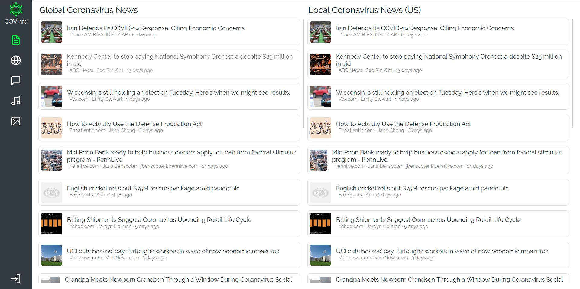
The news page - Automatically get the latest global and local news about the Coronavirus pandemic.
-

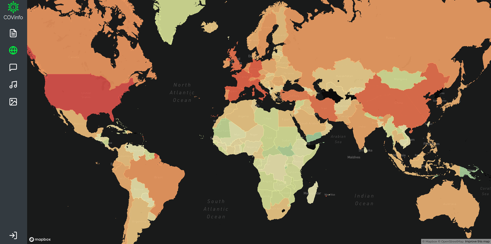
The map page - See how the Coronavirus has affected your area and areas around the globe. Also see how each country has responded.
-

The meme page - Distract yourself during long days in quarantine with relatable quarantine-worthy memes.

Inspiration
In times like these, information is everywhere. This makes it easily accessible for most people around the world, as everything you need is a Google search away. However, this makes the spread of misinformation just as easy. COVinfo aims to bring up-to-date COVID-19 information to your fingertips, all in one place.
What it does
COVinfo has six main pages. The News page has two sections: global news and local news. Global news gets the most recent COVID-19 news on a global scale, while local news shows you the most relevant news from your country (or the US, if you're not signed in). The Map page visualizes COVID-19's impact across the globe, updating daily so you can see the most recent impact across the world. In the Quarantine Chat, you can connect with people around the world and discuss anything from fun time-killing activities to just chatting about quarantine life. To make sure everyone stays healthy, the Hand Washing Music page allows users to submit songs with a starting timestamp that have a good 20 second span, perfect for washing your hands correctly. Finally, to raise the spirits of everyone trapped inside, and especially those who work non-essential jobs, the Meme page is available to give a humorous spin on this dim situation.
How we built it
The front-end of COVinfo is built with vanilla React.js and Bootstrap for UI design. We used Firebase for the authentication and database, with an Express server and sockets to send live messages to everyone in the Quarantine chat.
Challenges we ran into
We started out with lots of plans, such as designing a dashboard to put multiple features on one page. However, once we got to designing the UI, it became difficult to put all of the features we wanted without a full screen to work with.
Accomplishments that we're proud of
The data visualization on the COVID-19 map was something that we managed to add in the last few days of hacking. It was difficult to find a dataset that we trusted and was easy to work with, but now that we figured it out, it is one of our favorite parts of the project.
What we learned
We learned a lot about GeoJSON, as we hadn't heard of it before starting this project. Working with Uber's react-map-gl was very straight-foward, but pulling the correct data from multiple sources was where we learned them most.
What's next for COVinfo
After taking a break from it, we plan on improving the UI and also following feedback from users about new features and bugs that need fixing.
Built With
- bootstrap
- datahub
- express.js
- newsapi
- node.js
- react


Log in or sign up for Devpost to join the conversation.