-
-
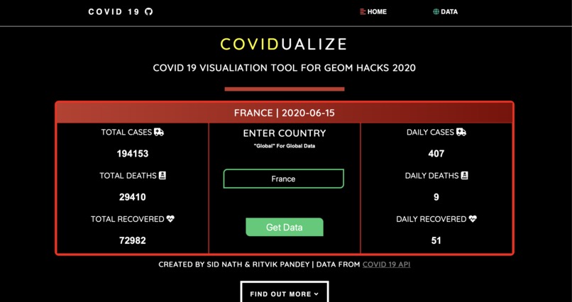
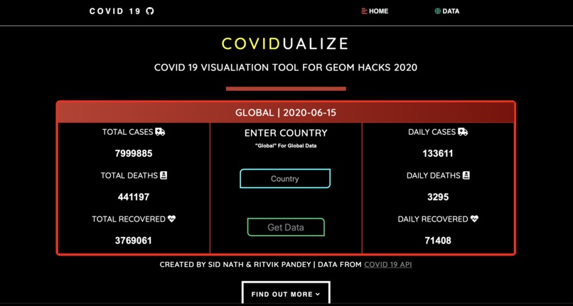
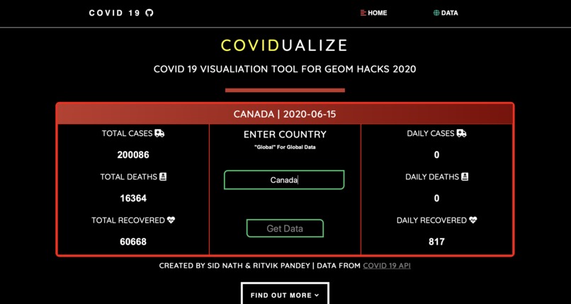
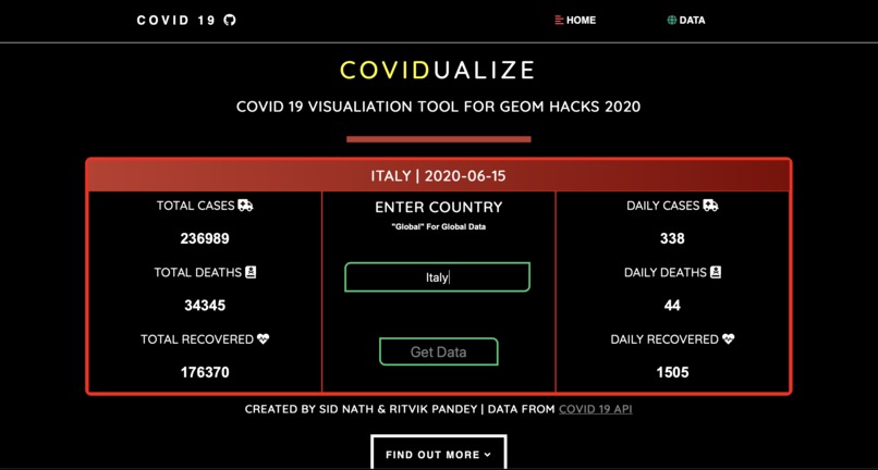
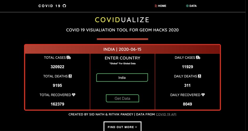
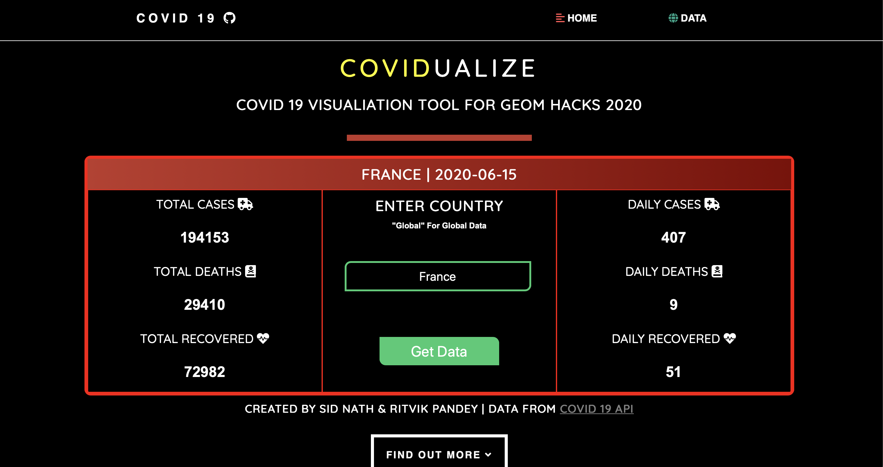
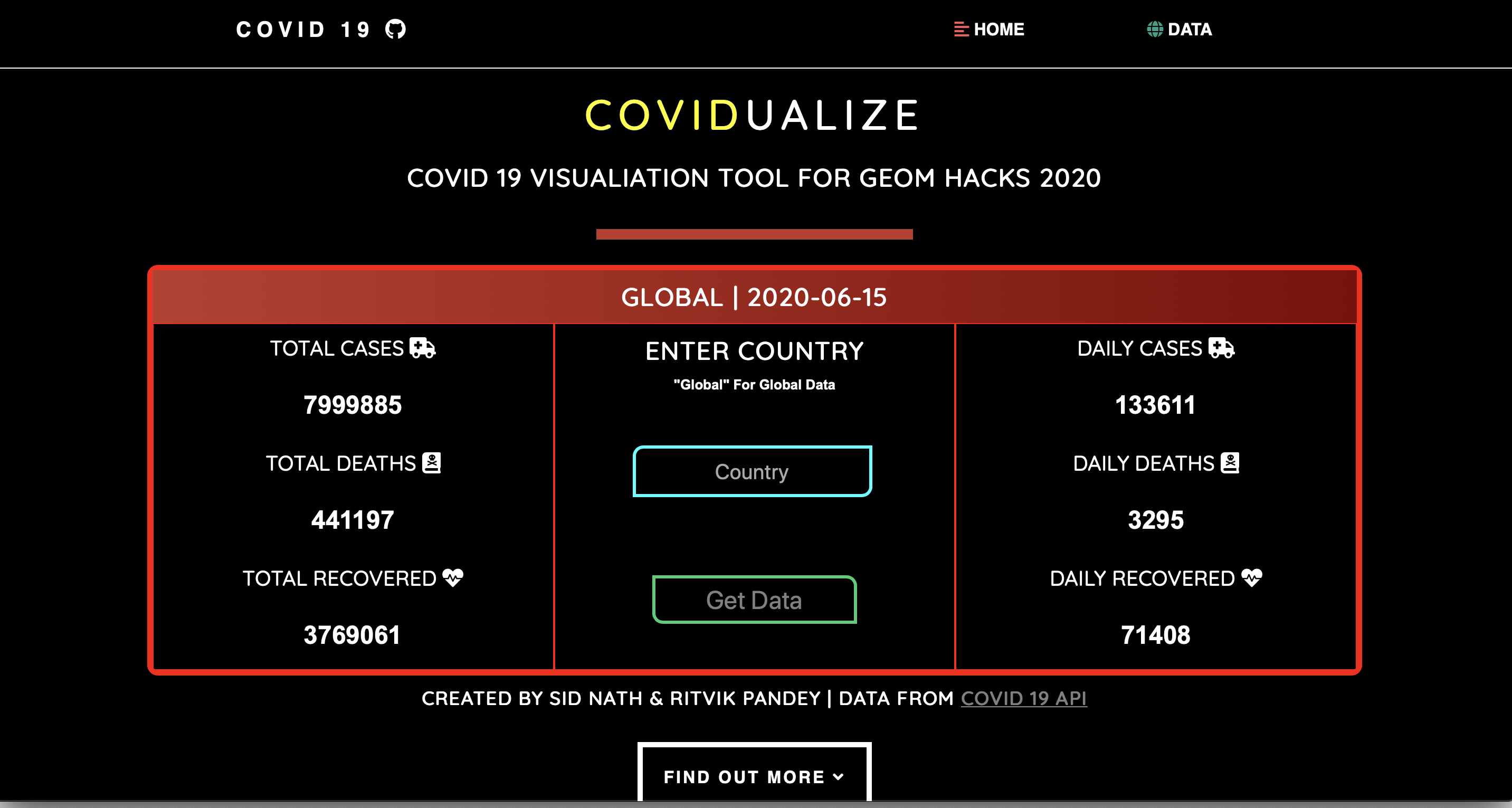
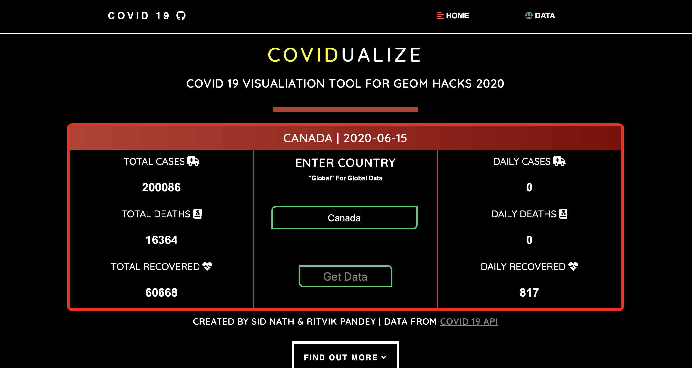
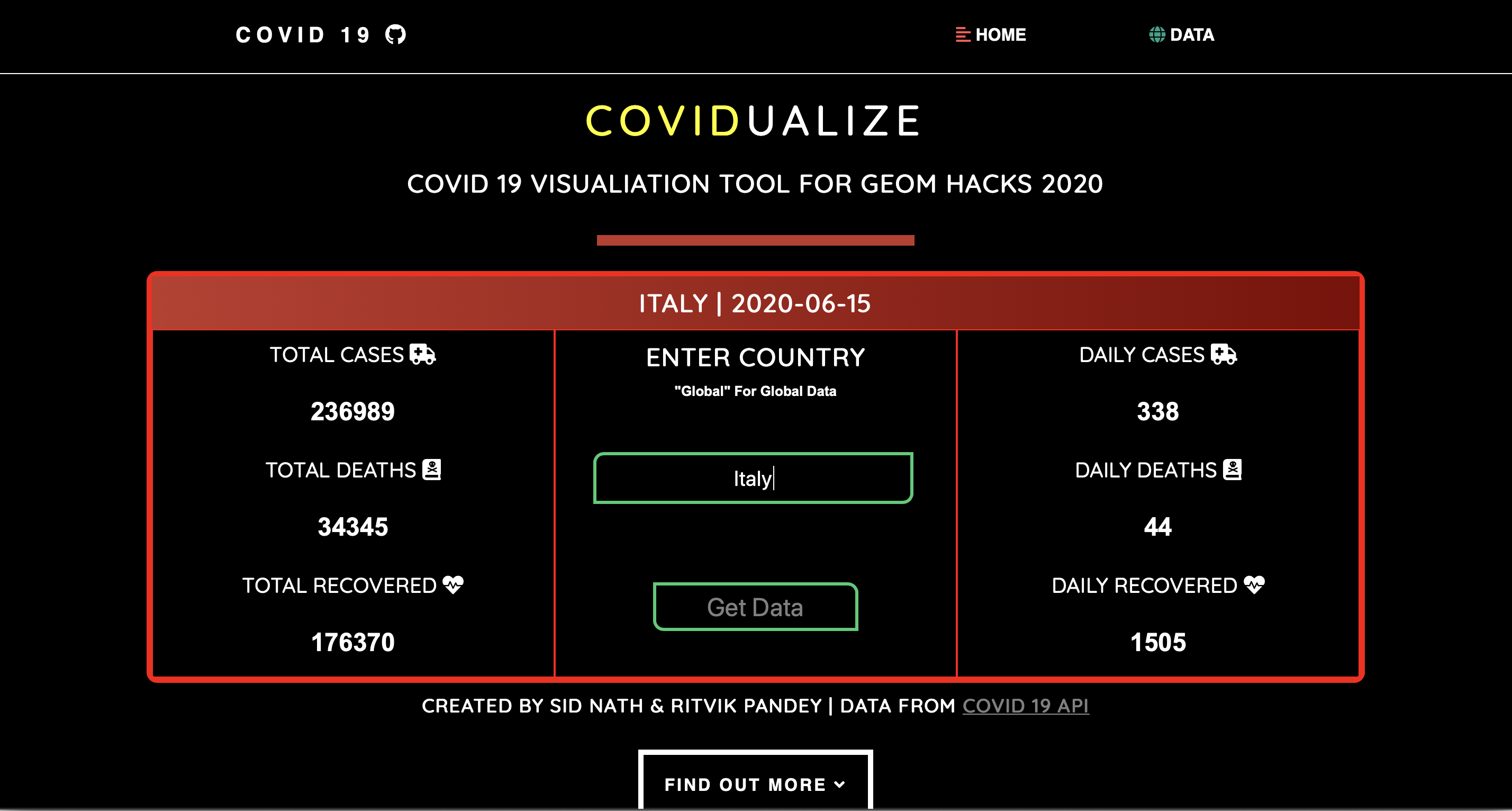
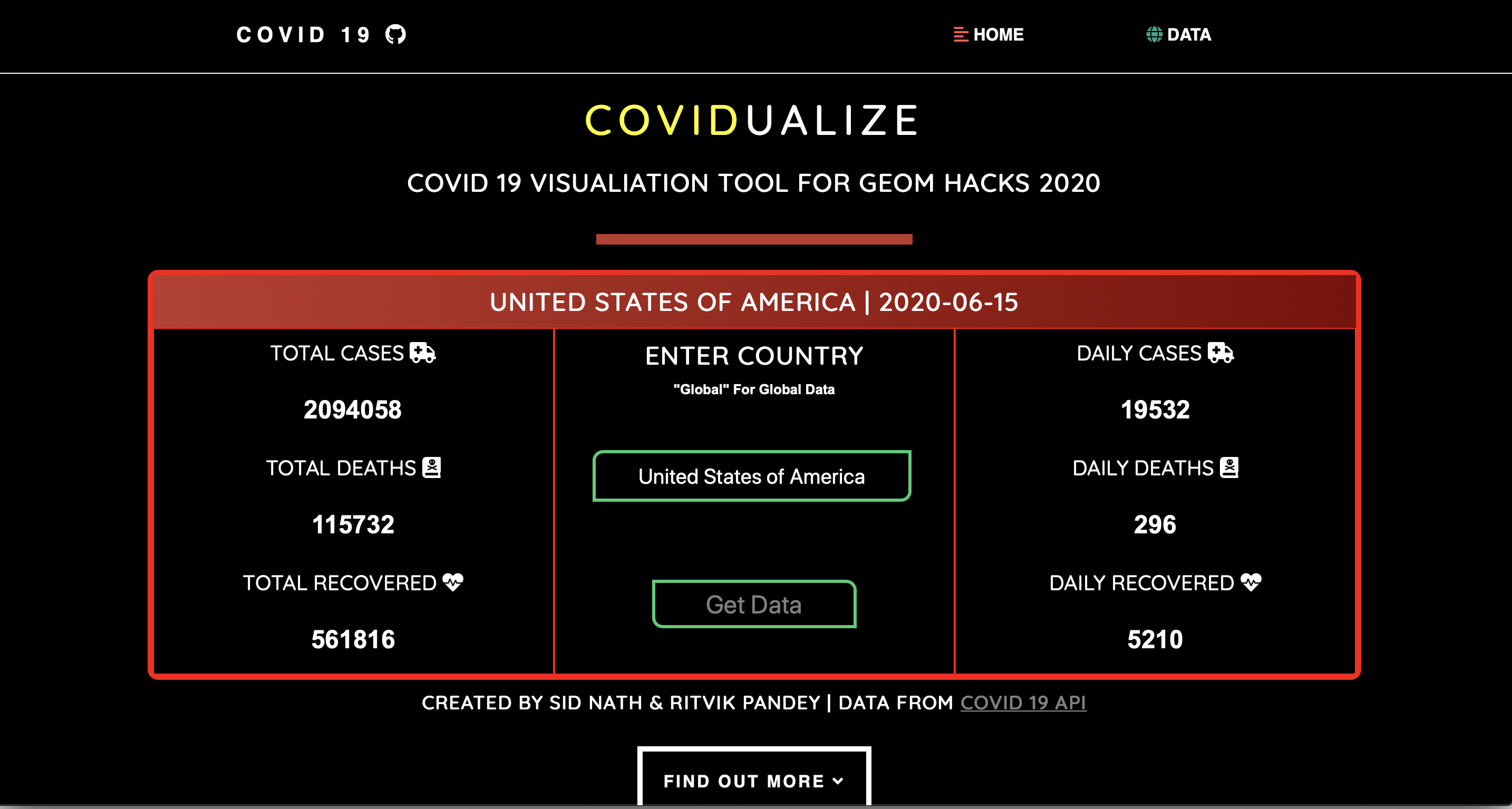
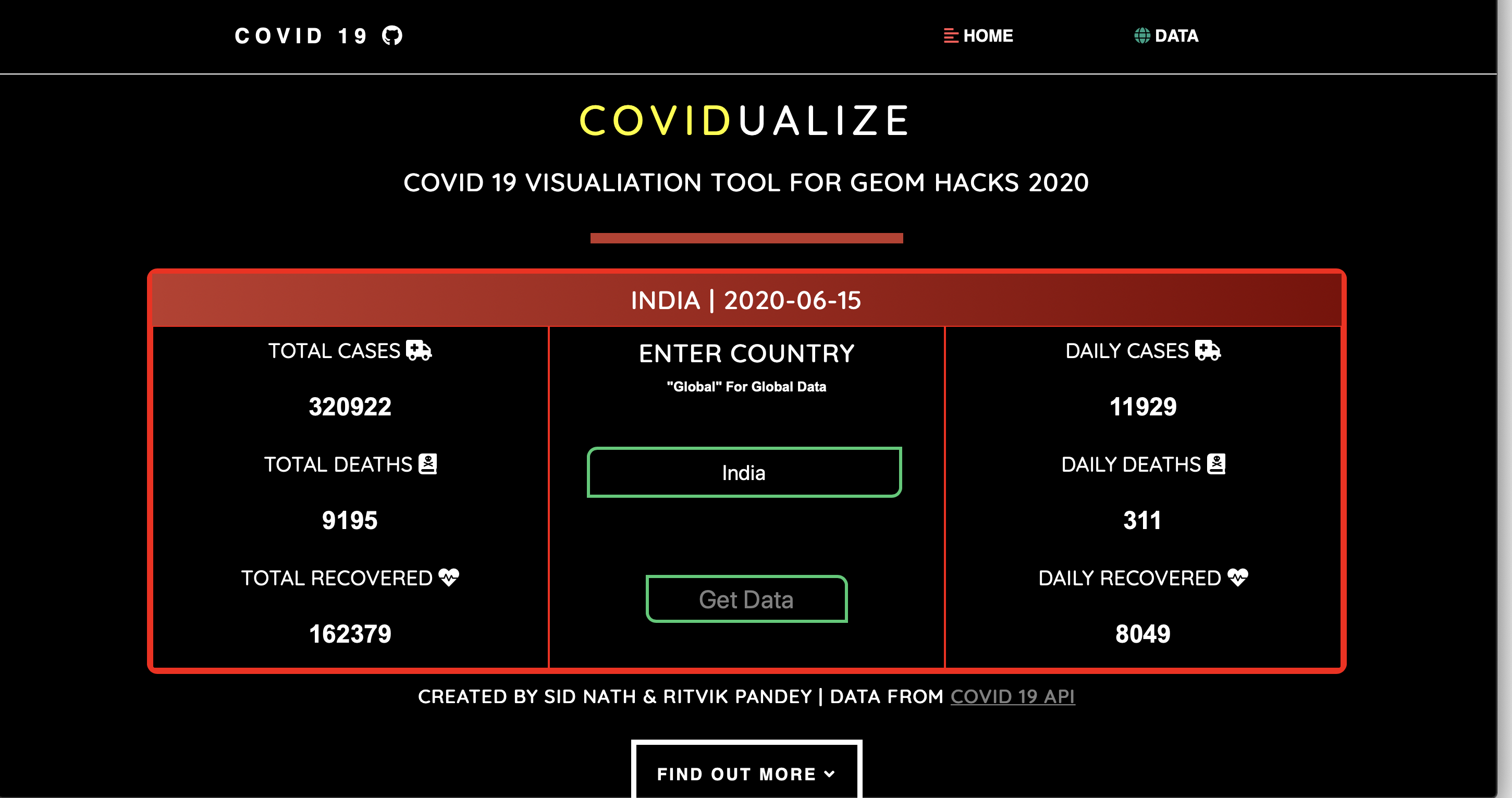
Demonstration of information table
-
Demonstration of information table
-
Demonstration of information table
-
Demonstration of information table
-

Demonstration of information table
-
Demonstration of information table
-
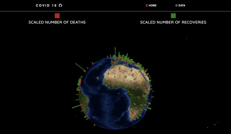
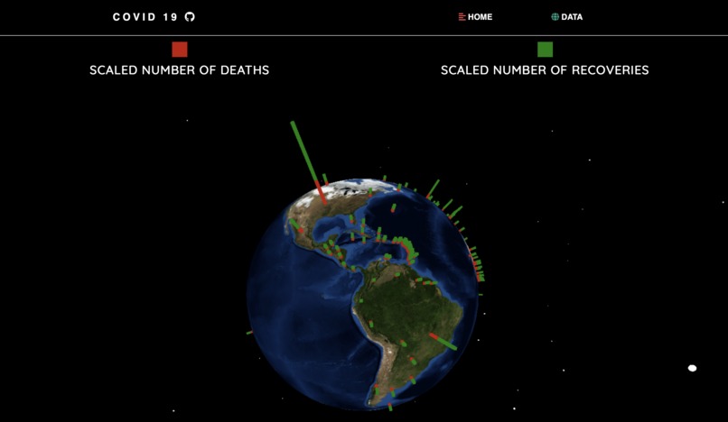
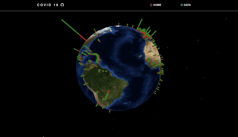
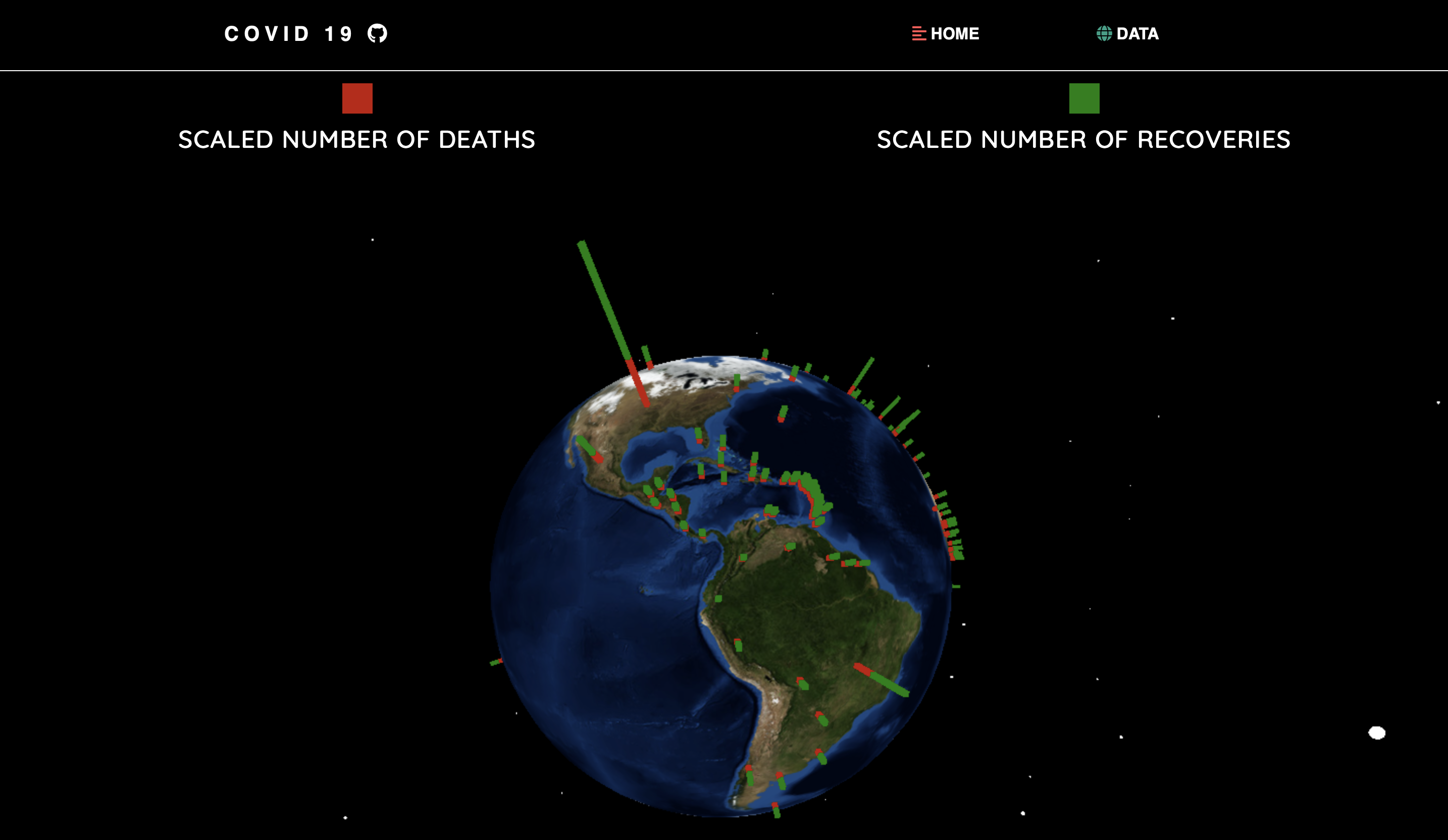
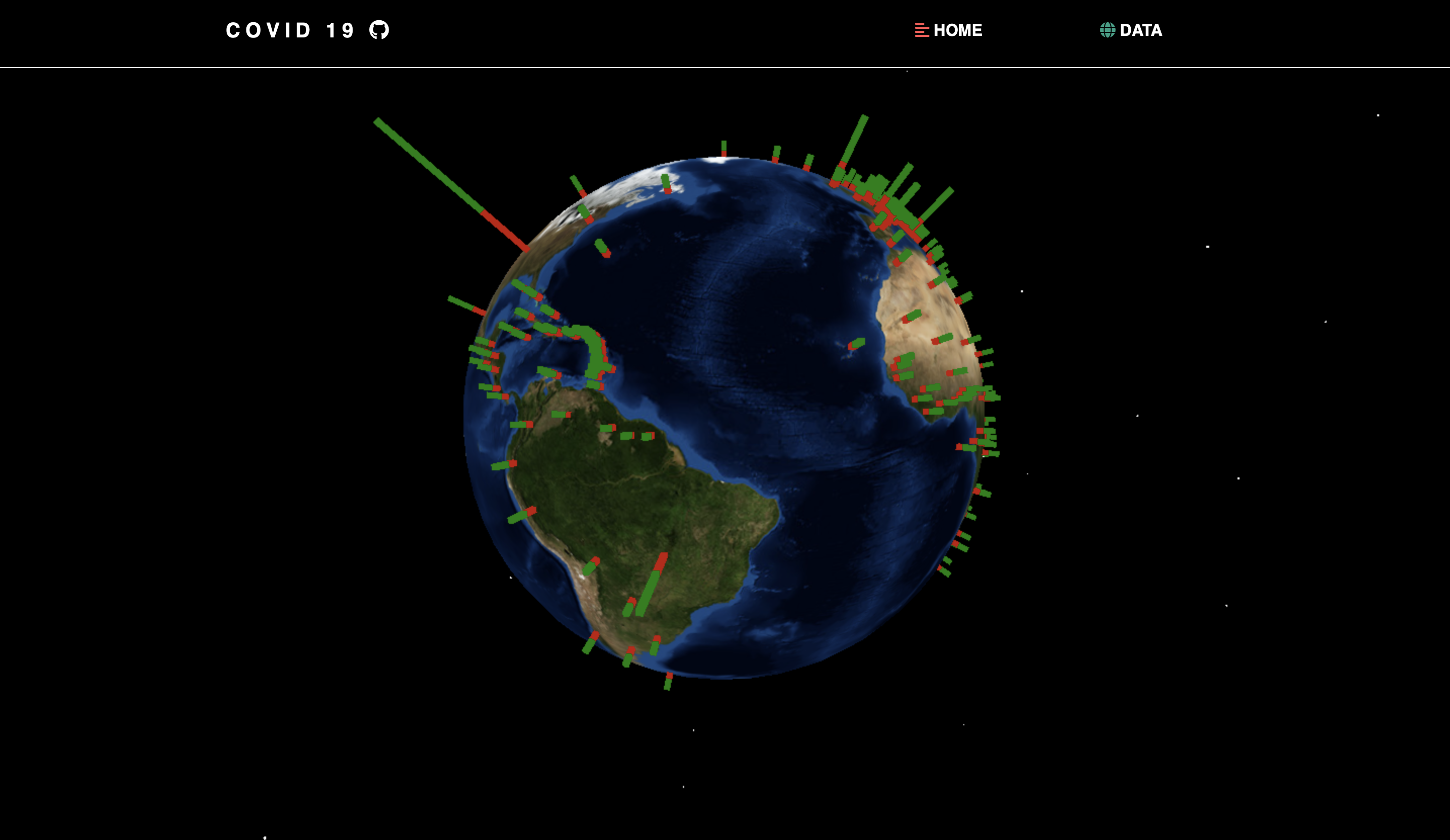
Demonstration of Interactive 3D Globe
-
Demonstration of Interactive 3D Globe
-
Demonstration of Interactive 3D Globe

Inspiration
After witnessing a hoard of CoVid-19 information and statistics all over the Internet and news sources alike, we wished to keep all information in a localized and easy-to-access data table with access to all the publicly available statistics per country. Additionally, apart from making a sophisticated data table, we wanted something visual to help our audience comprehend the sheer magnitude of the pandemic. We’ve really mainly paid attention to numbers instead of visuals, which is why we had the inspiration to have an interactive simulation of the recovered cases and total deaths per country. We believe our project will help provide perspective to those truly unsure and nervous about the virus, and we wish to continue adding features and updated graphics to give the best user experience we can.
What it does
CoVidualize provides two key items: a public data table with CoVid-19 statistics for each country, and an interactive 3D globe displaying the scaled number of total deaths (in red), and total recovered (in green). The data table and statistics are updated daily, as well as the visual bars and globe we built. For our first page, we display the global total cases, deaths, recovered, and the daily cases, deaths, and recovered, which updates every day. Additionally, you can enter the name or country code of any country and it will display the information specific to it. Scroll down, and we display the 3D globe and red and green bars in each country. The red bars represent the total deaths, and the green bars represent the total recovered. We scaled the statistics displayed on the globe with an algorithm we developed so that the percentiles remain constant, therefore it becomes easier to discern the proportionality between recovered and deaths per country.
How we built it
We mainly used JavaScript, HTML, and CSS to build CoVidualize. We used the https://covid19api.com/ and https://www.trackcorona.live/api/countries to obtain our information and data points that we then displayed in our table and on the globe. We used three.js libraries to build the interactive 3D globe. To go into more detail, we used the above APIs to gain access to the latitude and longitude per country, and then converted those into a (x,y,z) coordinate pair via spherical coordinates. We were able to build a cube at that point with a given height using our scaling algorithm so the proportionality would remain accurate using the deaths and recovered data points (entered into an array).
Challenges we ran into
About halfway through the hackathon, we were completely stumped on why we weren’t able to plot the data on our globe, and we spent hours trying every possible means of tutorials on youtube for three.js, and any attempt to get the cubes/data plotted in the proper country. The conversions to spherical coordinates were not difficult, but the application, especially concerning the data scraping from the APIs, was the primary challenge we came across. Additionally, we had many issues arise with three.js as both of us on the team were completely unfamiliar with the framework, and the OrbitControls took us many code attempts to implement.
Accomplishments that we're proud of
We’re extremely proud of ourselves for learning as much about three.js as we possibly could within this span of time, and learning the specific errors that come with not having a proper understanding of three.js, as the documentation isn’t very straightforward. Instead of simply copy-pasting code from the manual documentation, we had to understand to the best of our abilities the framework and how it processes adding geometries and textures.
What's next for CoVidualize
The future for CoVidualize is very bright, in our opinion, especially by taking the proper time to make the simulation possibly more interactive and well-built, as we had no prior experience with three.js. Additionally, my partner and I were discussing methods to bring more attention to our project, possibly by adding information panels on the globe, where if a user clicked on a specific red/green bar, there would be a pop-up with the given statistics for that country. Our primary focus is on providing appealing visuals for the users, and we feel that with more knowledge of three.js we can make our product more professional and exciting to work with. We have already begun working on a mobile infrastructure in the form of an app, so our users will have a built-in interaction with the globe and data table. We have been contemplating branching out past CoVid-19 applications, especially with other medical statistics useful for our customers.


Log in or sign up for Devpost to join the conversation.