-
Dashboard
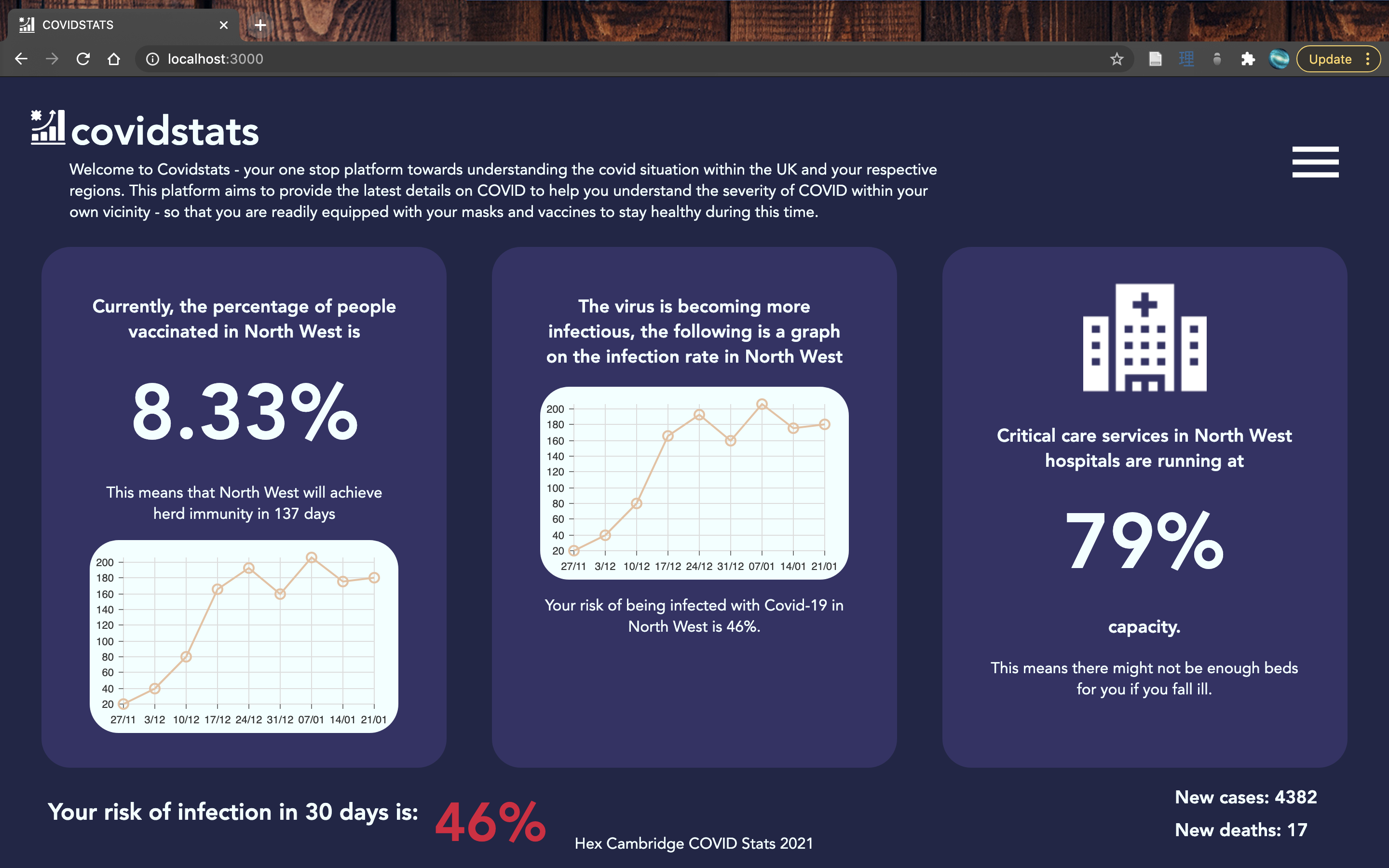
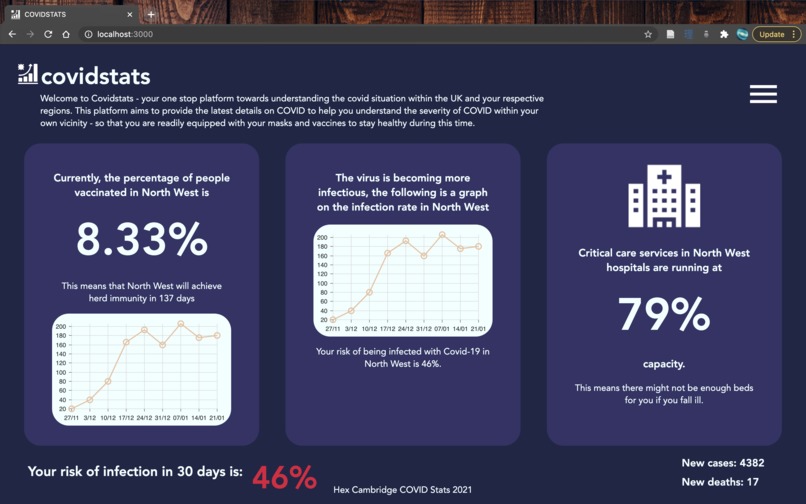
What is your infection risk?
As the coronavirus cases are increasing quickly, we were concerned about the general populations response to it, and questioned how might we help encourage the general population to take the vaccine. We envisaged a dashboard that could be the one stop platform to understand vaccination and infection rates, and also how your personal risk changes with vaccination.
How we built it
The NHS and UK Government makes a range of COVID-related data available via APIs. We used a Python backend to call the APIs and preprocess the data to bring it to the right format for our application. We decided to look at risk by NHS region, which includes London, Midlands, East of England, North East and Yorkshire, North West, South East and South West.
For the visual dashboard, we used Figma to create our UX/UI wireframes and used JavaScript and React.js to bring about the web app. The ReactJS FrontEnd webapp is
Challenges we ran into
The data, though freely available, was very messy. As COVID-19 is a very dynamic situation, the recording of data was irregular across time. The early days didn't have region-based data, and not all regions have data available (especially regarding vaccination).
Accomplishments that we're proud of
As most of us in the team predominantly started out at python programmers, we learnt how to connect the back end python code to the front end, which was programmed using a front end java script library.


Log in or sign up for Devpost to join the conversation.