-
-

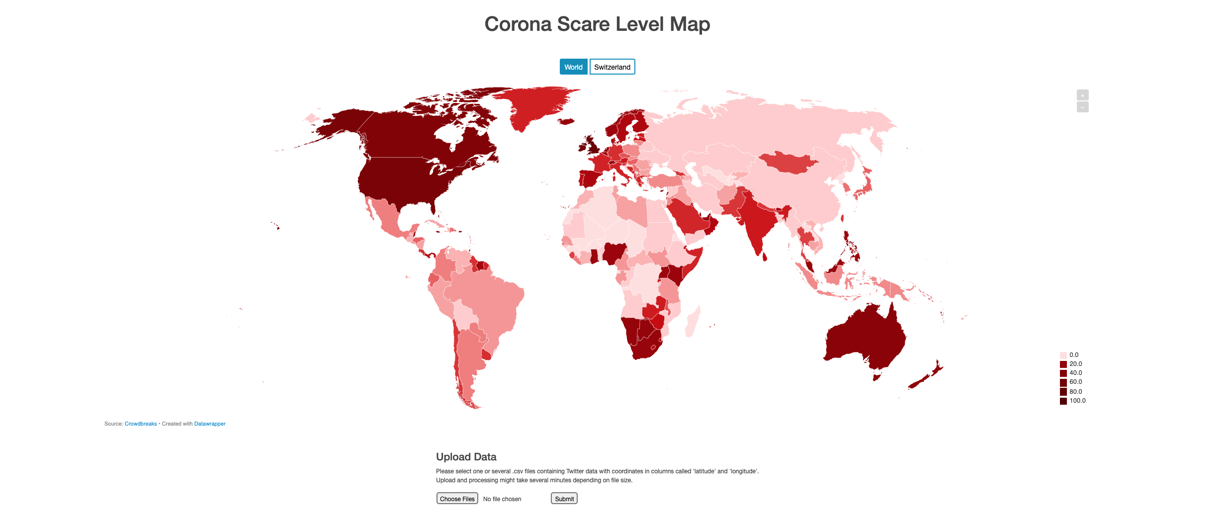
World Map
-
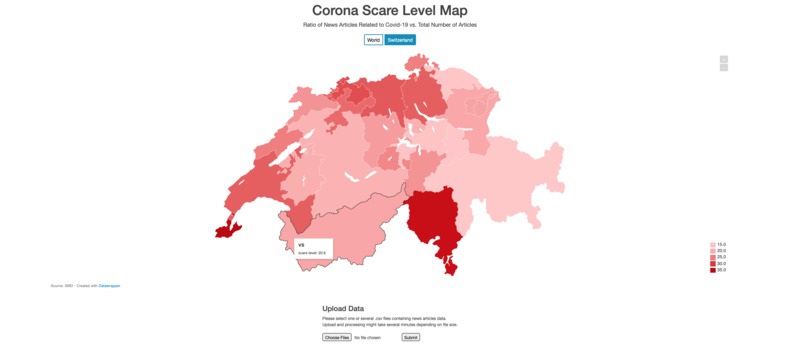
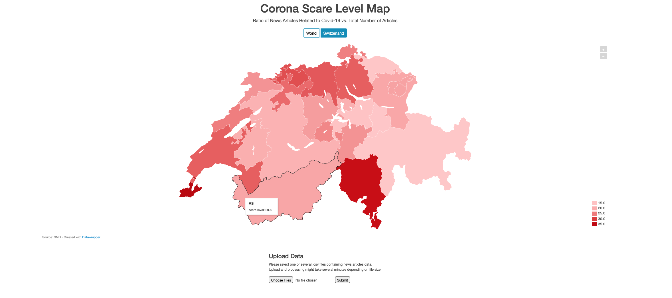
Swiss Map
Inspiration
The pandemic is the main topic at the moment and follows us everywhere. Not all people are affected to the same extent and through this challenge, we wanted to explore feeling patters around the globe.
What it does and how we created it
World Map
We started with the Twitter dataset we had been provided with. It was relatively easy to reverse geocode the data, since we were provided with coordinates. We've used a python package called reverse-geocode for this process which is an offline and quick solution. The module has a set of known geocoded locations and uses a k-d tree to efficiently find the nearest neighbour. In our perspective, the main challenge with the Twitter data was to make it useable for a map/chart. Since the Twitter dataset contained tweets from all over the world, we decided to portray our results in a world map. Of course, the number of Twitter users needs to be taken into account when calculating the Scare Level of a country and since this data wasn't available for all countries, we decided to approximate the figure using the country's population. Furthermore, the Tweets per capita numbers were normalized into a scale from 0 to 100.
Switzerland
For the SDM data, we focused on Switzerland which is also the main aspect of the challenge. At first, we tried to use natural language processing (NLP) to extract location names (Name Entity Recognition). However, we weren't able to achieve desirable results with our approach: processing the big amount of data wasn't possible for us in a reasonable time. Therefore, we switched to another technique using keywords to detect locations and assign them to their correspondingg canton. Similarly, using keywords, we tried to detect news articles which were related to Corona. In the map itself, the ratio of articles that mention a specific location and Corona vs. total amount of articles that mention the location is displayed and is our interpretation of the "Corona Scare Level" in Switzerland.
How we built it
We decided to implement our project as a small web application using a Python backend (Flask) to do the data processing. On the frontend, we used the Datawrapper API to create the visualizations. Used programming languages and important packages:
- Python 3.7.9
- flask
- pandas
- reverse-geocode
- scikit-learn
- datawrapper
- HTML/CSS
- Bootstrap
- Embed Datawrapper iFrame
Challenges we ran into
We were struggling a lot to achieve desirable results using Name Entity Recognition, especially due to the long processing time. Therefore, we switched to alternative techniques for basic location matching, as mentioned above.
Accomplishments that we're proud of
It being our first hackathon, we are happy that we were able to get something running and even having something to submit. The whole event was definitely a great experience and we are proud that we were able to tackle and solve one of the challenges.
What we learned
The project helped us improving our skills needed to create a web app. On the one hand, we were able to apply our knowledge on backend programming and practice the use of frameworks such as Flask. Moreover, we acquired additional know-how on how to handle and process large datasets. Last but not least, we gained many insights into the whole Hackathon experience and are now ready and highly motivated to join other developers and tackle new challenges in our next Hackathon.
What's next for CoronaScare
Since we are rather unexperienced programmers, our main focus for the project was on having a more or less "finished" and working "product" rather than putting a lot of effort into details and precision. The user interface could be made more appealing, the data processing has many possibilities for improvement (use name entity recognition/machine learning, better approaches to compare scare level of different countries/cantons, speed up processes) and other features would be desirable such as the possibility to select a time span etc.

Log in or sign up for Devpost to join the conversation.