-
-
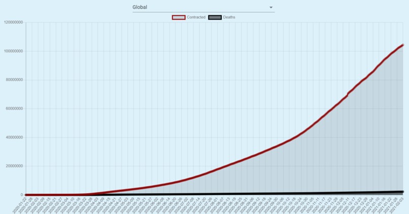
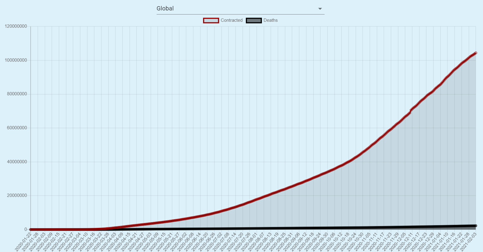
Graph of Daily Global Contracted Cases and Deaths
-
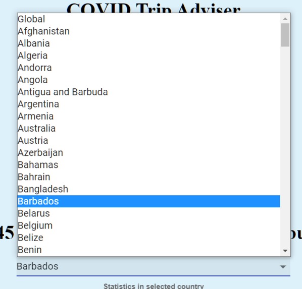
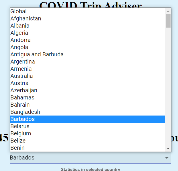
Country Selector
-

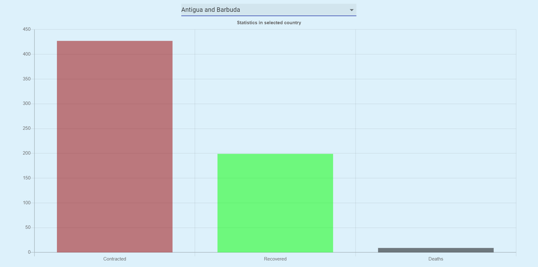
Bar Graph of Active Cases, Recovered Cases, and Deaths of Select Country
-

Recommendation of whether or not to go to a country. (There are three recommendations based on the total number of cases in a country)
-

Two of three recommendations
-

Three of three recommendations


Inspiration
COVID has caused lots of change to our lives in the past year. Many want to travel, which is highly unadvised, but we want to minimize the effects by recommending whether or not a location is safe if an individual has their mindset on traveling. We recommend or don't recommend a country based on the number of people currently active with corona.
What it does
It tracks the number of people currently active with COVID in a selected country. It also advises whether or not the country is safe to travel to.
How we built it
This program was coded nearly completely in Javascript, using libraries such as React, Axios, and more. Axios was used to fetch the data from the API, which we then filtered and passed into the program. We have three components (Info (the numbers), Graph (the graphs), Location (the country selector)).
Challenges we ran into
We had some creative difficulties at the beginning of the hackathon as we weren't really sure how to approach such a problem. Once we got into coding it, we also encountered the problem of an outdated installation command for chart.js, but we figured it out pretty quickly.
Accomplishments that we're proud of
We are proud of the fact that we overcame the challenges as a team and developed a working program. We are also proud of the fact that we developed a website useful to the world right now.
What we learned
Throughout the time of this hackathon, our team gained a solid level of familiarity with Javascript and React.js. We not only learned the basics of coding a frontend with Javascript, but also the backend of a project. By the end of the night, all of us agreed that Javascript is one of the most versatile languages we've worked with in our academic careers. To be honest, a lot of the scale of COVID was unknown to us prior to working with this data. Seeing the magnitude of the numbers displayed was extremely eye-opening and really put into perspective just how large of an impact COVID has made this past year.
What's next for COVID Travel Adviser
We are planning on adding a map that shows COVID density, as well as connecting to a database that will allow us to also show the user which airline/route is the safest.


Log in or sign up for Devpost to join the conversation.