-
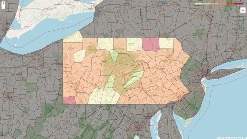
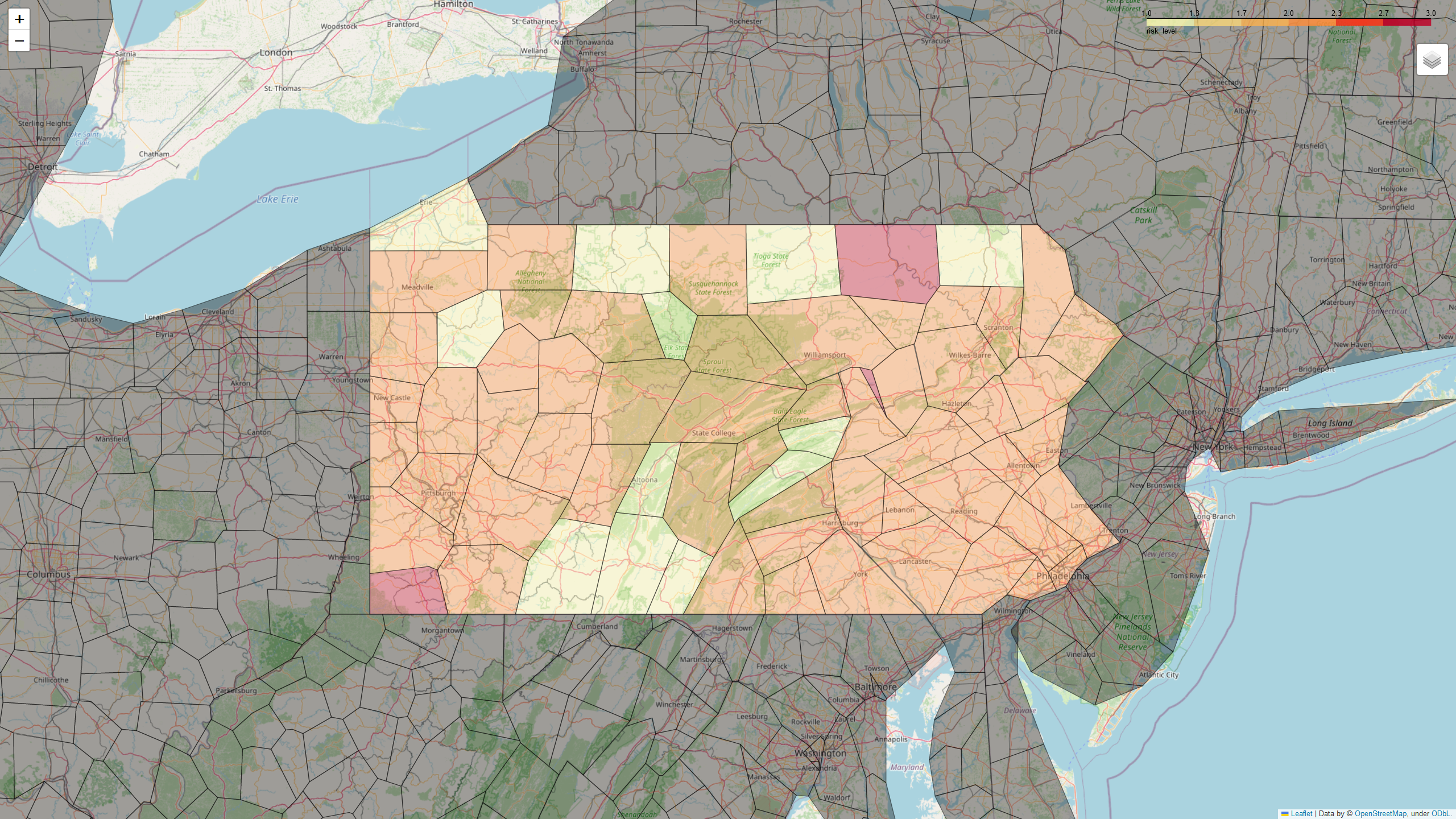
This is the picture of the Map. The covid-19 risk level is on a scale from 1-4, with 4 being the most extreme case
Inspiration
Our inspiration was an idea from my partner Mike. We originally wanted to make a heatmap of covid risk levels in PA but then we changed it to a Choropleth map.
What it does
It takes data from the Covid Act Now Data API and puts onto an interactive Choropleth map
How we built it
We first extracted the data necessary from multiple csv files to use for the map. We decided to look for the covid risk level in each county .We organized the data and used the Folium module to make that map and display the data for each county
Challenges we ran into
We had problems organizing the data and took multiple hours to get the folium map to work with our data.
Accomplishments that we're proud of
Finally got the colors to display for the risk levels in each county. The higher the risk level, the brighter the color (in this case it is red).
What we learned
We learned different modules that could manipulate data in python. We learned what it takes to make a map that displays data.
What's next for Covid Risk Levels
This project is obviously not finished so the next step would be to make the map fully customized.
Built With
- covidactnowapi
- folium
- python

Log in or sign up for Devpost to join the conversation.