-
-

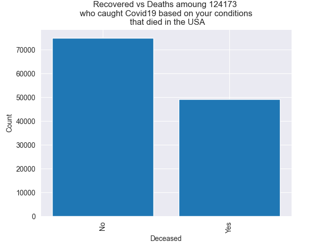
Example output of the program
Inspiration
I wanted to know what factors influenced a person's odds of surviving covid 19. I had heard in the news that older people were more at risk so I wanted to quantify that.
What it does
You specify a field, like age_group = "10 - 19 years" and or "Male" and it subsets a large Pandas Dataframe then counts the entries that are for deceased and alive patients. It returns those counts. Those two numbers are then converted into a bar plot and you can see the total sample size in the title. You can play around with different parameters to see what combination of parameters has the highest risk.
How we built it
Originally there were two other people that were going to join me that each had experience with front-end dev. Both had other things come up so I was left to do the whole project myself. The amateurish-looking forms were pretty much the first HTML I've written.
I reduced ~ 25M individual-level outcome data from the CDC using pandas down to ~2.3M by committing all the rows with one or more missing relevant values. For example, if they didn't report the gender of the patient I would drop that row. There are some methodological problems with this approach like it not being representative but I thought it was good enough for a first draft.
Challenges we ran into
I originally wanted to be much more specific with co-morbidity data to really see the relationship between risk and diseases like obesity and hypertension. Unfortunately, I could not get a big enough dataset. Instead, all different co-morbidities are mapped onto the single boolean 'medcond_yn' column.
It took me a solid hour to get an image of a bar plot to show up where I wanted it to.
Accomplishments that we're proud of
I got a bar plot to render.
What we learned
Basic HTML. How to use flask to manage moving around a webpage.
What's next for Covid Risk by Demographics
It could be made more robust by not limiting the data so strictly. I could make the website live after I get some help and or learn more about making the whole process look better.
I could also allow for stacking of filters. EG gets everyone from 2+ months instead of just one. Right now the options are either don't filter by the column or be very restrictive.
Also, I could create a very simple Decision Tree that would let people put in their own demographics and it would spit out a stat of what % of people like them, died when they were positive from Covid 19.
I think having a graphic of little cartoon people would be better than just a simple bar chart.
The data is too large to upload to GitHub but you can download it for yourself here: https://data.cdc.gov/Case-Surveillance/COVID-19-Case-Surveillance-Public-Use-Data/vbim-akqf/data

Log in or sign up for Devpost to join the conversation.