-
-

Landing Page
-

Bot sending back health/case information given a zip code
-

GET request for cases in county of a zip Code
-

Dynamic visualization with NY Times COVID Case data


Inspiration
- Lack of access to centralized COVID-19 case information organized by county
- Wanted people to have the ability to easily find information about their local county health department
What it does
For a (COVID-19) Pandemic Response Hackathon, we took local health county cases/deaths data on COVID-19 (using The New York Times data) and on local health departments (using NACCHO) and created a Twilio bot, exposed it as an API, and built a dynamic visualization in R Studio with Leaflet.
How we built it
Visualization
Click here to view the repository for the visualization. Click here to view the visualization. Created with Leaflet in R Studio, this allows you to view the cases/deaths by county due to COVID-19. Data comes from The New York Times, and it is automatically updated everytime they add new data. Heatmap was generated using logarathmic transformation of the data, in order to generate a better visual despite the presence of any outliers. Cases matched to unknown counties were removed. The New York Times data contains data for all boroughs associated with New York City as one data point - thus, each of these boroughs shows the aggregate data for all of NYC as associated with them. As per the data, cases associated with Kansas City are not shown. All Chicago cases are included with Cooke County. For other limitations, see the github repository associated with the data.
Twilio Bot
Click here to view the repository for the twilio bot. It was created with Node.JS, Twilio, and Heroku. First, text anything to (216)-284-3839. It then prompts a user for their location (via zipcode), then gives the user information (from NACCHO) about the local health department closest to them. It also provides them with the most up-to-date data (from The New York Times) regarding the number of cases of and deaths due to COVID-19. It was built with Node.JS and Twilio and is deployed via Heroku. Because we're using the free tier of Heroku, sometimes, the bot goes to sleep - if you don't get a response the first time, wait a moment and try again.
API
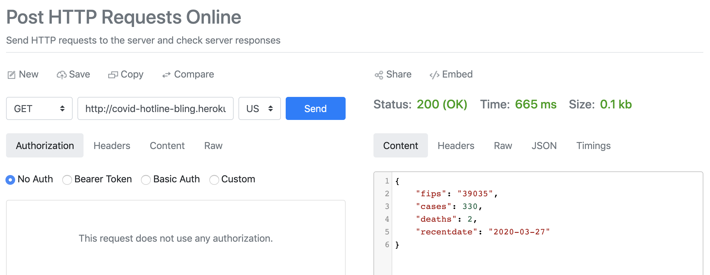
Click here to view the repository for the Node.JS application that serves as an API which allows you to access The New York Times cases/deaths data for COVID-19 by county given a zip code. Using it is easy - make a GET request:
http://covid-hotline-bling.herokuapp.com/zipcode/44106
It will return a JSON object with the FIPS code for the county, number of cases, deaths, and the last time the data was updated:
{
    "fips":"39035",
    "cases":330,
    "deaths":2,
    "recentdate":"2020-03-27"
}
Challenges we ran into
- Data limitations were an issue - for example, the data for NYC and Kansas City were not organized in the same way that data for other counties within cities were. This led to difficulties with the visualization especially, since we could only organize it via county.
- Pulling data from the NACCHO site was challenging - they do not have an API, so this required a more "outside-the-box" solution.
- The New York Times data is condensed as a giant CSV on github - allowing our applications to pull the data every time it is updated was challenging without an API to do so (and part of the reason we tried to create our own API)!
Accomplishments that we're proud of
- Figuring out solutions for the challenges mentioned above
What we learned
- Node.JS, Twilio, Heroku, Puppeteer, R, Leaflet
- Data visualization always takes longer than we expect it to
What's next for COVID Health Hotline Finder
- Twilio Bot: Allow people to enter symptoms and triage them for next steps
- API: Build this out further to allow for pulling cases by more than just zip code (i.e. by multiple zip codes, county, state, or the entire country in aggregate)
- Visualization: track county changes over time
Built With
- heroku
- leaflet.js
- node.js
- puppeteer
- r
- twilio


Log in or sign up for Devpost to join the conversation.