-
-
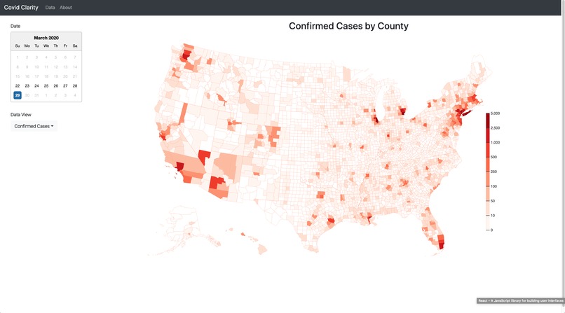
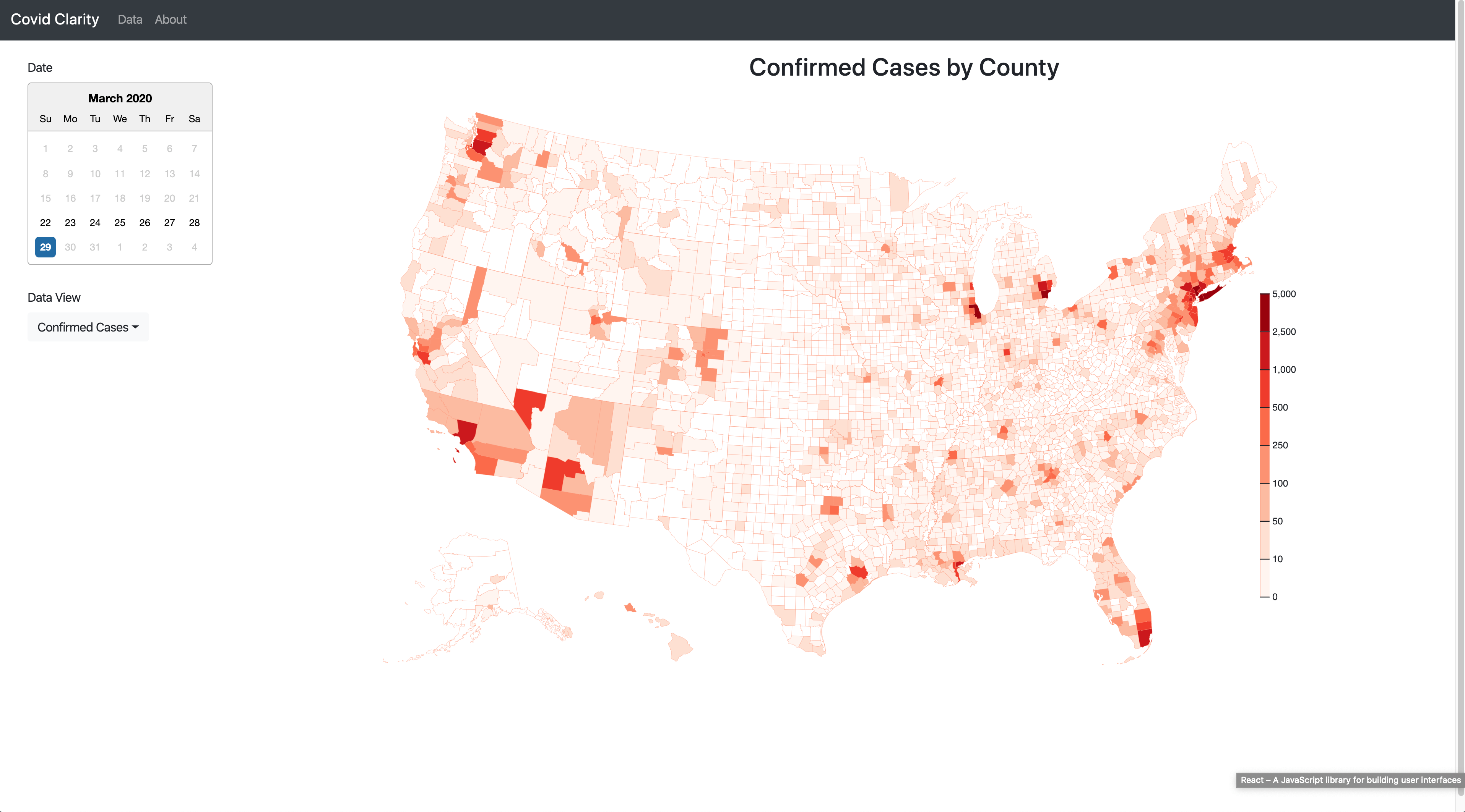
Infection data from today
-
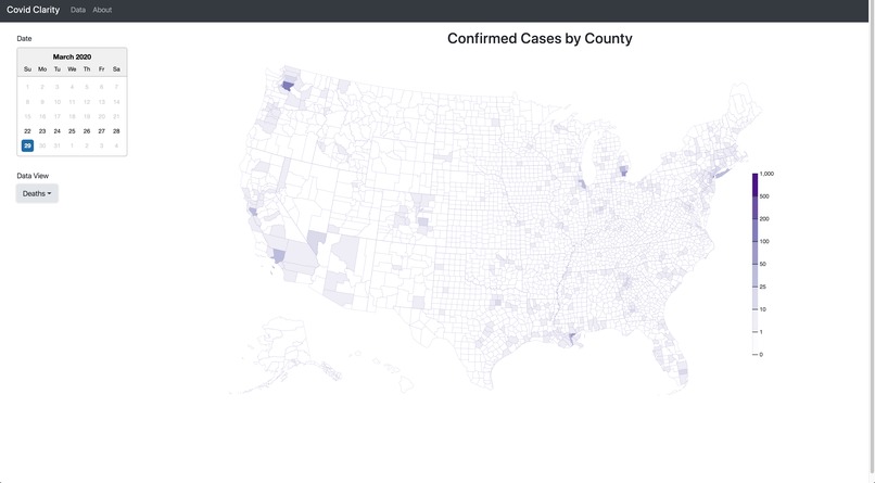
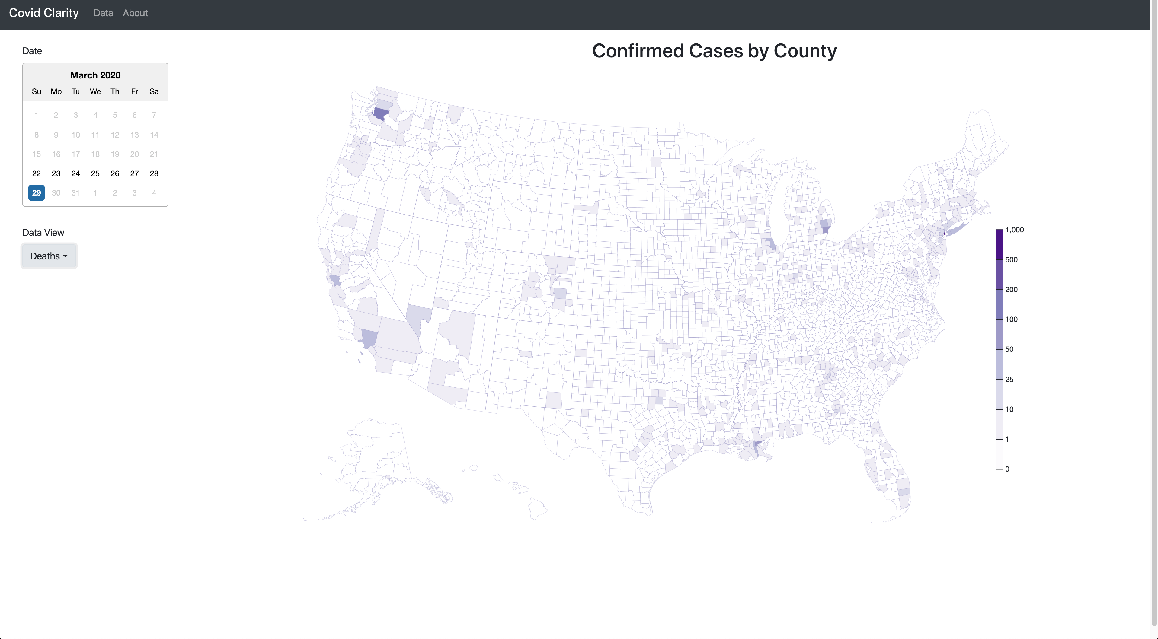
Deaths data from today
Inspiration
I wanted to create a way to see the spread of the virus based not only on current data, but historical data as well.
What it does
Allows you to see the infection and death rates in the US for any specific day that the data is available for.
How I built it
I built it with D3 and used a lot of example data provided by the creator of D3 Mike Bostock's example(https://bl.ocks.org/mbostock/5925375).
Challenges I ran into
D3 can be very complicated and working with even small details such as the legend can take a lot of time.
Accomplishments that I'm proud of
I'm really happy with how the chart turned out and the ability to change the day to see the corresponding data.
What I learned
I feel a lot more comfortable with D3, although I still have a lot to learn. I also learned quite a bit about Redux and thunks while creating this project.
What's next for Covid Clarity
I would like to make some more D3 charts to add to the visualization options of the site.


Log in or sign up for Devpost to join the conversation.