-
-

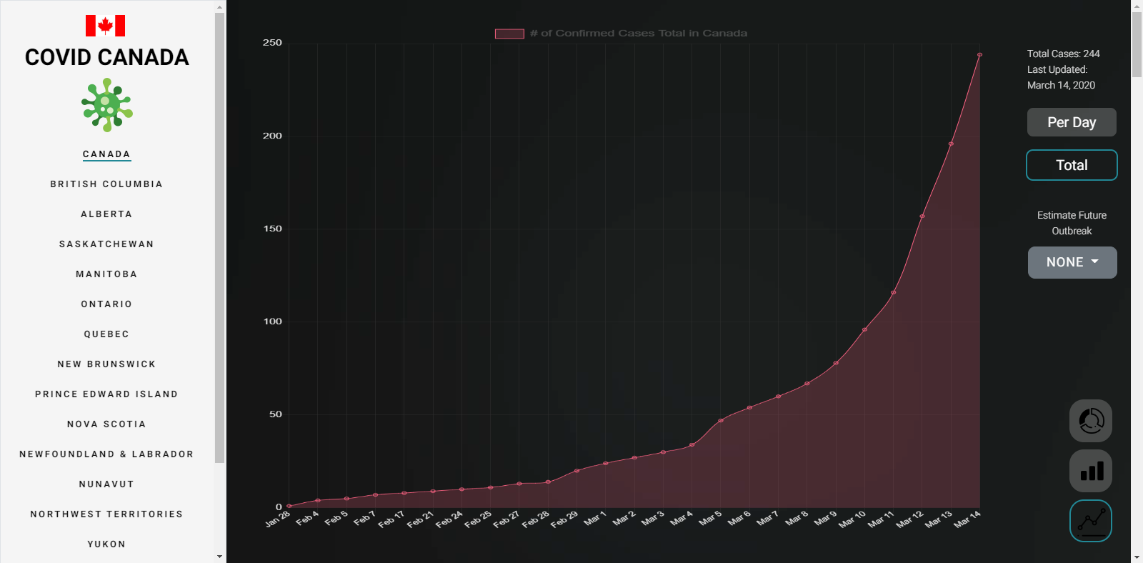
Graph of data
-
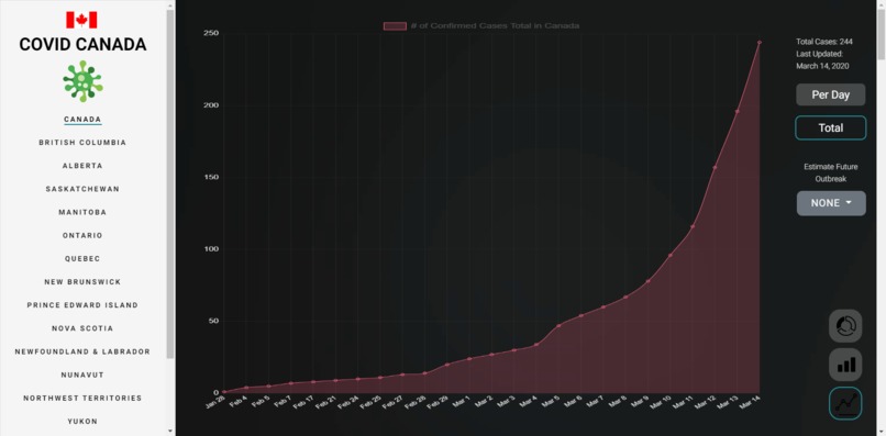
Graph of number of total cases
-

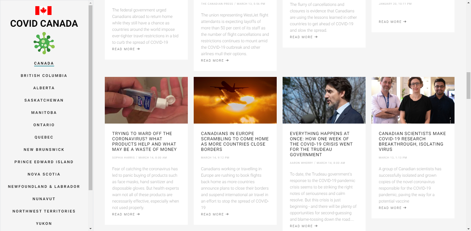
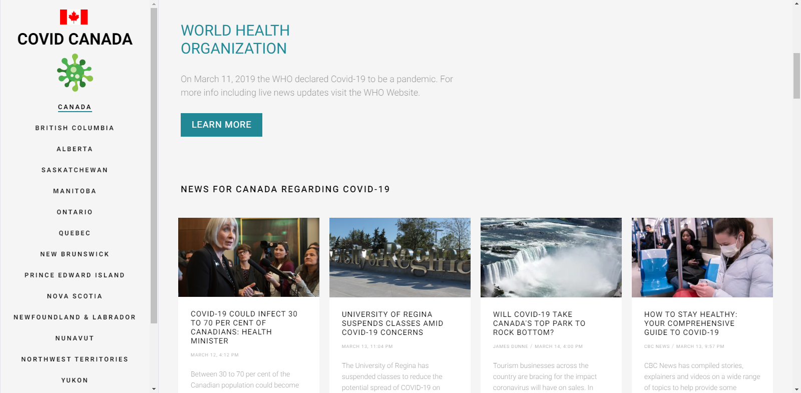
News feed
-

Information from WHO

Inspiration
A friend asked me if I could make a website similar to others made to track the global spread of the virus, but this website would be targeted specifically to Canadians. He wanted to know if I could use the data to predict the future growth of the virus, so I made a simple algorithm to predict future cases for each province and across the country of Canada.
What it does
The website has 2 primary functions. To track the growth of the virus per day, and provide relevant news information to Canadians by province.
How I built it
I started with bootstrap and jquery and focused first on making a graph to show the growth of the virus across Canada per each province. Data is taken from a Wikipedia article dedicated to reporting the daily stats of COVID-19 in Canada. link The next step was finding a way to extrapolate the data over time to estimate the growth of the virus in Canada over time. Although it's not a very accurate way of predicting virus spread I settled on linear regression using the R2 method for the increase in reported cases per day. I then used that information to determine the total number of cases over time. After that, I added a news feed for each province and pulled RSS news sources from Global, CBC, and CTV.
Challenges I ran into
One of the hardest parts of the projects was finding a way to get news RSS feeds on a static website. Since the project is hosted on Github pages, I was unable to use PHP to web scrape the URL for the RSS feed and CORS policy prevented the use of ajax and JS to pull the data. I ended up settling on a service provided by RSS2JSON link in order to convert the RSS data into a usable JSON object structure.
Accomplishments that I'm proud of
I am very happy with how fast I was able to produce the site. I was expecting a long drawn out project but it really only took a couple days to build and set everything up. I am happy with the overall professional type quality of the website.
What I learned
This is the first time I have ever used RSS to pull news sources, so that was certainly a fun new experience. It was also the first time I have ever pulled live data from a Wikipedia article and graphed it.
What's next for Covid Canada
Currently it still doesn't look great on mobile devices, and I am hoping to do more work to make a mobile friendly version of the website. It currently looks better on Desktop, however is still usable on mobile.


Log in or sign up for Devpost to join the conversation.