-
-

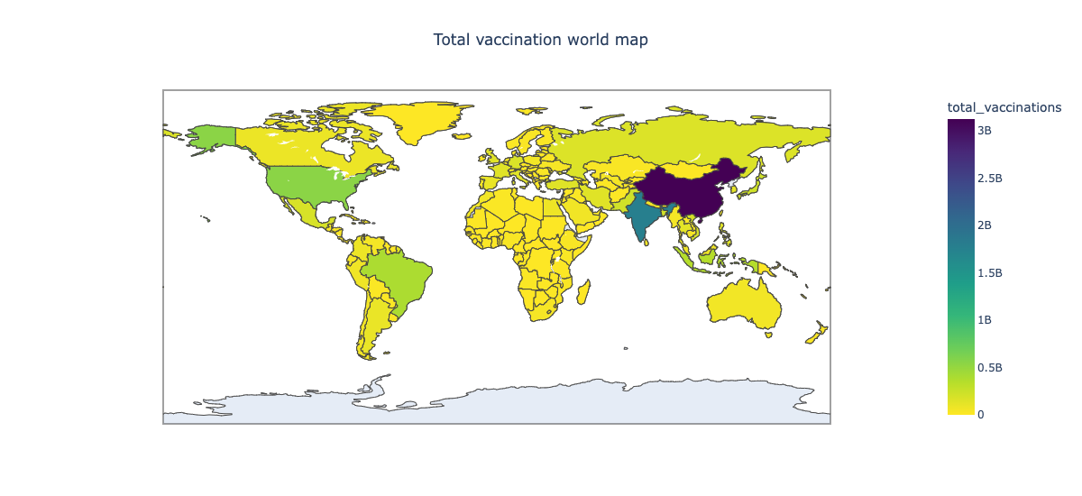
Total Vaccination world map
-

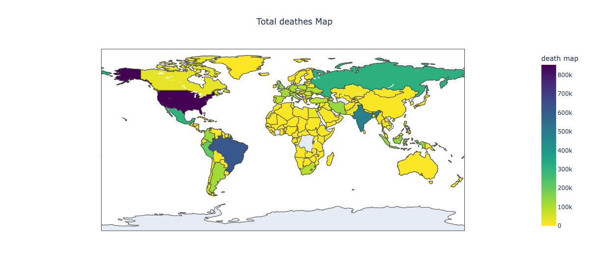
Total Deaths Map
-

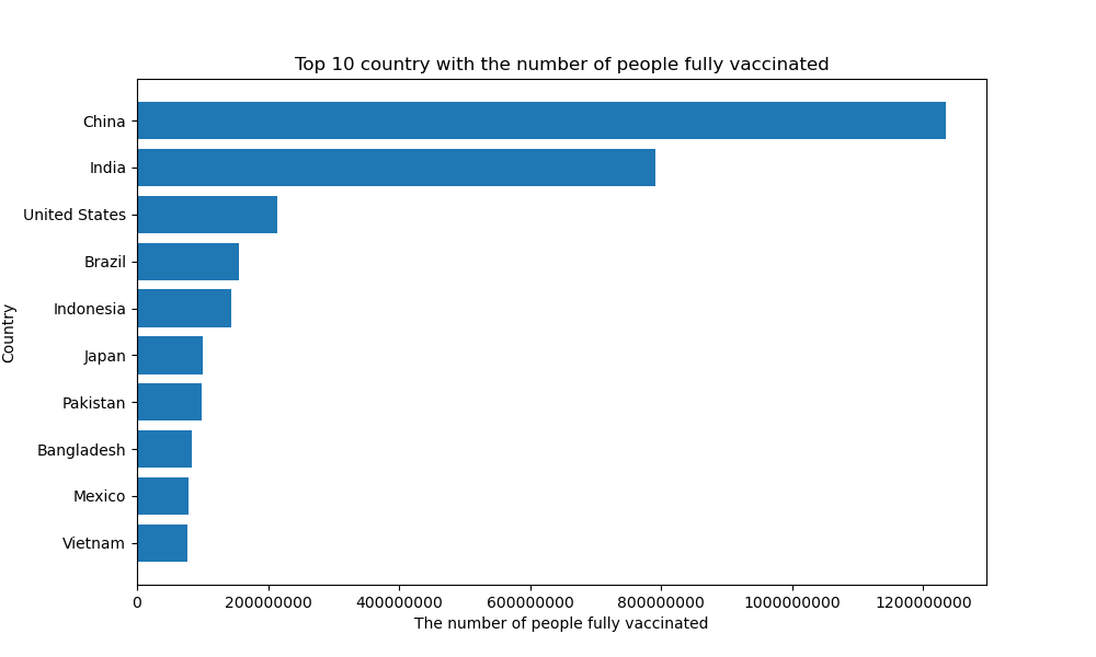
Top10_country_people_fully_vaccinated
-
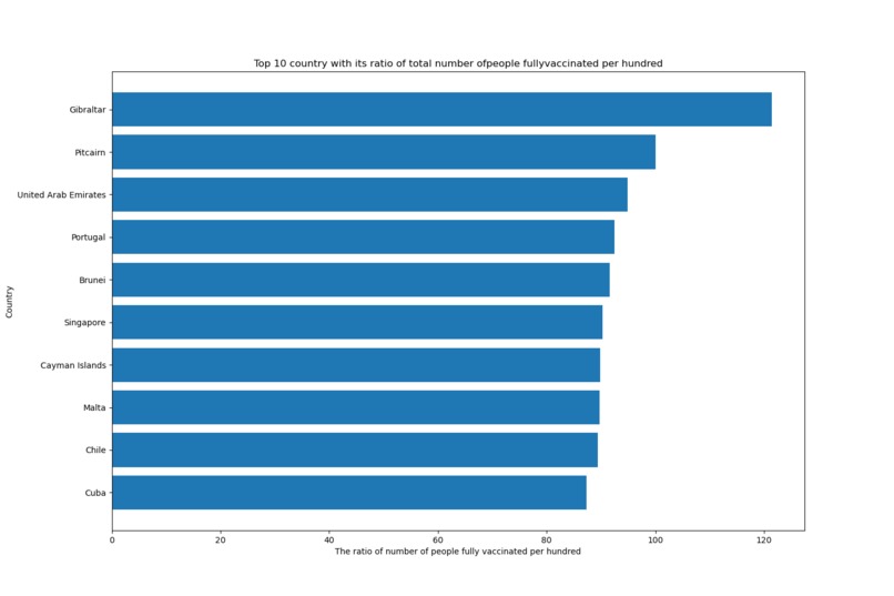
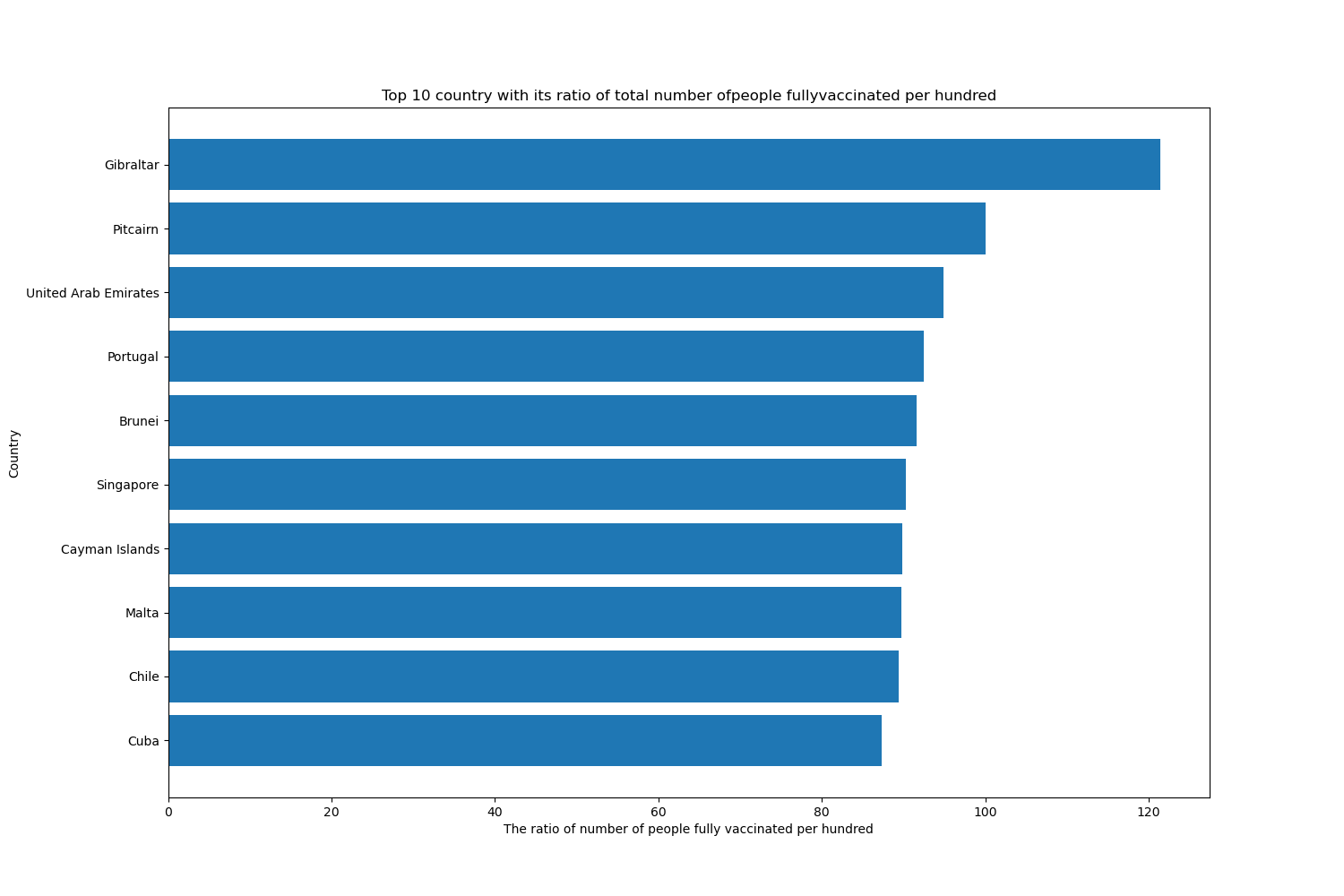
Top10_country_people_fully_vaccinated_per_hundred
-
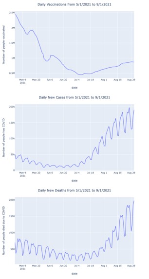
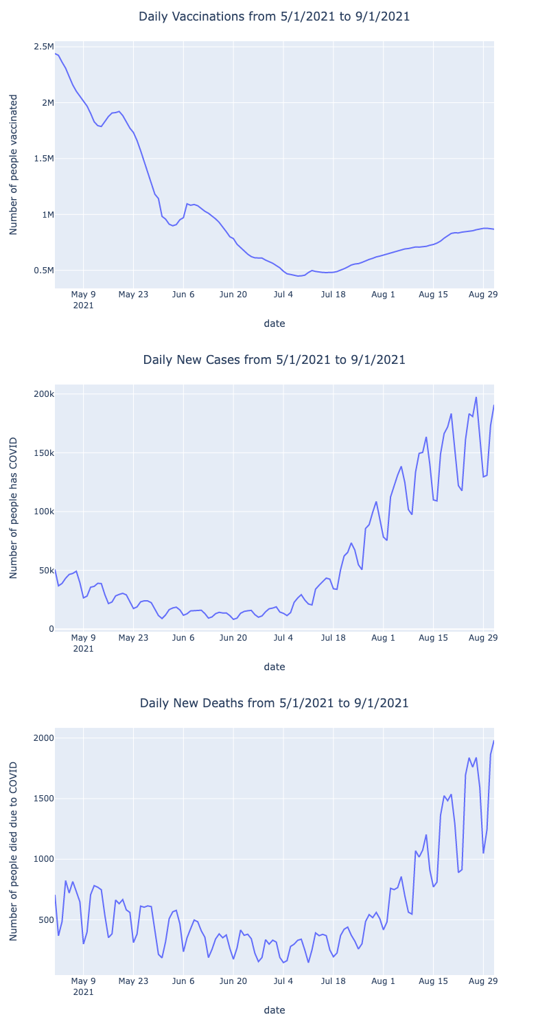
normal_vac_case_death
-

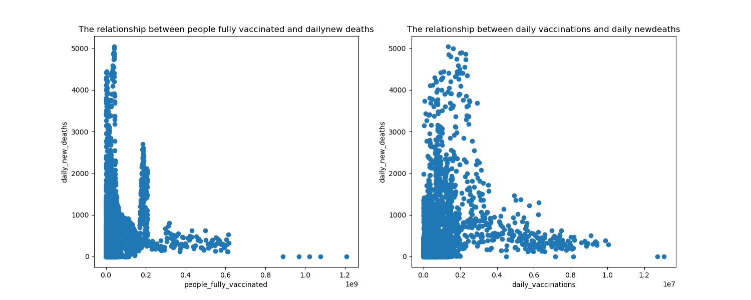
Relationship between death cases and vaccines
-
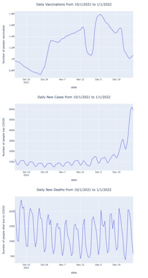
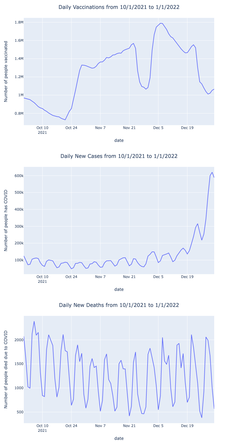
holiday_vac_case_death
-
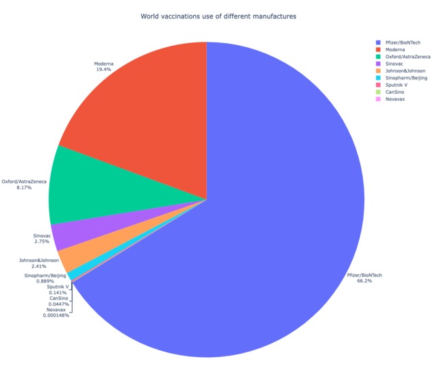
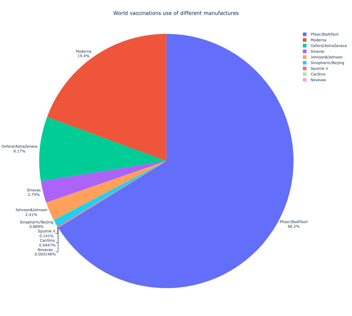
world_vaccination_pie
Inspiration💡
The COVID-19 pandemic has led to the dramatic loss of human life and presents unprecedented challenges. It is crucial and urgent to get vaccinated and make it universally accessible to ensure a safe condition for the general public. We want to find a general pattern about the distribution of total vaccination, usage of different brands of vaccination, different periods of time’s vaccination pattern through our analysis.
What it does
Aim to disclose the serious situation of the global pandemic and find the correlation between covid-19 related factors.
How we built it
We first merged the dataset and did the data processing to get rid of the unnecessary data, only keeping the essence. And then using the plotly library and matplotlib to construct the interactive graphs.
Challenges we ran into
As we want to import plotly into the notebook, it didn't work the first time, which takes lots of time to set up. Also as we merge the dataset, we have met multiple iso_code errors in plotting the Choropleth map.
Accomplishments that we're proud of
We have made multiple charts including choropleth, scatter plot, line chart, pie chart, which is interactive. Also, we are able to compute the r-square and p-value based on the graph we made to further back up for our analysis
What we learned
We enhance python skills in more advanced data analysis, also combine them with multiple apps such as Tableau, Git, to put the knowledge we have learned into practical use.
What's next for COVID-19 Vaccination, Cases, and Deaths Worldwide
In the future follow-up, we will combine the knowledge of machine learning to use other models such as exponential, logistic, etc. to further find the line of the best fit between the daily new deaths and daily vaccinations / people_fully vaccinated.


Log in or sign up for Devpost to join the conversation.