-
-
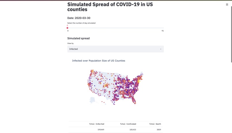
A screenshot of the app

Inspiration
I wanted to see how fast COVID-19 is going to have an impact on my county
What it does
It simulates the spread of COVID-19 based on SIR model. The web app displays the interactive graphs for the simulated results.
How I built it
Using selenium and beautiful-soup, I scrapped COVID-19 data from the web. Companied with us county population and commute flow data from the US census, I built an SIR model to simulate the spread. After producing a fit model, I record the simulation data and built a streamlit app that displays interactive charts to give people an insight into the future.
Challenges I ran into
The data parsed from the web is very dirty, I had to spend a lot to time cleaning it.
Accomplishments that I'm proud of
The web app looks great and the chart works well
What I learned
Streamlit is a great module for building interactive data visualization apps in python
What's next for COVID-19 US County Simulation
Using machine learning models to fit the data. I am currently thinking about graph neural network. If you have any idea or want to contribute => https://github.com/MarkintoshZ/covid19-us-spread <=


Log in or sign up for Devpost to join the conversation.