-
-
dashboard
Inspiration
There are many covid19 tracking tools out there. But most of them look pretty flashy with colorful maps, fancy charts, and what not, with information scattered all over the places. Some tools take time to figure out what they are doing.
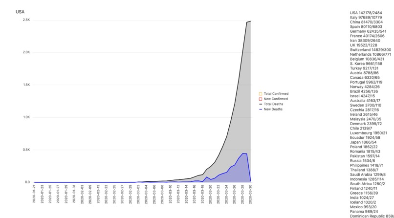
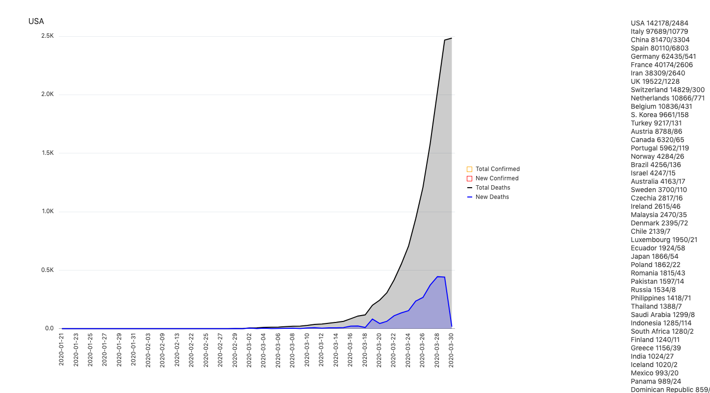
However, I just want a simple and clean way to be able to easily and quickly see the 4 important curves that matter the most right away (total confirmed, new confirmed, total deaths, new deaths) and I want to be able to switch back and forth between countries to see those 4 curves. And most importantly, I want all information on the same page, fetched from a real data store.
What it does
- It can show the curve of total confirmed, total deaths, new confirmed, new death all in one chart, and the data is pulled from John Hopkins data store.
- Clicking on the country name can switch to a different chart particular to that country, with animation added.
- The series can be removed or added and the chart will be adjusted accordingly with rescale.
- Hover over the chart and you will see the detail of each data point
- The country list is ranked based on the total confirmed cases in descending order.
Accomplishments that I'm proud of
I like the fact that I can easily and quickly switch to different countries, and see the 4 most important curves right away.
What's next for covid-19 "curvy" dashboard
Planning to integrate it with webhooks so that I can get real-time data updates.


Log in or sign up for Devpost to join the conversation.