-
-
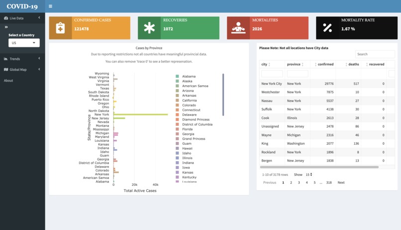
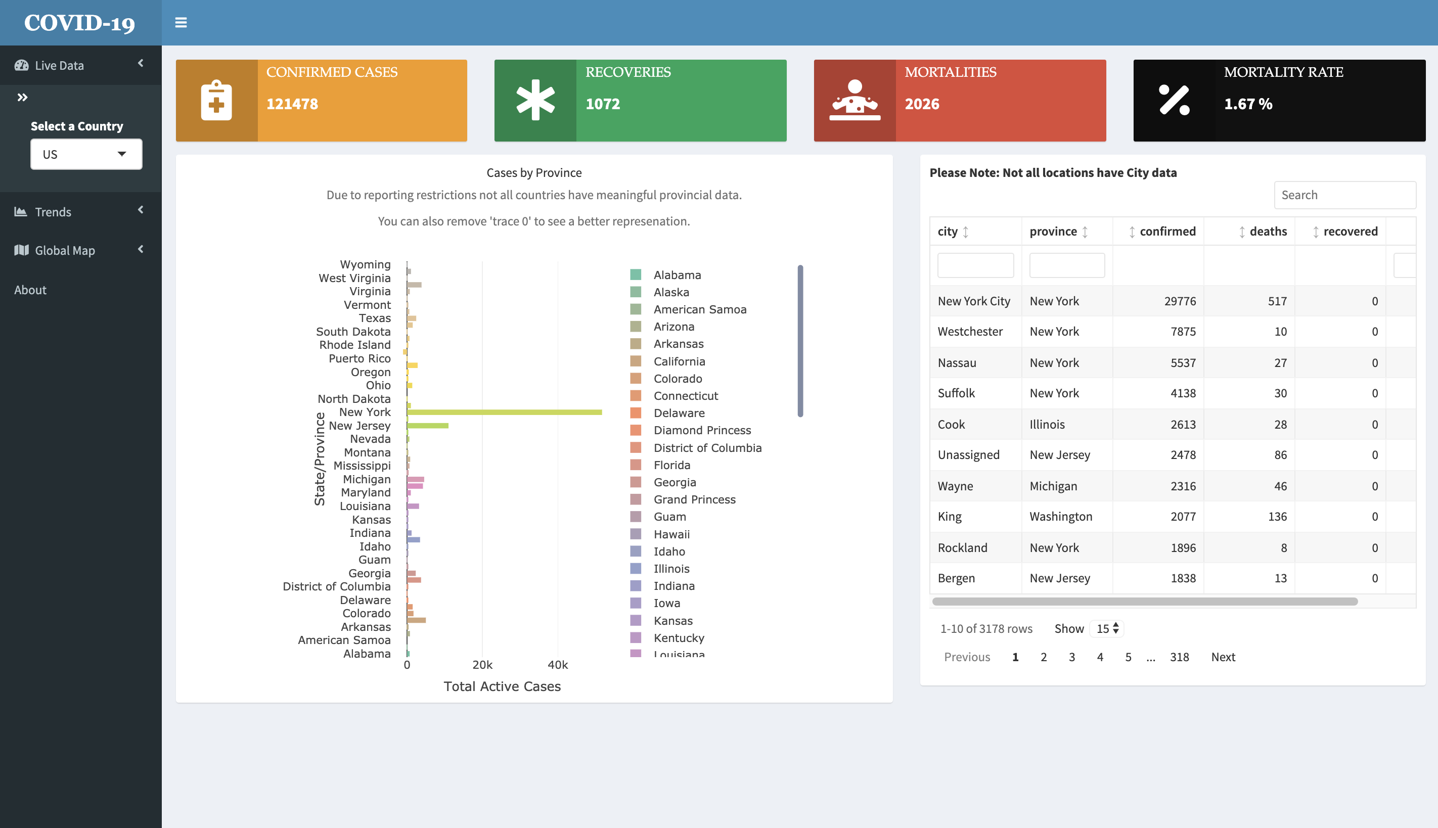
Live Barplots (with reporting restrictions)
-
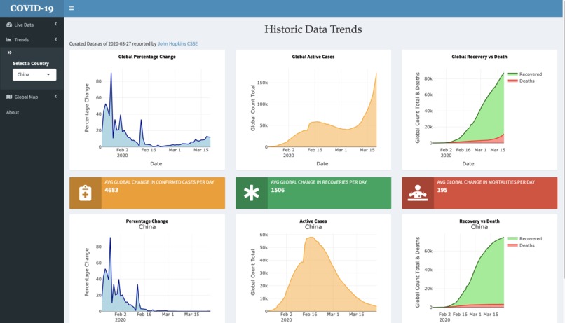
Historical Trends (Global vs Country, line plots)
-
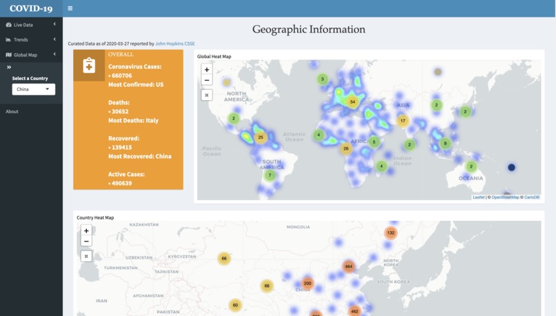
Heat Map Page (Global vs Country, historical plots and Live Counts)


Link to app: https://chrton.shinyapps.io/COVID-19DashBoard/
Inspiration
How to better understand the magnitude of the growing numbers, convey findings in an illustrative manner and spread awareness.
What it does
Visualizes the number of active cases per country, per city (barplot,lineplot, heatmap). The user can also select or filter which countries they are interested at looking at and scroll along the plots to see the statistics.
How I built it
Using Rstudio, we embedded R code into ShinyDashboard framework, implementing customizations and user functions with HTML/CSS.
Challenges I ran into
Find accurate, up-to-date data and presenting them properly, fact-checking interpretations at every step. The wrong analysis in this atmosphere can lead to very frightening findings. Data sources did not exactly provide up-to-date, live data and accuracy for the numbers presented was dependent on reporting frequencies for the API source/Kaggle.
Accomplishments that I'm proud of
Strong collaboration, work-ethic, time management, application of classroom knowledge and skills.
What I learned
The multitude of the numbers growing exponentially, importance of precise and accurate presentation, UI/UX aspects.
What's next for COVID-19 Tracker
With more data, how we could forecast/project numbers, find the peak and when it starts to plateau. These will provide hints or clues for the coming days, weeks and advise stakeholders on how to best prepare for the coming worst.


Log in or sign up for Devpost to join the conversation.