-
-
See change since yesterday globally or for selected country
-
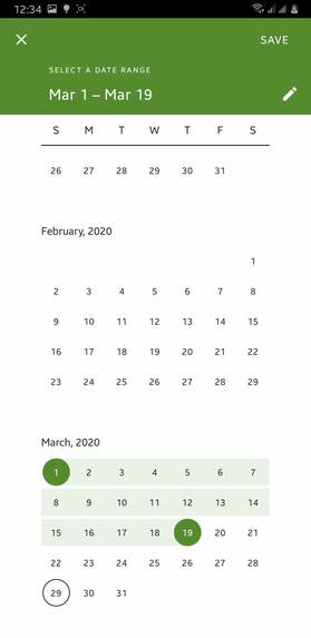
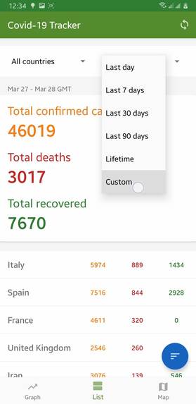
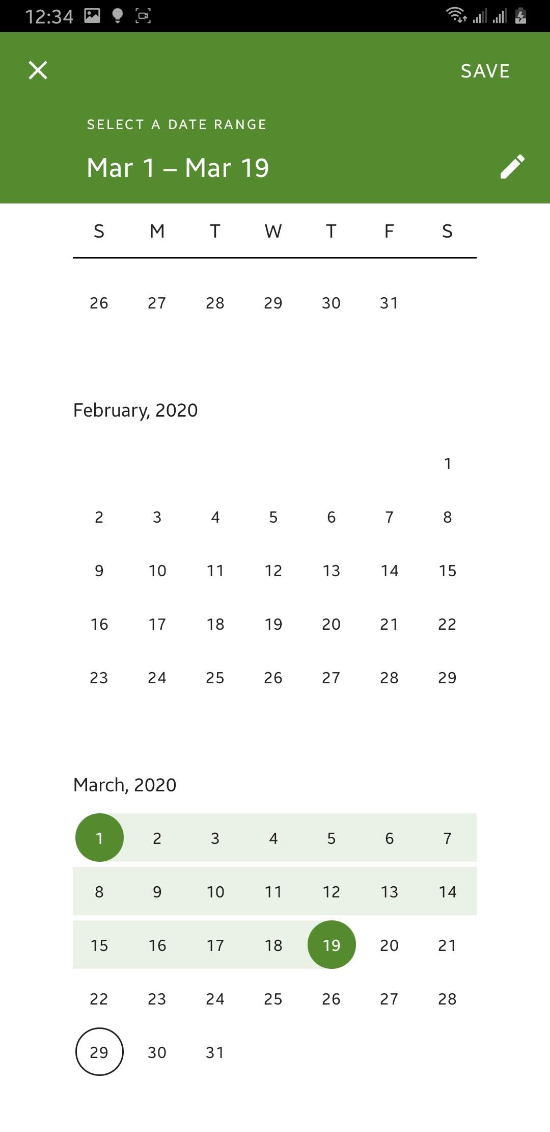
Select custom range to see changes in that period of tiime [1]
-
See what changes were there in the cases from date 7 days before till latest reported date
-
Country-wise covid-19 cases change in graph
-

Global covid-19 cases change in graph
-
Select custom range to see changes in that period of tiime [1]
-
Total covid-19 cases till current date
-
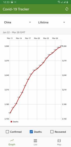
The descending of curve from exponential path represent how China is improvisinig
-
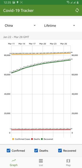
Graph showing china had prevented many death cases increasing everyday. Big different in recovered and deaths can be seen.
-

Visualize covid-19 cases in graph

Inspiration
I wanted to build an app that could show Covid-19 reports in the best form so that much information can be grabbed with simple data. I found a few sites that showed the data in a graph, map, and numeric values. It was a great source of inspiration that pushed me to build an android app by adding tons of useful features extracted from simple data.
What it does
I have added three tabs that do a job separately from each other and have a different purpose.
Tabs/Pages:-
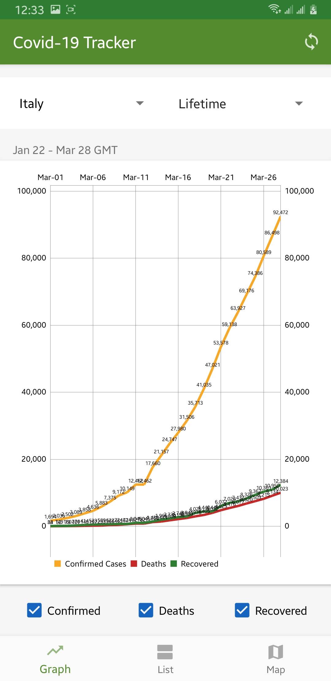
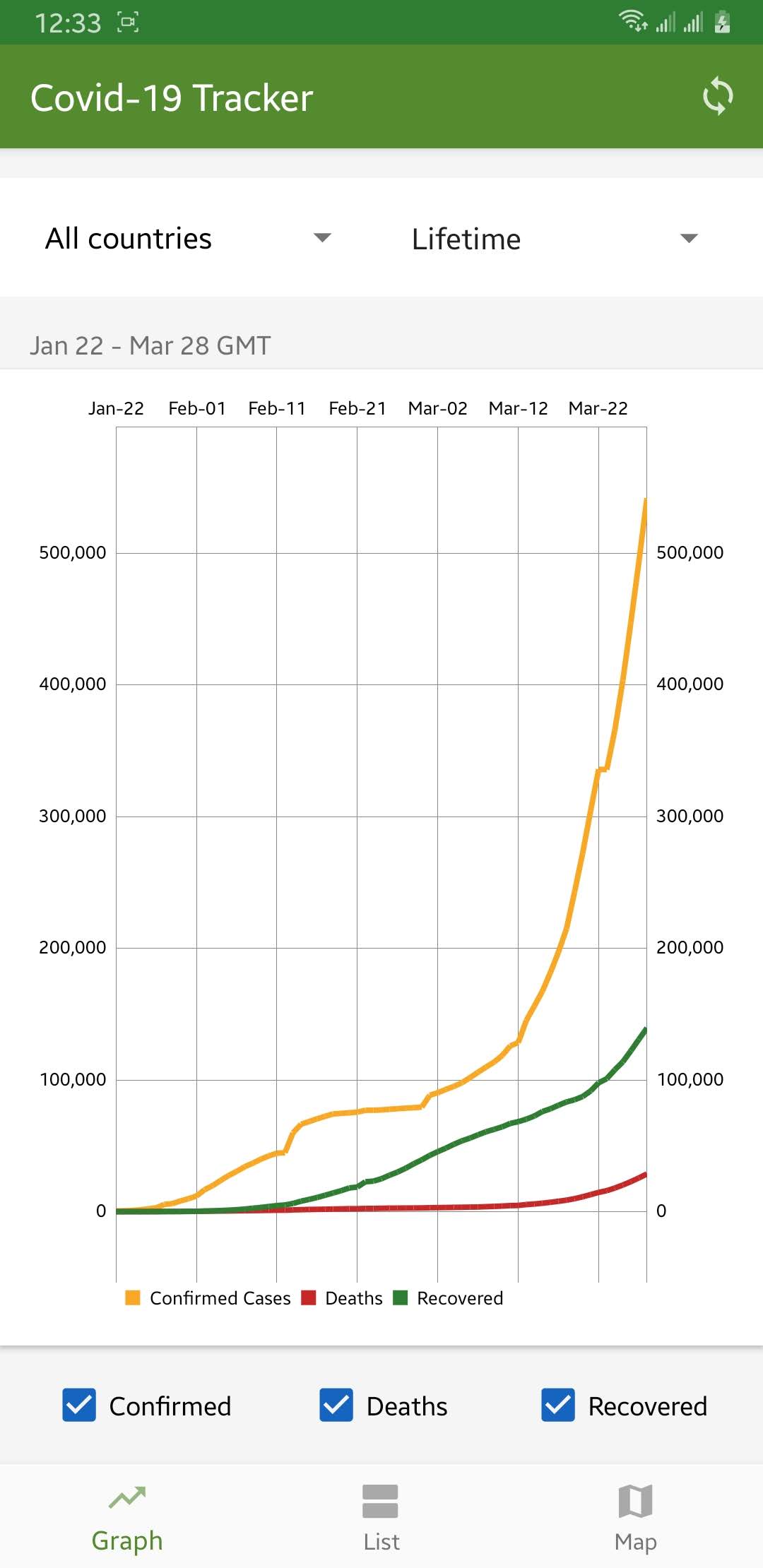
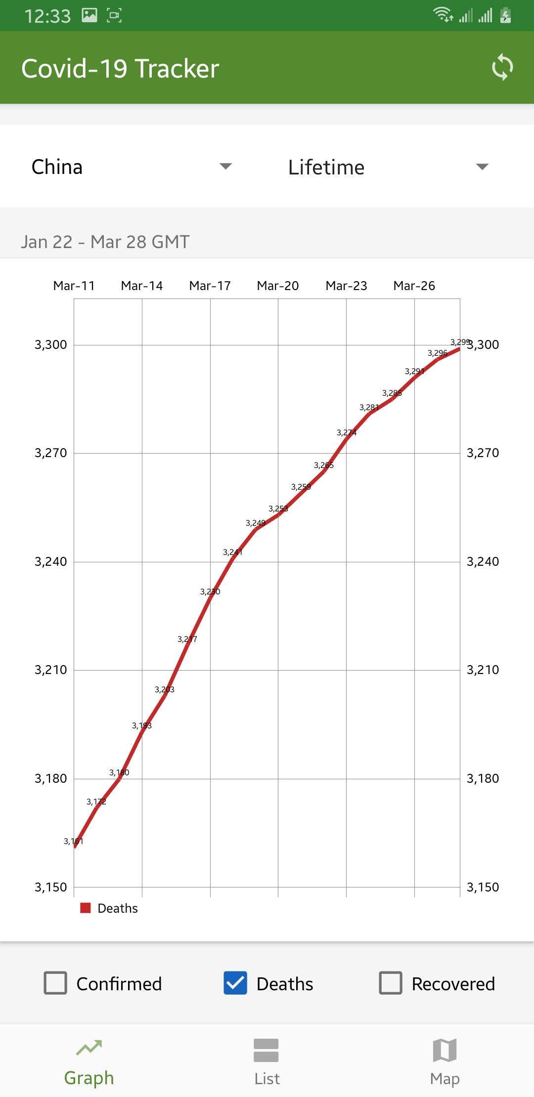
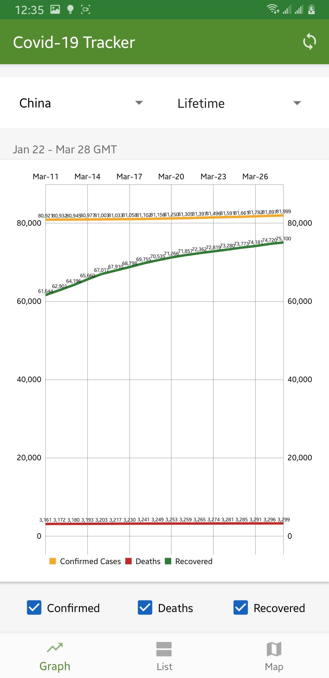
1. Graph
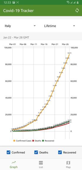
- It is a line chart showing cases including confirmed, deaths and recovered cases changing over time in a single graph.
- Users can also select a particular country as well as a custom range of dates.
Screenshot [1]: Data for all countries in lifetime

Screenshot [2]: Data for selected country "Italy"

Screenshot [3]: Data for selected country "China" shows a drastic decrease in the number of deaths when compared to recovered cases those who were infected.

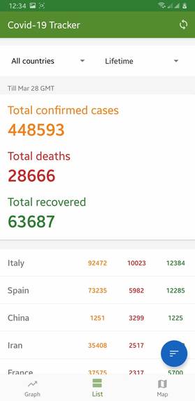
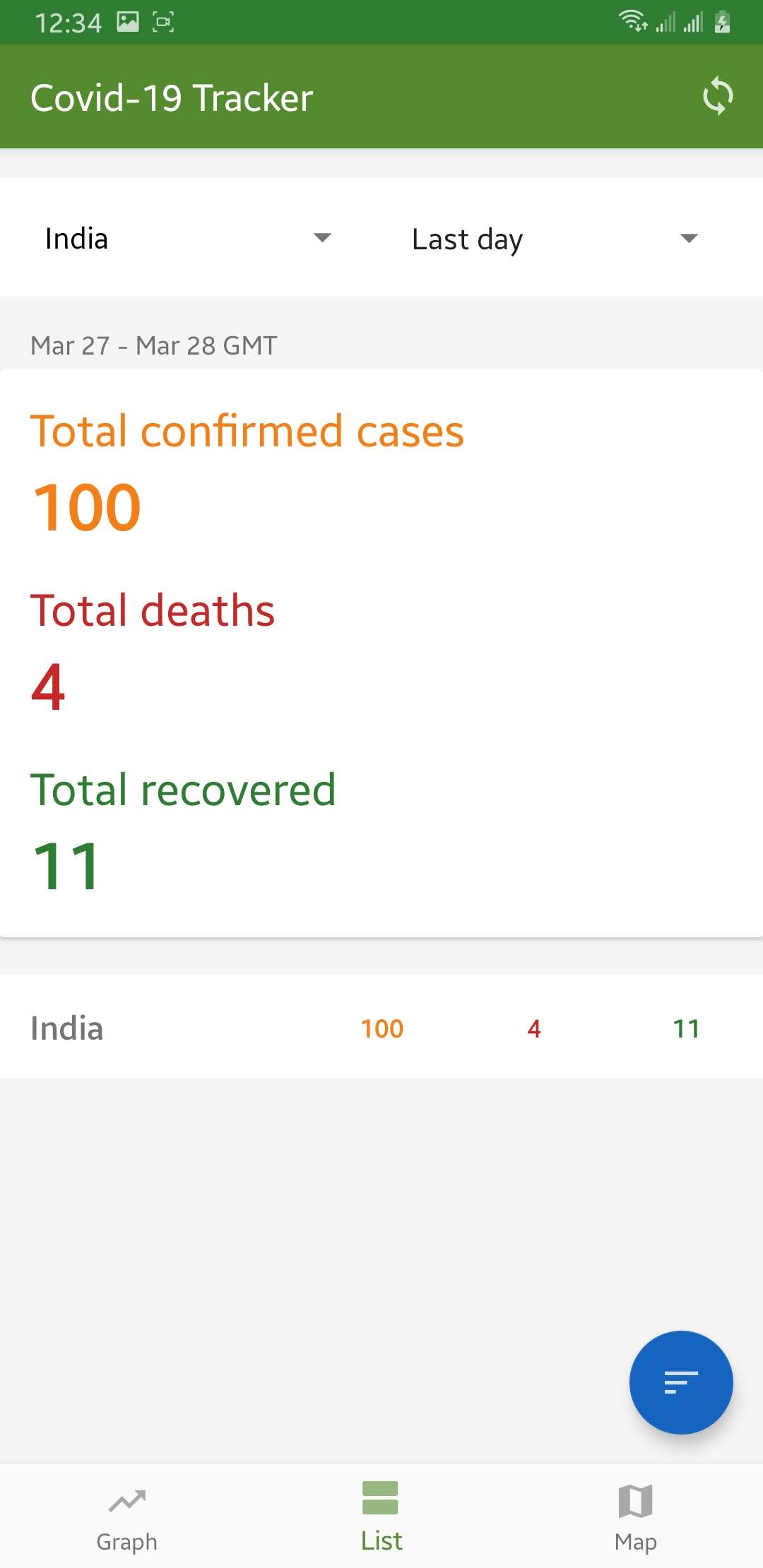
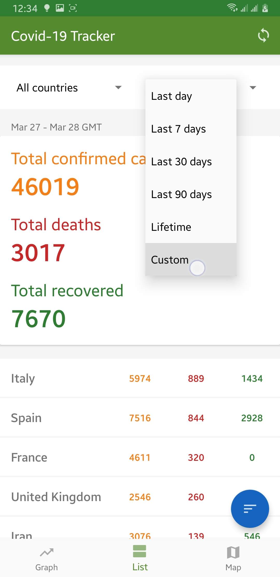
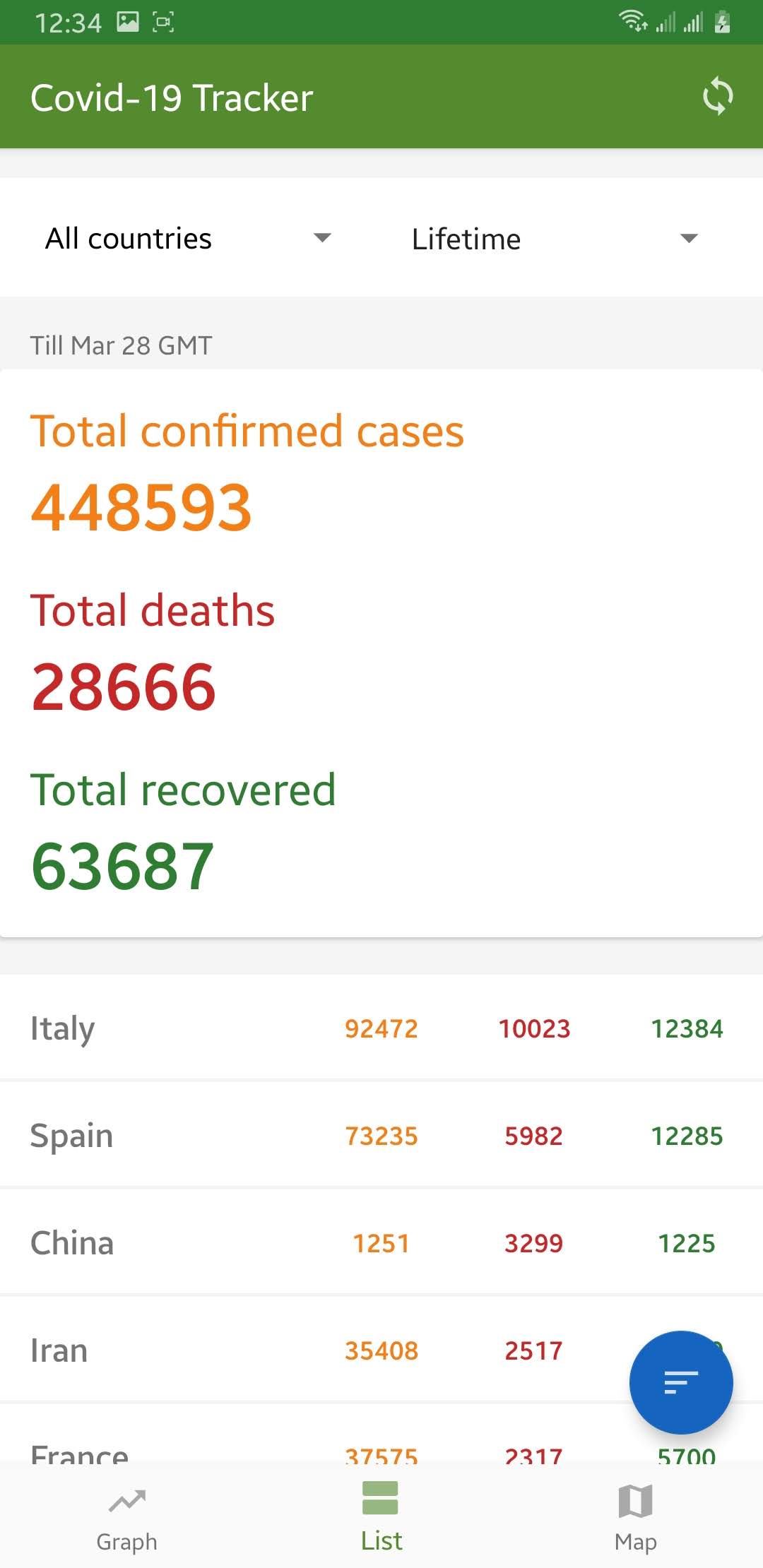
2. Numeric data
- This tab shows total cases in the entire globe, in every country individually as well as in an individual state/province of a country.
- Users can also select a particular country to view it's every state/province reported cases.
- By default, this tab shows changes since the previous day but can be custom.
- Users can also sort the data by total confirmed cases, deaths and recovered cases or by title.
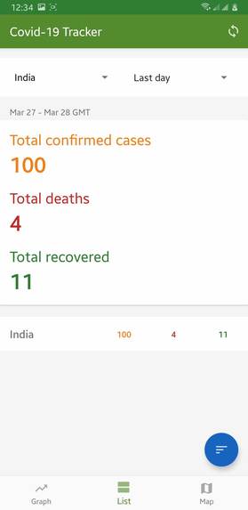
Screenshot [1]: Showing total cases globally till today.

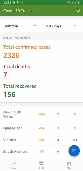
Screenshot [2]: Showing data for the selected country "Australia" till today from date 7 days before.

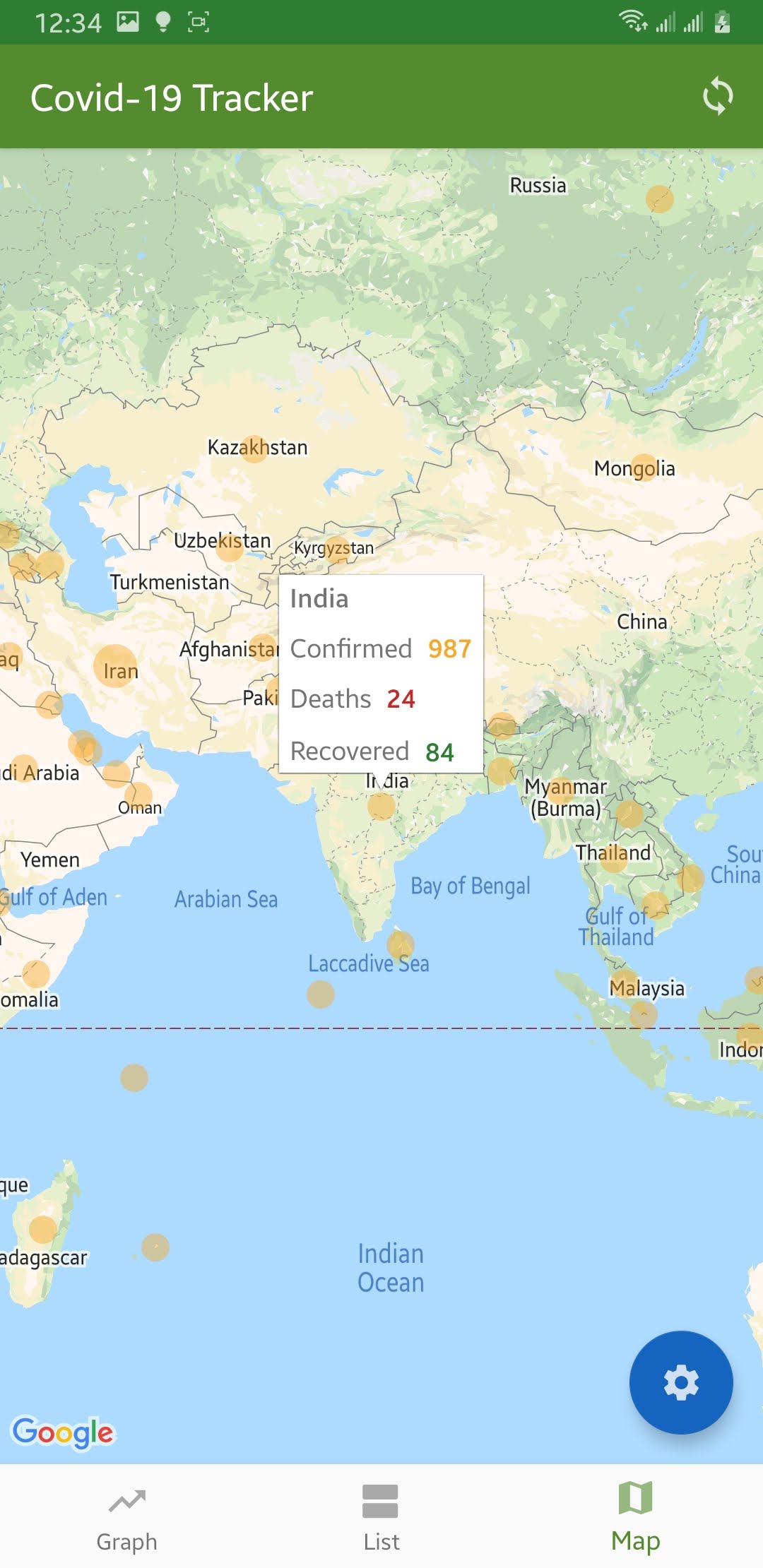
3. Map
- The big circle in the map shows the area with more number of cases. The map type can be chosen any of confirmed, deaths and recovered cases.
- User can see cases in a map in any chosen date (defaults to the latest reported date)
- Screenshot[1]: Showing confirmed cases map.

Network-Local Synchronization
- The app minimizes the network request by saving data into the local database.
- Data for a particular date is only fetched once by the app then loads locally.
- When an app is first launched it asks network for the latest report date and then fetches data for that date. This ensures the latest data is loaded when the app is launched.
- Since data persists locally, this app can be run in the absence of the internet.
How I built it
1. Pre-development
- Researched on the availability of the data.
Found that https://github.com/CSSEGISandData/COVID-19 publishes data every day from the sources below:-
- World Health Organization (WHO): https://www.who.int/
- DXY.cn. Pneumonia. 2020. http://3g.dxy.cn/newh5/view/pneumonia.
- BNO News: https://bnonews.com/index.php/2020/02/the-latest-coronavirus-cases/
- National Health Commission of the People’s Republic of China (NHC): http://www.nhc.gov.cn/xcs/yqtb/list_gzbd.shtml
- China CDC (CCDC): http://weekly.chinacdc.cn/news/TrackingtheEpidemic.htm
- Hong Kong Department of Health: https://www.chp.gov.hk/en/features/102465.html
- Macau Government: https://www.ssm.gov.mo/portal/
- Taiwan CDC: https://sites.google.com/cdc.gov.tw/2019ncov/taiwan?authuser=0
- US CDC: https://www.cdc.gov/coronavirus/2019-ncov/index.html
- Government of Canada: https://www.canada.ca/en/public-health/services/diseases/coronavirus.html
- Australia Government Department of Health: https://www.health.gov.au/news/coronavirus-update-at-a-glance
- European Centre for Disease Prevention and Control (ECDC): https://www.ecdc.europa.eu/en/geographical-distribution-2019-ncov-cases
- Ministry of Health Singapore (MOH): https://www.moh.gov.sg/covid-19
- Italy Ministry of Health: http://www.salute.gov.it/nuovocoronavirus
- 1Point3Arces: https://coronavirus.1point3acres.com/en
- WorldoMeters: https://www.worldometers.info/coronavirus/
- Pre-computed and transformed data into a compatible form so that all data from beginning till today have a uniform data structure.
- Hosted pre-computed-transformed data and made accessible to the android app via API.
2. Android app development
- Followed the MVVM architecture to build the app.
- Used the Room library as an abstraction layer for the local database and Volley for a network request.
3. Business Logic
3.1. Synchronization
- As soon as the app is launched, the latest reported date is fetched from the server.
- Upon success, data for that date is searched locally and if not found is fetched from the server.
- Upon error, it loaded the latest reported date from the local and loads data locally.
- When a user requests data for some date while in the app, local search is done and when not found tries to get it from the server.
3.2. Graph
- The dates are mapped to the x-axis of a graph and numeric values of cases (confirmed, deaths and recovered) are plotted in the y-axis.
- The graph is adjusted such that the entire data fits in a single graph without leaving any padding.
3.3. Listing numeric values
- The total number of confirmed cases, deaths, and recovered cases are calculated by SQL query by passing arguments such as country name and the selected date.
- The sorting is however after the data is fetched from the database to avoid a lot of database transactions.
3.4. Map
- The data are simply plotted into the map with their latitude and longitude data.
- The sizes of the circle are mapped to specific lower and upper bounds with the given number in each confirmed, deaths and recovered cases.
Challenges I ran into
1. Making older data compatible.
- I found that older data from January had no latitude and longitude in a country which would be impossible to plot in the graph.
- I used Python to put latitude and longitude in those data with the help of the latest data.
2. Making newer data compatible
- Data sources are unreliable some of the time because of unstructured data although data are correct. I found out that from March the newer data had few more columns in their data which were not useful for the app at the moment. I had to truncate the data and make it compatible with reference.
3. Synchronization
- Synchronization was really a challenge I spent a lot of time on. As I had to make components loosely couple but had to access the same repository it became difficult to maintain minimum data transactions. With proper use of MVVM architecture, this problem was solved and data fetch was faster.
Accomplishments that I'm proud of
I am really happy to see the accomplishment that I planned for. It went the same way as I thought.
1. Material design
- I am inspired by google apps and they encourage us to use material design for apps. I took a reference to their apps design and accomplishment the same.
2. Synchronization
- I have never done such robust synchronization before. It worked as I expected. Data was only fetched when need from the server and other times it loaded from local database making it work offline without any issue.
3. Intuitive graphical representation
4. Working of an app on numerous devices without any issue.
5. App download size
- The app download size is around 3 MB. This was accomplished by using material design, use of minimum resources and code optimization.
What I learned
Inside app:
- Synchronization of data between a server and a local database.
- Ability to show data in graph and maps
- Material design paradigm
- Updating data automatically every day.
- Fallback method for non-guaranteed sources.
Outside app:
- Working on a project according to the situation and needs of the world.
- Working with high intensity with less time frame.
What's next for Covid-19 Tracker Android app
- In-app notification for new reports globally and nearby.
- App widget updating as soon as new data arrives.
- Logarithmic graph for visualization of the the country who has a good number of dropping deaths and confirmed cases while in increasing of recovered from an infection.
- Comparison between countries in the same graph.
- Creating web apps and PWA apps.
Built With
- android
- android-studio
- butterknife
- google-maps
- java
- mpandroidchart
- mvvm


Log in or sign up for Devpost to join the conversation.