-
-
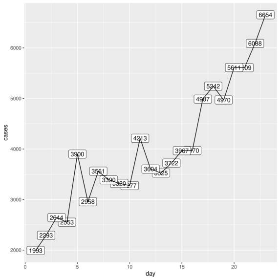
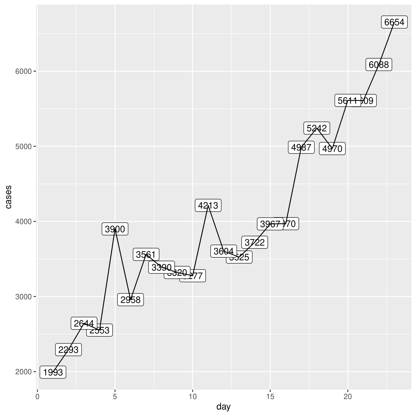
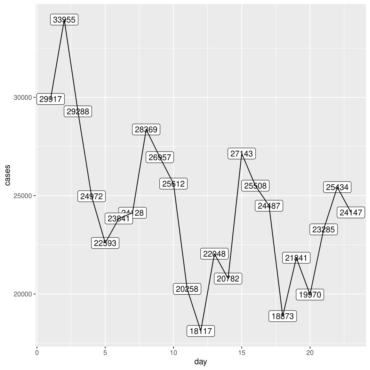
India Cases Last Month
-
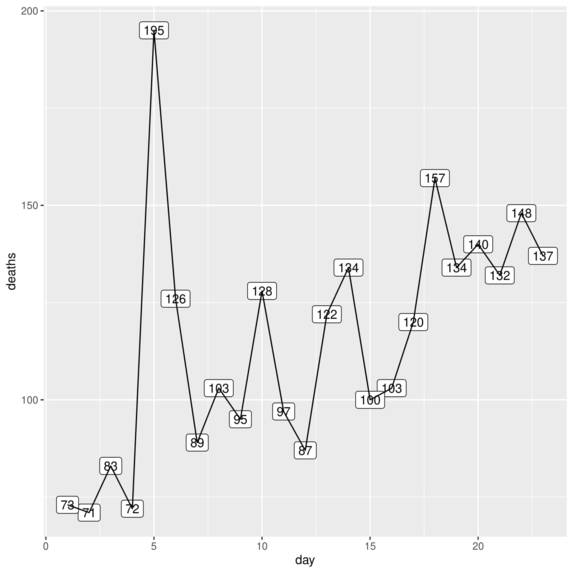
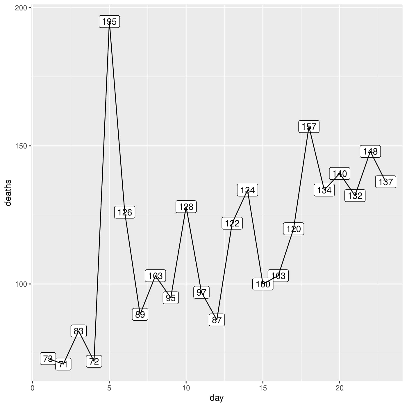
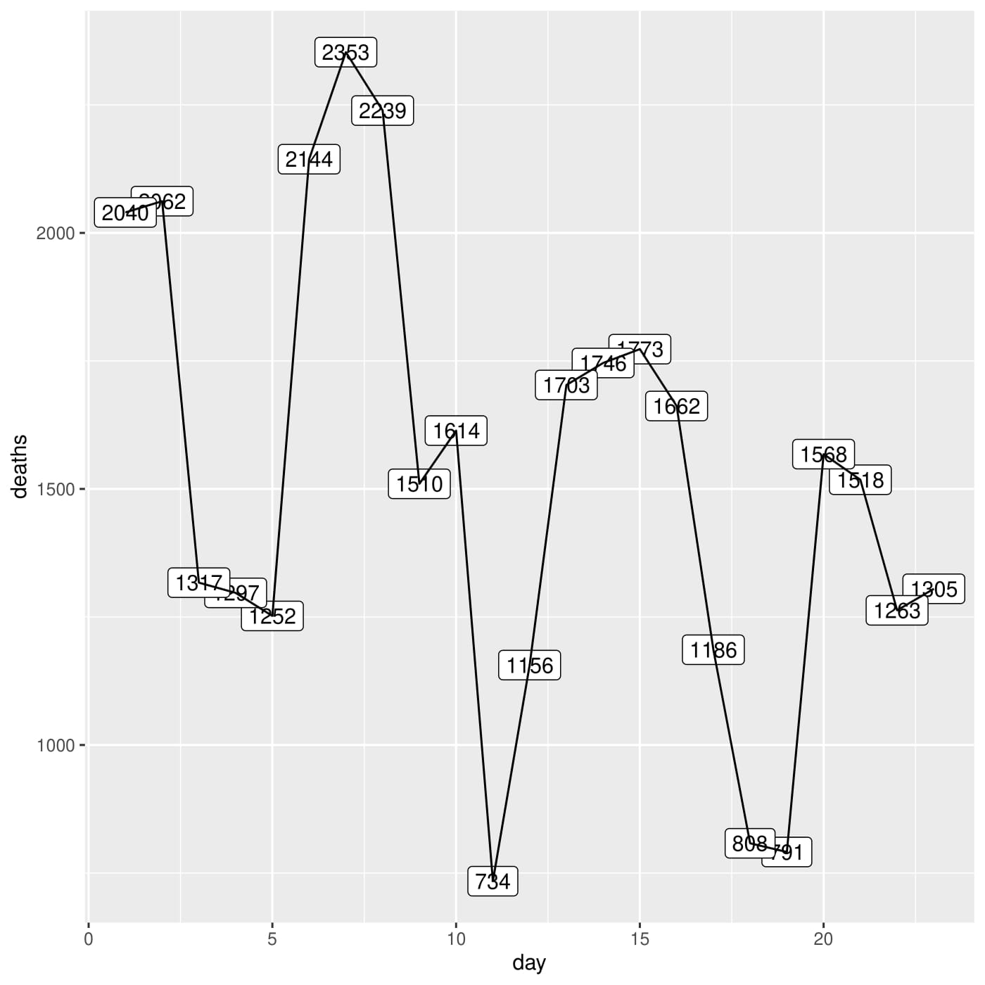
India Deaths Last Month
-
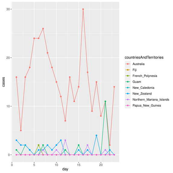
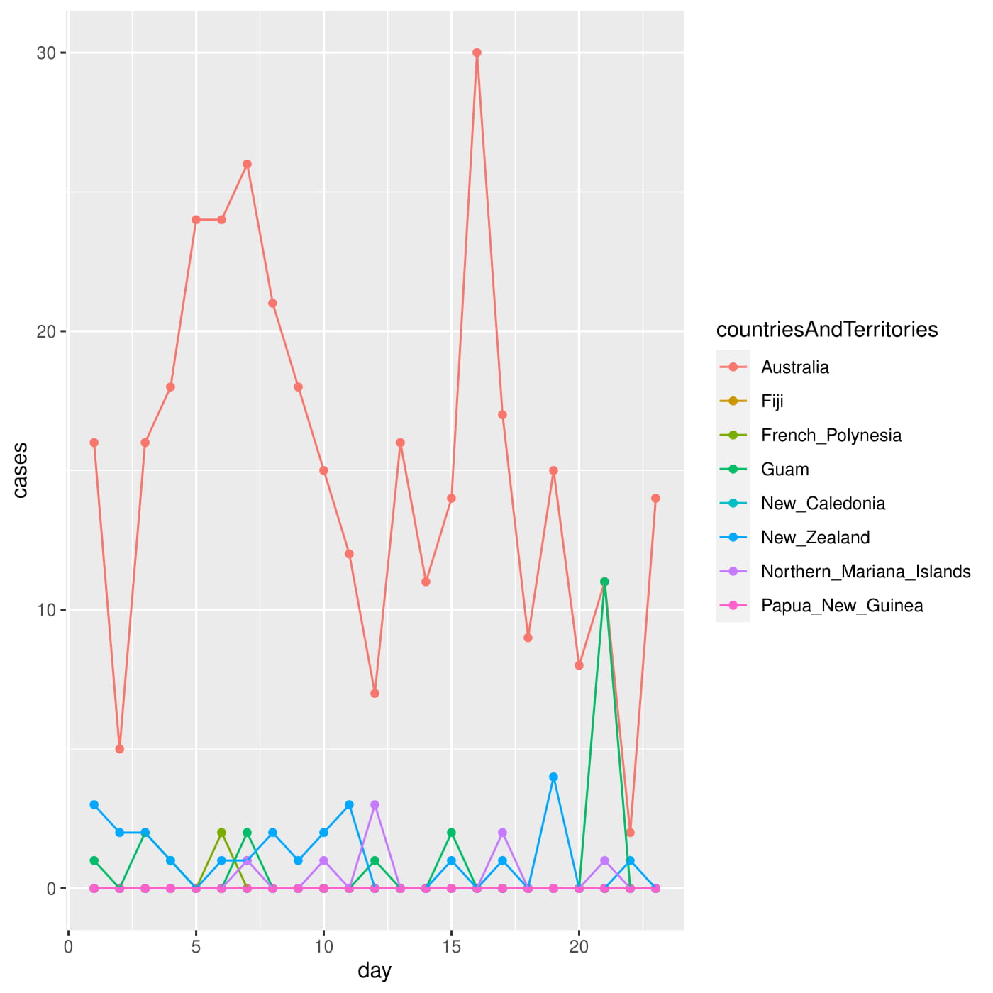
Cases Oceania by Country Last Month
-
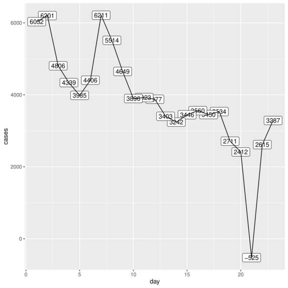
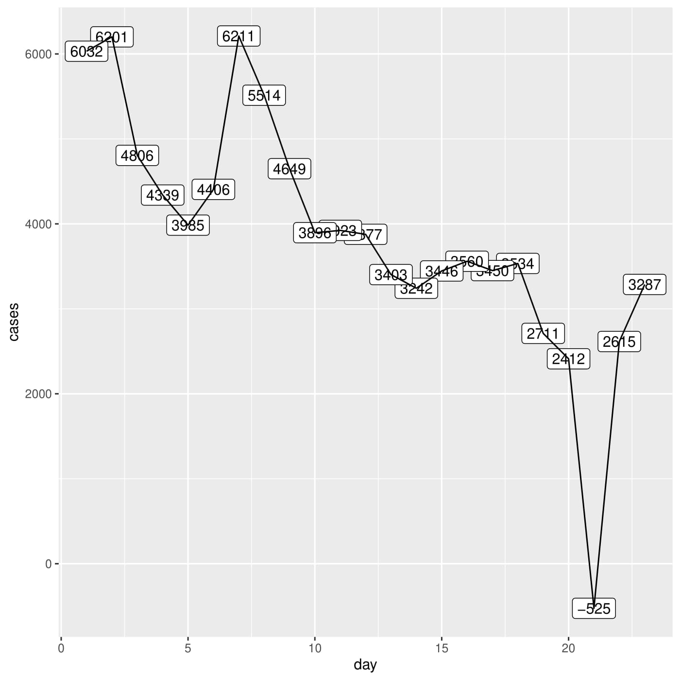
UK Cases Last Month
-
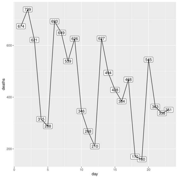
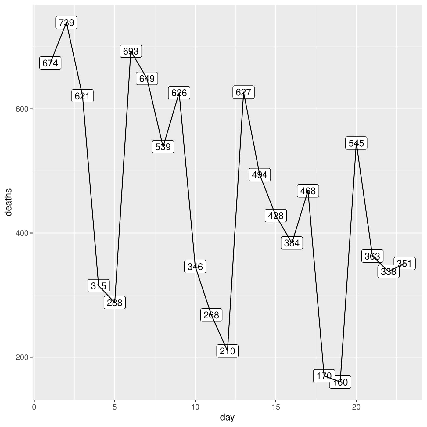
UK Deaths Last Month
-
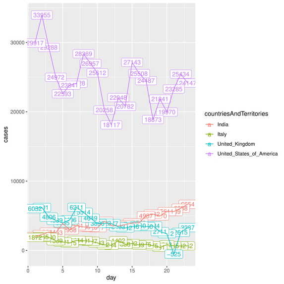
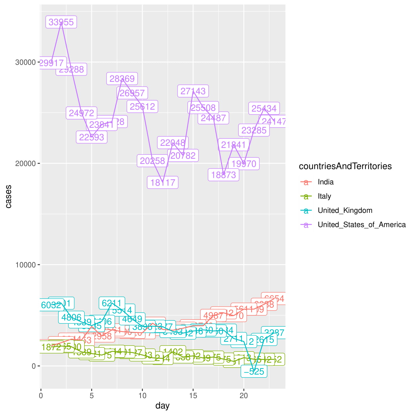
US, UK, India and Italy Cases Last Month
-
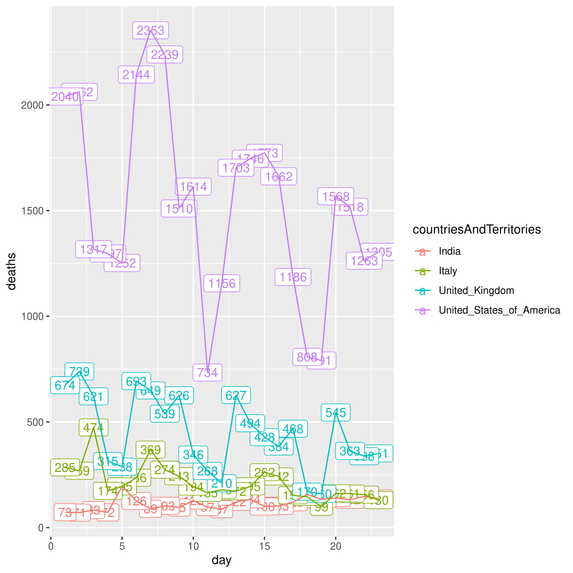
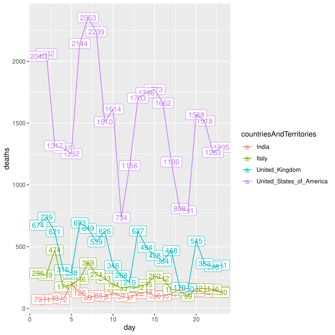
US, UK, India, Italy Deaths Last Month
-
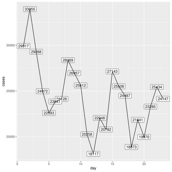
US Cases Last Month
-
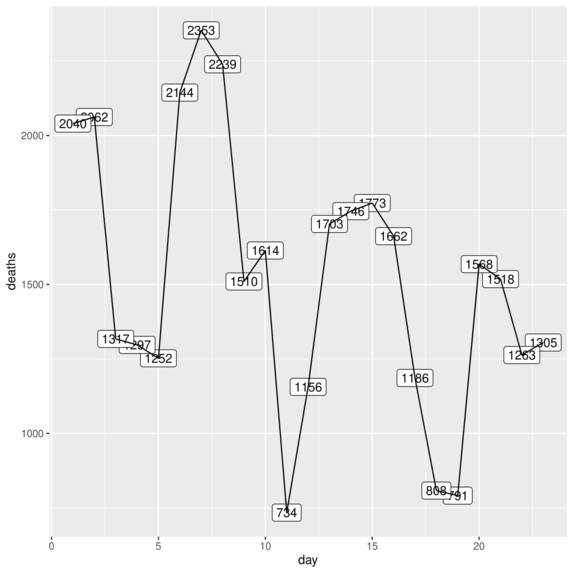
US Deaths Last Month
Inspiration
I was inspired for this project because of the lack of education on COVID-19. Sometimes, people overestimate or underestimate certain countries' measures/data which is why I wanted to change their perceptions through plots/graphs and other data.
What it does
My program downloads the latest available data off of the EU Open Data site, stores it in an object 'data' and then performs operations such as plotting graphs of cases/deaths for different countries/continents exported as pdfs and Top 10 COVID-19 cases/deaths rates exported in as Excel Spreadsheets.
How I built it
I built my program using the R programming language.
Challenges I ran into
I ran into a lot of challenges as some syntax was beyond my capabilities which is why I received a lot of errors, but I fixed them all through the built-in R documentation which helped me see what arguments I could use for all my functions.
What I learned
I learned a lot mainly about the capabilities of the libraries I used. For example, I grew much more comfortable using pipelines in dplyr to write code succinctly.
What's next for COVID-19.R
With the same data set but with more complex operations, I believe I may be able to plot more complex graphs, wrangle data more efficiently and through this, educate the general public about COVID-19 effectively.
Built With
- dplyr
- ggplot2
- r
- rcurl
- readr
- writexl


Log in or sign up for Devpost to join the conversation.