-

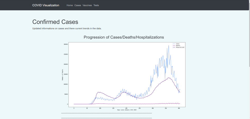
Cases,Deaths, and Hospitializations Data
-

Vaccination Data
-

Covid-19 Relief Fund Links
-

Vaccination Data


Inspiration
In the news, there's a lot of statistics and numbers about the Covid-19 pandemic. In terms of cases, we see a lot of data visualizations but not much in terms of vaccines and vaccine distribution. Therefore, we aimed to help other people understand the vaccination progress and the current state of the Covid-19 pandemic all in one website.
What it does
This website has graphs about vaccine distributions, vaccines left to get to herd immunity, Covid-19 positive test rates, and daily cases, deaths, and hospitalizations over time. It also includes interactive maps that show the percent of the population vaccinated, as well as the number of cases in each state. It also has links to donate to Covid-19 relief funds.
How we built it
Our graphs were made from Python using csv files taken from the Covid Tracking Project. We used Python with folium and data from the CDC website to create our interactive maps and converted them to HTML. The website was built using bootstrap code that we modified to display our maps and charts.
Challenges we ran into
We struggled with finding good, clean data that we could use for the charts and graphs. We also tried to make a Covid-19 cases by county interactive map but we could not figure out how to use the Geojson file that the data was within.
Accomplishments that we're proud of
Being able to finish most of the website and create interesting visualizations of data that we encounter often in our current lives.
What we learned
New ways to code and create information accessible.
What's next for Covid-19 Data Visualization Website
Adding counties cases maps and more accessible visualizations.

Log in or sign up for Devpost to join the conversation.