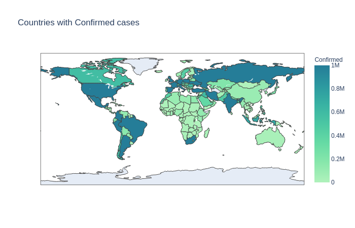
Covid-19 Data Visualisation Find the top 20 countries with the maximum number of confirmed cases Generated bar plots Plot the data on the world map using Plotly This project uses Covid-19 public dataset Built With numpypandaplotlypython Try it out github.com
Updates Manish Kumar Barnwal started this project — Jan 13, 2021 12:30 AM EST Leave feedback in the comments! Log in or sign up for Devpost to join the conversation.
Manish Kumar Barnwal started this project — Jan 13, 2021 12:30 AM EST Leave feedback in the comments! Log in or sign up for Devpost to join the conversation.


Log in or sign up for Devpost to join the conversation.