-
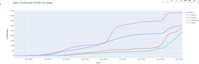
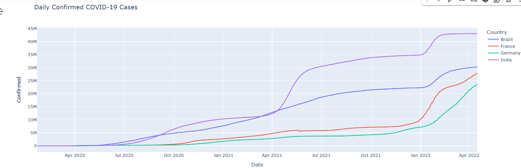
COVID-19 cases over time (Line Chart)
-

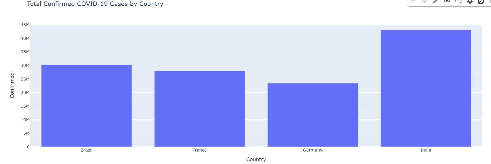
Country-wise comparison of COVID-19 cases (Bar Chart)
-
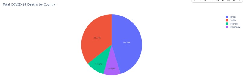
Distribution of total cases vs deaths (Pie Chart)

Inspiration
the global impact of COVID-19 inspired me to analyze real-world data and visualize it in an interactive way. I wanted to make data easier to understand through visual storytelling.
What it does
This project is an interactive COVID-19 Dashboard built with Plotly and Dash. It visualizes confirmed cases, deaths, and recoveries using line, bar, and pie charts. The app allows users to explore trends over time and compare data between countries.
How I built it
- Used a live COVID-19 dataset from GitHub.
- Cleaned and analyzed data using Pandas.
- Created visualizations using Plotly.
- Built the interactive web dashboard using Dash.
- Deployed the app on Plotly Cloud.
Challenges I ran into
- Learning how to connect Dash with Plotly Cloud for deployment.
- Managing dataset formatting and compatibility.
- Keeping the app interactive and visually clear.
Accomplishments that I'm proud of
- Built and deployed my first fully interactive data dashboard.
- Learned Plotly, Dash, and data visualization concepts.
- Created a meaningful project from real-world data.
What I learned
- How to build dashboards with Plotly Dash.
- How to visualize large datasets effectively.
- How to deploy an interactive web app.
What's next for COVID-19 Dashboard with Plotly
- Add filters for countries and timelines.
- Include vaccination and testing data.
- Add AI predictions for future trends.


Log in or sign up for Devpost to join the conversation.