Inspiration
The inspiration started from our simple wondering: why can’t every country have the same level of access to the data we need? Why is it so difficult to get our regional data of COVID-19 infection? We wanted to help people to know the exact information in their region and their loved ones so that they can feel safe and know what is going on. As the situation gets serious in Europe and the whole globe, the most important thing is to get the exact data. That is why we came up with this idea of our application: COVID-19 Dashboard.
What it does
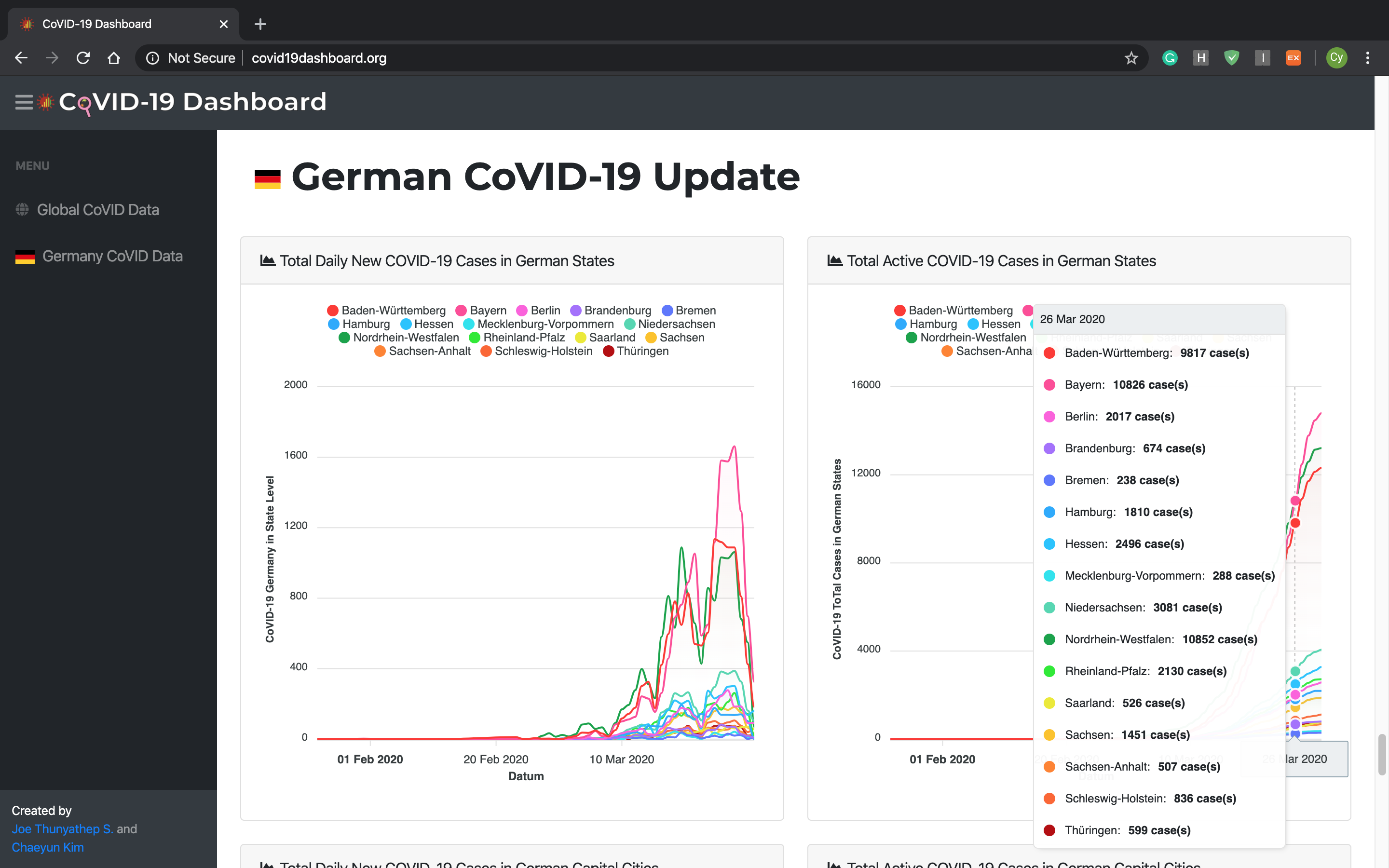
Visualizing the COVID-19 data in as a Chart. Update every 24 hours The chart informs people of the valuable trend of the COVID-19 situation better than only the latest updated value. Collection of trustworthy data source in one place as a dashboard. To help the German and other citizens, understand the trend of COVID-19 better. I started with the data in German cities as I am now studying in Stuttgart, Germany. To help people understand the daily trend of COVID-19 what is going on in their own regions.
How I built it
Challenges I ran into
Server data was deleted, we fixed it.
Accomplishments that I'm proud of
What I learned
This project is showcased and awarded on the HFT Stuttgart website, OGC resource page, and won an online hackathon challenge.
What's next for COVID-19 Dashboard
Adding more countries.

Log in or sign up for Devpost to join the conversation.