-
-

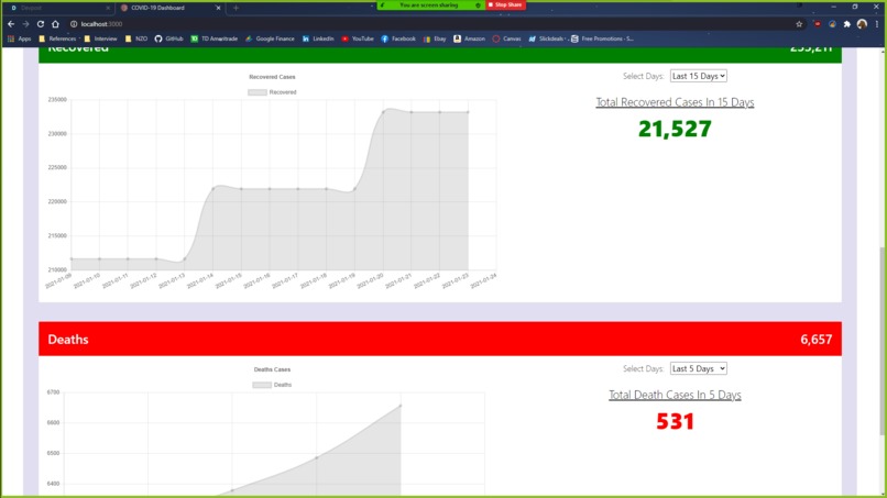
Covid-19 Dashboard Image 1
-
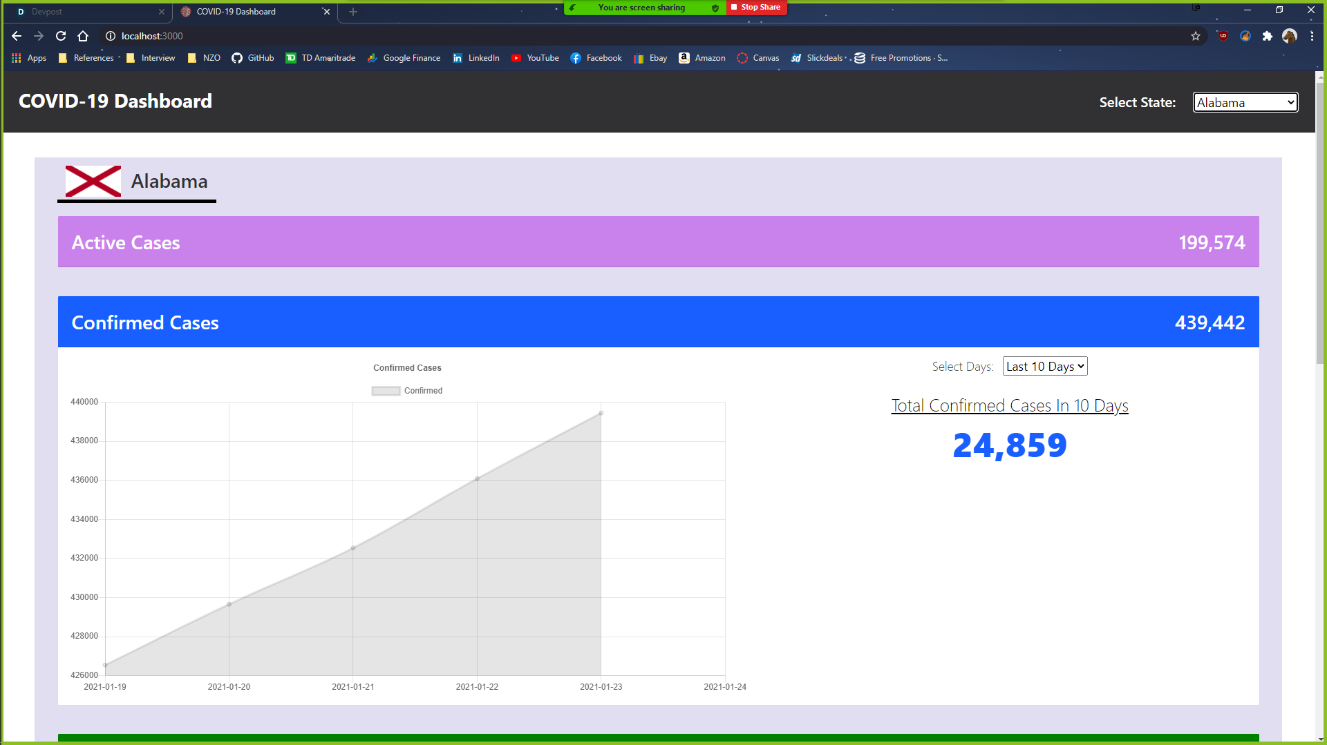
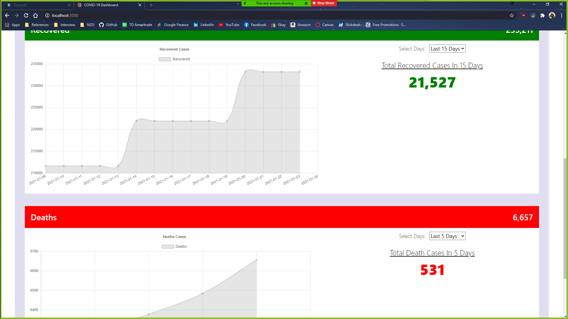
Covid-19 Dashboard Image 2
Inspiration
We wanted to do a Covid-19 dashboard because we felt it was relevant to the ongoing pandemic. Also, this was a good opportunity for us to gain some experience in web development as both of us are not too familiar with it.
What it does
Our project displays important Covid-19 statistical data: active, recovered, confirmed, and death. Furthermore, our project allows the user to view data in timeframes. They can see a line-plot as well as a numerical number of the selected timeframe. It is great for people who are interested in analytics or curiosity.
How we built it
We used various technologies for our project: HTML, CSS, Javascript, and React.
Challenges we ran into
Due to our limited experience in web development, we encountered many obstacles as we worked on this project. Some of our biggest challenges were finding a good Covid-19 API for us to use in our application and getting used to working in a web development environment.
Accomplishments that we're proud of
We are proud of the level of control we developed in our project, albeit skimpy, at the moment. However, I think we can still be proud of the fact that we developed a seemingly fast, updatable dashboard to view Covid-19 data across the US. The frontend itself was a very minimalistic approach that we are also proud of.
What we learned
Our project gave us a lot of insight into how Covid-19 really spread like wildfire in the US. Mainstream news always reminds us about the toll of this virus but to really see the numbers puts it in a different perspective.
What's next for Covid-19 Dashboard
We hope to be able to add a map of the U.S and have users view each state's statistics by selecting the state on the map. Due to our limited experience in JavaScript, we were unable to achieve this within this short time frame, but we thought it would have been a nice feature to have in our application
Built With
- covid-19-api
- css
- html5
- javascript
- react

Log in or sign up for Devpost to join the conversation.