-
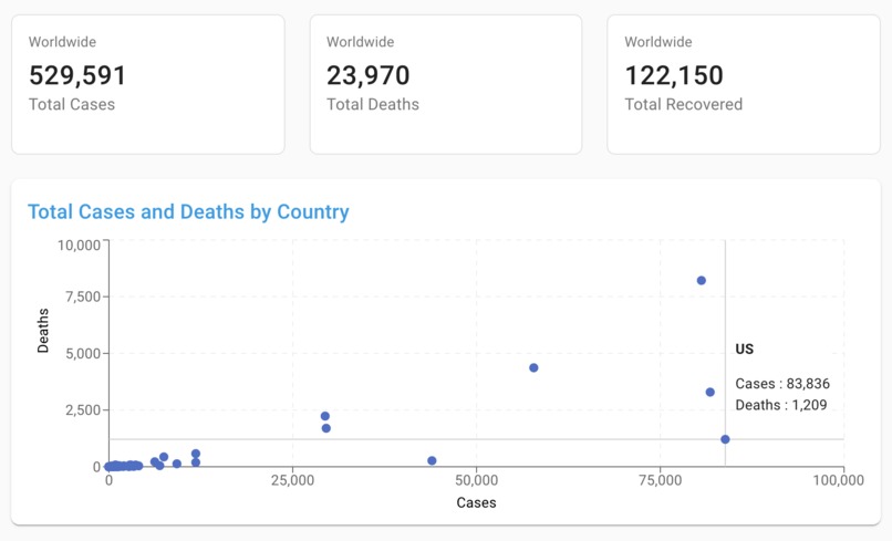
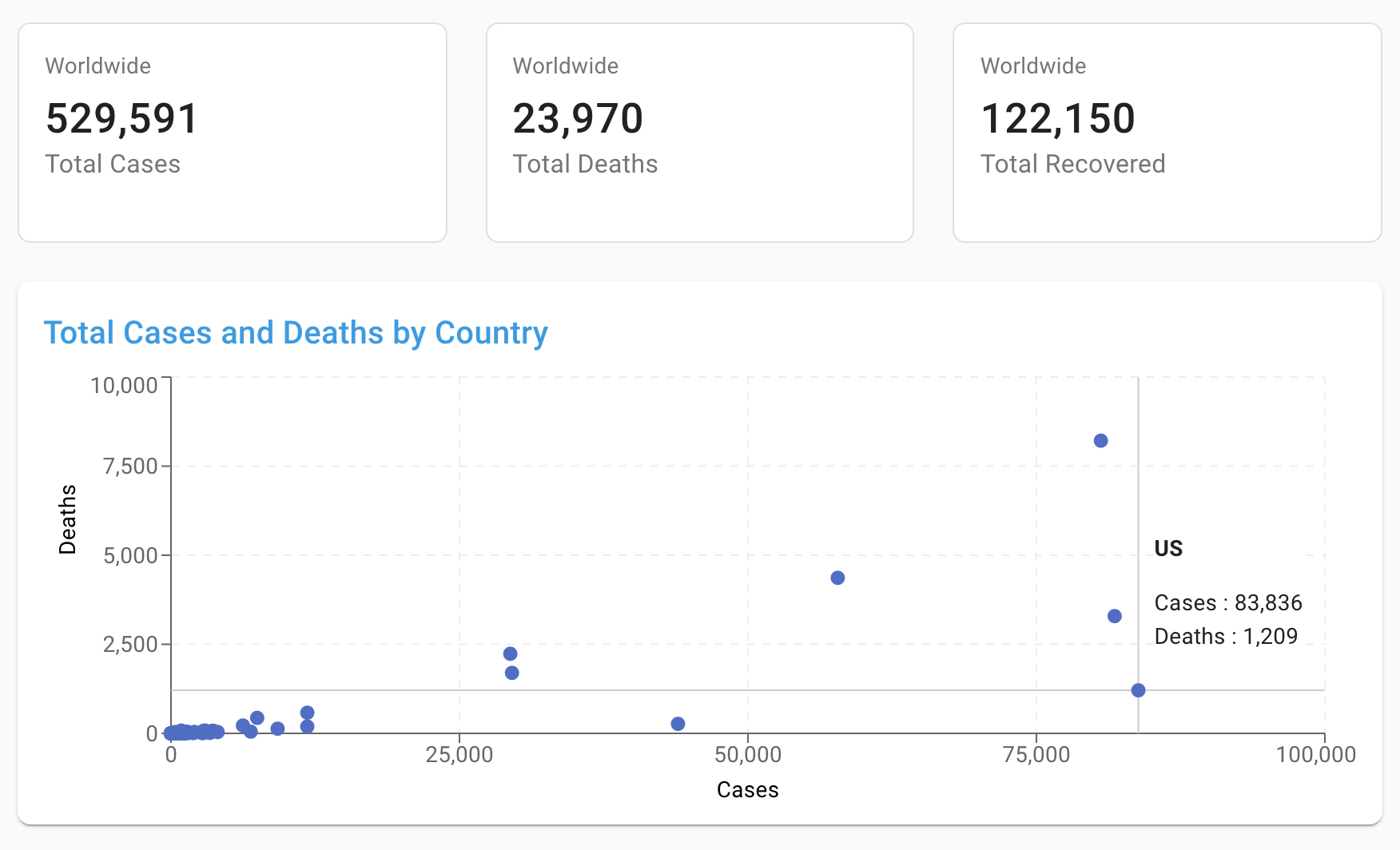
Country Level Data
-
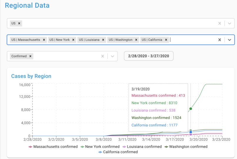
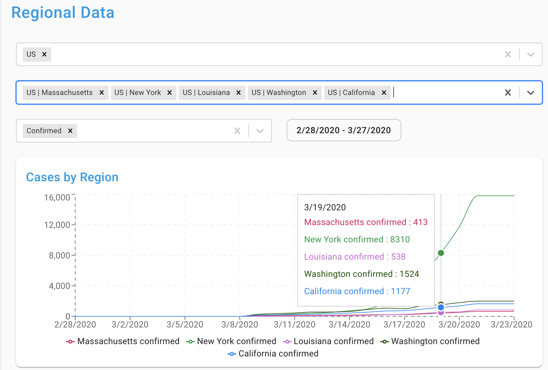
State Level Data
Inspiration
Johns Hopkins University is doing a great job in aggregating case data. We wanted to create a powerful data exploration tool that enables users to understand how the virus is spreading both globally and in their own region.
What it does
The COVID-19 Dashboard presents case data from Johns Hopkins in an engaging and interactive way.
How I built it
The COVID-19 Dashboard is being implemented using the React framework. On the back end, we have python workers running on Amazon Web Services to continuously update our Dashboard with the latest data from Johns Hopkins.
Accomplishments that I'm proud of
The scatter plot of cases and deaths per country provides a clear view of which countries are suffering disproportionately.
What's next for COVID-19 Dashboard
Additional visualizations.

 Jin")

Log in or sign up for Devpost to join the conversation.