Inspiration
I have a data science and machine learning background, so I thought I'd put that to good use to allow people to visualise the extent of the coronavirus pandemic globally.
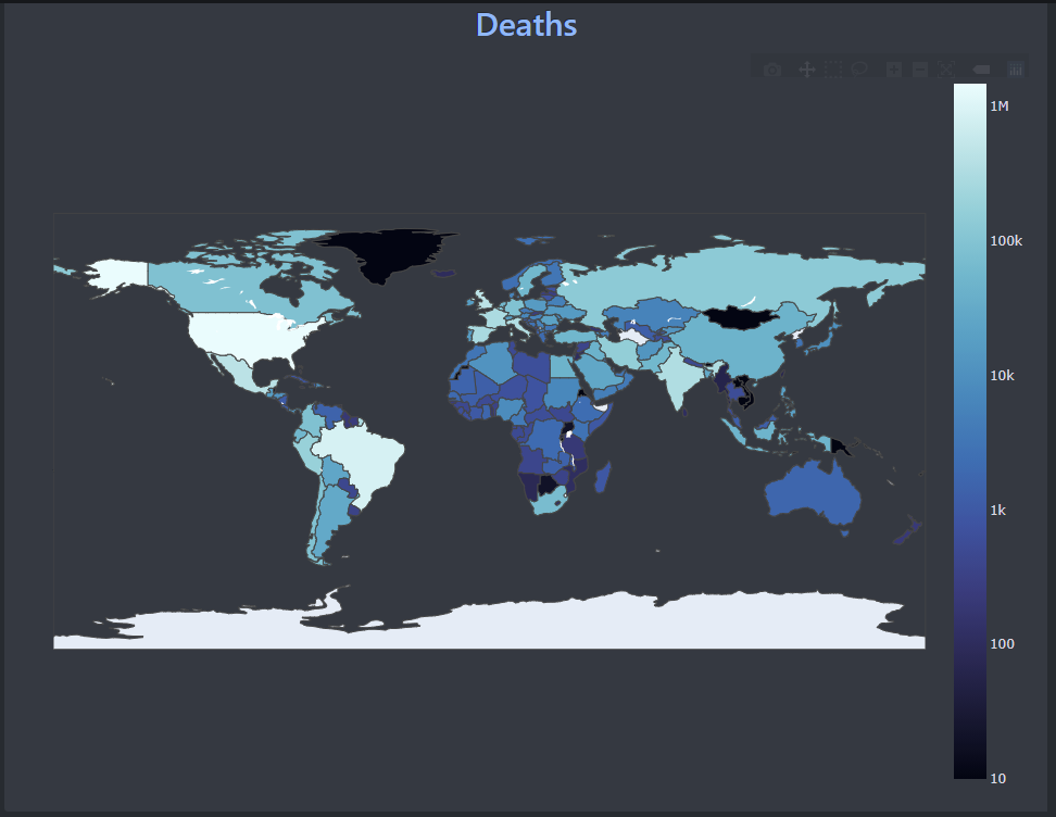
What it does
It allows you to see information about the COVID-19 pandemic on a country level on a choropleth map.
How we built it
Using three python frameworks: Pandas, Dash and plotly.
Challenges we ran into
So many: Learning a new framework is never easy, and especially so when front end design is a huge weakness, and while on a deadline. However, I managed to get over them and the app is in semi-good condition.
Accomplishments that we're proud of
Managing to make the front end look decently good, considering how clunky Dash could sometimes be.
What we learned
How to use dash and bootstrap, as well as general design: my experience is almost exclusively in back-end, command line applications, so being forced to produce something half presentable was a great learning opportunity.
What's next for the COVID-19 Map
Introduce more interactive features, data points, and hopefully a live updating data feed to give current data.


Log in or sign up for Devpost to join the conversation.