-
-
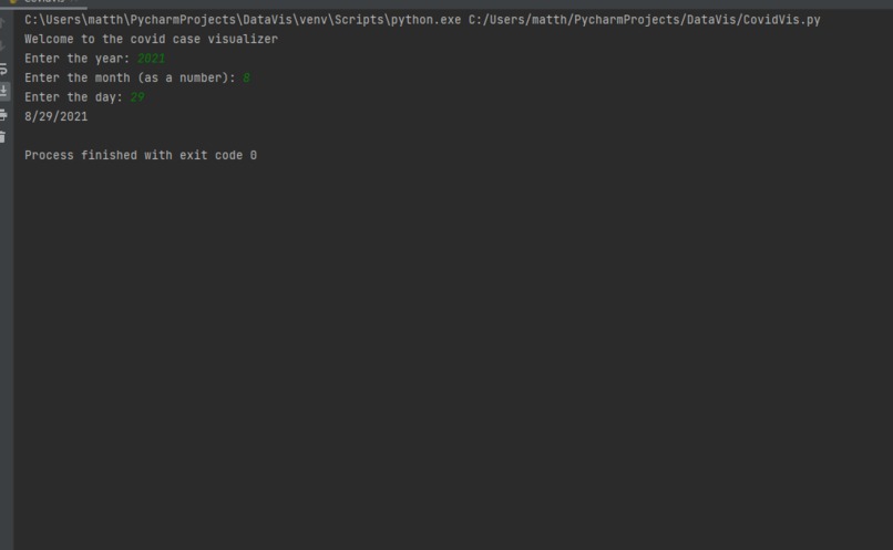
User Interface
-

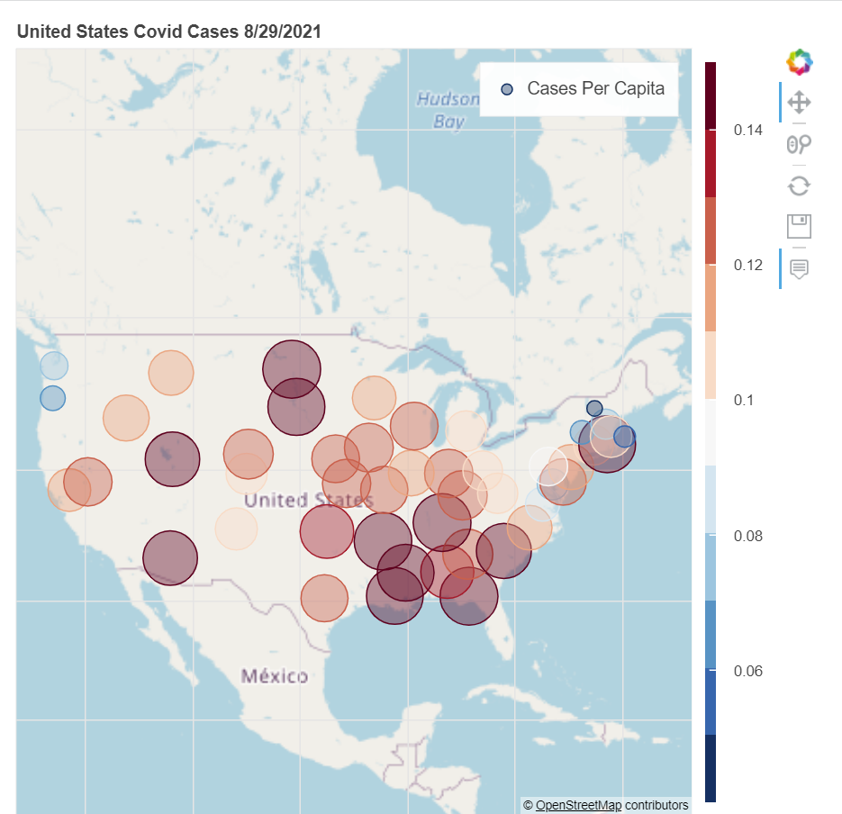
Covid Map
Inspiration
My inspiration for this project was other interesting types of data visualizations I have seen, so I wanted to try to create one myself.
What it does
When you first open the project, you will be prompted to enter a year, month, and day to visualize. If that date is not in the database you will have to enter again. If you enter a correct day, a map of the US will appear with different colored bubbles. The bubbles are sized and colored to represent the percentage of residents who live in that state who have Covid on that particular day. A bubble that is more red and larger is a higher percentage.
How we built it
The project is built in python, with pandas and Bokeh, which is a Python tool for creating visualizations. I got the Covid data from the CDC website, and the map is made with tiles from Open Source Map (OSM)
Challenges we ran into
One challenge I had was finding a way to represent a numerical value through the color of the bubbles. I was able to solve this by using a color mapper to map the red and blue colors to different percentage values.
Accomplishments that we're proud of
I am proud of the fact that I was able to use a language, Python, that I am not very familiar with to build this project. I was able to apply what I knew about Java and figure out a lot of the same things in Python.
What we learned
Firstly, I learned a lot about Python. More importantly, this was my first experience with data visualization, so I learned how complicated making a visual based on a dataset can be.
What's next for Covid-19 Cases Visualizer
I hope to be able to add a slider, so that it is easier to compare and contrast how the cases have changed over time. Adding other countries to the map could also be a future feature.


Log in or sign up for Devpost to join the conversation.