Inspiration
As a computer graphics major, I'm always interested in new applications of the subject. I recently stumbled across Cesium and learned all about 3D visualization for geospatial data. As someone who have been following the pandemic data closely, I thought that it would be cool to bring that data into the 3D world and tell the story of COVID-19.
My other goal for TecHacks was to create something with data that allows high level of interaction for the user. This motivated my decision to add UI elements that allow some customizations by the user.
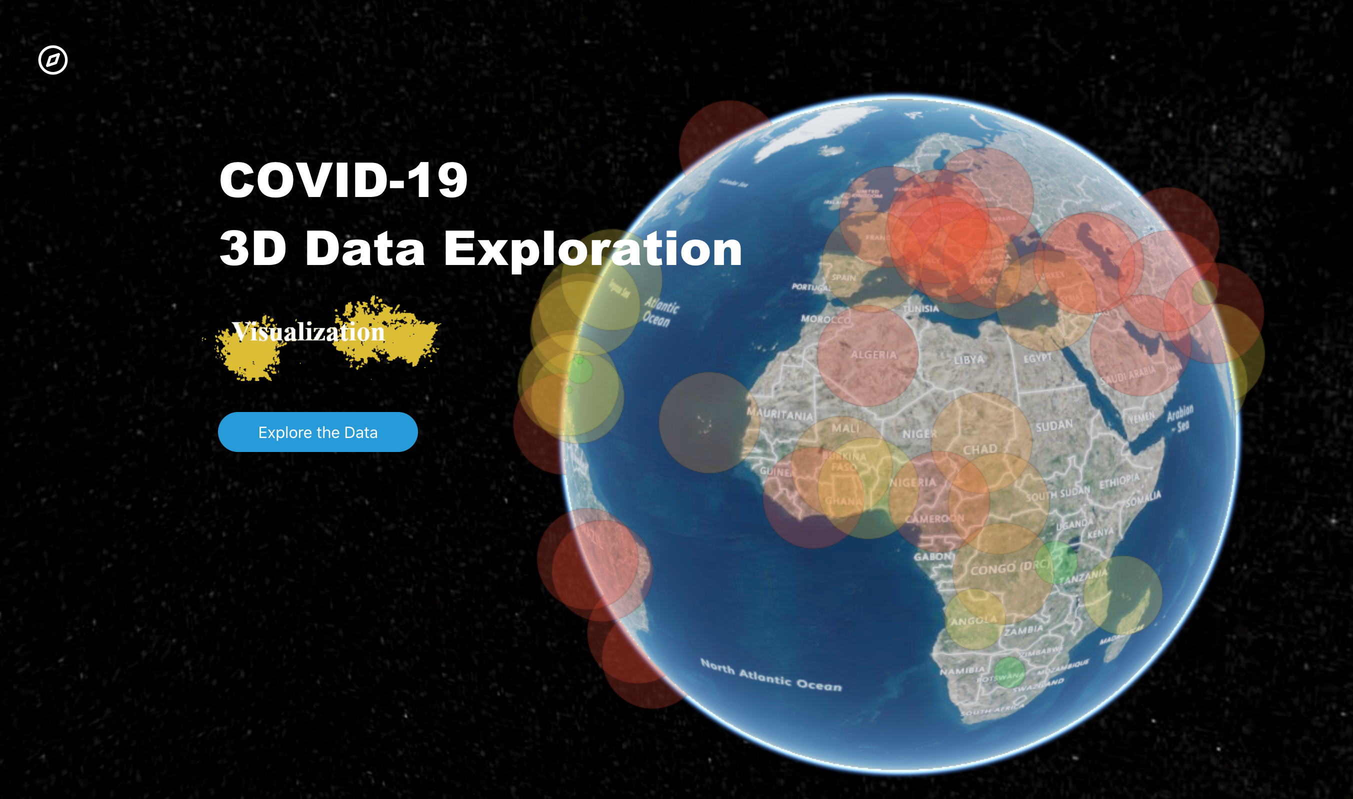
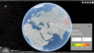
What it does
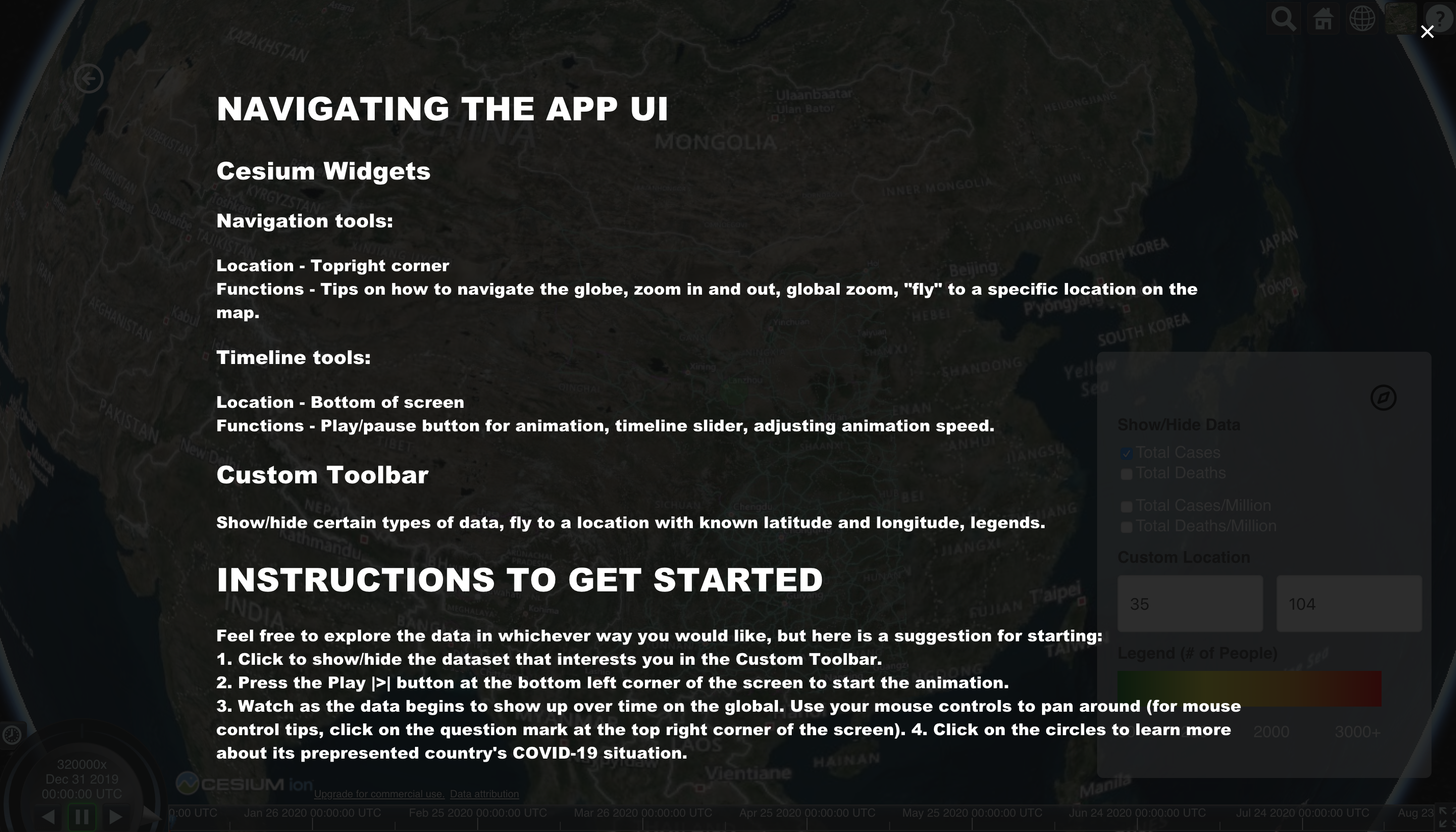
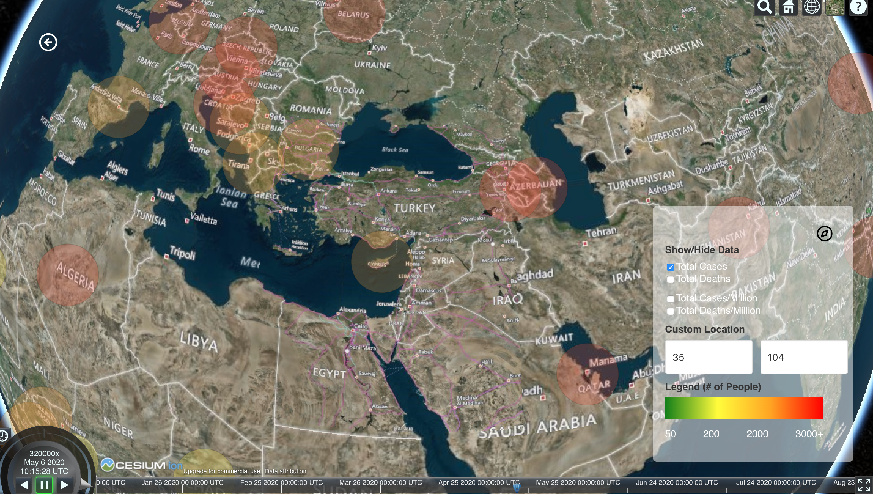
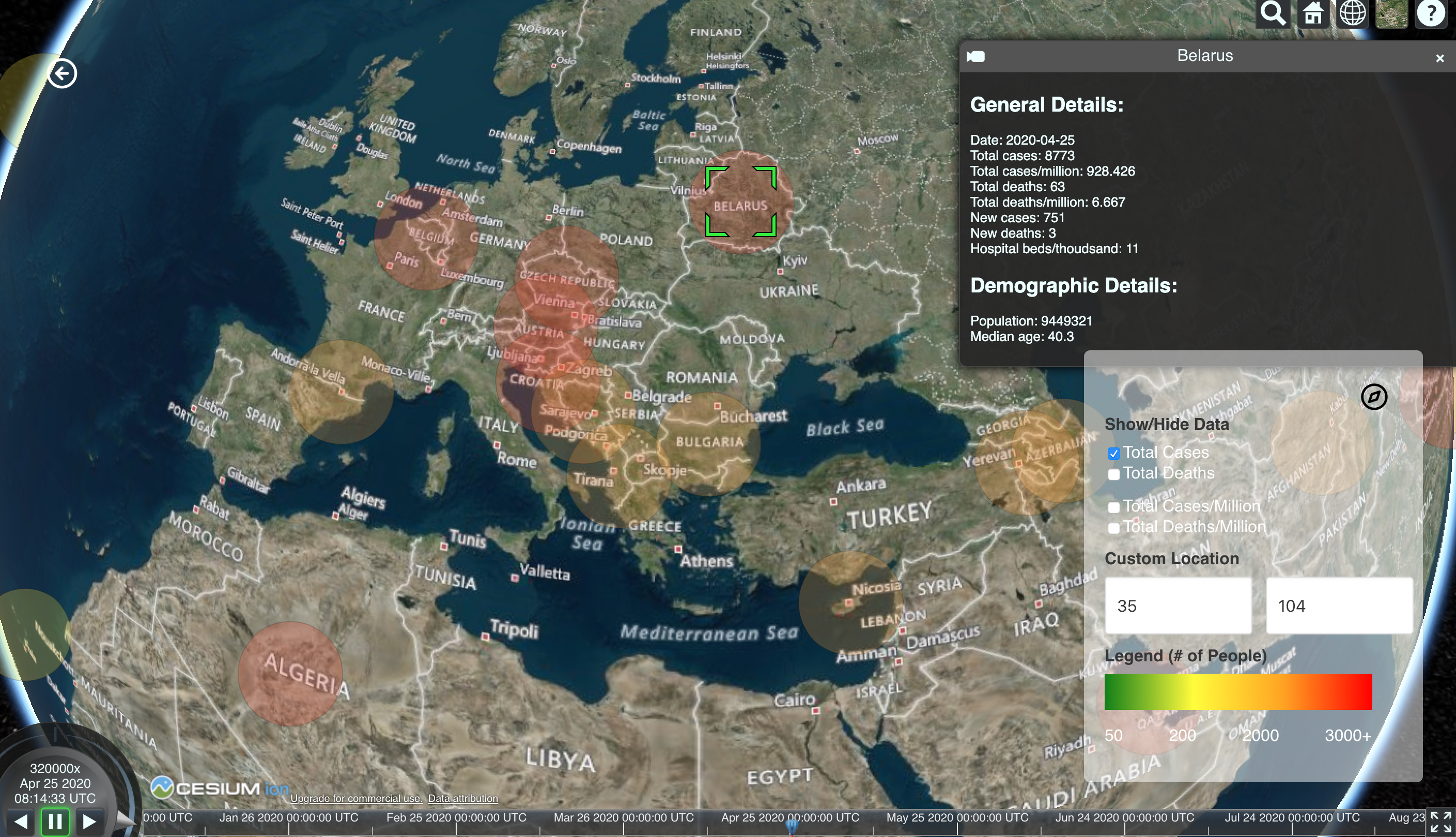
The tool is a web application that display COVID-19 data by country from December 31, 2019, namely the number of cases, deaths, cases per million, and deaths per millions. It allows users to view the data on a timeline, click on data points to learn more about a country's status, and zoom into certain regions (both by name and by latitude and longitude).
How I built it
This project was built using:
- Cesium/Resium: Cesium is a powerful open-source Javascript library for creating world-class, high-performant 3D maps. The base of the project utilizes this tool, which enables for a unique data format called czml to show time-dependent geospatial data. Resium is the React component library for Cesium.
- React: The frontend of this project is done entirely in React.
- Bulma: The CSS framework.
- czml-writer: The data format I used was czml, which is unique to the Cesium engine. It's a JSON file format for displaying time-dynamic data in the browser.
- Google Sheets' geocode function to turn countries into latitude and longitude.
- And finally, last but not least, dataset from Our World in Data.
Challenges I ran into
First, the data. I have never worked with time-dynamic data before and had no idea how czml works, so I spent lots of time trying to figure that out. I ended up writing a parser to turn JSON file (which was one of the available file formats for the original dataset). But to get to the JSON file, I had to first add the data to Google Sheets and use the geocode function to convert countries to latitudes and longitudes. There were 36,692 rows! Then I input this data as CSV into a converter to turn it into GeoJSON, another geospatial data file format. Finally, I ran it through my parser. I kept running into unclean data and had to write edge cases for them.
Another challenge I ran into was the speed of the visualizer. Running graphics in the browser is not a simple task and with 36,692 rows, I couldn't get the simulation to run smoothly. Therefore, I was only able to include a little less half of the countries on the list.
Accomplishments that I'm proud of
- Learning a new data format (czml)
- Adding help texts to the UI
- Designing and implementing the project in 2 days!
What I learned
- A new data format (czml)
- How to work with z-index in css
- How to use Resium and incorporate it into React
- How to deploy a create-react-app with gh-pages!
What's next for COVID-19 3D Visualizer
It would be awesome if I could figure out how to load all of the data for all countries. Perhaps I could limit it to a certain date range. There are lots of other interactive features I can add to the project. For instance, I could add a slider to allow the user to filter the data points by number of people.
One feature I really wanted to add but didn't have time was a story. In Cesium, you can manipulate the camera so that it follows a path. I wanted to have the camera start in China and follow the spread of the virus into major metropolitan areas. Each view would be attached to a card that explain how the pandemic got there and the people's and government's response to it.
Overall, I am still very proud of the project's current state. Hope you enjoy!
The github repository can be found here: https://github.com/dzungpng/covid19-data-visualization

Log in or sign up for Devpost to join the conversation.