-
-
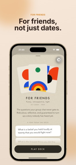
bauhaus style cards
-
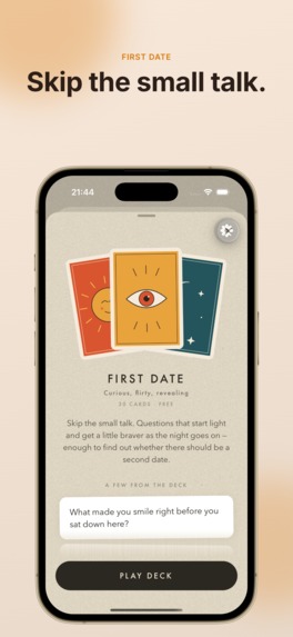
tarot card style
-
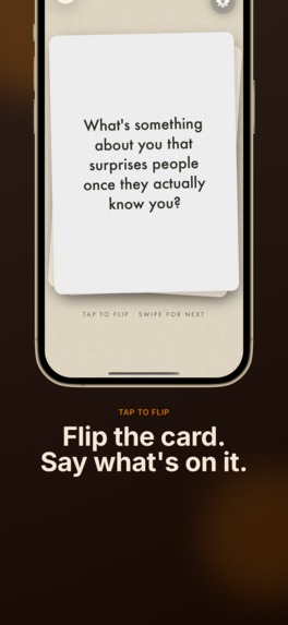
flip cards
-
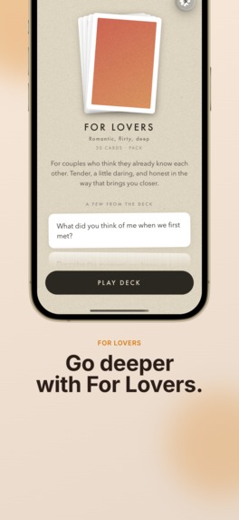
paid packs
-
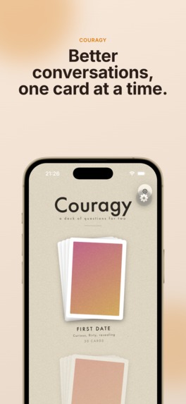
card packs
-
icon
-
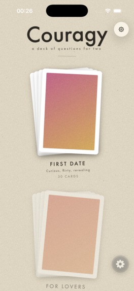
app home screen
Inspiration
Conversation-card decks are a real product you can buy in a shop — a box of cards, you draw one, you read it aloud, and suddenly dinner isn't small talk anymore. They work. But they're a box you have to remember to bring.
The obvious move is an app, and the obvious app is a list of questions with a "Next" button. That version is worse than the cardboard, and it's worse for a specific reason: the deck isn't a container for questions, the deck is the experience. The weight of it, the not-knowing-what's-underneath, the small ceremony of turning a card over. Strip that out and you've built a quiz.
So the bet behind Couragy was narrow: build the physics first, and let the questions ride on top. If handling the app doesn't feel like handling a deck, nothing else matters.
What it does
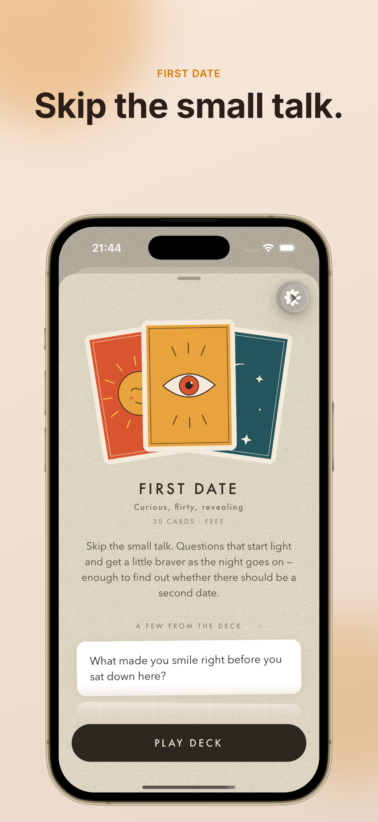
Couragy is an iOS app for couples and small groups — designed to be played in person, phone propped between two people or passed back and forth.
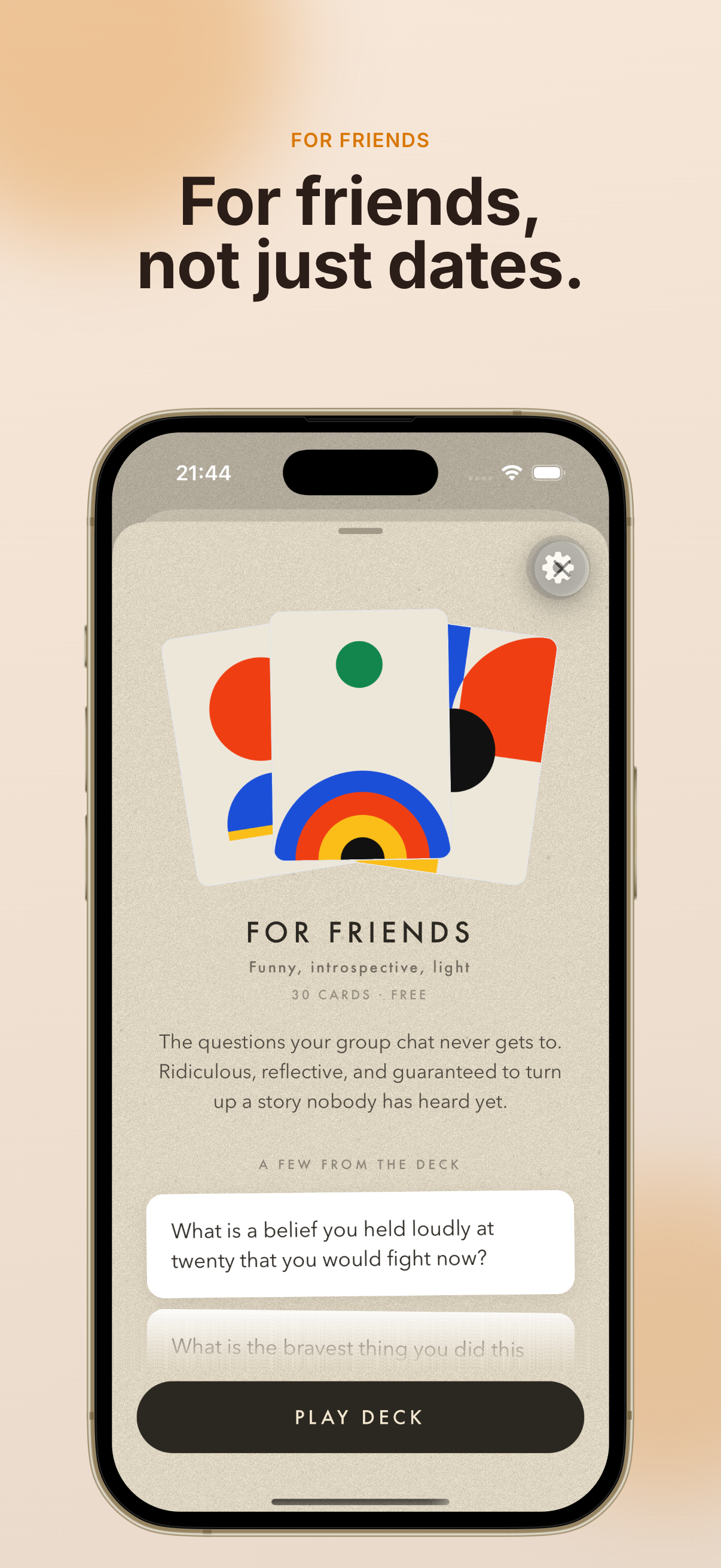
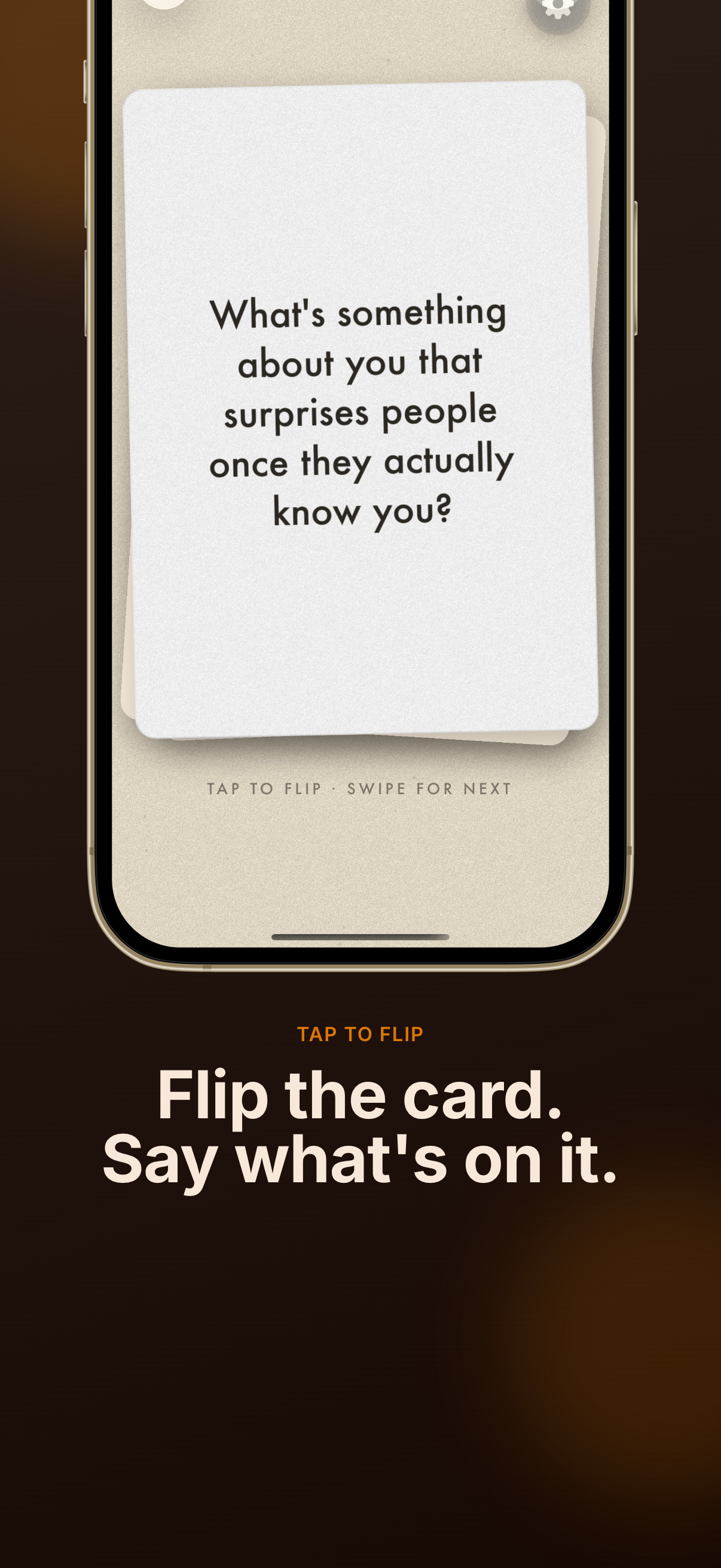
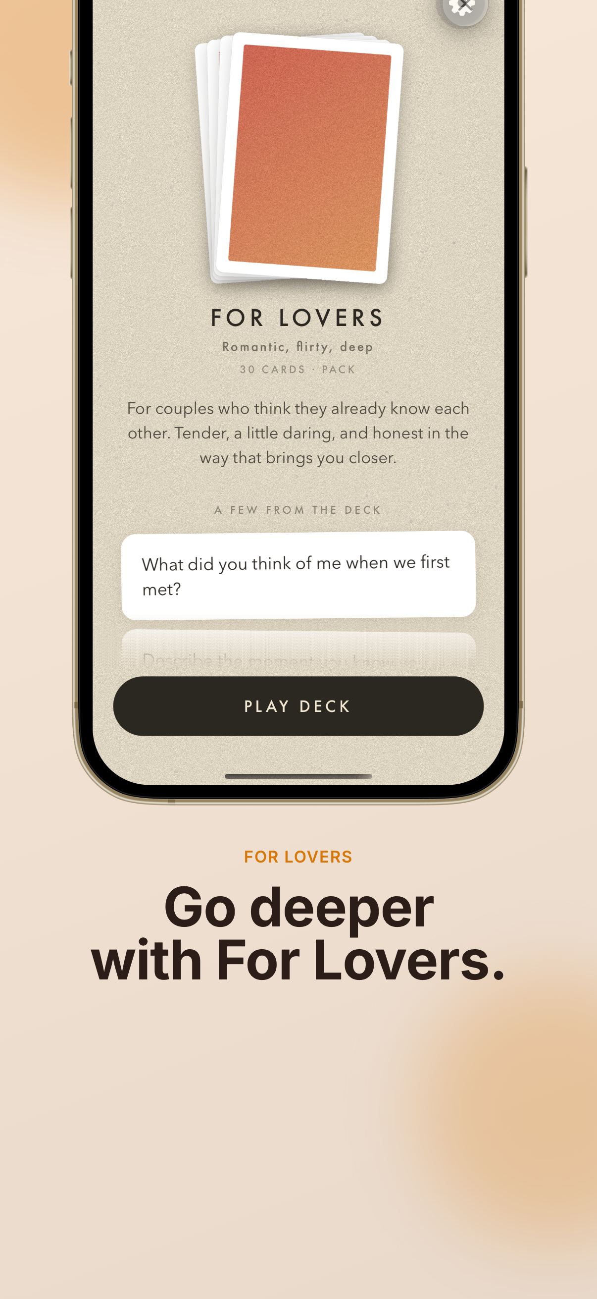
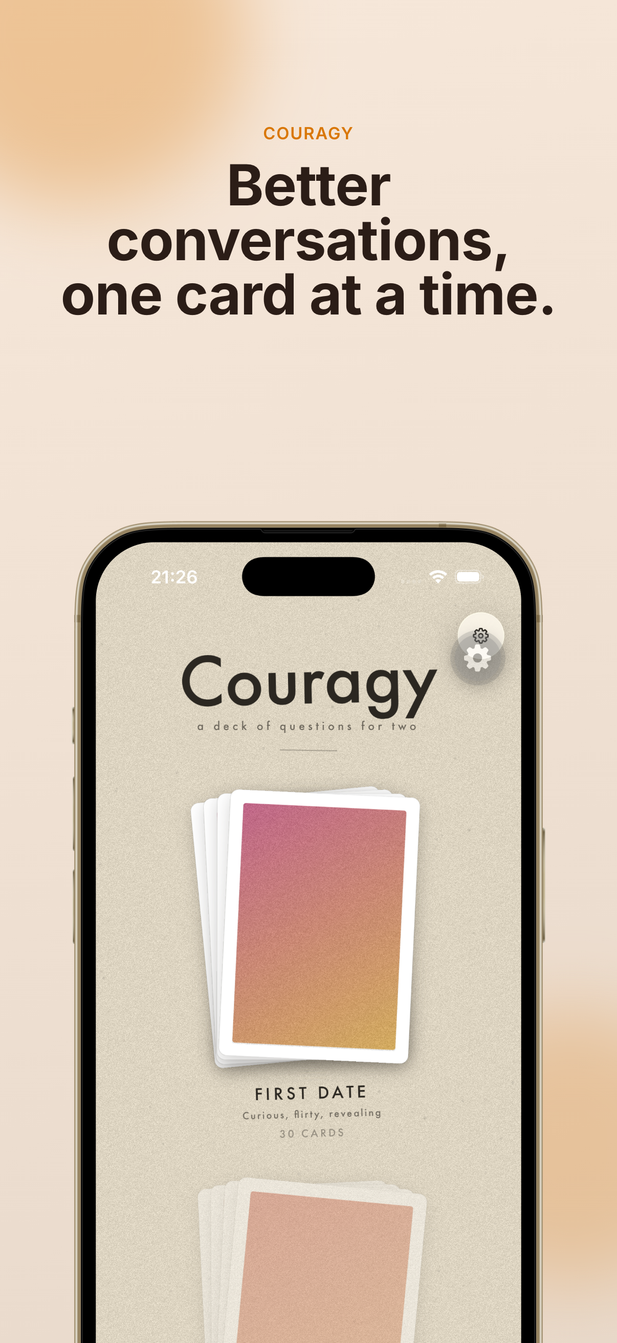
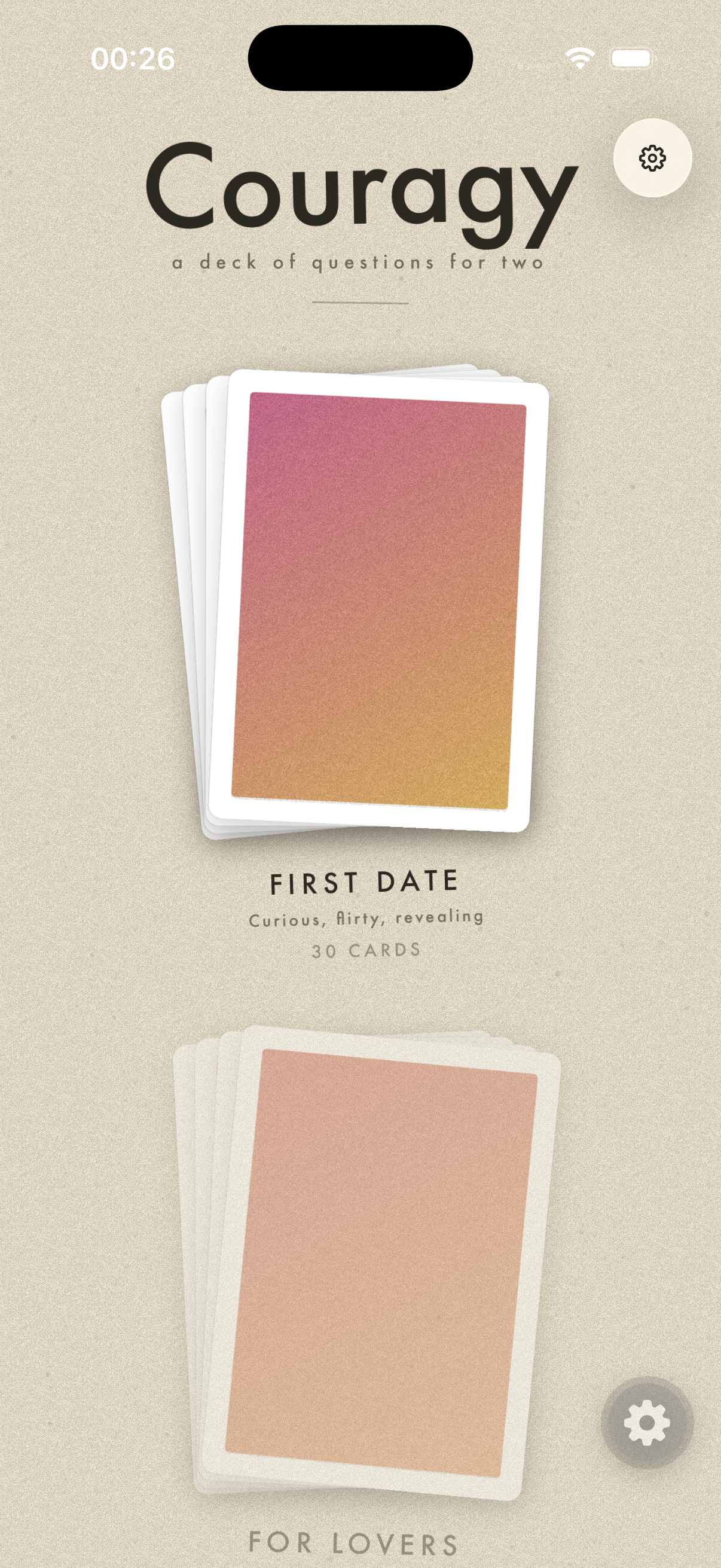
A face-down card sits in the middle of a loose pile. You tap it, it flips in real 3D, and there's a question. You swipe to advance; the card flies off and the next one rises into its place. You can swipe back. Three decks: First Date (free, the flagship), For Friends (free), and For Lovers (a paid pack). Every deck has its own hand-illustrated card backs — not one repeated pattern, but distinct art per card — so the deck reads as a physical object before you've even flipped anything. Decks shuffle once per session with no repeats until exhausted, and your place is saved if you close the app mid-deck. How I built it
Stack: Expo (managed workflow) + React Native + TypeScript, react-native-reanimated for every animation, react-native-gesture-handler for tap and swipe, expo-router for navigation. No backend — decks, questions, and art are bundled locally. RevenueCat handles the paid pack.
The flip is two absolutely-positioned faces sharing one footprint, each with backfaceVisibility: 'hidden', animated 180° out of phase — the front goes 0°→180° while the back goes 180°→360°, so exactly one face is ever visible. A perspective of 1000 keeps it from squashing flat. All of it runs on Reanimated shared values, on the UI thread, so it holds 60fps while a gesture is in flight.
The pile was the part that actually sells the illusion. A single card floating in space looks like a UI element. Rendering three — the current card, the next one peeking underneath, and the previous one flying off — with a few degrees of random rotation and a small offset on each, makes it look like a deck someone set down on a table. This was the highest-leverage visual decision in the project and it's maybe forty lines of transform code.
Navigation got rebuilt once. The first version treated "next" and "back" as separate code paths, which meant every animation fix had to be made twice and they drifted apart anyway. I reworked it into a symmetric forward/backward step machine — one state transition, run in either direction — and the whole class of "swiping back looks wrong" bugs disappeared.
Shuffling is plain Fisher-Yates, nine lines, with a unit test. Resume stores the pile as an array of question indices plus a cursor, and validates it against the current deck on load — if an app update added or removed questions, every saved order for that deck is silently invalidated rather than restored into a wrong state.
Ads on the free decks are the design decision I'm happiest about. The standard approach is a full-screen interstitial between cards, which is exactly the thing the product principles forbid: never interrupt a session in progress. Instead, the ad is a card in the pile. It gets dealt in like any other card, you flip it, there's a banner, you swipe on. It respects the deck metaphor instead of bulldozing it.## Inspiration
Built With
- admob
- expo.io
- react-native
- revenuecat


Log in or sign up for Devpost to join the conversation.