-
-

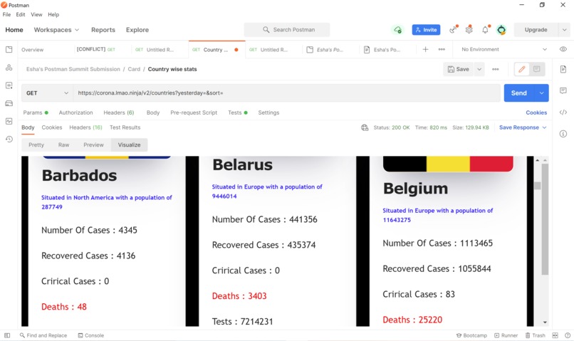
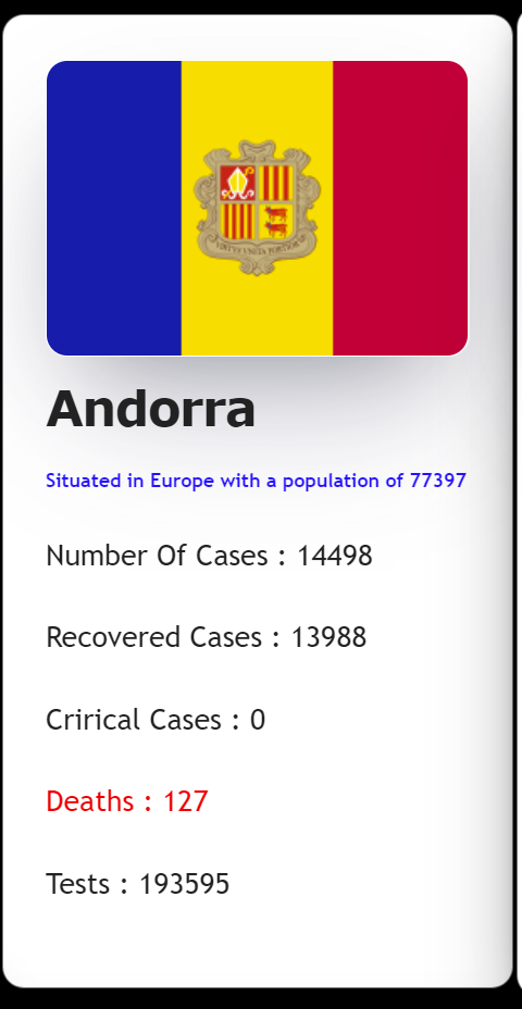
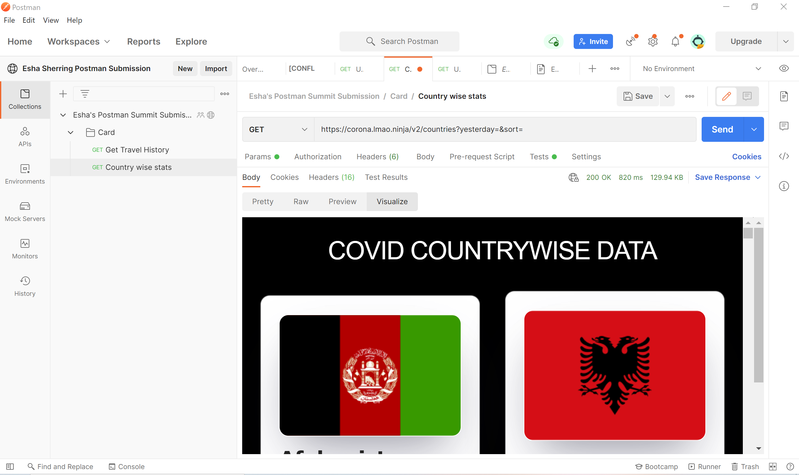
Country stats
-
Country stats
-

Country stats
-
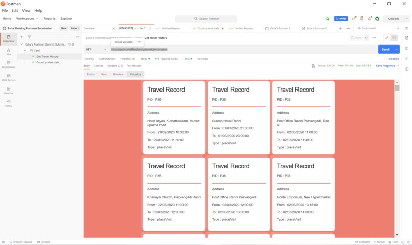
Travel Cards


Inspiration
Recently the entire world has been impacted by COVID-19 . Data has proved to be a powerful tool for both analysis and tackling of the pandemic . Various API's have been made to increase the reach of this data .However understanding JSON data is not an easy task . This project aims to simplify the same.
What it does
The project :
- Displays country wise statics of covid cases, deaths, recoveries and tests.
- Travel History of people (uses dummy data)
How we built it
Fetched data from a free API and visualizes the fetched JSON data in the form of cards using HTML and CSS.
Challenges we ran into
Being a backend developed I hard time in handling CSS properties but needed up learning a lot about CSS .
What we learned
I was learning CSS in depth .I came across SCSS and tired my hand at that too
What's next for Country Cards
I hope to build a full application using which people can visualize data in the format they want without having to change scripts.

Log in or sign up for Devpost to join the conversation.