-
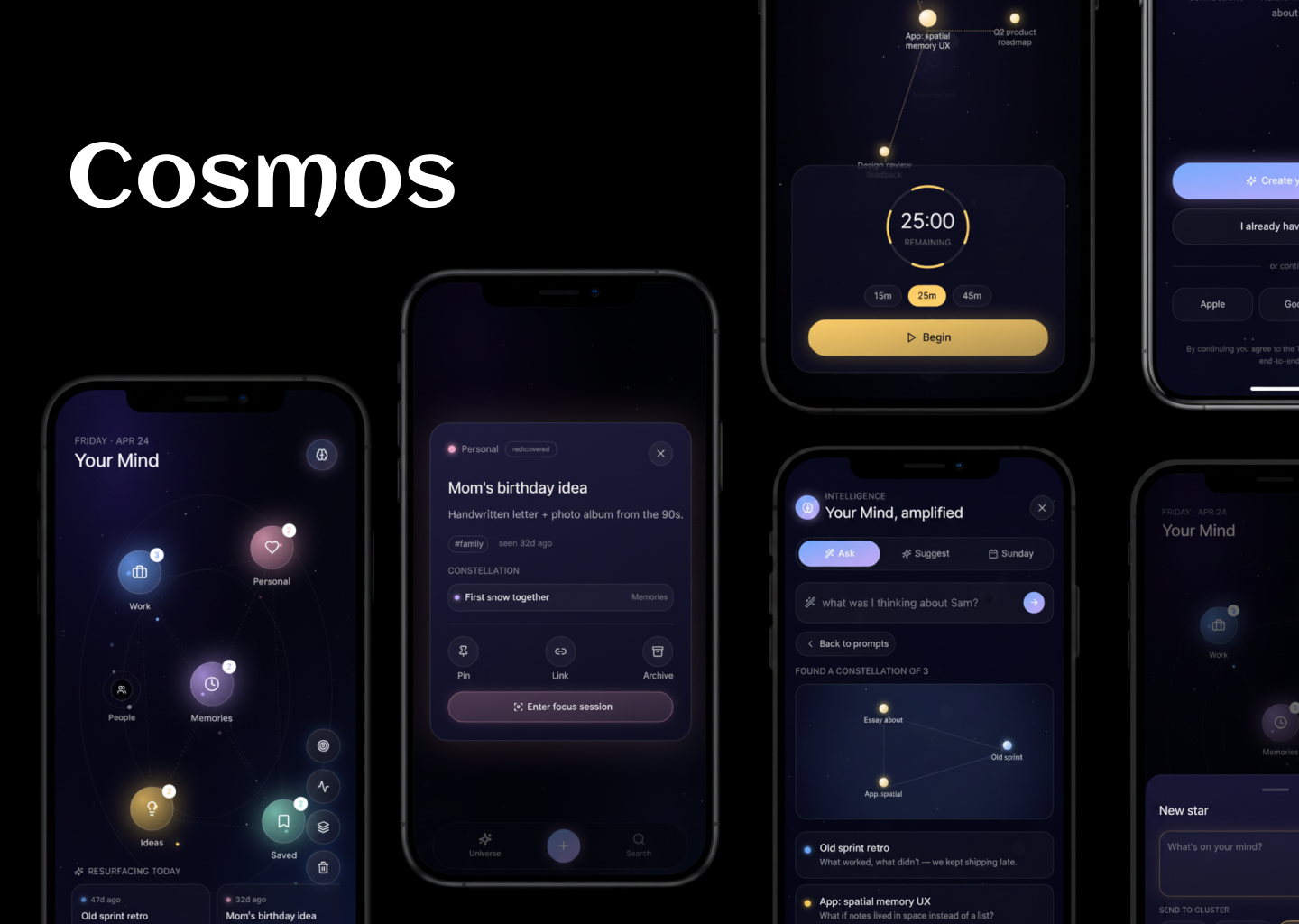
Thumbnail
-
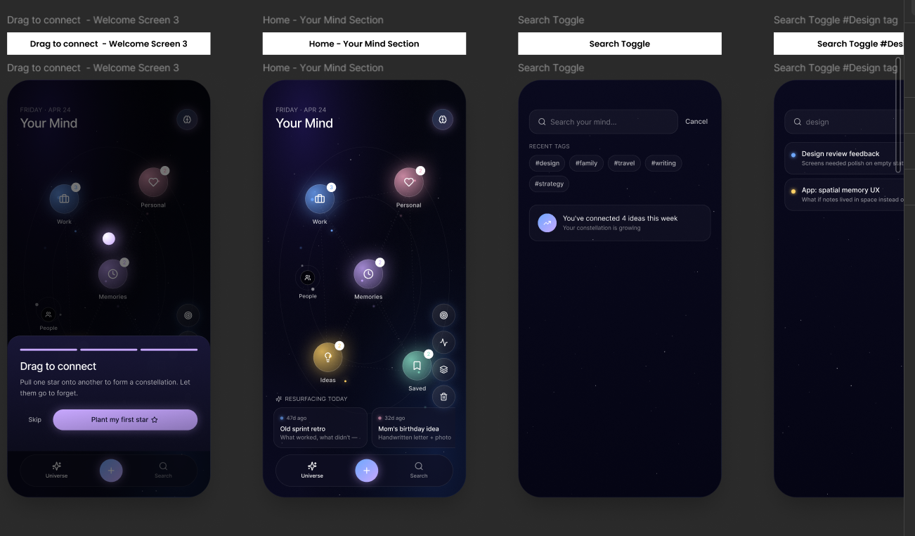
Screens Closeup
-
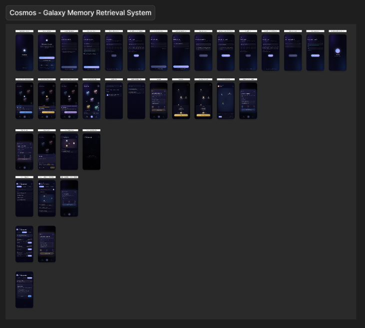
Cosmos - Galaxy Memory Retrieval System
-
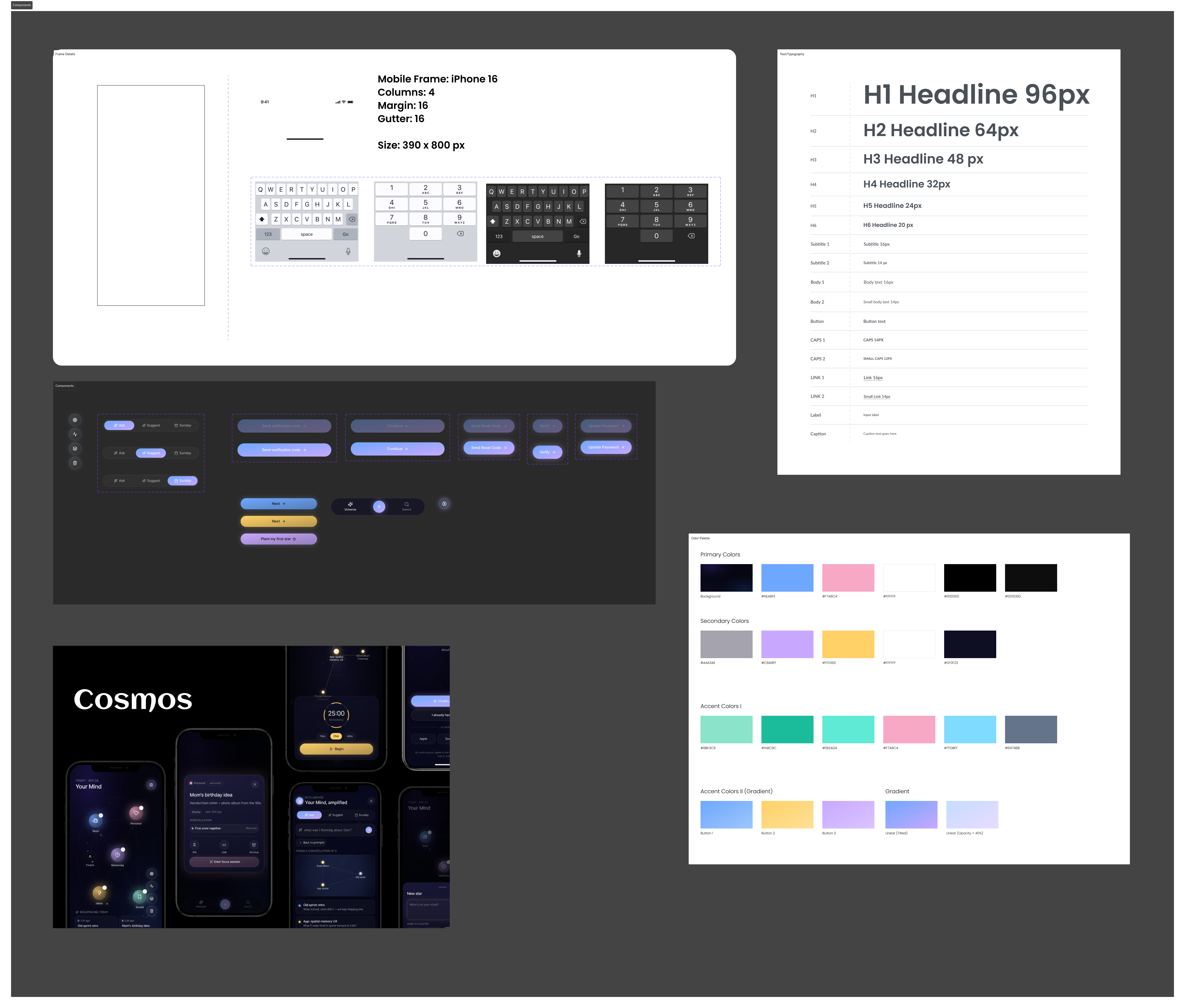
Components & Icons
Inspiration
We’re constantly capturing thoughts where notes, ideas, links, but over time, they get buried in linear lists and folders. The more we save, the harder it becomes to rediscover what actually matters.
We asked a simple question: What if memory wasn’t a list… but a place?
Inspired by how humans naturally think in associations rather than hierarchies, we designed Cosmos as a spatial interface, where ideas exist like stars, connected through meaning, not folders.
What it does
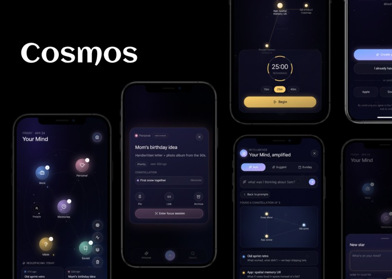
Cosmos transforms your thoughts into a living, navigable universe.
- Each idea or memory becomes a star
- Related thoughts form clusters (life areas)
- Connections between ideas create constellations
Instead of scrolling endlessly, users:
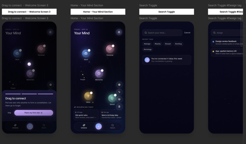
- Zoom and navigate their thoughts spatially
- Rediscover forgotten ideas as they drift and resurface
- Visually understand relationships between concepts
The core feature is “Lost & Found”: Ideas that haven’t been revisited gradually fade to the edges, then intelligently resurface at the right moment—bringing forgotten value back into focus.
How we built it
We focused on delivering a high-impact UX prototype rather than overengineering the backend.
- Design: Figma (interactive prototype with transitions, zoom states, and microinteractions)
- Motion Thinking: Simulated physics (drift, clustering, focus transitions)
- Structure:
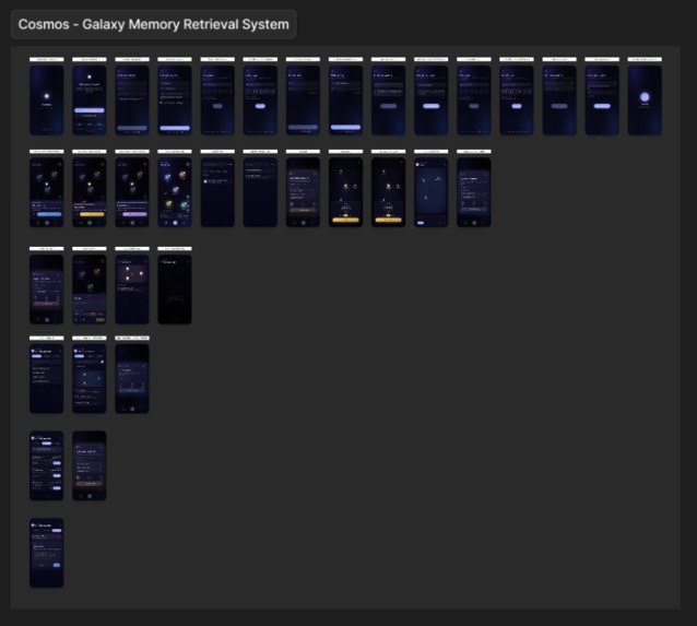
- Galaxy view (overview)
- Cluster view (category level)
- Focus mode (individual memory)
We prioritized:
- Smooth navigation flows
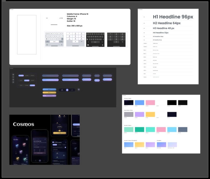
- Clear visual hierarchy
- Meaningful animations (not decorative)
Challenges we ran into
- Balancing beauty with usability A galaxy UI can easily become overwhelming. We had to constantly simplify:
- Limit visible elements
Reveal complexity only on interaction
Making spatial navigation intuitive Users aren’t used to “zooming into thoughts.” We solved this by:
Adding guided focus states
Keeping familiar patterns like search and quick-add
Avoiding gimmicks It’s easy for this idea to feel like a visual experiment. We focused on grounding every interaction in a real use case:
“Does this help users find or understand something better?”
Accomplishments that we're proud of
- Designed a non-linear information system that still feels usable
- Created a clear ‘Lost → Found’ interaction model (not just aesthetic storytelling)
- Built a concept that is:
- Visually striking
- Functionally meaningful
- Easy to demo and understand quickly
Most importantly, we turned an abstract idea into a coherent mobile UX system.
What we learned
- Innovation in UX isn’t about complexity, it’s about clarity in a new form
- Spatial interfaces can reduce cognitive load if designed carefully
- Motion and animation should always communicate meaning, not decoration
- Even the most experimental ideas need familiar anchors (search, structure, feedback)
What's next for Cosmos
AI-powered associations Automatically connect related ideas based on context and content
Smart resurfacing Predict when a “lost” idea becomes relevant again
Cross-device experience Expand into tablet/desktop for deeper exploration
Collaboration mode Shared “galaxies” for teams—visualizing collective knowledge
Lightweight real backend Turning the prototype into a functional product
Built With
- figjam
- figma
- miro


Log in or sign up for Devpost to join the conversation.