Inspiration
The idea of combining predictive analytics with the real-time mapping of coronnavirus that has taken off in recent weeks. We wanted a place for users to be able to track their own data to understand their risk of contracting or spreading the virus.
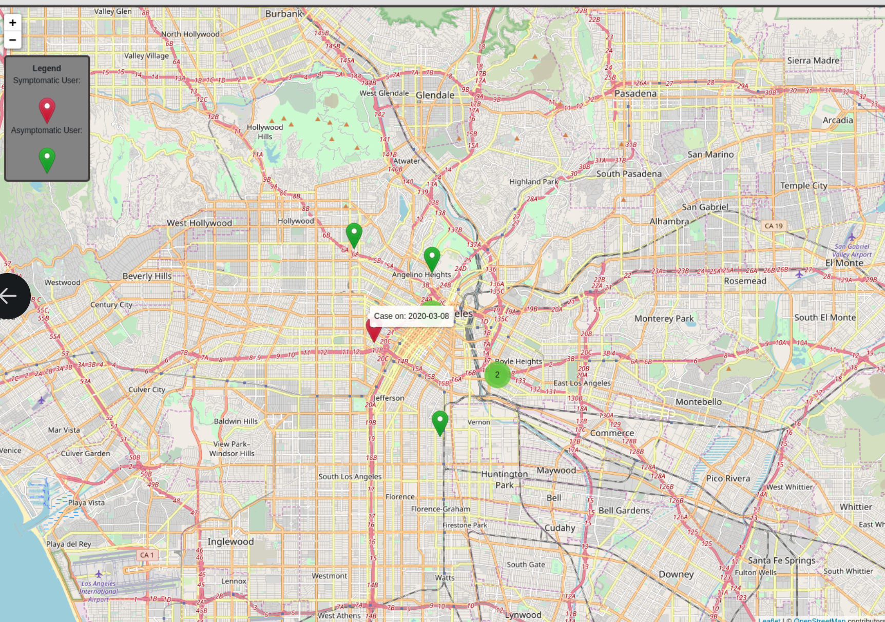
What it does
The map uses both pre-existing population movement data and user-submitted information (both anonymized) to reveal current danger spots along with feeding a prediction model of future spots of concern.
How I built it
Used ReactJS + leaflet to visualize map in frontent. AWS serverless, dynamodb, S3, and lambda. R/Python for Machine Learning
Challenges I ran into
We had 3 teams : User-Interface, Machine Learning, and Databases to structure the core of the POC product. The three teams communicated regularly over shared Slack channels, and designed their workflow according to one another’s needs.


Log in or sign up for Devpost to join the conversation.