-
-
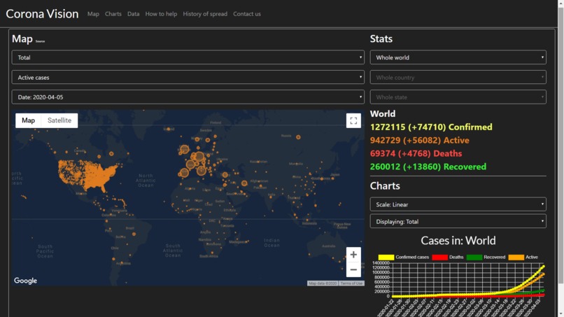
Main page, showing a maps and charts of confirmed cases.
-
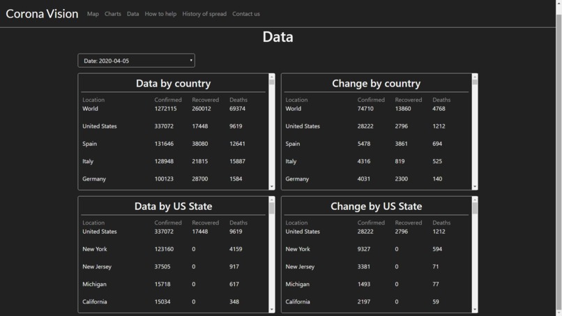
Data page, showing charts of changes in confirmed cases on a per-country basis
-
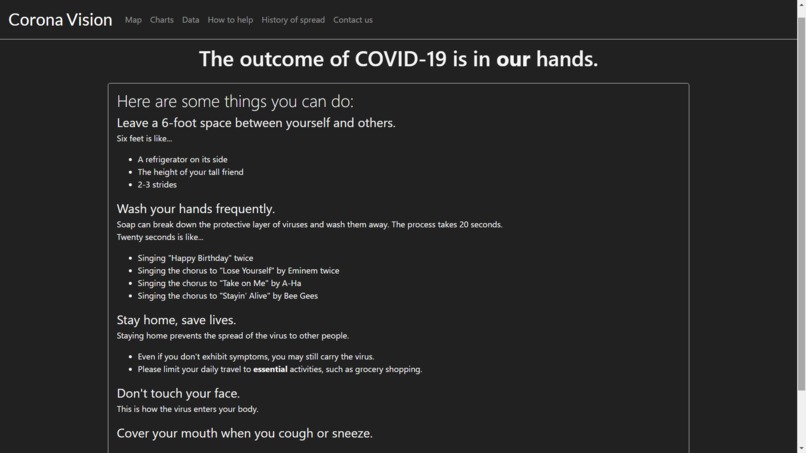
Page where people can learn about ways to help protect themselves and others from the spread
-
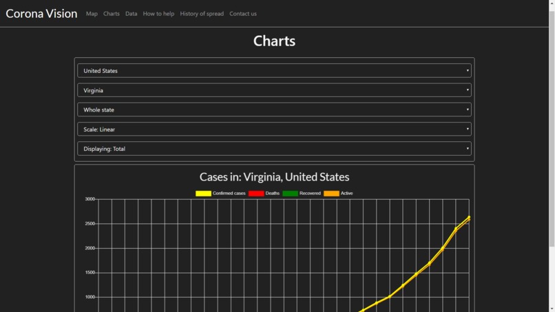
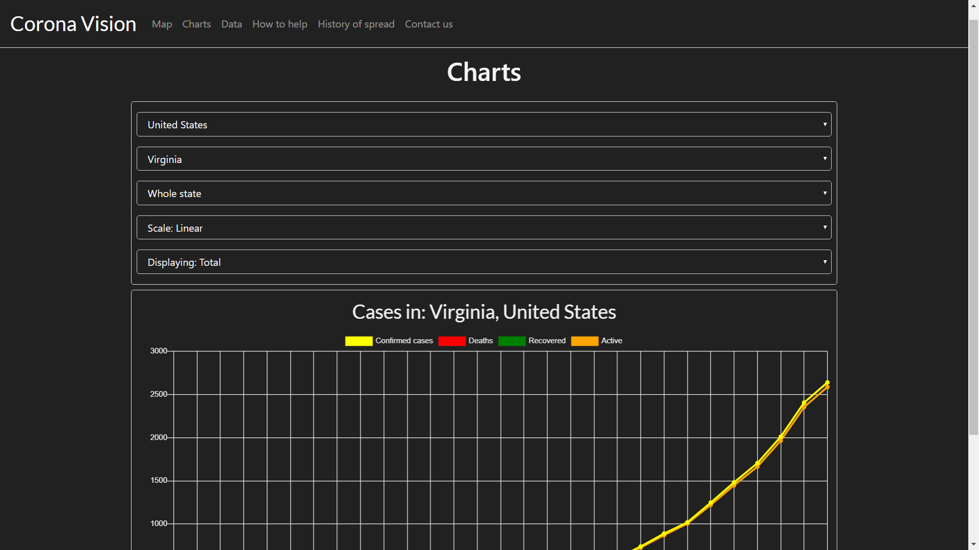
Page where people can make custom charts based on their country, state, or county
-
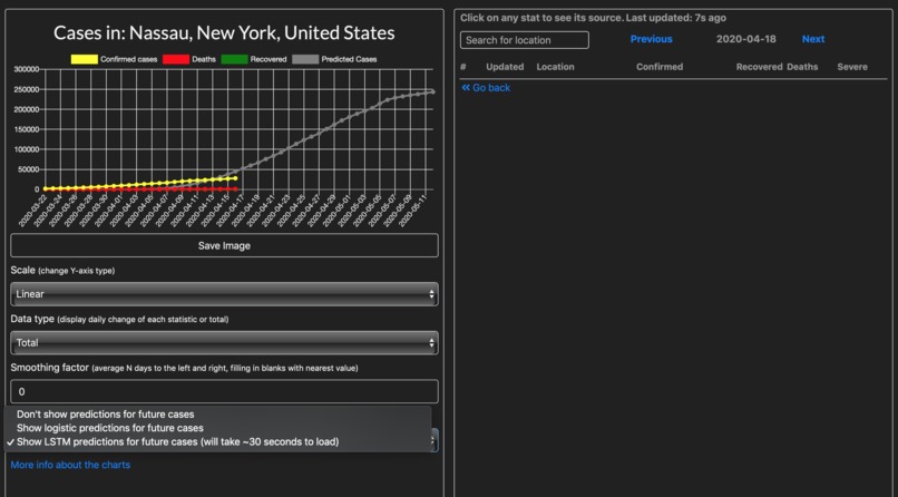
On the charts, you can make predictions, either an LSTM time series model or logistic regression


Inspiration
The Novel Coronavirus is one of the most contagious pathogens of our time. It's crucial that we understand the current spread of the virus, so that we can adequately prepare ourselves by sending medical equipment to regions with high numbers of confirmed cases. To help battle COVID-19, we wanted to make a website where it would be easy to access county and state-level data for the Coronavirus.
What it does
There are many features on the website that visualize data, including:
- Maps of active cases, confirmed cases, and deaths
- These maps give the option to view snapshots of the spread on different days
- Ability to make a custom line graph based on your country, state, and county
- Option to show daily change or use a logarithmic scale
- Timelines of the Coronavirus spread based on the first day of arrival within each country
- See how many confirmed cases, active cases, recoveries, and deaths there are been
- Data tables based on country and US state that show the daily increase in confirmed cases
- For any location, predicts the future number of cases using LSTM
How we built it
We used Flask and SQLite 3 for the backend. For SQL management, we used a library called "SQLAlchemy". We had to make an API to download the most recent data from Johns Hopkins, and process the data for each country/state/county. For the App, we used React-native, and for the website, we are using regular Javascript, and we will eventually migrate it to React-native as well. We also used Pandas and Numpy for preprocessing time series data. We used Keras for modeling.
Challenges we ran into
It was difficult to have the server automatically download the data and process it, because there were many edge cases in the data that we needed to take into account. It was also difficult to code the Javascript backend for the website, because we had to use many libraries and APIs that we had not previously used.
Accomplishments that we're proud of
We're happy that the map works, and that we were able to develop this website to a level where someone could really use it to see the spread of the virus over time.
What we learned
We learned that data can often be difficult to work with, and we gained experience with developing websites with React-native and Javascript libraries for maps and charts.
What's next for Corona Vision
In the app, we also plan to add notifications every time new data is added, so you can stay updated in recent coronavirus cases in your county/state/country.


Log in or sign up for Devpost to join the conversation.