Inspiration
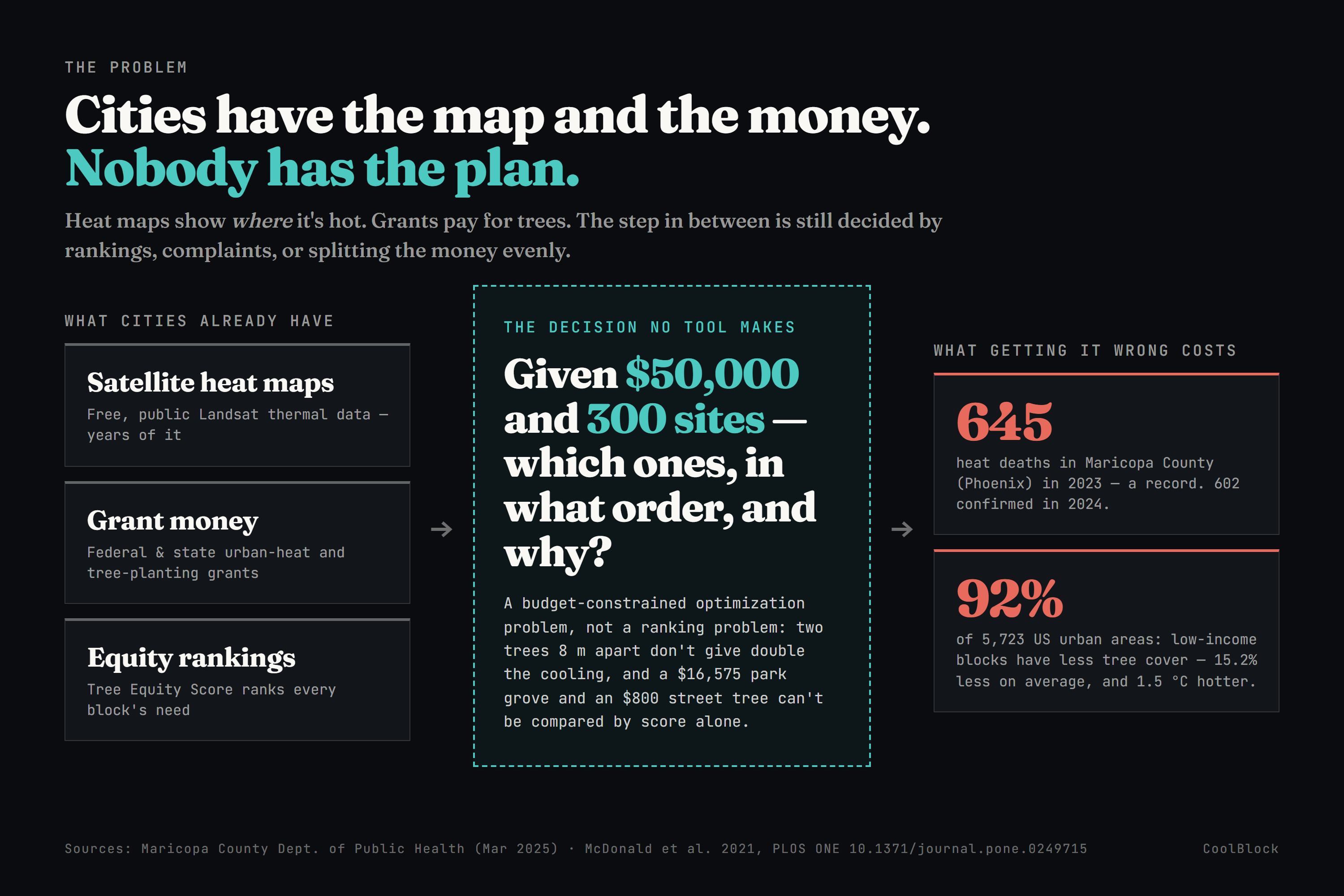
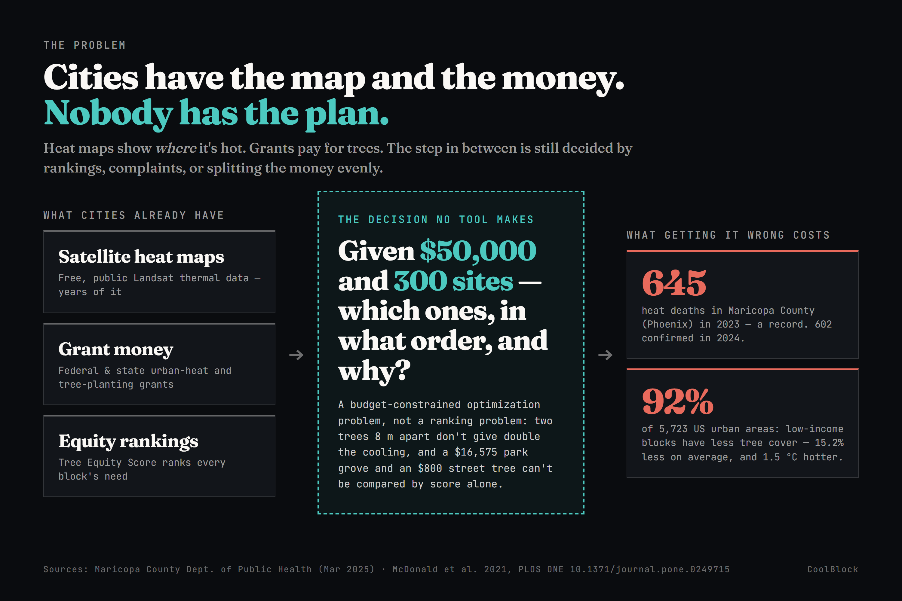
In 2023, 645 people died of heat in Maricopa County, the county that contains Phoenix. It was a record. Another 602 deaths were confirmed in 2024 (Maricopa County Dept. of Public Health). Heat kills more people in the US each year than any other kind of weather.
It doesn't kill evenly. Across 5,723 US urban areas, the poorer blocks have less tree cover in 92% of them - on average 15.2% less shade, and 1.5 °C hotter than the richer blocks in the same city (McDonald et al., PLOS ONE, 2021). The blocks that cook are the blocks with the oldest housing, the fewest trees, and the fewest cars to escape in.
Here's what surprised us: this is no longer a data problem. Cities already have free satellite heat maps, going back years. Money exists - federal and state programs fund tree planting. Tree Equity Score already ranks which blocks need shade most. Phoenix even has a written target: 25% tree canopy by 2030, in its own Tree and Shade Master Plan.
All of that, and the disparity still hasn't moved. So we went looking for the tool that answers the question a city council actually has to vote on:
"We have $50,000 and 300 possible places to plant. Which ones do we fund, in what order, and why those and not the others?"
We couldn't find one. Every tool stops at the map.
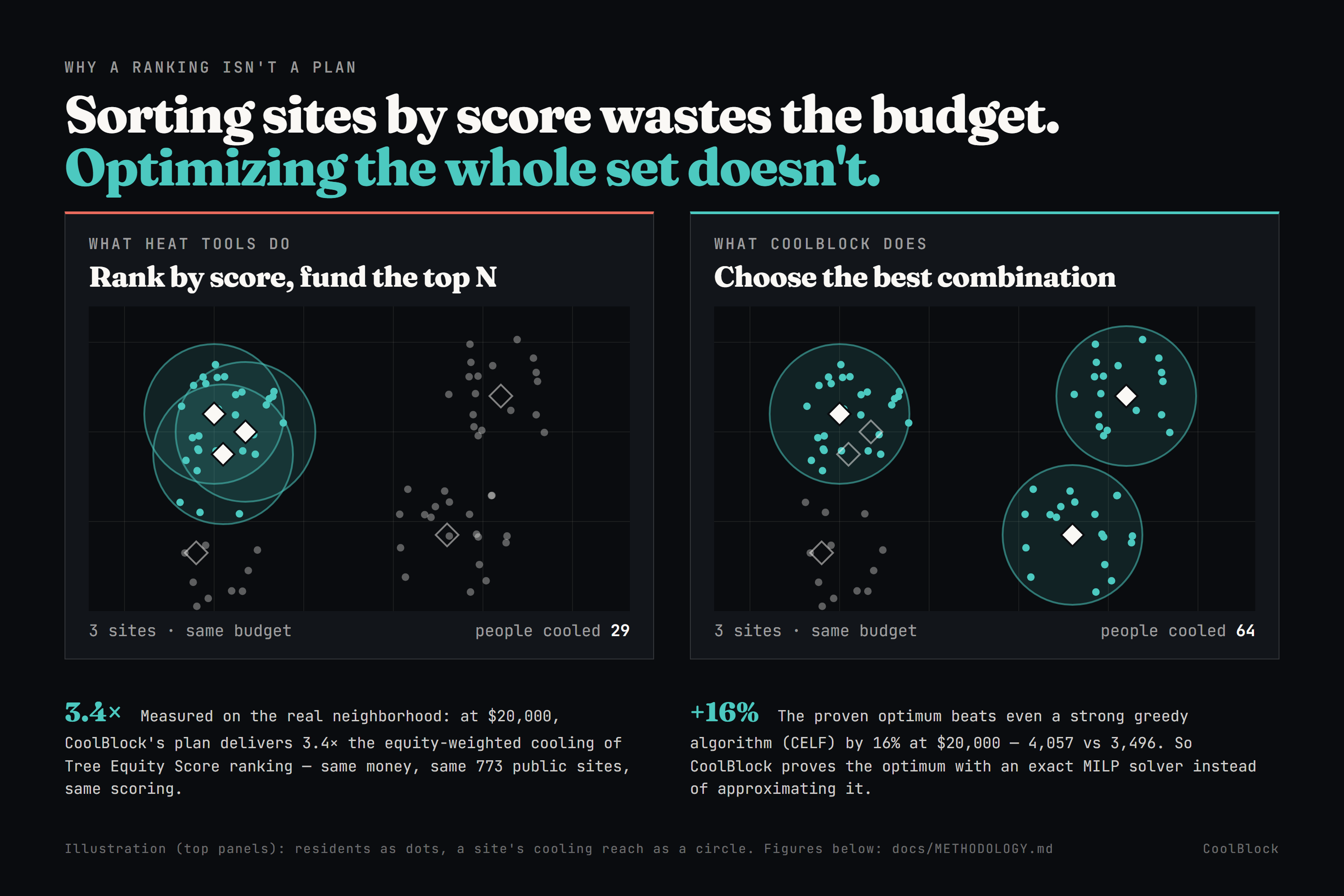
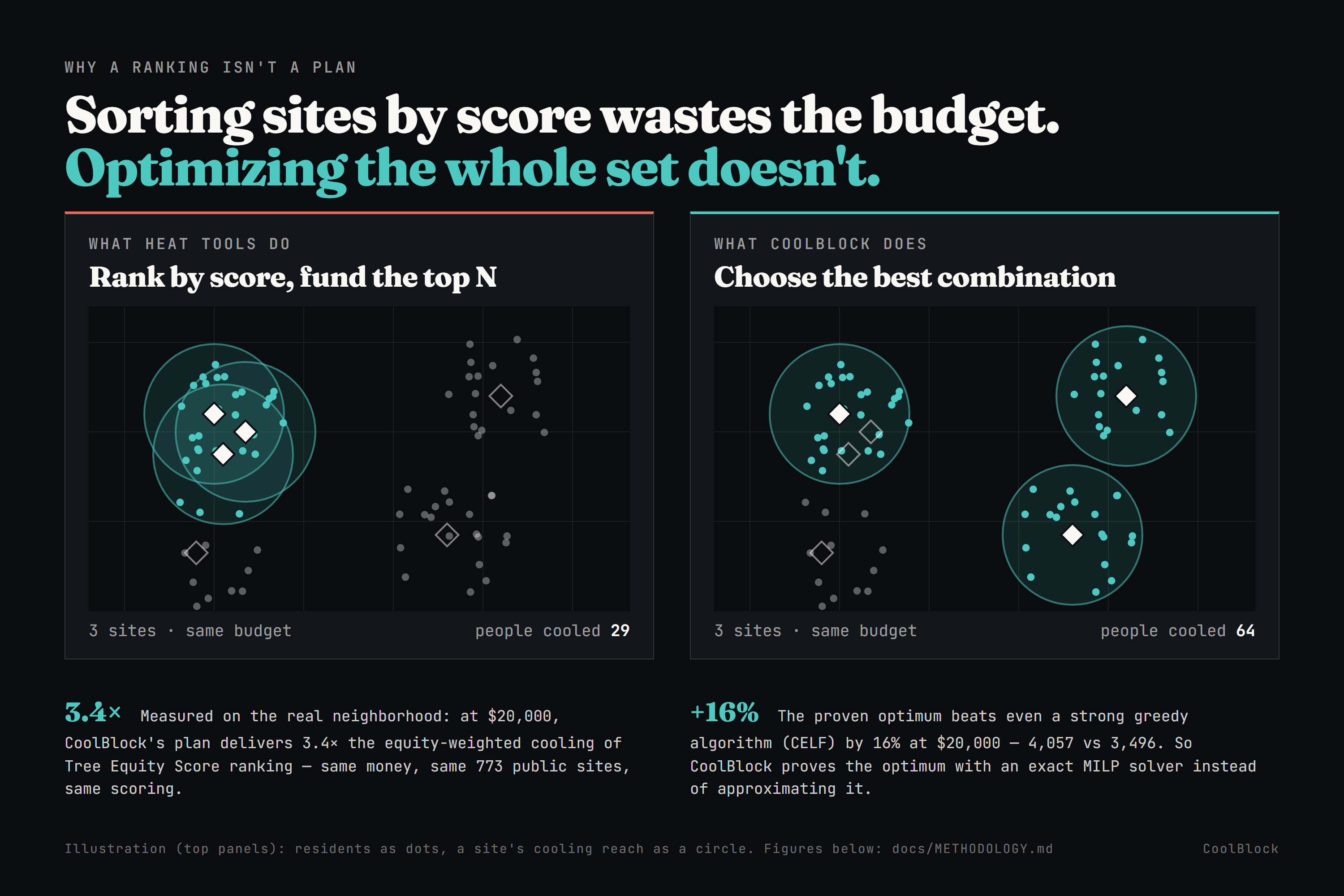
And the reason that last step is hard is that it isn't a ranking problem, even though it looks like one. Two trees planted eight meters apart don't cool twice as many people - they shade the same people twice. A $16,575 park grove and an $800 street tree can't be compared by score alone. So "sort every site by score and fund the top ones" - which is effectively what cities are left doing - quietly buys overlapping shade and leaves people out in the heat.
The data has been public for years and the gap hasn't closed. That's not a data problem. It's an allocation problem. So we built the allocator.
What it does
CoolBlock is a planting planner for one real neighborhood: Edison–Eastlake, Phoenix. You give it a budget. It gives you back the plan - and shows its work.
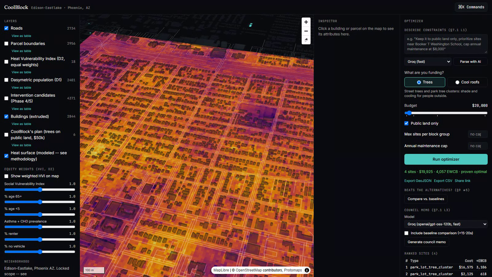
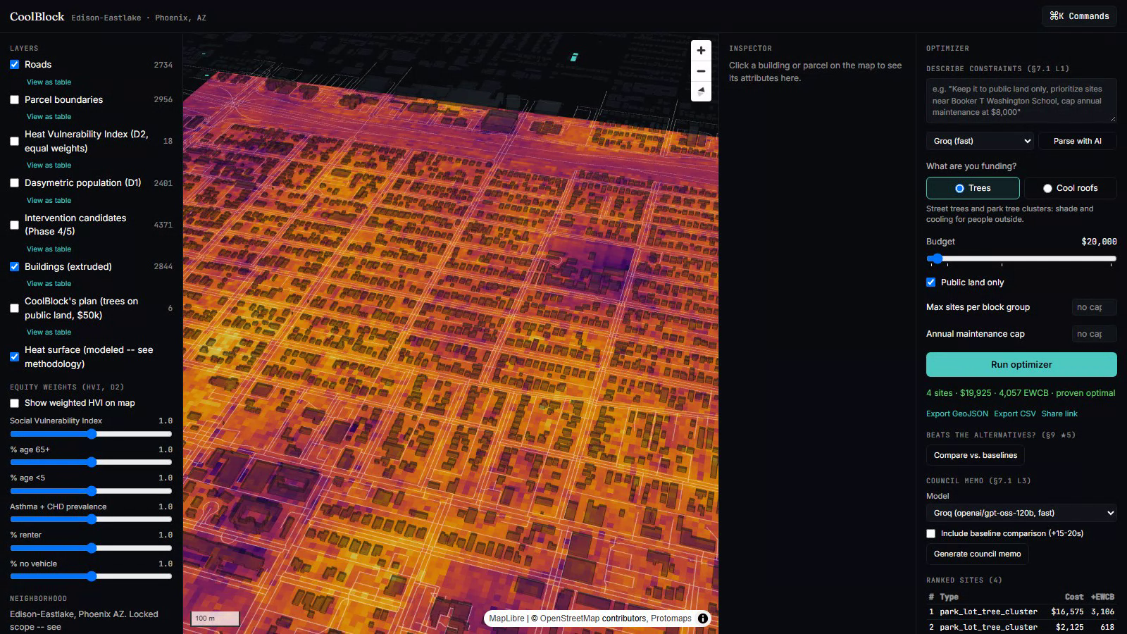
Here's what actually happens when you set the budget to $20,000 on the live site:
- It searches 773 real places. Those are every spot where the city could actually plant on public land - street edges, park and parking-lot margins - each with a real cost attached.
- It picks 4 of them, for $19,925. Three park tree clusters and one street tree - about 46 trees.
- It proves that's the best possible answer. Not "the best we found." An exact solver checks the combinations and proves no other set of sites fits the budget and does better. It takes about two seconds.
- It shows you on the map, with the real heat surface underneath and the sites appearing one by one as it solves. You can export the list as GeoJSON or CSV, or share a link.
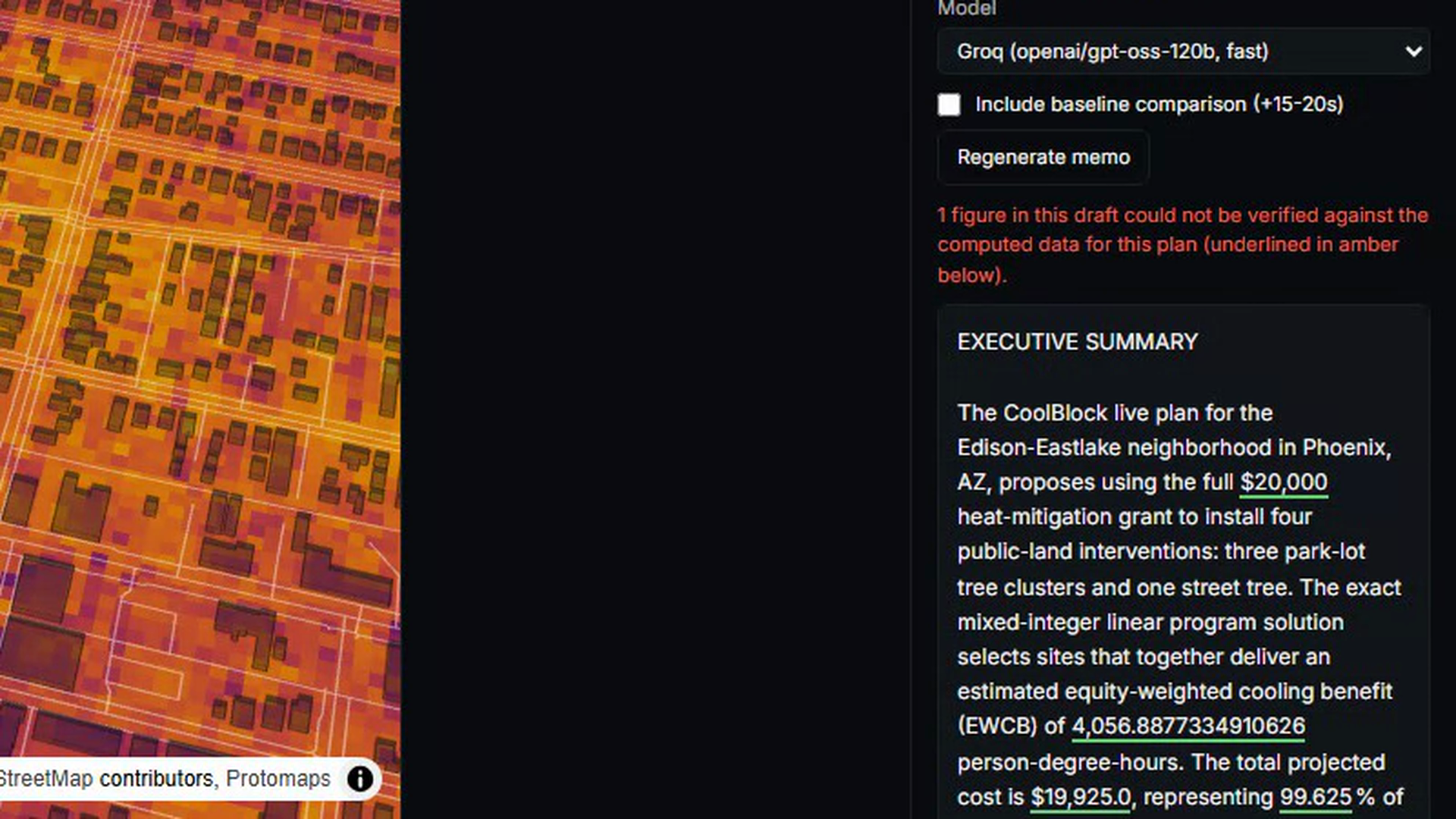
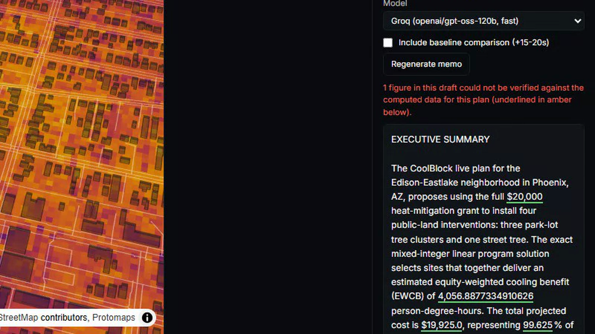
- It writes the council memo - and checks every number in it against the real computed plan before anyone reads it.
Why it picks differently from a ranking. A ranking fills the budget with the highest-scoring sites, which tend to sit next to each other in the same hot block, shading the same people over and over. CoolBlock chooses the set that covers the most people who are most at risk - so the same money reaches further.
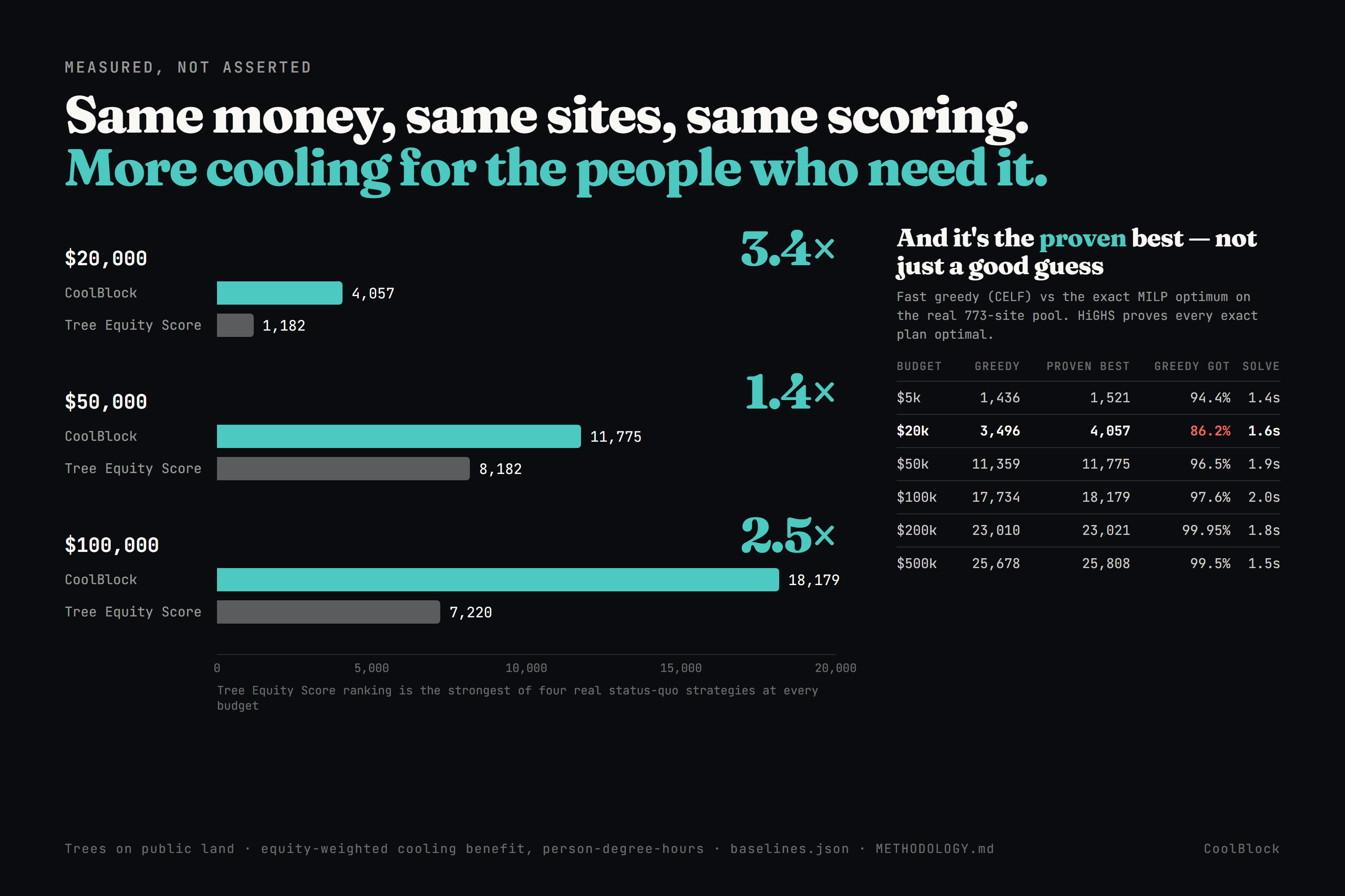
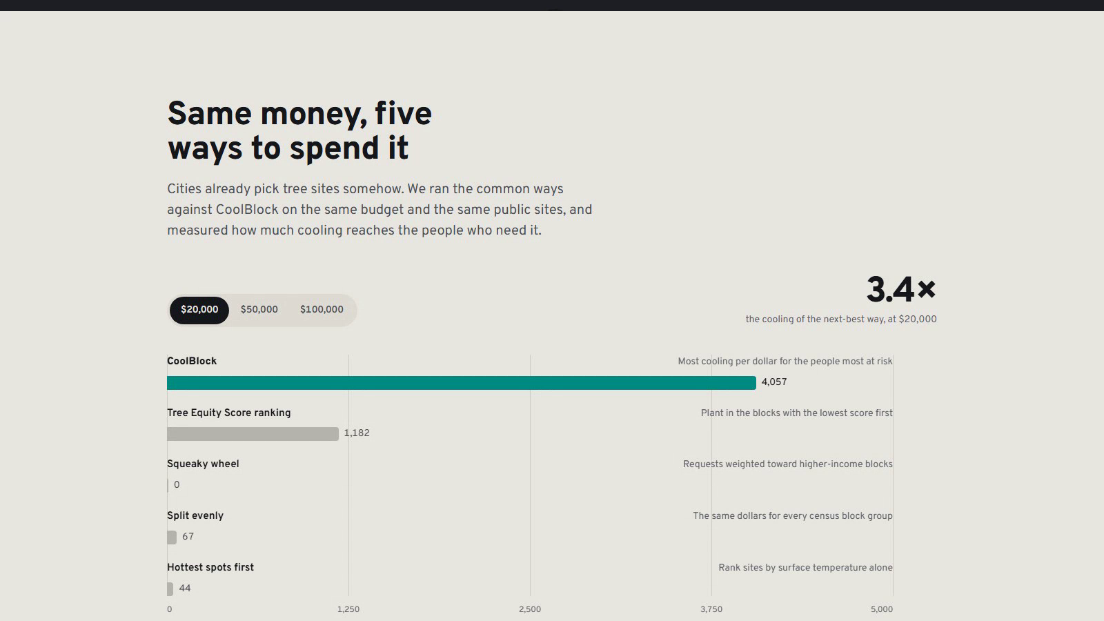
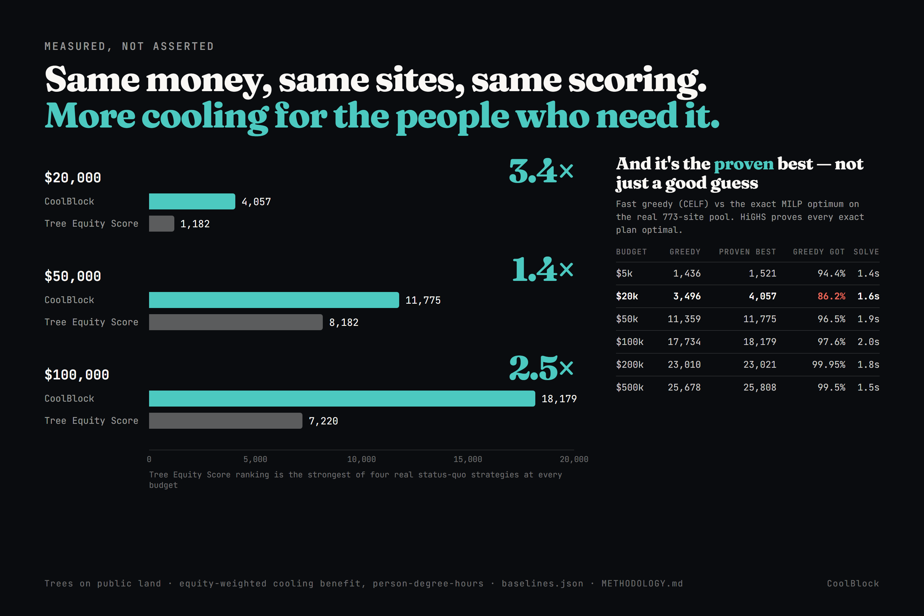
And it says how much better, in numbers. We ran the same budget, the same sites and the same scoring through the ways cities pick today. The strongest of them is Tree Equity Score ranking, at every budget we tested:
| Budget | CoolBlock | Tree Equity Score ranking | CoolBlock's lead |
|---|---|---|---|
| $20,000 | 4,057 | 1,182 | 3.4× |
| $50,000 | 11,775 | 8,182 | 1.4× |
| $100,000 | 18,179 | 7,220 | 2.5× |
The unit is cooling that reaches people, weighted toward the people most vulnerable to heat - older residents, lower income, health conditions, no car. (We call it equity-weighted cooling benefit, in person-degree-hours.)
The memo is the part a council can use. An AI writes the draft from the plan's own data. Then a separate check pulls every number back out of the text and matches it against what was actually computed. If a figure can't be matched, it is shown flagged in amber, not quietly deleted.
Who this is for
- City heat offices - a defensible allocation, where every site is justified by cooling, cost and who it reaches.
- Council members - a memo they can vote on, with checked numbers and real sources.
- The residents who get hit hardest - the optimizer is deliberately weighted toward them.
- Grant writers - a quantified benefit and an exportable site list.
- Anyone who wants to check the work - open data, stated method, stated limits.
How we built it
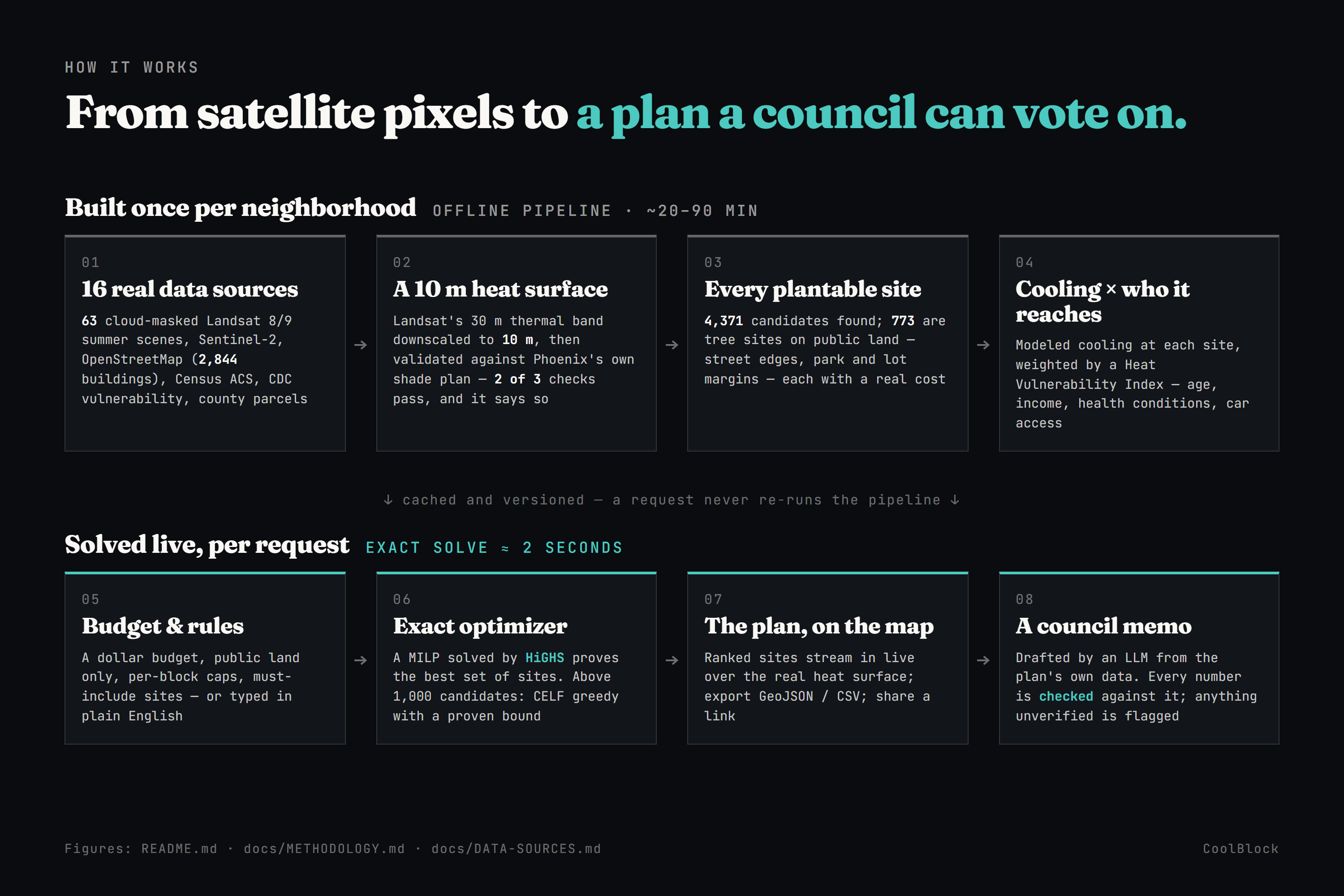
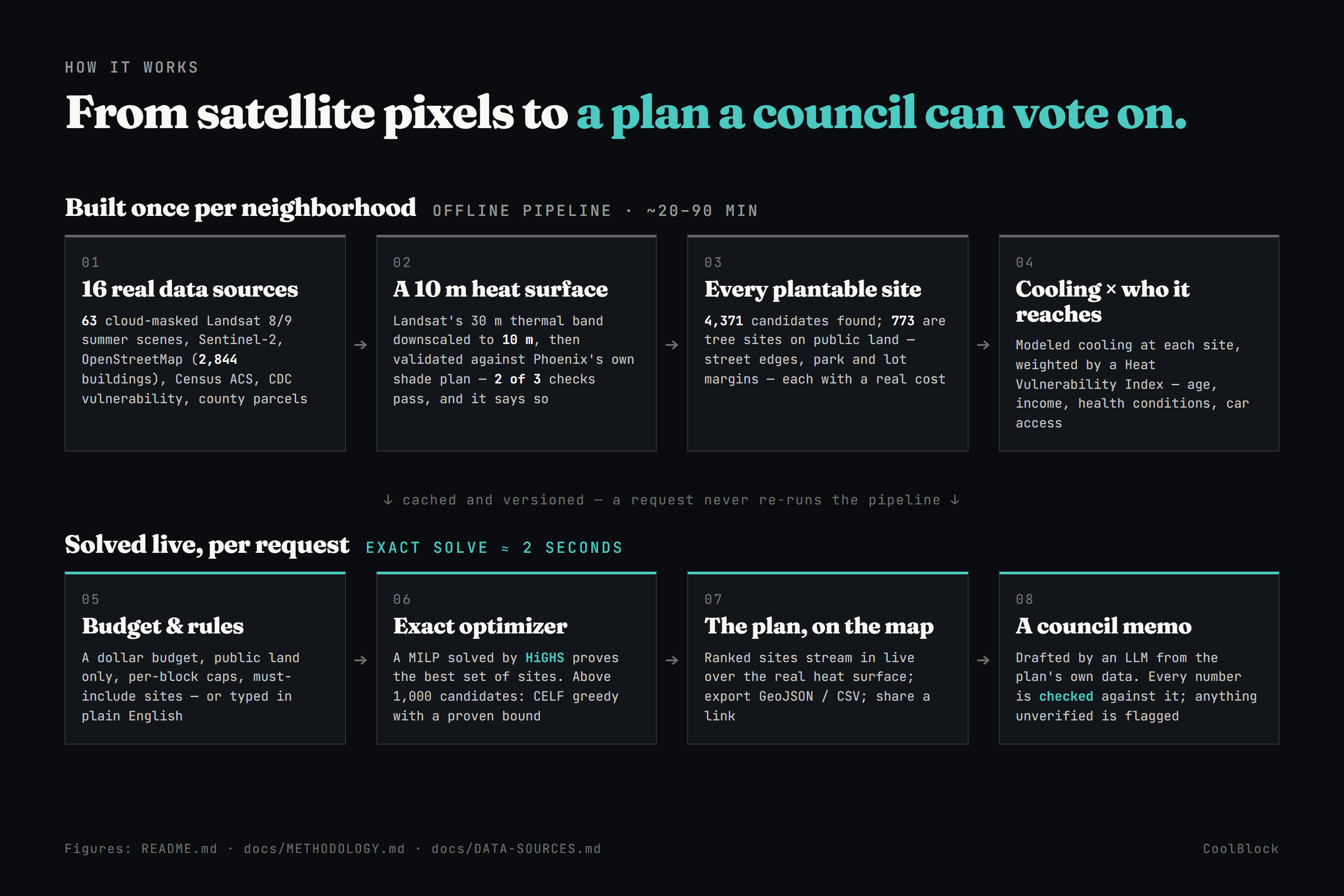
The heavy work happens once per neighborhood (20–90 minutes), and gets cached:
- Gather real data - 16 sources. 63 summer satellite images with clouds and shadows masked out (Landsat 8/9), Sentinel-2, OpenStreetMap (2,844 real building footprints), Census income and age data, CDC health-vulnerability data, and county parcel records.
- Build the heat surface. Satellite thermal images are 30 m per pixel - too coarse for "which corner of this block." We sharpen it to 10 m using a machine-learning model trained on what makes places hot (vegetation, built-up surfaces, how reflective the ground is), then check the result against the city's own published shade plan.
- Find every plantable spot. 4,371 candidate sites in total across trees and cool roofs, public and private land - including the 773 tree sites on public land this plan can actually fund. Each gets a real cost.
- Score each one by cooling × who it reaches. How much a tree cools is anchored to published research: added canopy lowers air temperature by up to 1.5 °C in hot areas (npj Urban Sustainability), and trees roughly halve the urban heat island effect (Nature Communications). Then we weight that cooling by how many vulnerable people are close enough to feel it (Scientific Reports).
Then each request is solved live, in about two seconds. The budget and rules (public land only, caps per block, sites you must include - or just typed in plain English) go to an exact solver called HiGHS, which proves the best combination. For very large site pools we fall back to a fast approximation with a known quality bound.
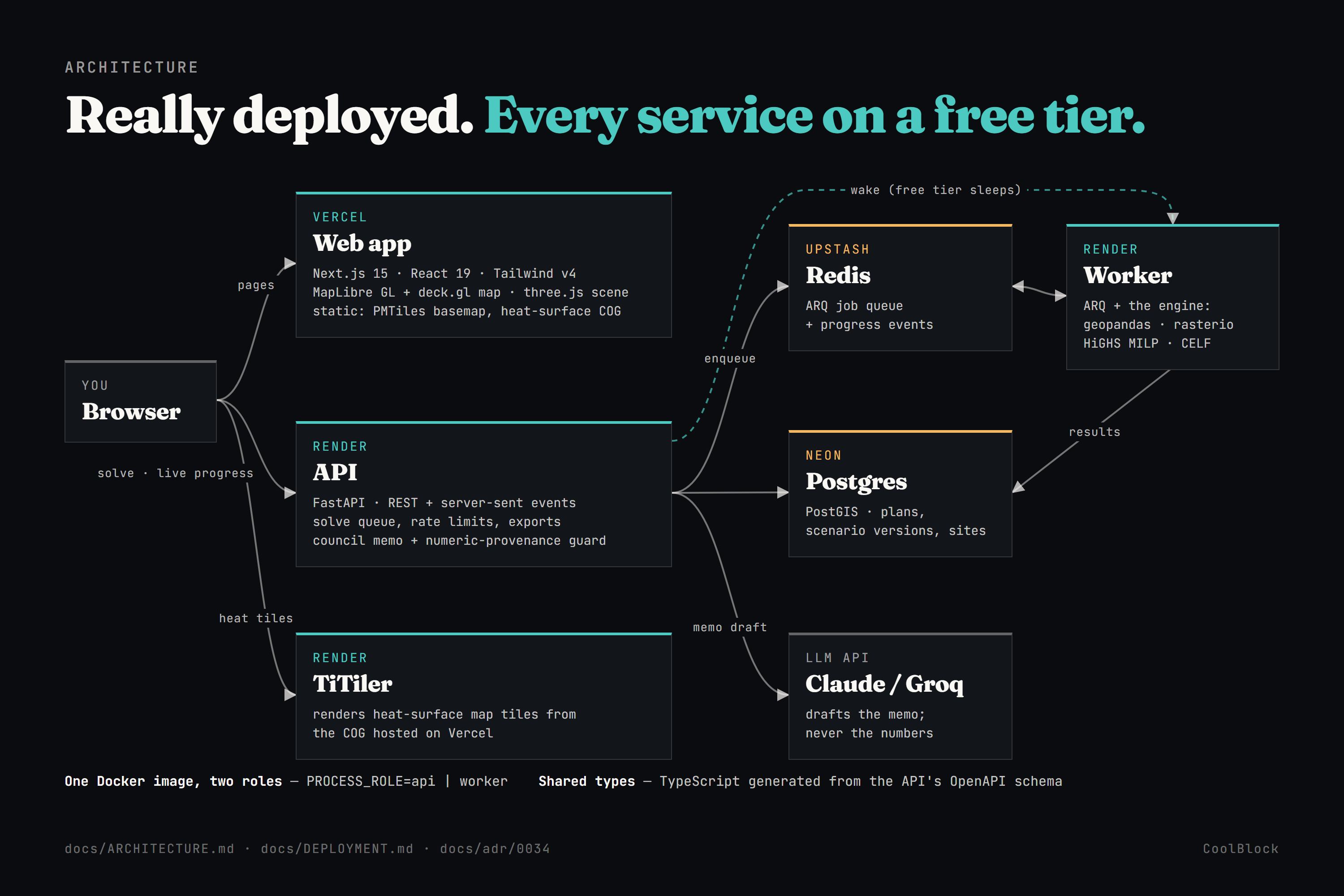
The stack, and it's all really deployed on free tiers:
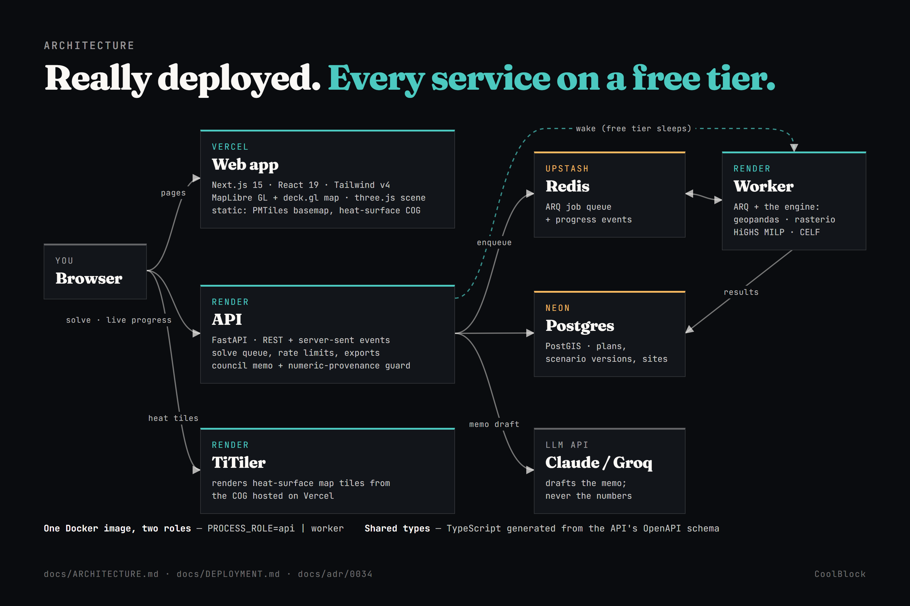
- Web app - Next.js 15, React 19, Tailwind v4; MapLibre + deck.gl for the map, three.js for the homepage scene.
- API - FastAPI, with Postgres + PostGIS for plans and results, and progress streamed live to the browser.
- Worker - the solving engine (geopandas, rasterio, HiGHS) on a job queue, so a slow solve never blocks the site.
- Map tiles - TiTiler renders the heat surface from the source raster.
- AI - Claude (or Groq when speed matters) drafts the memo; a separate provenance check verifies the numbers.
- One Docker image runs as both the API and the worker, and the TypeScript types are generated from the API's schema so the two sides can't drift apart.
Challenges we ran into
Our first version would have planted zero trees. We ranked trees and cool roofs in one list. But a tree cools the air and a cool roof cools a surface - different physical quantities. Compared head to head, cool roofs always won. A product whose homepage asks "where should the next 40 trees go?" would have returned a plan with no trees in it. Now they're separate programs that are never ranked against each other.
The fast algorithm was good, and not good enough. We were about to ship a greedy algorithm. Once the real site pool was small enough to solve exactly, we measured the two against each other - and at $20,000 the proven-best answer beat greedy by 16% (4,057 vs 3,496). That's cooling we'd have thrown away for no reason, so we switched to proving the answer.
Two real privacy bugs, caught before launch. One export carried a private parcel owner's name. Worse, every solve was quietly reading raw county parcel records - real names, real home addresses - just to weight population. Both were fixed at the source.
The free tier fought us, and recording the demo is what exposed it. Three separate failures, all invisible on our laptops:
- The API and the solver ran in one container and blew past the 512 MB limit, crash-looping under real traffic. We split them into two services.
- Then the solver went to sleep and never woke up. Free services sleep without web traffic, and a queue worker never gets any - so solves just hung, with no error anywhere. We only saw it because a demo take sat on "Solving…" for 175 seconds. The API now pings the worker awake when a solve starts.
- The heat map - the product's whole visual - never appeared for anyone. A security setting read one variable name while the map read another, so the browser silently blocked every heat tile. It looked fine locally and was broken in production for days.
The AI got our own metric's name wrong. The memo expanded "EWCB" as "equivalent wet-bulb cooling benefit". It means equity-weighted. Our checker didn't catch it, because it checks numbers, not words. We fixed the prompt, and separately fixed a bug where correct figures were being flagged as unverifiable when the model wrote them with an unusual space character between digits.
Accomplishments that we're proud of
It's real all the way down. Real satellite, census and parcel data for one real neighborhood. A real deployment anyone can open. Even the demo video is screen recordings of the live site - no mockups, no staged progress bars.
The answer is proven, not just fast - and we measured the 16% gap that makes that distinction worth caring about.
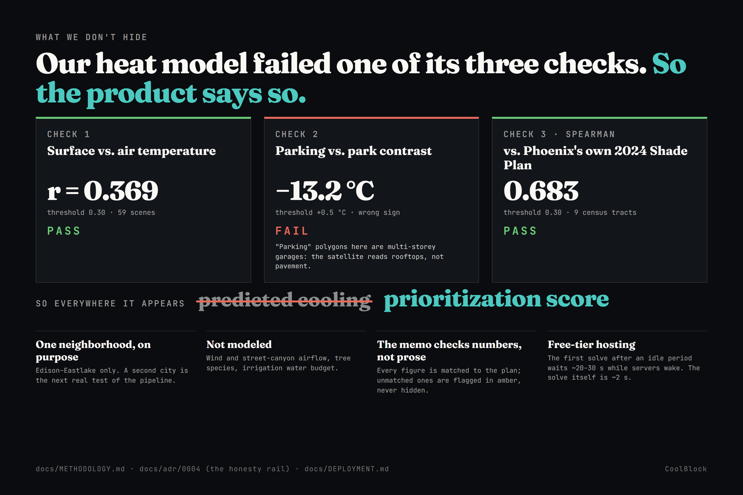
It tells you what it can't do. Our heat model has to pass three independent checks before we'd call its output a prediction. It passes two. The third fails for a findable reason: the "parking lots" in the map data here are multi-storey garages, so the satellite is reading rooftops instead of pavement. So everywhere the product shows modeled cooling, it calls it a prioritization score, not a prediction - in the app, in the memo, in the docs.
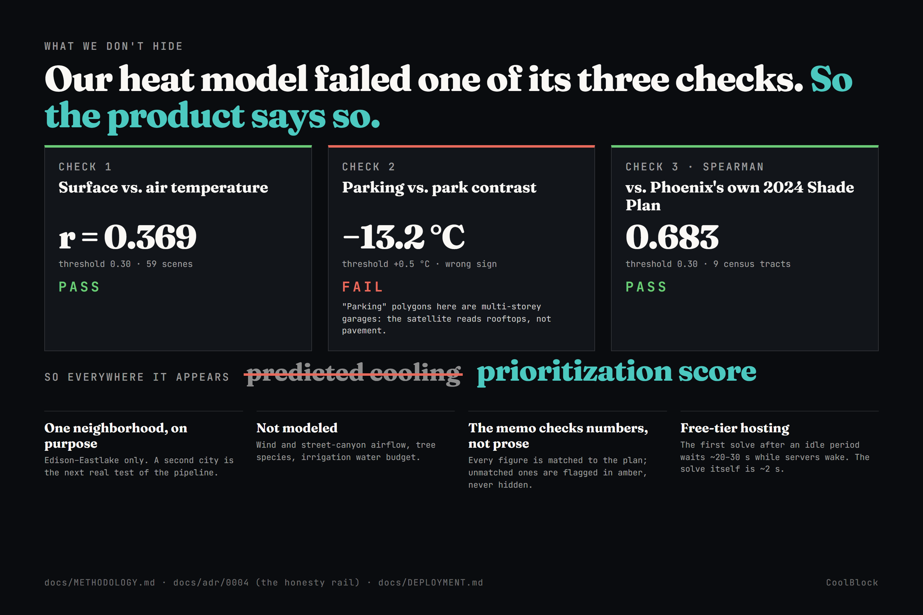
That decision cost us a more impressive-sounding claim. We think it's the most trustworthy thing in the project.
What we learned
The honest version of a result is usually the more interesting one. Measuring greedy against exact - instead of assuming greedy was fine - is what actually made the product better. Publishing a failed validation check made the rest of the numbers more credible, not less.
"It works locally" means almost nothing. Every serious bug in our final week was invisible on a laptop and obvious the moment we used the deployed URL the way a judge would: the sleeping worker, the blocked heat tiles, the memory crash. Watching your own product on the real internet is a testing method.
An AI can be wrong in ways your checks aren't looking for. We verified every number the model wrote and still shipped a sentence that misnamed our core metric. Verification only covers what you thought to verify.
What's next for CoolBlock
- A second neighborhood - the real test of whether the pipeline generalizes or needs rework.
- Checking the memo's words, not just its numbers, starting with terminology and claims about the plan.
- Re-running the failed validation check against better ground truth (county land-use records instead of crowd-sourced map tags).
- Accounts per city team - today the live demo is one shared workspace, which we disclose.
- A printable, council-ready PDF of the plan and memo.
Built With
- arq
- claude
- deck.gl
- docker
- fastapi
- geopandas
- groq
- maplibre-gl
- neon
- next.js
- postgis
- postgresql
- python
- rasterio
- react
- redis
- render
- scikit-learn
- sentinel-2
- tailwindcss
- three.js
- titiler
- typescript
- upstash
- vercel

Log in or sign up for Devpost to join the conversation.