Do you want to see how sustainable each area is? We took in ConocoPhillips data and applied it to our globe website, which compares the resource emissions each country uses. You can sort by name/time.
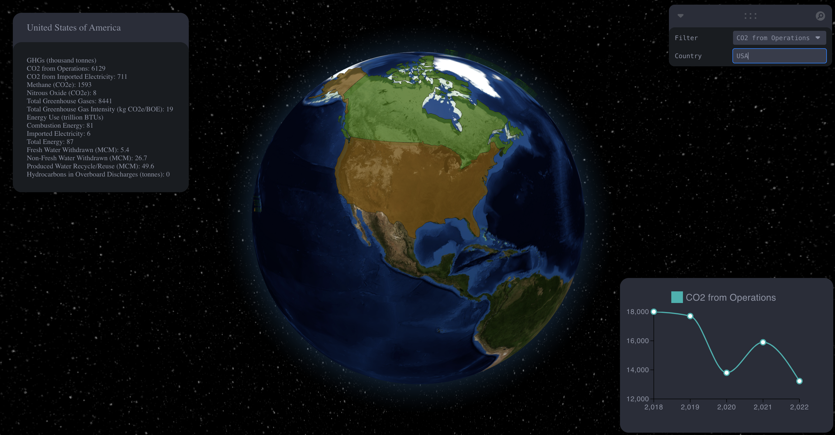
Searching for USA, allows it to pan to the country
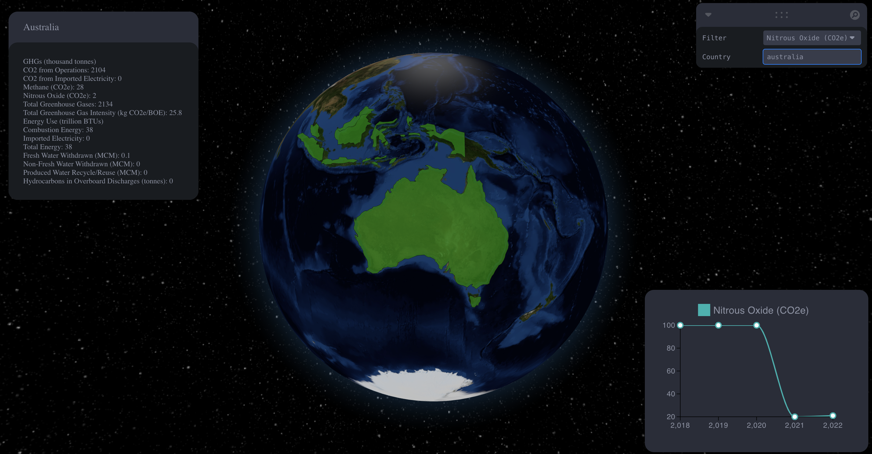
Changing the filter allows the line chart to show annual information on the filter
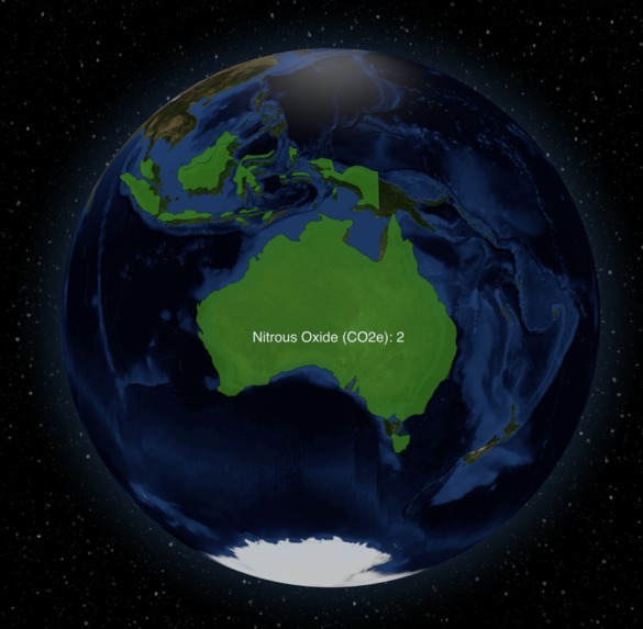
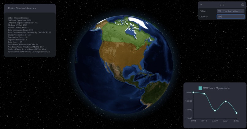
Hovering a country managed by ConocoPhillips allows us to see information
Inspiration- Simple but interactive data visualization that allows users to see Global and annual impact.
What it does- Showcases ConocoPhillips sustainability efforts on a 3D visual.
How we built it- Using three.js, we created a 3D visualization on a React Web Application. We parsed data from ConocoPhillips excel sheets using Python into a JSON file, using this data we connected it into our visual chart and global model.
Challenges we ran into- For the most of our team, this is our first hackathon. We found that we all have different skill sets and follow different tech stacks. Thus, we all had to learn something new!
Accomplishments that we're proud of- We are very proud of our design and the fact that we learned new technologies within 24 hours.
What we learned- Learning to work as a team with people we met at the event! We also learned how to pivot when learning something new.
What's next for ConocoPhillips Sustainability Tracker - Ideally, we would want it to be connected to a database where users could add data and have the visual reflect the added data.
Log in or sign up for Devpost to join the conversation.