-
-
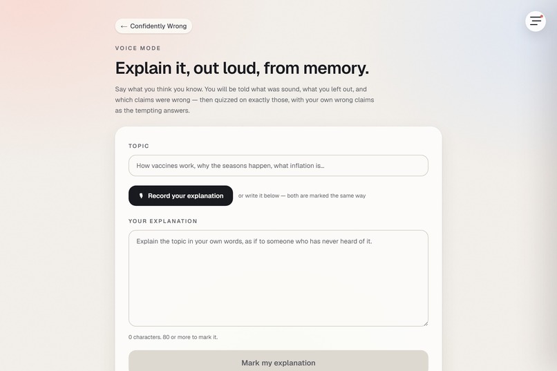
Explain Out Loud
-
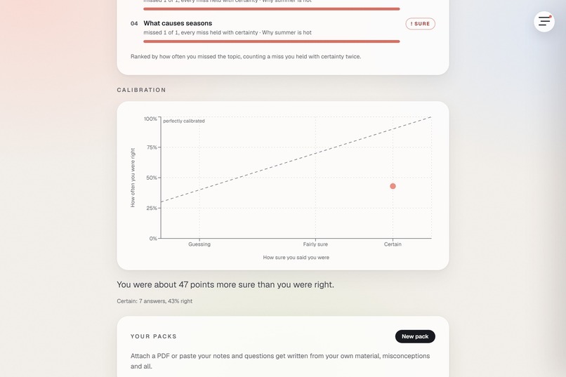
Weak Topics Dashboard
-
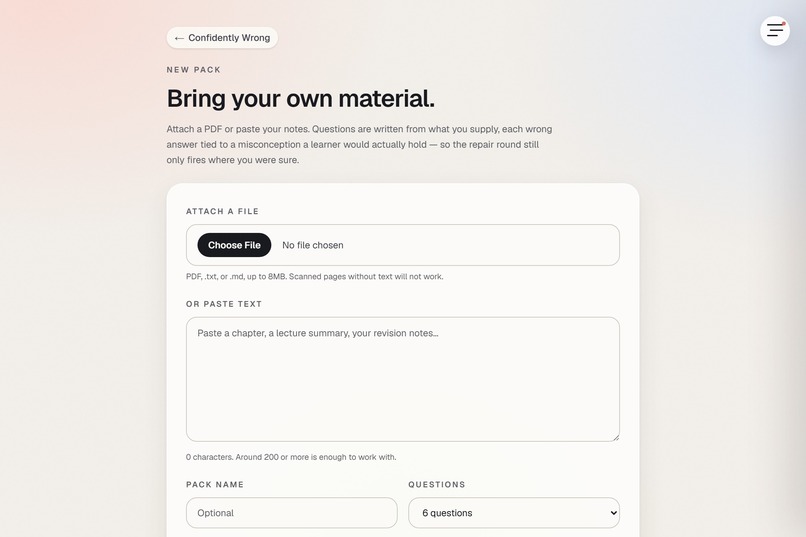
New Pack
-
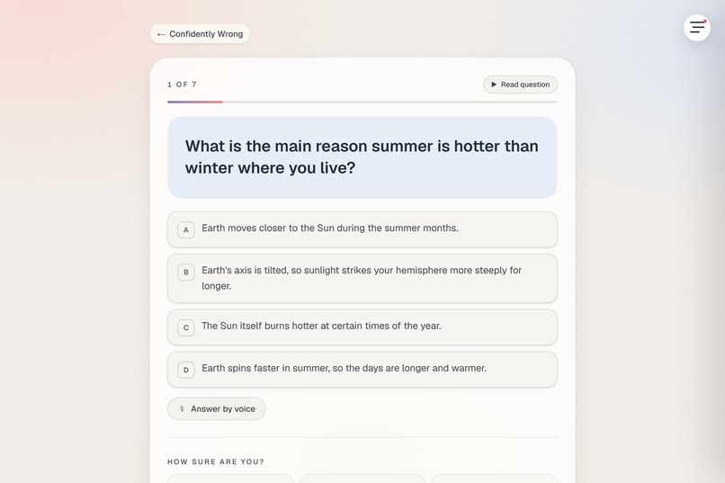
Question
-
Second Beliefs
-
Quadrants
-
Calibration
-
Recheck Curves
-
Recheck Summary
-
Certainity
-
Refutation
-
Home
-
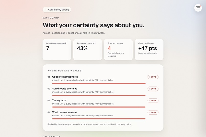
Dashboard
Inspiration
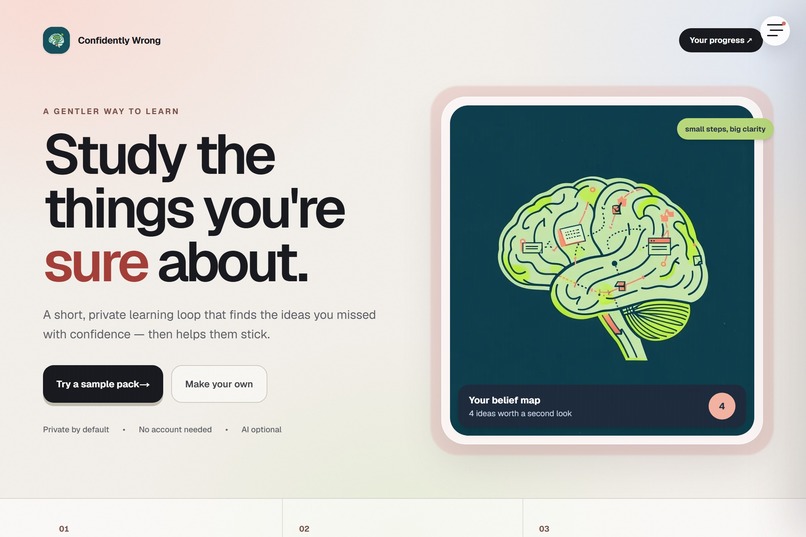
Every study tool tells you what you got wrong. None of them tell you what you were sure about and wrong about, which is the category that matters. A wrong answer you guessed costs you nothing, because you already knew you didn't know. A wrong answer you would have bet on is a belief that keeps steering you until something knocks it out.
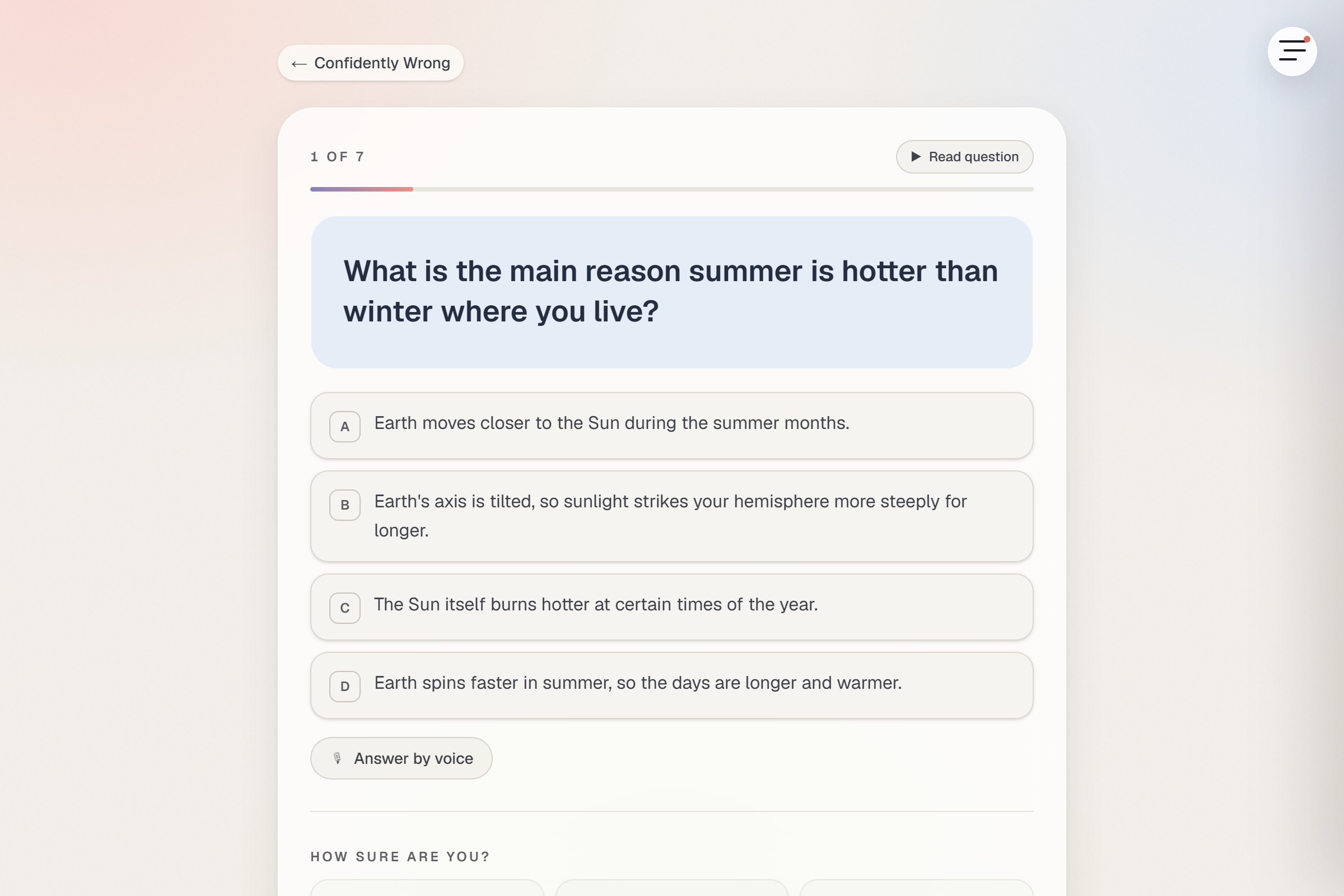
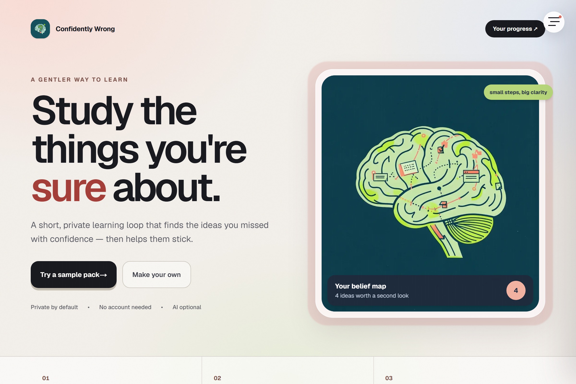
Confidently Wrong is a study loop built on that one distinction. You answer questions on material you have not studied yet, you say how sure you are, and you find out nothing until the end.
Three findings set the design. Gardner-Medwin's certainty-based marking, used in summative medical exams at UCL since 1994, scores your confidence alongside your answer. Butterfield and Metcalfe (2001) found the hypercorrection effect: errors held with high confidence get corrected better than low-confidence ones, once they are surfaced. Richland, Kornell and Kao found that answering questions before you study the material helps on its own, which is why the quiz comes first.
What it does
Five phases, driven by one piece of state: PICK, PROBE, REVEAL, REPAIR, RECHECK.
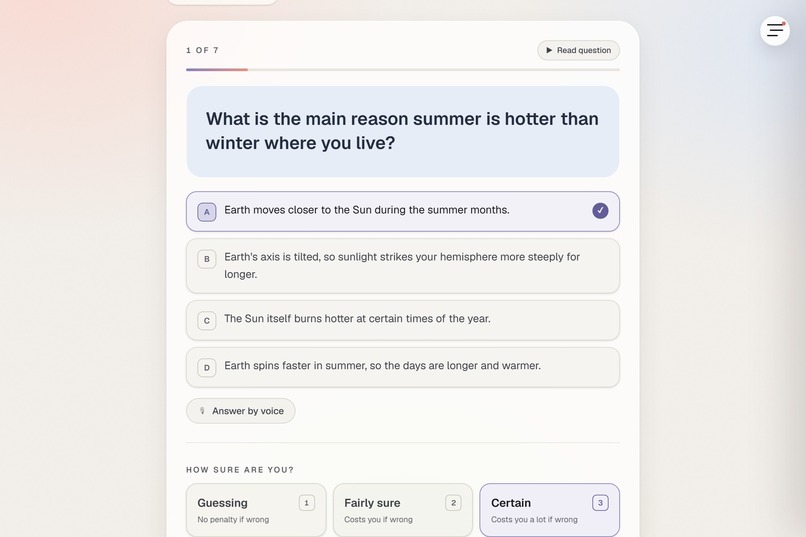
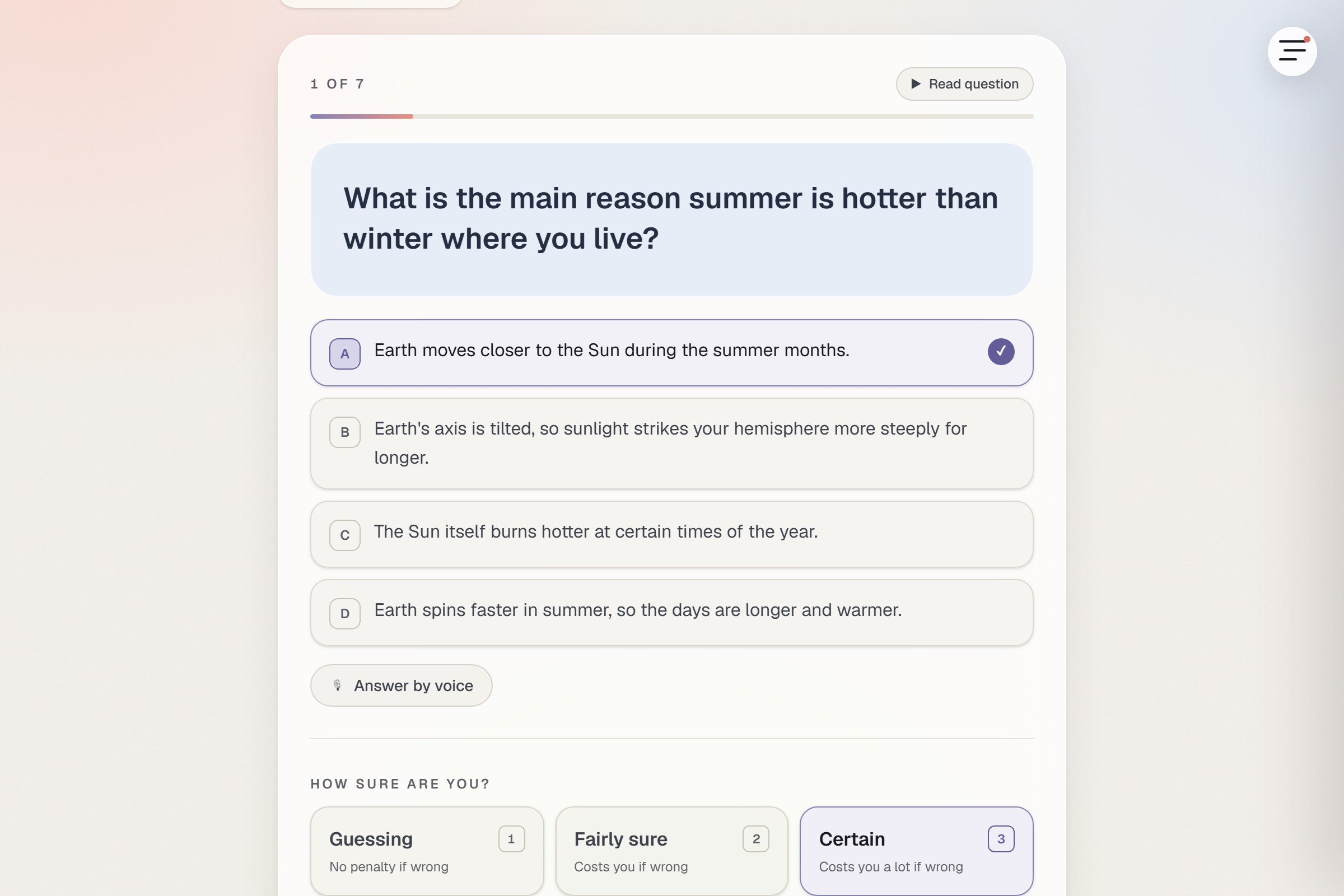
In PROBE you answer and rate your certainty (1 guessing, 2 fairly sure, 3 certain) with no feedback at all. Feedback here would teach you to hedge, and hedging destroys the only signal the app collects.
REVEAL marks your certainty as well as your answers, on the Gardner-Medwin table:
certainty            correct   wrong
1 (guessing)            +1       0
2 (fairly sure)         +2      -2
3 (certain)             +3      -6
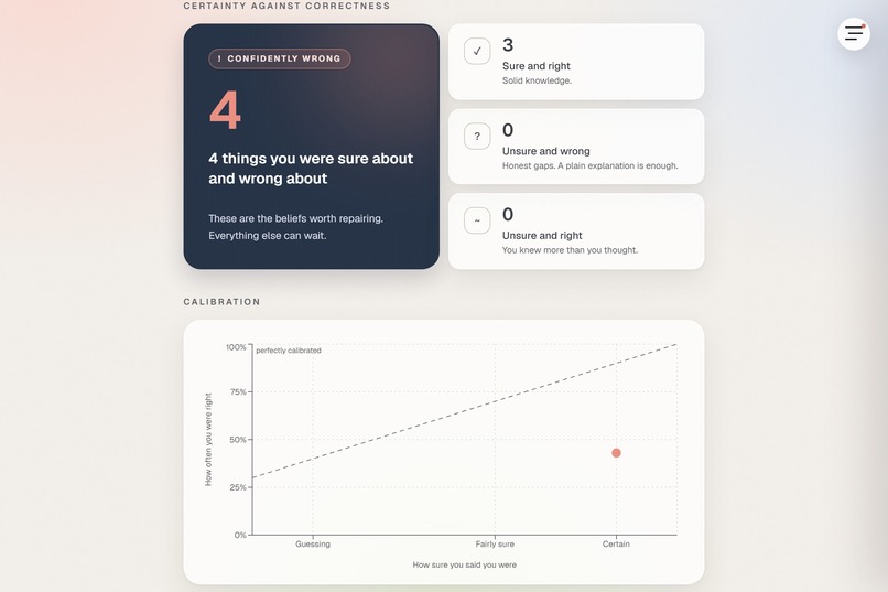
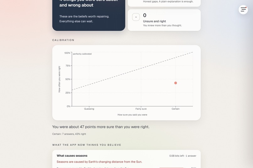
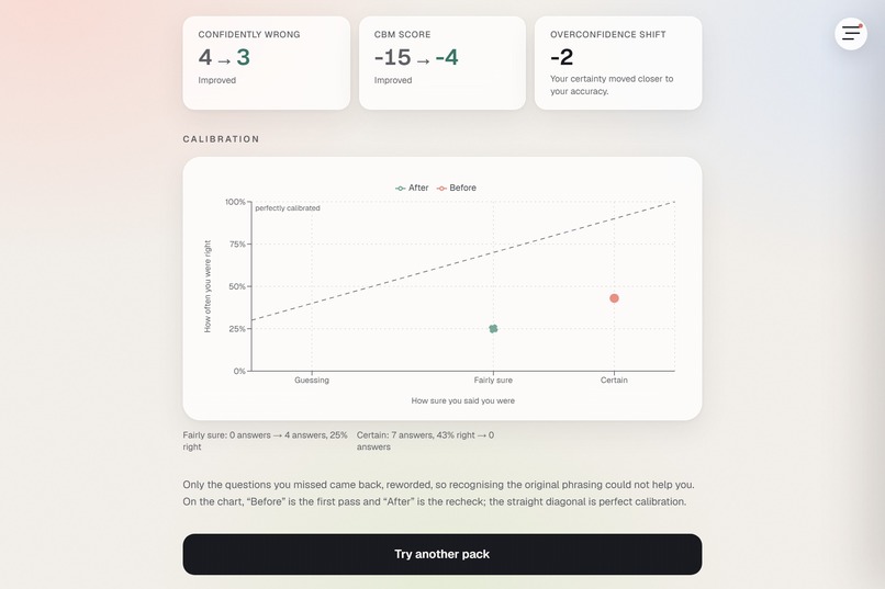
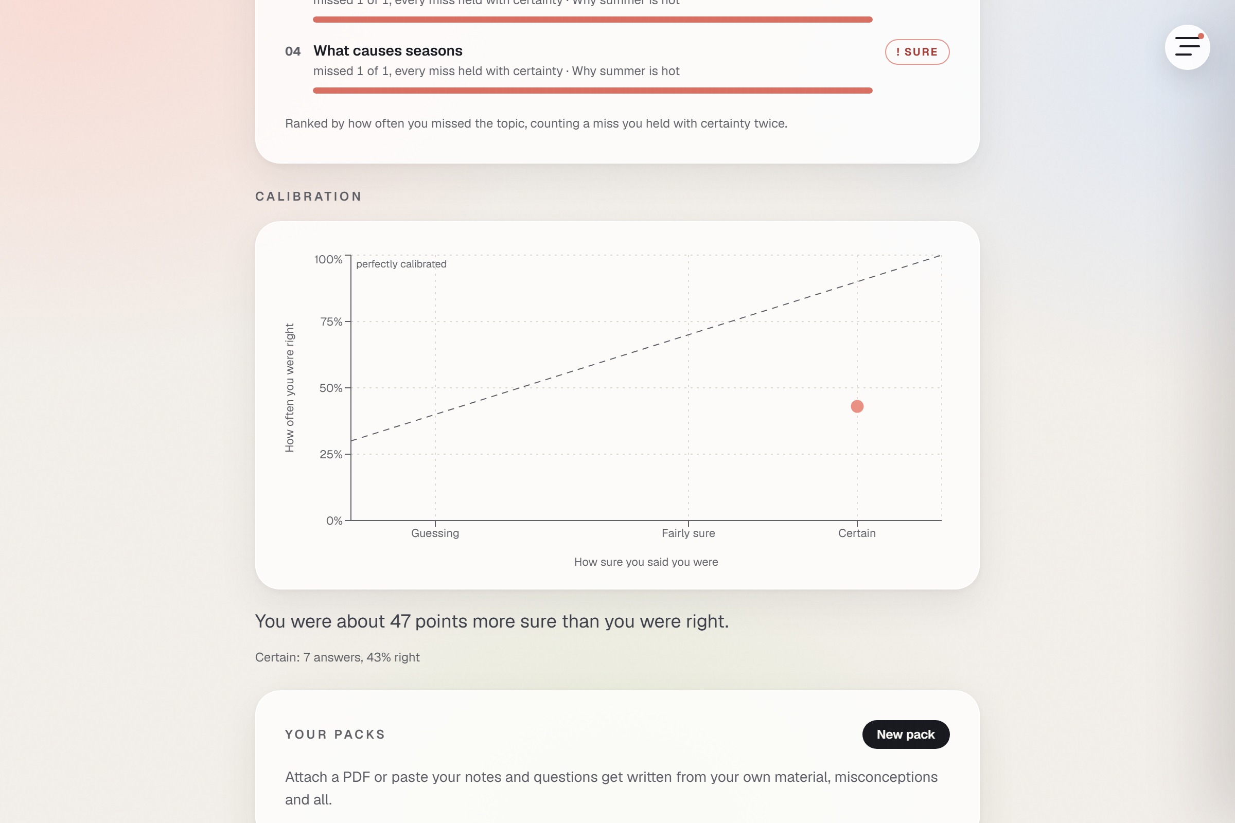
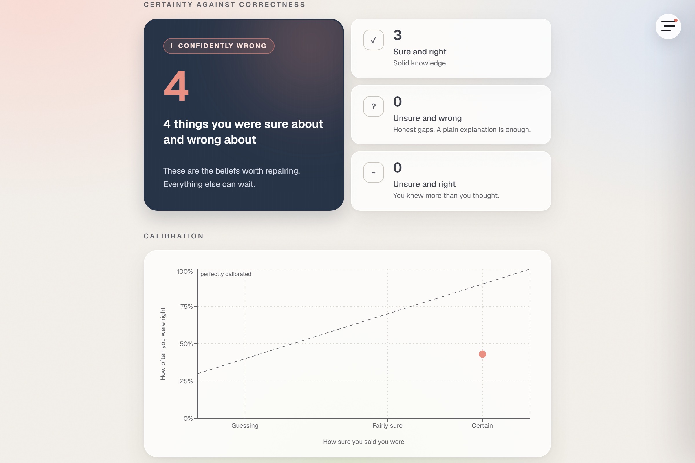
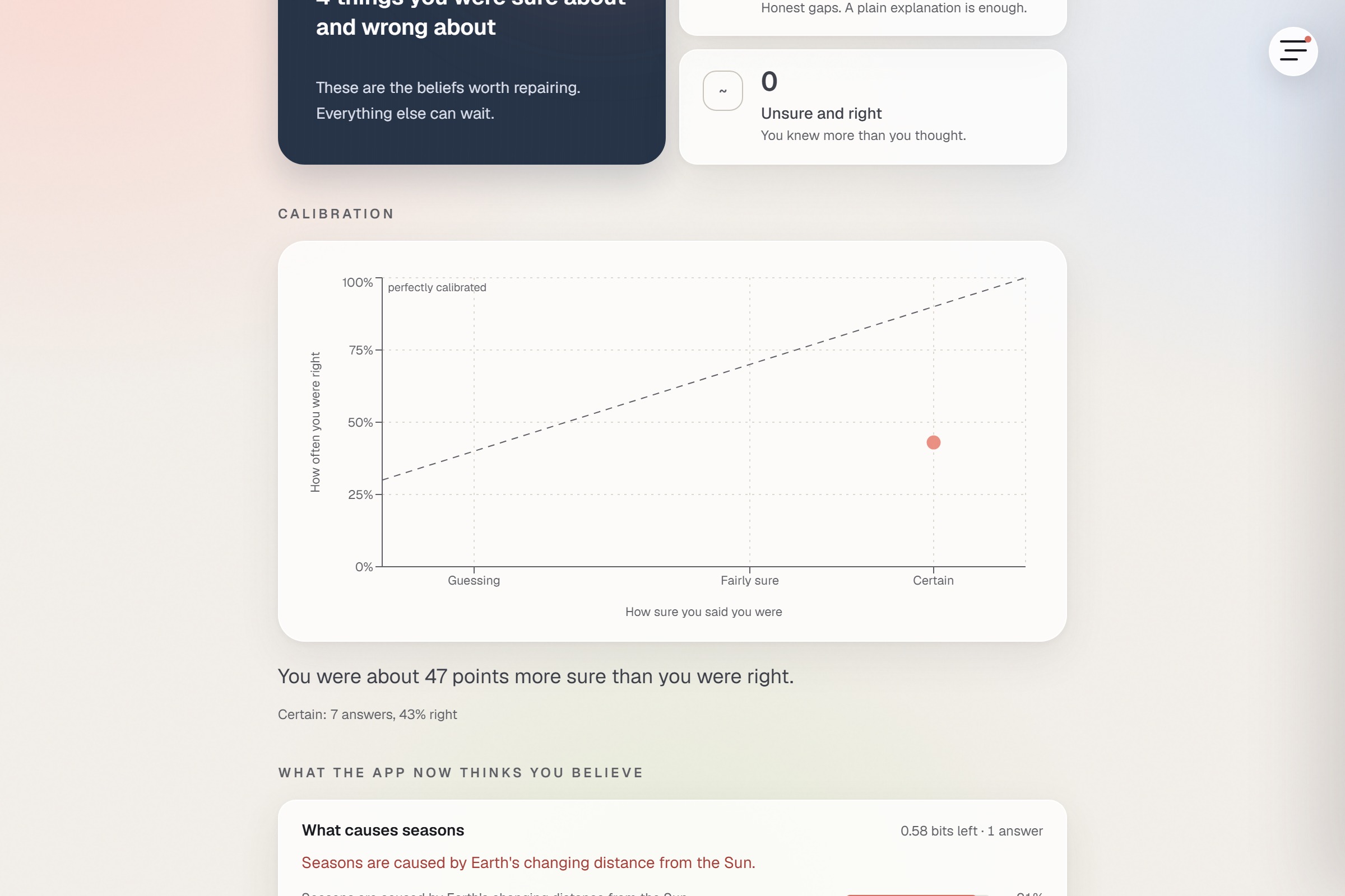
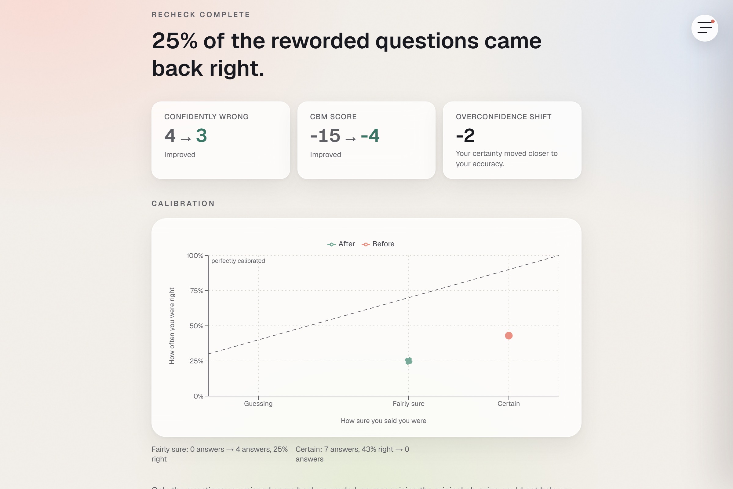
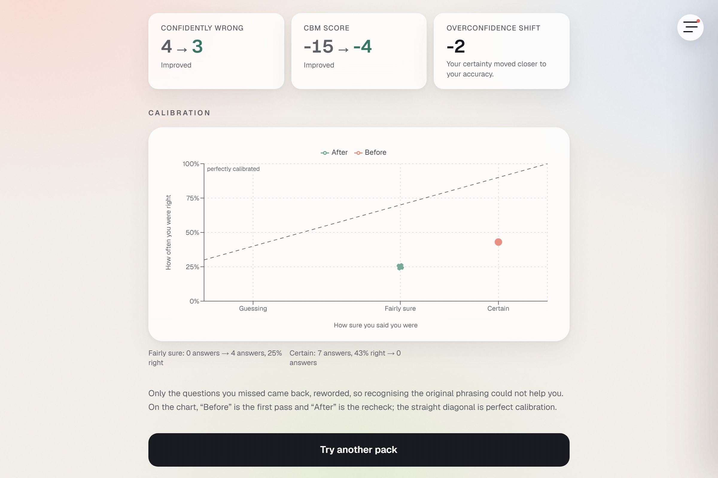
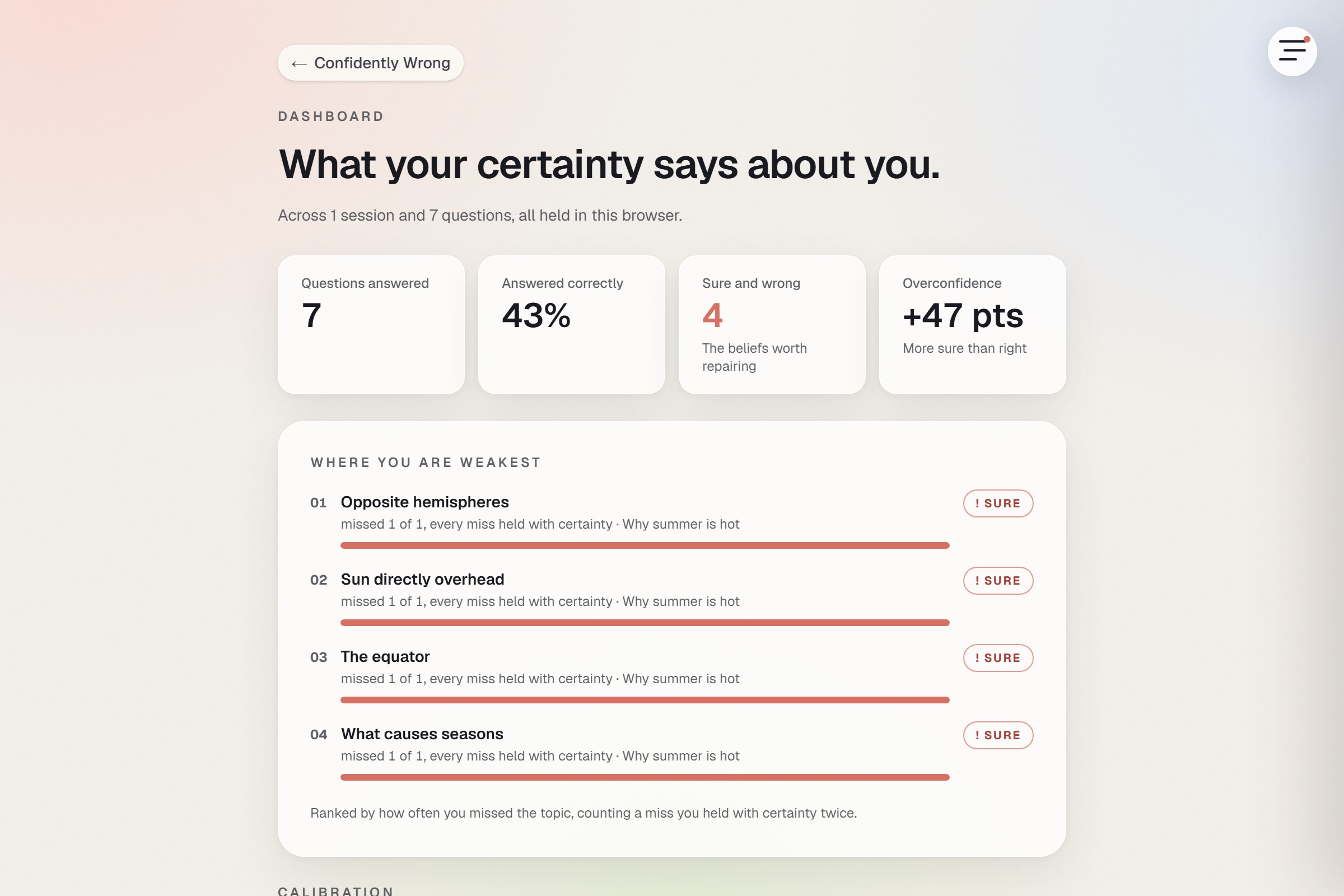
A confident wrong answer costs six. That asymmetry is the pedagogy: it makes honesty the winning strategy. Alongside the score you get a 2x2 quadrant grid, a Brier score, a calibration curve against the diagonal, and an overconfidence gap, which is how far your stated certainty ran above your actual accuracy.
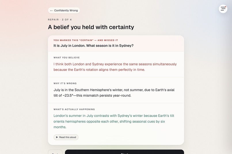
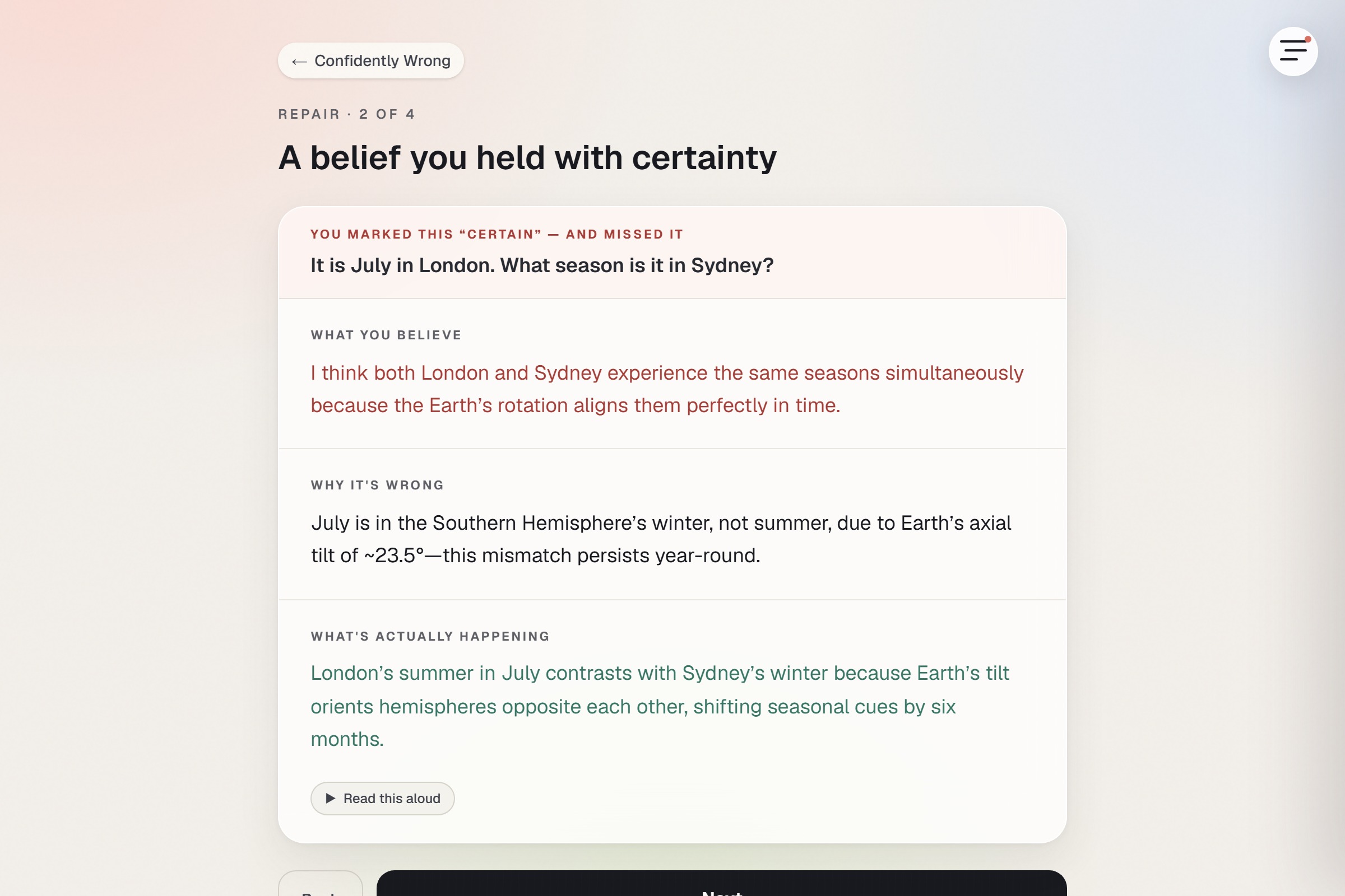
REPAIR holds the one design decision I care most about. Educational Psychology Review (2026) reports that personalised refutation can backfire. A refutation names a belief, states it, then dismantles it, and if you never held that belief, the naming can plant it. So the app gates it:
kind: conf >= 2 && !correct ? "refutation" : "plain"
Only the confidently-wrong quadrant earns a personalised refutation. Every other wrong answer gets a plain neutral explanation. That single condition is the thesis of the project.
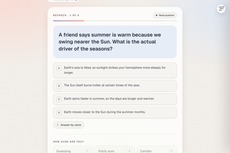
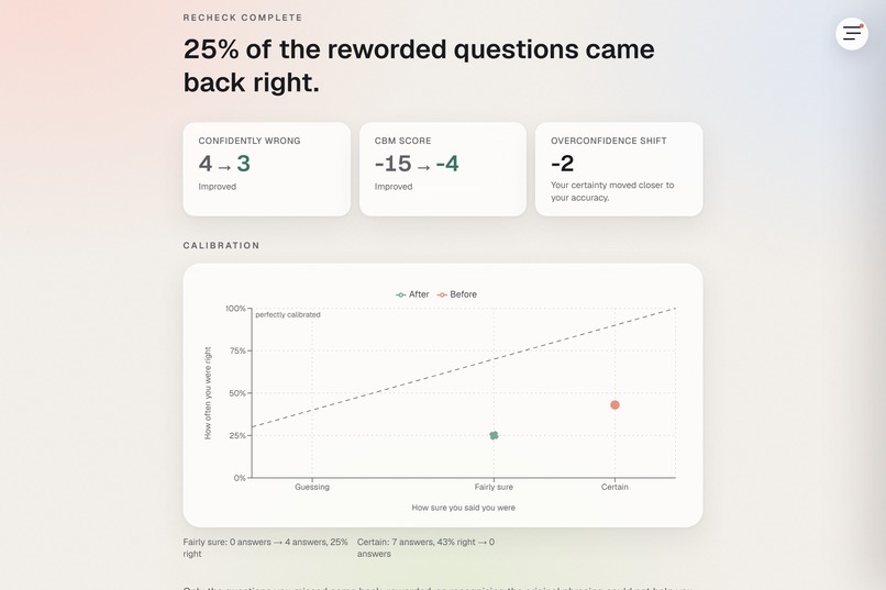
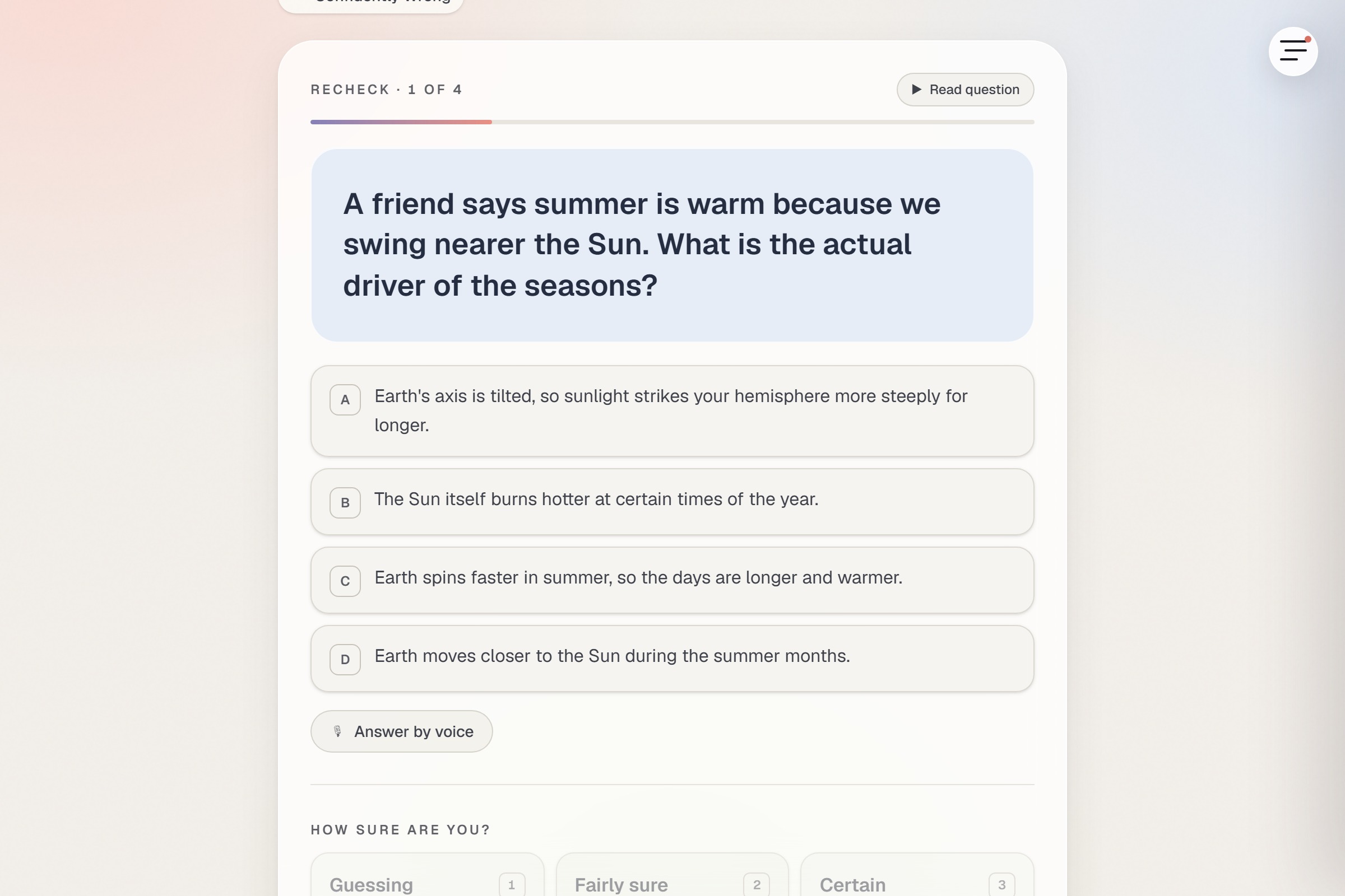
RECHECK asks the misses again, reworded, so you cannot pattern-match the phrasing, and overlays the second calibration curve on the first.
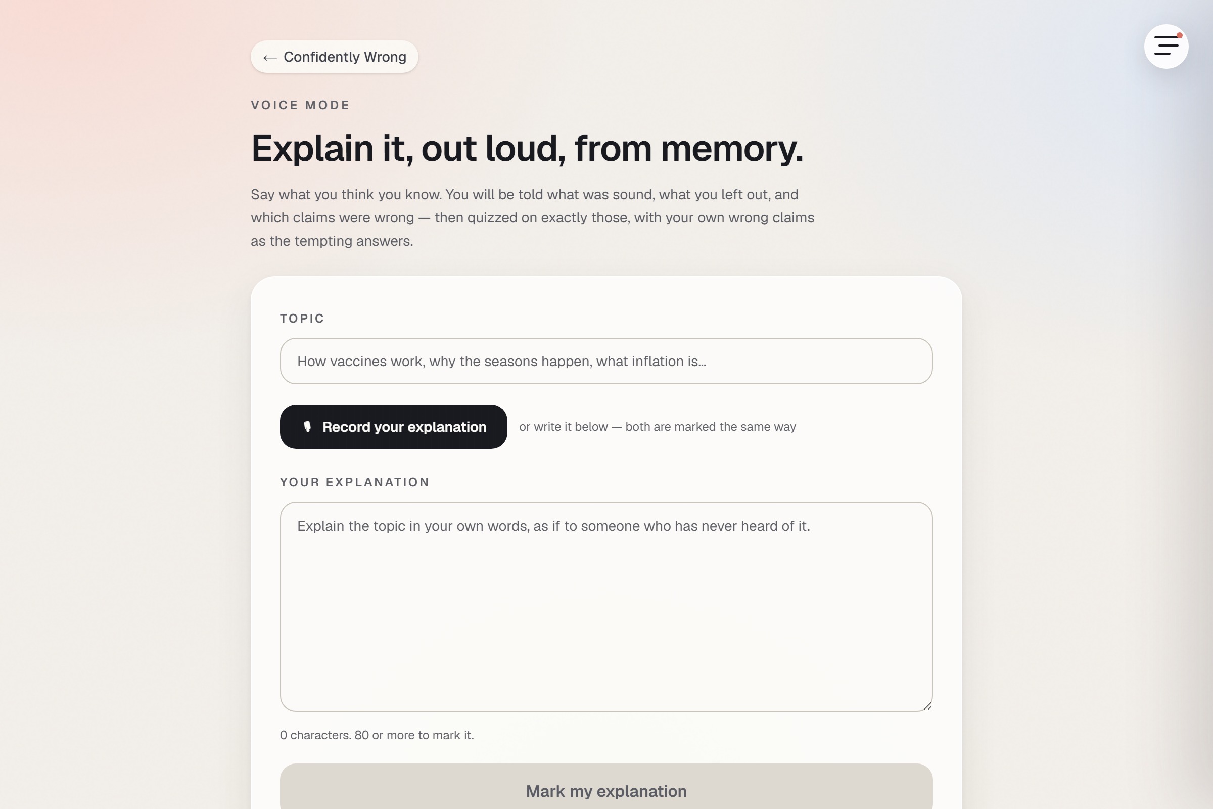
You can also explain a topic out loud instead of answering multiple choice. The app transcribes you and quizzes you on what you left out.
How we built it
Next.js App Router, strict TypeScript, Tailwind, Zustand over localStorage, Recharts for the curves. There is no database. There is no account and nothing to leak, and your calibration history lives in your own browser.
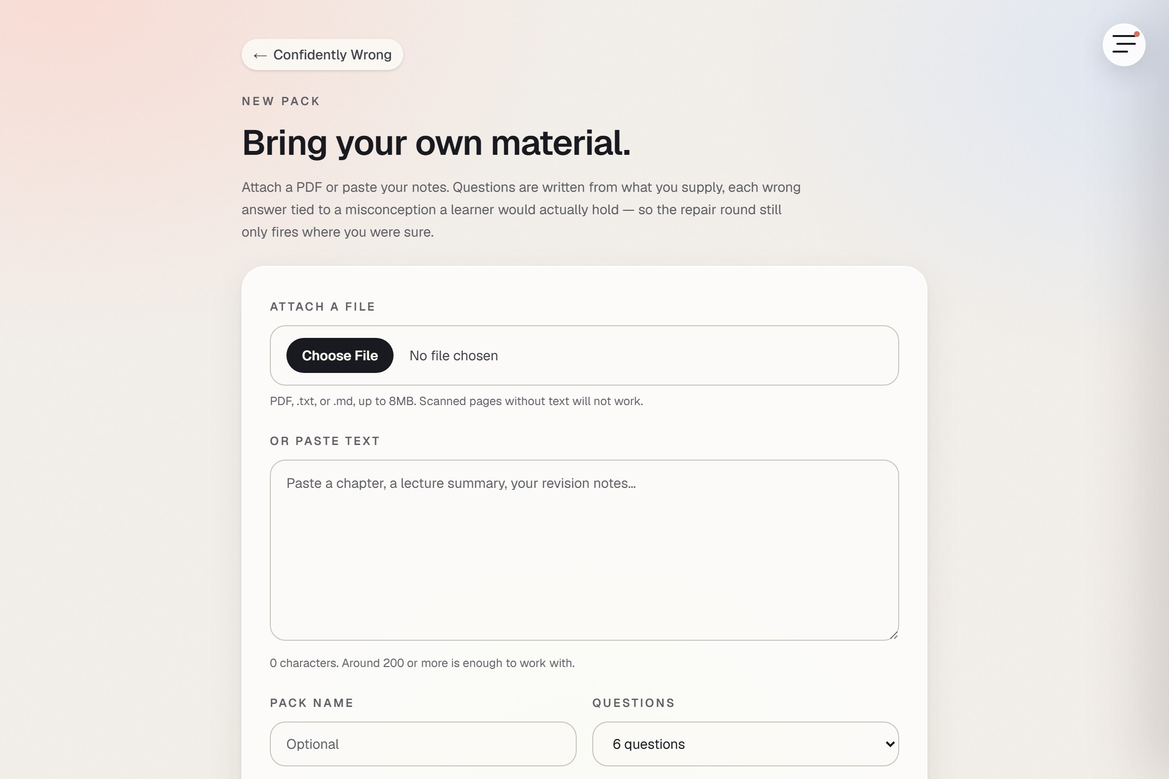
Mistral runs everything. Ministral 3B writes the questions, the distractors (each one a named misconception rather than filler), and the refutations. Voxtral handles speech: voxtral-mini-tts-latest reads refutations aloud, and voxtral-mini-latest transcribes you explaining a topic.
A small model writing teaching material is a liability, so nothing ships unchecked. The generator eval runs a form rubric, then a second opinion pass that answers each question blind to the key and throws out anything it gets right for the wrong reasons, then a citation pass that has to find a verified span of your source that settles the question, then stem embeddings to catch reworded repeats that word overlap misses. The last run: 93 model calls over 3 sources, 15 questions kept, 15 of 15 passing the rubric, 15 of 15 with a verified source span, 4 rejected by the second opinion, 4 caught as paraphrase repeats. The rejections are in the report rather than hidden.
The generation endpoint is public and spends money, so it says exactly that in a comment above the handler and is guarded to match: the API key is read server-side only, max_tokens is hard capped, oversized bodies are rejected, and an in-memory per-IP rate limiter answers 429 before it reads the body, so a client hammering it cannot make it expensive by sending large payloads.
Three documents in docs/ are generated by scripts anyone can re-run, not written by hand. The accessibility report is 22 axe-core scans across the whole study flow at phone and laptop widths, with a second pass that measures axe's undecided elements from the rendered pixels, because an undecided result is not a pass: 0 violations, 0 shortfalls, closest ratio 4.77:1 where 4.5:1 is required. The failure report drives the app into all four of its failure states and records the message, the request count and the status code behind each one. The Lighthouse report covers 5 screens at 5 runs each: accessibility, best practices and SEO all 100, performance 74 to 92, zero layout shift everywhere.
Challenges we ran into
The real one was resisting the feature that would have demoed better. Instant feedback after every question is what every quiz app does, and it would have made the PROBE round feel alive. It also destroys the measurement, because hedged certainty is worthless, so the app shows nothing until the end and has to earn the wait.
A happy-path audit is blind by construction. Eighteen clean scans found nothing, because two of the app's colours only render when something has gone wrong. Adding the two cheapest failure states (a 9MB attachment rejected in the browser, and a dashboard revisited once it had history) turned up eleven contrast shortfalls, the worst at 3.00:1.
One "worst" number can lie. The audit reported a single worst contrast ratio until the worst element turned out to be a 30px numeral, which owes 3:1 rather than 4.5:1. Reporting one figure invited the reader to read a pass as a failure, so it now reports the closest ratio per requirement.
Timing waits are lies waiting to happen. The repair scan waited 3.5 seconds for refutations to arrive and sometimes measured loading skeletons instead of the text it existed to measure. It now waits for an element that cannot exist without the content behind it.
Lighthouse on a working laptop is noisy. Two passes over the same build disagreed by 15 points and put the screens in a different order. This machine's own benchmark index ranged 859 to 1599 across 25 runs while it was serving the build being measured, and Lighthouse multiplies that by a 4x CPU throttle. First paint and layout shift repeat within a tenth of a second, but total blocking time does not, and the score is mostly total blocking time.
Smaller ones: a 373 KB chart library gets prefetched onto four screens that never draw a chart, and next/image's priority prop is deprecated in favour of preload, which only emits a preload link, so the hero image was shipping with no priority hint at all until Lighthouse said so.
Accomplishments that we're proud of
The gate. Three lines of state and one condition, conf >= 2 && !correct, turn a quiz into a tool that treats a confident error and a lucky guess as different things, and refuses to refute a belief you never held.
Evidence instead of claims. Every number above comes out of a script in the repo. 22 accessibility scans with 0 violations and 0 measured shortfalls, all four failure modes documented with their status codes, and Lighthouse scores published with their run-to-run ranges rather than a flattering median.
An eval that throws work away. Four of nineteen questions were rejected by a model that had never seen the answer key, and four repeats were caught by embeddings after word overlap cleared them. Both counts are in the report.
370 tests across 15 files, a clean type check and lint, and a deployed build.
What we learned
Measure the noise before you believe the measurement. The performance report now publishes each score's range and tells the reader to read the range rather than the median, because the first single number I had was mostly a statement about how busy the laptop was.
The scans that pass tell you the least. Every real accessibility finding in this project came from a state the app only enters when something breaks.
A cheap model is usable for teaching material only if something adversarial checks it. The second opinion pass, which answers blind to the key, threw out more than a fifth of the questions that had already passed the form rubric.
And research findings can point in opposite directions on the same screen. Hypercorrection says to hit confident errors hard. The 2026 backfire result says a personalised refutation can plant a belief in someone who never held it. Both are true, and the confidence rating is what tells you which learner is in front of you.
What's next for Confidently Wrong
Adaptive item selection by expected information gain, so the next question is the one that would tell the app the most.
An opt-in research mode that randomises refutation against plain correction within the confidently-wrong quadrant, so the app can report its own comparison with an honest sample size.
A delayed 24-hour retest. Right now the recheck curve is measured minutes after the repair, which means it is partly evidence about immediate re-exposure rather than retention. That is a real limitation of the current design and the README says so.
Embedding-based clustering of misconceptions on the dashboard, so a learner sees the shape of what they believe wrongly instead of a list of items.
Built With
- axe-core
- css
- lighthouse
- localstorage
- mediarecorder-api
- ministral-3b
- mistral-ai
- mistral-api
- next.js
- node.js
- playwright
- react
- recharts
- tailwindcss
- typescript
- vercel
- vitest
- voxtral
- web-speech-api
- zustand


Log in or sign up for Devpost to join the conversation.