-
-
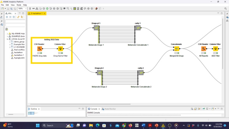
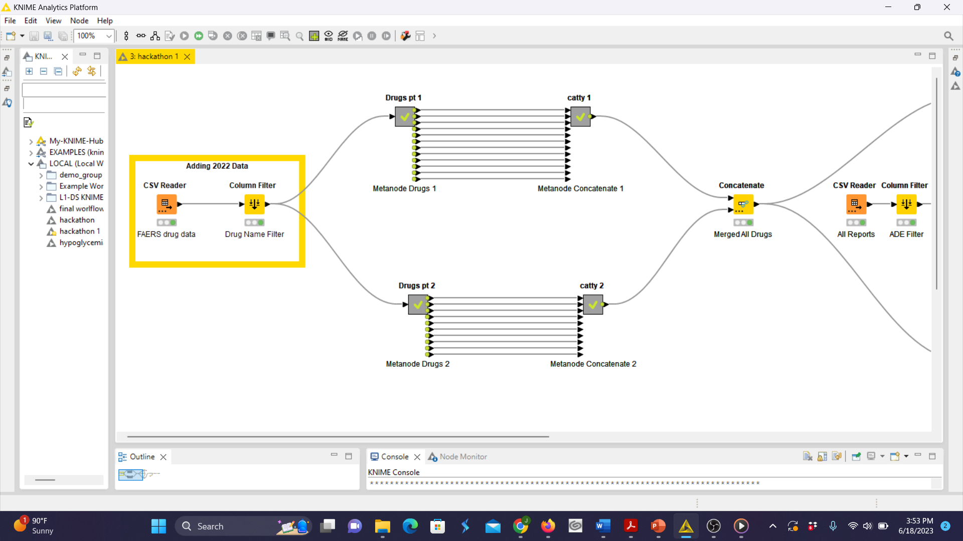
The first part of our workflow
-
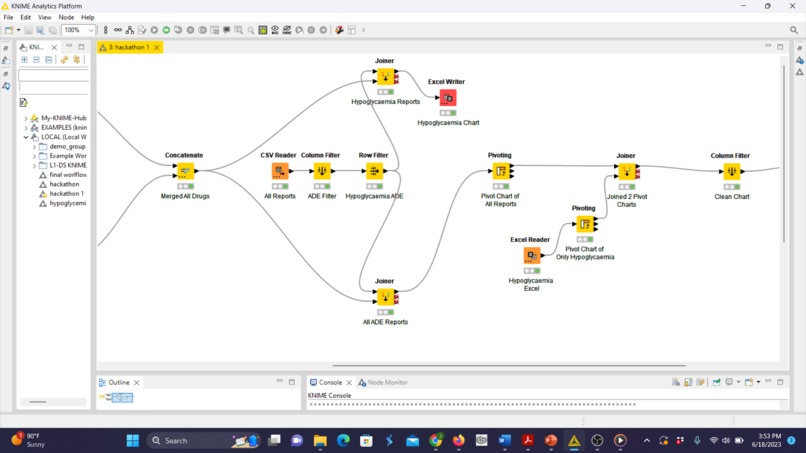
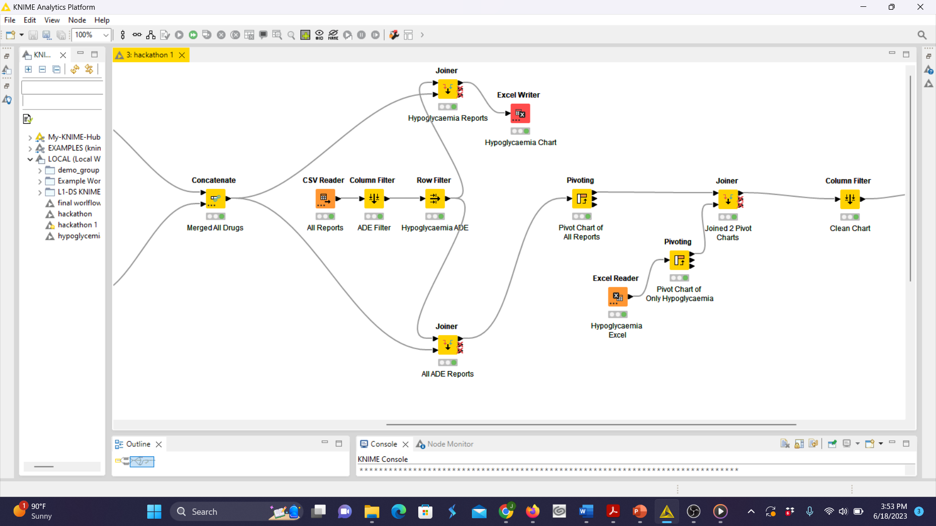
The second part of our workflow
-
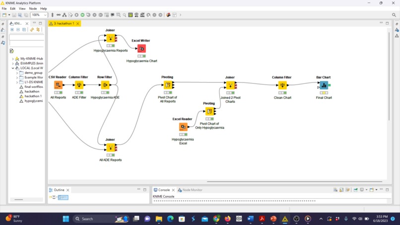
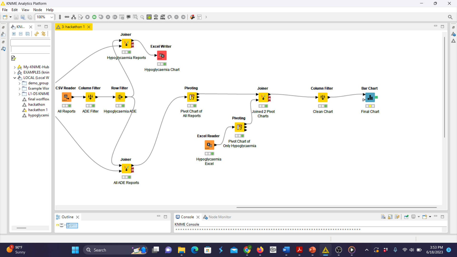
The third part part of our workflow
-

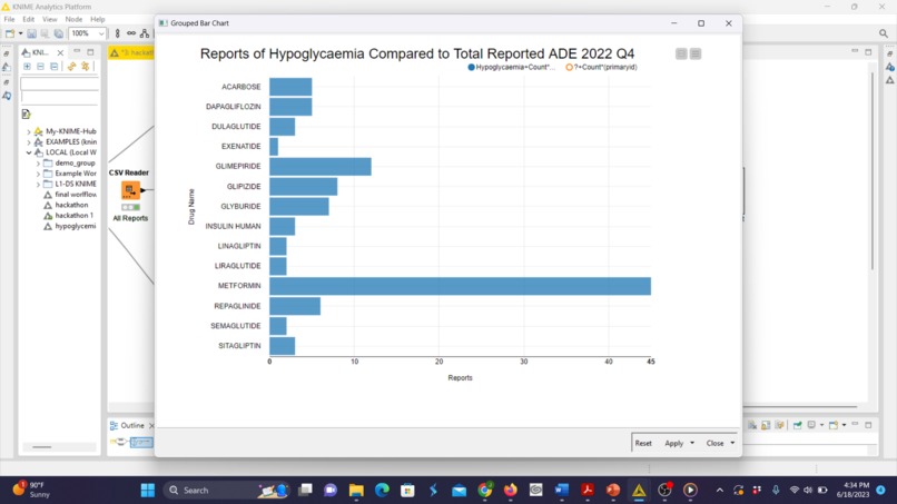
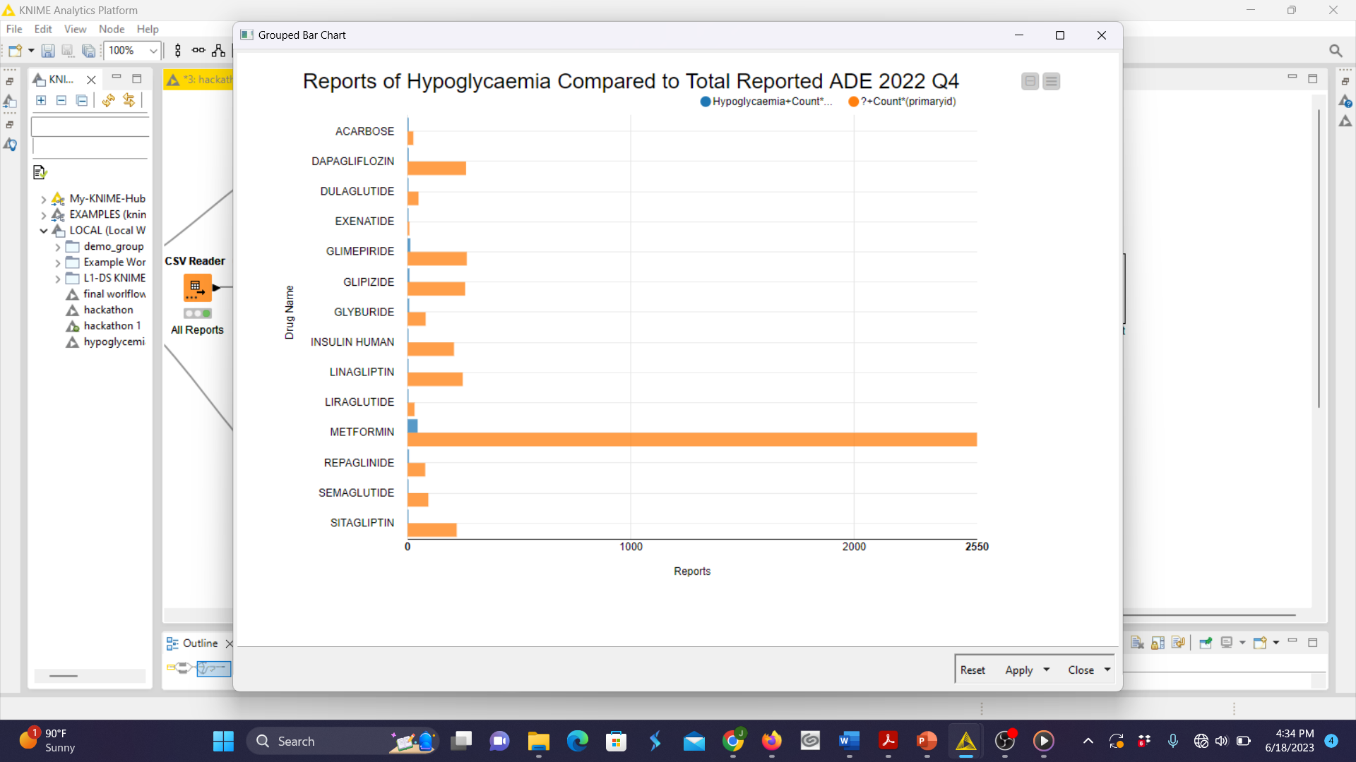
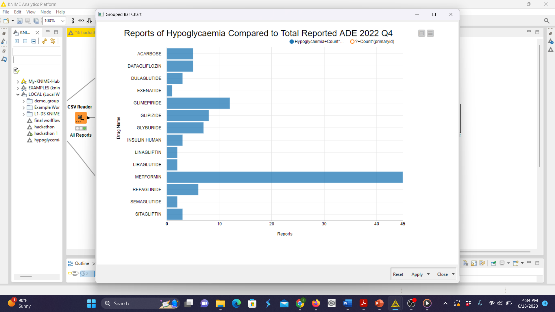
Our bar chart with all reported ADE in orange and reports of hypoglycemia in blue
-
Our bar chart with data isolated for just hypoglycemia reports
Inspiration
As pharmacy students, we are interested in providing the best patient-specific care possible. One of the ways we hope to do that is by gathering as much data as possible to be able to make the most informed decisions on our patient's behalf.
What it does
Our workflow filters over 400,000 data points for the FAERS 2022 Q4 data set down to just the points we were interested in. For our case specifically, these would be those related to either hypoglycemia or one of the 24 antidiabetic agents we were interested in.
How we built it
We built our project solution using a combination of both KNIME and Excel.
Challenges we ran into
Our main challenge was our inexperience with the KNIME platform. We also are unfamiliar with coding lingo so we didn't realize that a CSV filetype is the same thing as an ASCII filetype. This was important because the FAERS data was downloaded in an ASCII file. We also could not figure out how to get the Odds Ratio node to work. This roadblock caused us to pivot to a bar chart to visualize the data in a similar way.
Accomplishments that we're proud of
We are proud that we have some working code to submit. We are also proud of how organized and legible our bar chart is. We felt like it accurately conveys the same information you would be able to get in an odds ratio, which was our original final target.
What we learned
Teamwork truly makes the dream work. We helped each other become more familiar with the KNIME platform and how to interact with the workspace. We also learned more about which drugs have the highest correlation with hypoglycemia.
What's next for Comparison between reported ADE and Hypoglycemia 2022 Q4
Hopefully, we will be able to figure out how to make the odds ratio node work. To create a more accurate representation between hypoglycemia and antidiabetic drugs we would like to move to incorporate data from the entire year rather than just one quarter.
Built With
- excel
- faers
- knime

Log in or sign up for Devpost to join the conversation.