-
-

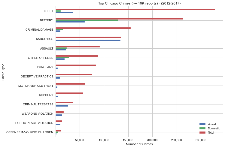
Tip Chicago Crime >= 10k reports
-

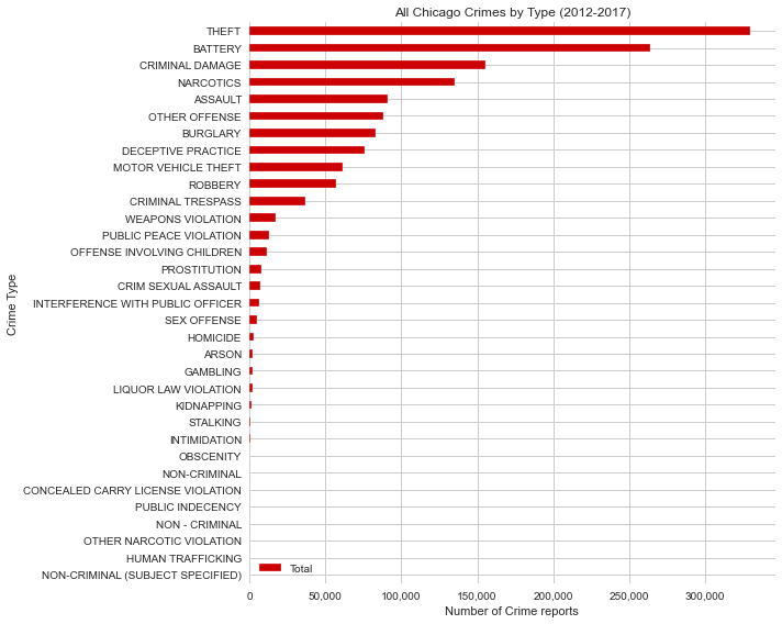
All Chicago Crimes by Type
-

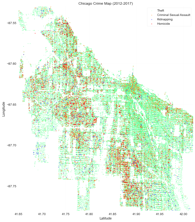
Historical Crime Map
-
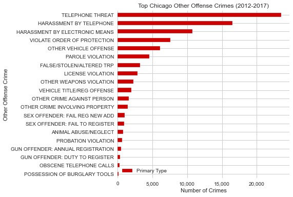
Top Chicago Other Offense Crimes
-

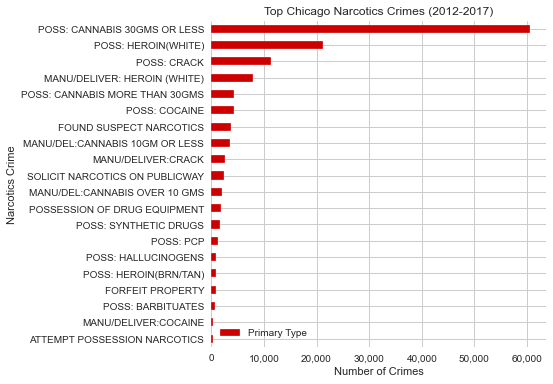
Top Chicago Narcotics Crimes

Please look through the gallery for clear pictures of static charts
Inspiration
Our inspiration was based on trying to make social injustice more easily visible for community planners and other government workers. We wanted to focus on the relationship between the police and the citizens in an area. During our research we came across a systematic review suggesting that "community-oriented policing strategies have positive effects on citizen satisfaction, perceptions of disorder, and police legitimacy, but limited effects on crime and fear of crime."
What it does
We created a dashboard to help inform city planners and other government officials about locations where a police station that is community oriented can be created. We believe it will help have a positive effect in reducing the fear of citizens and social inequalities as a whole.
We chose to focus on the city of Chicago because of the historical oppression by police faced by minorities living there. Our dataset is sourced from Kaggle and the dashboard has historical data from 2012 to 2017.
This would help directly tackle the issue of police brutality by highlighting the areas of highest need using high crime rate as a proxy of increased hostility between citizens and the police. There is a static portion of the dashboard that allows users to see the concentration of crimes historically. The most important part of the dashboard is the interactive heatmap of Chicago where users are able to interact with the map in a similar way to google maps and areas that are darker red have high rate of crime. So city planners can more easily see where police might become overwhelmed and where sensitivity/community based training might be useful to decrease citizen fears and hopefully crime rates in the long run.
How We built it
The dashboard is coded using Jupyter Notebook and Python libraries. We also used the Google Maps static API through Google Cloud Products. For the data cleaning and analysis we used Pandas and Numpy library. For the data visualization and charts we used Seaborn and Matplotlib. For the interactive heatmap we used gmaps which is the Google python library for interfacing with Google Maps API and Google Cloud Platform.
Challenges We ran into
We did not have a lot of webdev experience so we had to learn how to put the cleaned data into a format easily accessible by the user. Displaying geographic data starting with only longitude and latitude was difficult using the standard libraries and so we had to research new libraries we could use.
Accomplishments that We're proud of
We are especially proud of how thorough our data was and how thorough our research was, including building our assumptions based on the research paper "Community-oriented policing to reduce crime, disorder and fear and increase satisfaction and legitimacy among citizens: a systematic review." We are also proud of the potential positive impact this hack could bring to society in the current tense socio-political climate.
What I learned
We learned a lot about how to present data in a way where a non-technical person would be able to digest information and infer solutions that would best fit their community. We also learned how to make useful graphics using the google api to make heatmaps. We also learned new techniques on how to clean and chart data.
What's next for CommConnect for Justice
We believe that a machine learning approach would increase the chances of re-introducing historical biases that we are working hard to move away from. The next step would include showing historical data of how adding community centers or police stations of Chicago, and for that we would need to connect with the local government leaders to gain access to that data. NYPD and other cities also release similar datasets and we would love to include this data into our project so city planners across the country can use our project.
Built With
- google-cloud
- google-maps
- jupyter
- matplotlib
- numpy
- pandas
- python


Log in or sign up for Devpost to join the conversation.